The Reuters logo’s simplicity does not mean it’s easy to understand. It’s a business-like and strict sign that considers every element. Although all details are identical, many are just like the news transmitted by the media agency. In this way, the emblem symbolizes that our world is entirely made up of interesting information.
Reuters: Brand overview
In 1851, German immigrant Paul Julius Reuter founded a news agency in London, marking the beginning of Reuters’ history. Reuter initially used pigeons to carry financial news between Aachen and Brussels, bridging the gaps in telegraph communication.
The agency established an office in London’s Royal Exchange in October 1851. Reuter began transmitting commercial news to newspapers via the telegraph, the latest technology. This allowed the news service to quickly become the leading source of financial information for brokers and banks in London.
A significant turning point for the company came in 1858 when The Times began publishing the agency’s reports. This raised the organization’s profile and influence. Over the following years, it expanded globally, opening offices in Alexandria, Bombay, Melbourne, and other key locations.
The news service was crucial in transmitting updates about the American Civil War (1861–1865) from America to Europe. The organization used innovative methods to quickly disseminate information, such as employing freed carrier pigeons to send news across the Atlantic Ocean.
In 1865, the agency was the first to report the assassination of U.S. President Abraham Lincoln to Europe, solidifying its reputation as a reliable source of international news.
By the late 1800s, the company had become a global news agency, providing services to governments, businesses, and newspapers worldwide. The organization continued to innovate, including broadcasting news via radio in the early 1900s.
During World War I, the agency played a crucial role in disseminating information despite censorship and other challenges. It also provided detailed coverage of the Russian Revolution in 1917.
In 1923, the company went private and became owned by the Press Association, a move designed to ensure the agency’s independence from government influence.
The Second World War marked another significant period in the organization’s history. Despite difficult circumstances, the news service continued to provide vital information on the state of the conflict. After the war, it continued to grow and adapt to new technologies. In the 1960s, the agency began using computers to process and distribute news, making its operations more efficient.
The company went public in 1984, listing its stock on NASDAQ and the London Stock Exchange. This move allowed the organization to attract more capital for growth and development.
As digital technology advanced rapidly in the 1990s and 2000s, news services significantly invested in this area. The organization began offering real-time information over the Internet and launched various online services, including its website.
A major development in the company’s history occurred in 2008 when it merged with the Canadian information company Thomson Corporation. This merger created Thomson Reuters, one of the largest information companies in the world.
In 2018, Thomson Reuters sold its financial and risk division to a group led by the Blackstone Group, resulting in the formation of Refinitiv. The news division, still part of Thomson Reuters, continues to provide news and content to Refinitiv.
Throughout its history, the organization has consistently demonstrated its ability to adapt to market demands and technological changes while maintaining its core principles of objectivity, independence, and accurate reporting. From using pigeons to cutting-edge digital technology, the news service remains one of the most respected and trusted sources in the world, playing a significant role in the global information landscape.
Meaning and History
Paul Reuter was a pioneer of the telegraph. He used it to broadcast the most topical events with the goal of immediate coverage. This led to the creation of the British news agency that relayed fresh information. Of course, the media service needed a personal logo reflecting its concept of rapid communication. Hence, in the second half of the 20th century, the legendary emblem of numerous small dots appeared. They represent the perforation on the teletype tape, first applied in 1846.
What is Reuters?
Reuters is a British news agency with its headquarters in London, although it belongs to the Canadian company Thomson Corporation. The news service has existed since 1851, opening its own branches worldwide for immediate coverage of topical events. The founder of the media service is the German Paul Julius Reuter, and the owner is the Thomson Corporation from Canada.
1851 – 1858
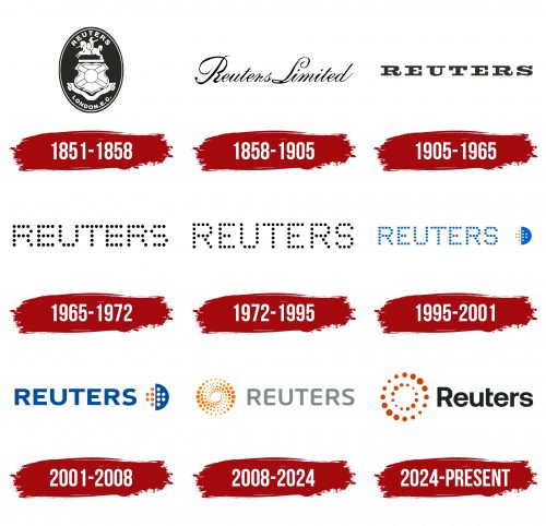
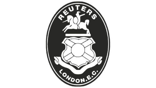
The Reuters logo appears as a name medallion. It consists of a vertical oval with a double black-and-white frame. Inside is a heraldic shield, diagonally bound with wide ribbons. Another ribbon is at the bottom, but wavy, double, with fancy ends. Above the shield is drawn a rider – a knight with a spear on a galloping horse to the left. His outlines are not precise but approximate, yet they still reveal the figure of a person in military gear. Arched inscriptions are located at the top and bottom: “Reuters” and “London. E.C.”.
1858 – 1905
This time, the emblem has become an exquisite text, stylized as a manual inscription. It is executed in calligraphic font with a right-hand slope. The word “Limited” is added to “Reuters,” indicating the legal status of the information company. The inscription is cursive, thin, and black.
1905 – 1965
The developers changed the refined calligraphic design to a coarse print to align the logo with identity standards. Such a move was provoked by the need to modernize the emblem, which hadn’t changed since the beginning of the century. The letters became large, wide, squashed, and got a block style. But the grace remained: it is manifested in the curved legs and smooth lines, which balance the angles. The inscription is reduced to one word, translated into upper case, and supplemented with serifs.
1965 – 1972
The “teletype tape” era began, corresponding to quick news transmission at any distance to acquaint the population of other countries. Therefore, the text turned into a continuous perforation. Alan Fletcher of the Pentagram design studio depicted bold black dots instead of solid lines forming letters. The concept turned out to be successful and remained for a long time. At the same time, it’s a simple and accurate emblem.
1972 – 1995
The new logo reflects the principle of teletype operation. However, to increase the text’s readability, the authors slightly spread the glyphs, increasing inter-character space. In addition, they pulled the letters upwards and reduced the points, adding clarity to the inscription.
1995 – 2001
The Reuters logo became colorful: the monochrome was replaced by a combination of blue, white, and red. Designers from Enterprise IG downsized the inscription to appear proportional to the nearby sign. The authors drew a circle containing two semicircles: the right side is blue with white dots, and the left is white with red. One of them represents the night, and the other represents the day. This symbolizes that the agency covers news around the clock.
2001 – 2008
The logo has traditional glyphs – without dots but with straight lines. The letters came out bold and low-set yet remained readable. The designers kept the blue color because it symbolizes creative uplift, hope, and striving for new horizons. Plus, it’s the color of the sky, from the height of which you can oversee a large amount of territory. The sky palette hints at this principle. The sign on the right is now enlarged and looks more distinct.
2008 – 2024
Another visual identity redesign took place in 2008. The Reuters logo ascended a new level of evolution, gaining a modern look that fits into the principle of two-dimensionality. This is needed for the symbol to reflect adequately on displays of any type. Eventually, the idea of combining perforation and traditional font emerged. Letters in uppercase, semi-bold, printed, with semi-rounded ends (the corners are not sharp but smooth). The era of black color ended: grey appeared instead.
Designers moved the perforated circle to the left and enlarged it. Developers redesigned it, changing the principle of dot arrangement. Now, it looks like a concentric spiral, with elements of different sizes—large, medium, and small. As a result, another circle—white, neutral, pure—appeared in the negative space in the center.
2024 – today
The Reuters logo, introduced in 2024, is part of the company’s updated brand identity, developed in collaboration with the agency Code and Theory. This logo reflects modern trends and strategic shifts in the brand, aimed at adapting to the challenges of the digital age.
The main symbol of the emblem is a circle composed of numerous orange dots, creating a dynamic and fluid shape. This element symbolizes the news agency’s global reach and continuous flow of information. The circular composition of dots emphasizes the idea of interconnectedness and the interaction of various elements of information and data.
The orange color has become more vibrant, symbolizing energy, creativity, and innovation, aligning with the company’s renewed vision in the era of AI. Combined with the black text, this contrast highlights the seriousness and reliability that have always been central to the company’s philosophy.
The font has been modernized to meet contemporary standards of minimalism and functionality. The new typeface is simplified yet retains clarity and legibility, which is crucial for a news agency that values clarity and precision in news delivery.
Font and Colors
The typeface in the Reuters logo depends on the year the sign appeared. Early versions used a custom font created by Alan Fletcher. But these were not textual glyphs but drawn ones. Later, a familiar variant similar to Neo Sans Std Medium appeared – without serifs, with slightly rounded ends. Its author is designer Sebastian Lester.
The corporate palette is sparse, including red colors: blue, white, and pale red. Many monochromatic emblems, primarily black and white, are also present.
