


![]() Robinhood Logo PNG
Robinhood Logo PNG
The Robinhood logo preaches freedom and nobility, which makes it easy to earn money. Anyone can start from scratch and make a profit. This is the whole essence of the platform that the emblem conveys.
Robinhood was founded on April 18, 2013, by Baiju Bhatt and Vladimir Tenev. The idea grew out of the mood around Occupy Wall Street and the belief that stock trading should be open to a wider public.
The founders had worked on high-frequency trading systems for financial firms, which helped them see how stock trading could be simplified for ordinary users. They named the startup Robinhood, after the outlaw known for giving stolen wealth to the poor. In 2014, after venture funding, the company began building a mobile app for commission-free stock trading. Its waiting list quickly drew hundreds of thousands of potential users.
The iOS trading app launched in 2015 with zero-commission stock trading, a rare offer at the time. The Android version followed later that year. In 2016, Robinhood introduced Robinhood Gold, a paid set of trading features and one of its first major monetization tools. From 2017 to 2018, the platform expanded its services and user base, adding cryptocurrency trading alongside stocks, ETFs, and options.
In 2019, after receiving a banking license, Robinhood launched savings products and worked on educational tools for users. In 2020, the platform saw a sharp rise in users and raised additional funding. In 2021, Robinhood completed its IPO on NASDAQ, entering a new stage as a public company. From 2022 to 2023, Robinhood focused on expanding financial products, improving the app experience, upgrading technology, and diversifying its services.
Meaning and History
![]()
The stockbroker lives up to its name by not charging interest on transactions. The logo also does not stand out from the concept: it depicts a feather, as in the hat of the famous robber, supplemented with the word “Robinhood.” The design generally contrasts with the conservative, corporate style of other brokerage companies.
Credit goes to branding specialist Alexandra Bond, who designed the app’s branding and interface. She did not follow the traditional path but decided to attract novice traders’ attention with something unusual. The designer relied on a simple design that does not scare off beginners with excessive seriousness.
At the same time, the electronic platform’s functions have become a game of investing. “Lottery tickets,” falling confetti, a list of trendy promotions, one-click trading, and emoji phone notifications have helped Robinhood acquire millions of customers, with an average age of around 26.
The company revolutionized the brokerage industry, but not in a positive way: American youth, especially newcomers, began taking big risks. This platform has made them addicted to gambling sites. Huge losses and application bugs often led to tragedies. So, the logo’s visual appeal is nothing more than a psychological device designed to attract the attention of people with minimal trading experience or who have even heard the word for the first time.
The main graphic symbol of Robinhood is a feather with an upward-pointing arrow. The geometrically simple image symbolizes the company’s folklore character. As you know, he was a big fashionista, so he decorated his hat with a feather. Given its positive reputation as a robber among the poor, the emblem should inspire trust and confidence among users. The arrow, in turn, hints at financial growth.
What is Robinhood?
Robinhood is a financial platform that offers exchange-traded funds, electronic stock trading, and cryptocurrency trading. Customer interaction is conducted through a mobile application launched in 2015. The founders of the company are Vladimir Tenev and Baiju Bhatt. It was founded in 2013. It is located in Menlo Park, California.
2013 – 2019
![]()
Until then, the Robinhood logo was light emerald, a shade of green and blue. It denoted confidence, calmness, and prudence, and was associated with the growth of material wealth, its main symbol. It also personified radiance and luxury, which is important for money service. In addition, the aquamarine emblem attracted users’ attention and increased traffic to the web resource. Both parts, both text and graphic, were painted in this color.
The inscription consisted of the name, typed in lowercase font with rounded corners. The angularity of the letters was removed to avoid negative emotions in customers and to prevent repulsion. The drawing depicted a feather, an attribute of the famous fighter with the rich, after whom the service is named. According to legend, Robin Hood wore it in his hat and was well-recognized. The pen consisted of several segments combined so that a thin white arrow was visible between the geometric figures. She symbolized financial growth, upward movement, active recovery, and profit.
2019 – 2024
![]()
After the logo update, black became the official color, lending the design a sense of austerity and simplicity. It emphasizes the company’s stability and seriousness. The font style also changed: instead of the previous elongated format, the letters acquired a more rounded shape, creating a sense of softness and accessibility in the financial service. This focus on friendliness is reinforced by the font’s smooth lines, evoking simplicity and ease of use.
The first letter of the name is highlighted in uppercase, drawing attention to the beginning and giving it greater expressiveness. Moving the feather from the left side of the text to the right visually balanced the composition. The feather, a key element, retains its fine lines, and its proportions have become more refined and minimalist, emphasizing the company’s pursuit of simplification and modernization.
Reducing the text’s proportions made the logo compact. It now fits better on digital platforms while maintaining recognizability. A key detail is the arrow formed in the negative space between the feather’s geometric shapes. This arrow points upward, symbolizing growth, progress, and ambition, highlighting the service’s core mission: helping users achieve their financial goals.
The brand name is associated with the image of Robin Hood, a hero known for his commitment to justice. This image aligns well with the company’s mission to make financial tools accessible to everyone. The logo’s style reflects the ideas of equality and openness.
The harmony within the emblem underscores the brand’s core message of convenience, progressiveness, and openness for all.
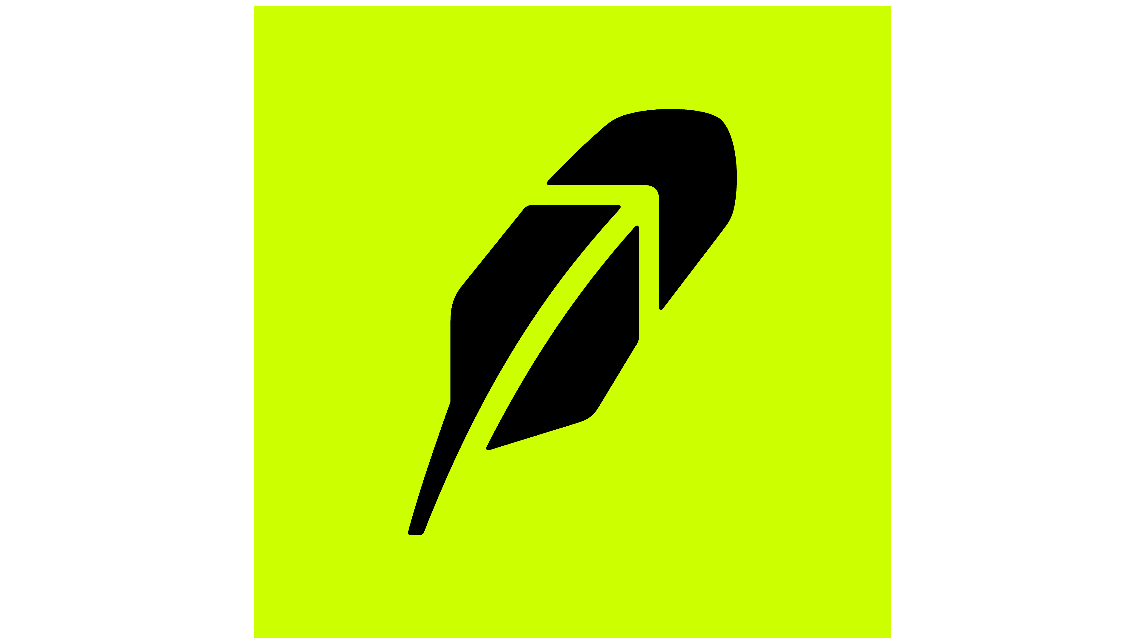
2024 – today
![]()
The PORTO ROCHA studio developed the new company logo, reflecting a meticulous approach to refreshing the brand’s visual identity. The feather remains the central design element, now rendered more minimalist. One of the lower segments of the feather was removed, making it cleaner and easier to perceive. The negative space between the remaining segments still reveals an upward-pointing arrow.
The feather, previously positioned on the right side of the text, has been shifted back to the left. This placement draws attention to the symbol, emphasizing its importance in the composition. The logo’s black color preserves its formality and versatility, making it adaptable to various contexts.
The logo’s typography has been updated to feature a custom sans-serif font paired with Martina Plantijn, a serif typeface. This combination gives the text a contemporary feel while adding a touch of tradition, balancing innovation with reliability. A distinctive feature of the font is the inclusion of subtle ink traps, which add elegance and an intriguing visual effect. The rounded shapes of the letters enhance the sense of approachability and friendliness.
The combination of the feather and text highlights the brand’s core message, the ease with which anyone can begin investing and managing capital. This updated design harmonizes modernity, simplicity, and profound meaning, embodying Robinhood’s values and mission.
Font and Colors

Designers paid little attention to the wordmark. They used a standard font similar to Street Plain Regular. The grotesque used for the inscription “Robinhood” is characterized by the absence of letter-end rounding. Perhaps this is another attempt to simplify the design to grab users’ attention.
The logo has a monochrome black-and-white version. However, green is often used because it matches Robinhood’s clothing color (and hat). By the way, in the stock market, this color means growth, which, according to the chief designer’s idea, should create positive associations. Alexandra Bond chose not a standard shade but a bright one (#00C805), which could appeal to younger generations. This is another neat psychological trick, a visual message that acts as a green traffic light.
FAQ
What font is the Robinhood app?
The app uses the Maison Neue typeface, designed by Milieu Grotesque. The team chose this practical and precise sans-serif font to replace their old typeface, meeting their needs for clarity and modernity.
Maison Neue’s clean design enhances readability, essential for a financial app. Users need to understand data and navigate the interface quickly. This choice reflects the brand’s commitment to providing a user-friendly experience, ensuring all text elements are clear and easy to read.
Adopting Maison Neue gives the brand a consistent, professional look across its digital platforms, helping create a recognizable visual identity. The typeface’s modern aesthetic supports the brand’s image as an innovative financial services provider.
What is Robinhood used for?
This online discount brokerage offers a commission-free investing and trading platform. Users can buy and sell stocks, options, exchange-traded funds (ETFs), and cryptocurrencies without paying traditional brokerage fees.
The brand aims to make finance accessible to everyone, regardless of their financial background or experience. Its user-friendly interface and mobile app have attracted many users, especially younger investors. The platform provides tools and resources to help users make informed investment decisions, like real-time market data, news updates, and educational content.
Robinhood’s commission-free model has changed the traditional brokerage industry, which usually charges fees for each trade. This approach allows users to trade more without worrying about costs. The brand’s focus on simplicity and accessibility has made it popular with new and experienced investors.
Is Robinhood a US company?
It is a US financial services company headquartered in Menlo Park, California. The brand was founded to democratize finance and make investing accessible to everyone.
The brand offers a user-friendly platform for commission-free trading and investing in stocks, options, exchange-traded funds (ETFs), and cryptocurrencies. The brand’s easy-to-use mobile app and straightforward approach have made it popular, especially among younger investors.
By eliminating traditional brokerage fees, the company has impacted the financial services industry, allowing users to trade more frequently without worrying about costs. This innovative model has attracted many users and positioned the brand as a major player in the market.
What is the Robinhood symbol?
The symbol is a feather, inspired by the legendary Robin Hood, who wore one in his hat. This symbol is painted in a trendy mint color, appealing to the brand’s young clients.
The feather in the logo is made up of several fragments. These fragments create an upward-pointing arrow in the negative space inside the feather. This design shows a growth trajectory in finance.
The feather represents the character Robin Hood and the brand’s mission to make finance accessible and virtuous.
What is the Robinhood IPO stock symbol?
In late summer 2021, the company went public and began trading on the Nasdaq under the symbol HOOD. The initial public offering (IPO) priced its shares at $38 each. This event marked a big step for the brand, moving from a private company to a publicly traded one.
Going public allows one to raise significant capital. This money could expand services, improve the platform, and reach more users. The IPO allowed investors to buy shares, showing their confidence in the brand’s growth and future potential.
Trading under the symbol HOOD made the brand’s stock accessible to more investors, increasing its market presence. This move supported the brand’s goal of democratizing finance and making investing accessible to everyone.
Does Robin Hood have a stock symbol?
Yes, the Robinhood mobile financial platform supports stock symbols. In 2021, when the brand became a public company, it began trading on the Nasdaq exchange under the symbol HOOD. This marked a big milestone for the brand, allowing it to raise capital and expand its reach.
Trading under the symbol HOOD makes the brand’s shares accessible to many investors. This symbol represents Robinhood on the stock market and its status as a publicly traded company. By going public, the brand can attract more investors and advance its mission to democratize finance.
The IPO and the adoption of the HOOD symbol have strengthened the brand’s position in the financial services industry. The stock symbol HOOD now represents the company’s innovative, user-friendly approach to investing.