


A Pilates class and tasting at Heartbeat High in Shenton Park marked the launch of Sashet, an Australian electrolyte drink brand. The brand launched in May 2026 with an identity by Melbourne-based designer Candy Brophy. Hand-drawn lettering, bright colors, and references to 1980s fitness videotapes frame the daily drink as an enjoyable habit.
Perth-based founders Taryn O’Donnell and Rob Tucker spent 6 months developing the powdered mix and tested over 20 samples. The first flavors were Cherry Cola and Raspberry Crush. Ingredients include Australian honey, dietary fiber, vitamins C, B3, and B6, sodium, magnesium, and potassium.
The name emerged early in the process. Brophy took “sachet,” the word for a small, single-serving packet, and replaced the “c” with an “s.” The spelling Sashet retained the connection to the product’s format. Both founders contributed to the identity, with Taryn O’Donnell serving as brand director.
Brophy drew inspiration from classic soft drinks, products found in small neighborhood stores, and the popular culture of past decades. She calls the direction “neo-nostalgia,” a fresh interpretation of familiar imagery. The identity centers on the pleasure of flavor and the daily habit of enjoying a favorite drink.
The logo is a hand-drawn wordmark that rises from left to right. Closely spaced letters combine rounded curves with pointed terminals and angled cuts. Slightly uneven edges resemble marker strokes. Uppercase and lowercase forms create a dense arrangement between the large opening “S” and tall final “T.”
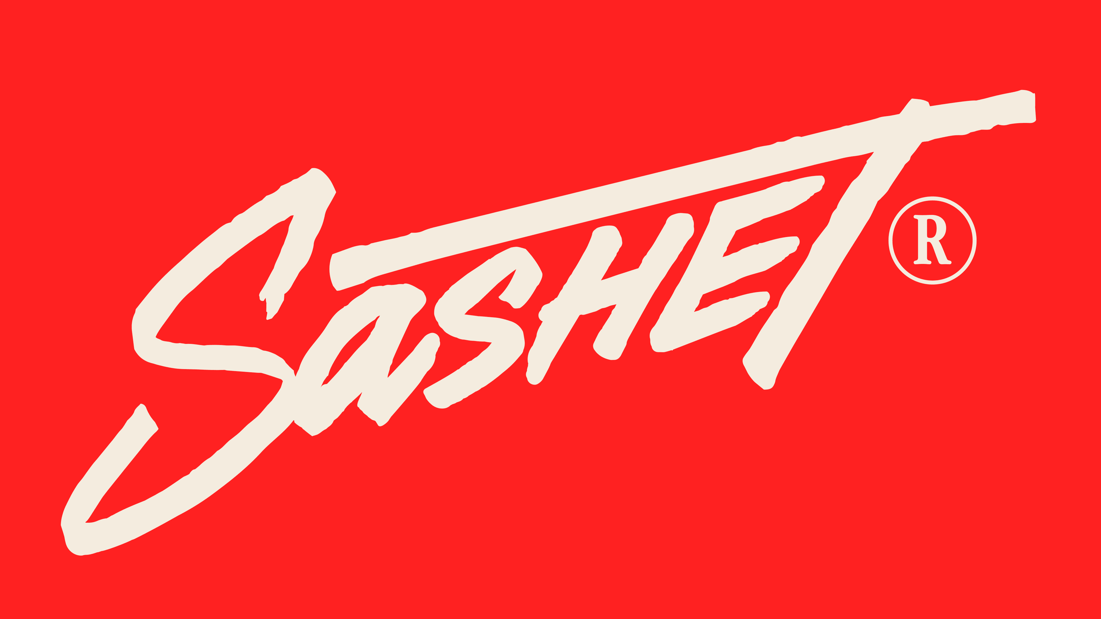
The lower curve of the “S” extends to the left and downward. The crossbar of the “T” reaches left across nearly the entire name, forming a slanted line above letters of varying heights. The result resembles a bold signature framed by an opening flourish and a long finishing stroke.
The lettering carries the fitness theme. Brophy compares its shape to a person caught mid-exercise during an aerobics routine. The extended strokes of the “S” and “T,” the slant, and the varying letter heights recall the loose, open poses of 1980s fitness culture. Soda-inspired flavors reinforce the connection to the era’s popular drinks.
Yellow is one of the primary brand colors, while each flavor has its own background. Cherry Cola uses red, and Raspberry Crush uses a saturated pink. A light-colored logo fills most of the front of the packet. Beneath it, diagonal stripes and the words “Daily Electrolytes” follow the name’s upward slant. Each box contains 10 servings.
In digital materials, the retro theme continues through Hydration Corporation, a fictional company presented with an address from its president and the look of an old video recording.