 Severn Trent Water Logo PNG
Water supply and wastewater disposal require complex infrastructure to serve homes and businesses. The company handles water treatment, transport, and quality control at various stages of the system. The Severn Trent Water logo represents a company that supplies drinking water and manages sewer networks in central England.
Severn Trent Water was established in 1989 during the privatization of the water industry in England and Wales. The company received a service area in central England, including Birmingham, Nottingham, and Derby. Its shares were listed on the London Stock Exchange at 240 pence.
In the early 1990s, Severn Trent focused on modernizing outdated infrastructure and improving water quality. In 1994, it launched a leak detection program using acoustic equipment. By 1996, the company had expanded its market presence by acquiring regional operators.
In 1997, Severn Trent paid 157 million pounds in windfall tax. In 1998, the regulator, Ofwat, imposed tariff restrictions. In the early 2000s, the company began working in waste management and started installing water meters.
In 2003, Severn Trent entered the international market and acquired water assets in the United States. In 2006, the company sold them and focused on developing its British business. In 2008, the company opened an operations center in Coventry to manage its entire network.
Since 2009, the company has begun introducing smart meters and telemetry systems. In 2012, the company rejected a 5.3 billion pound takeover offer. In 2014, the company launched a mobile app for customers. In 2015, the company started a program to replace lead pipes.
In 2018, the company implemented artificial intelligence to predict emergencies. In 2019, the company approved an investment plan totaling £ 7.6 billion. Following criticism in 2022 over wastewater discharges, Severn Trent allocated additional funds to modernize treatment facilities and upgrade the network. The company carried out these projects in 2023 and 2024.
Meaning and History
What is Severn Trent Water?
A major supplier of drinking water and operator of sewerage systems in central England and part of Wales, it is part of the Severn Trent plc group registered in Coventry. The company extracts, treats, and distributes water and also treats wastewater. Ofwat, the Water Services Regulation Authority for England and Wales, regulates it. In addition to its core business, the organization manages several reservoirs and nearby recreational areas.
1974 – 1989
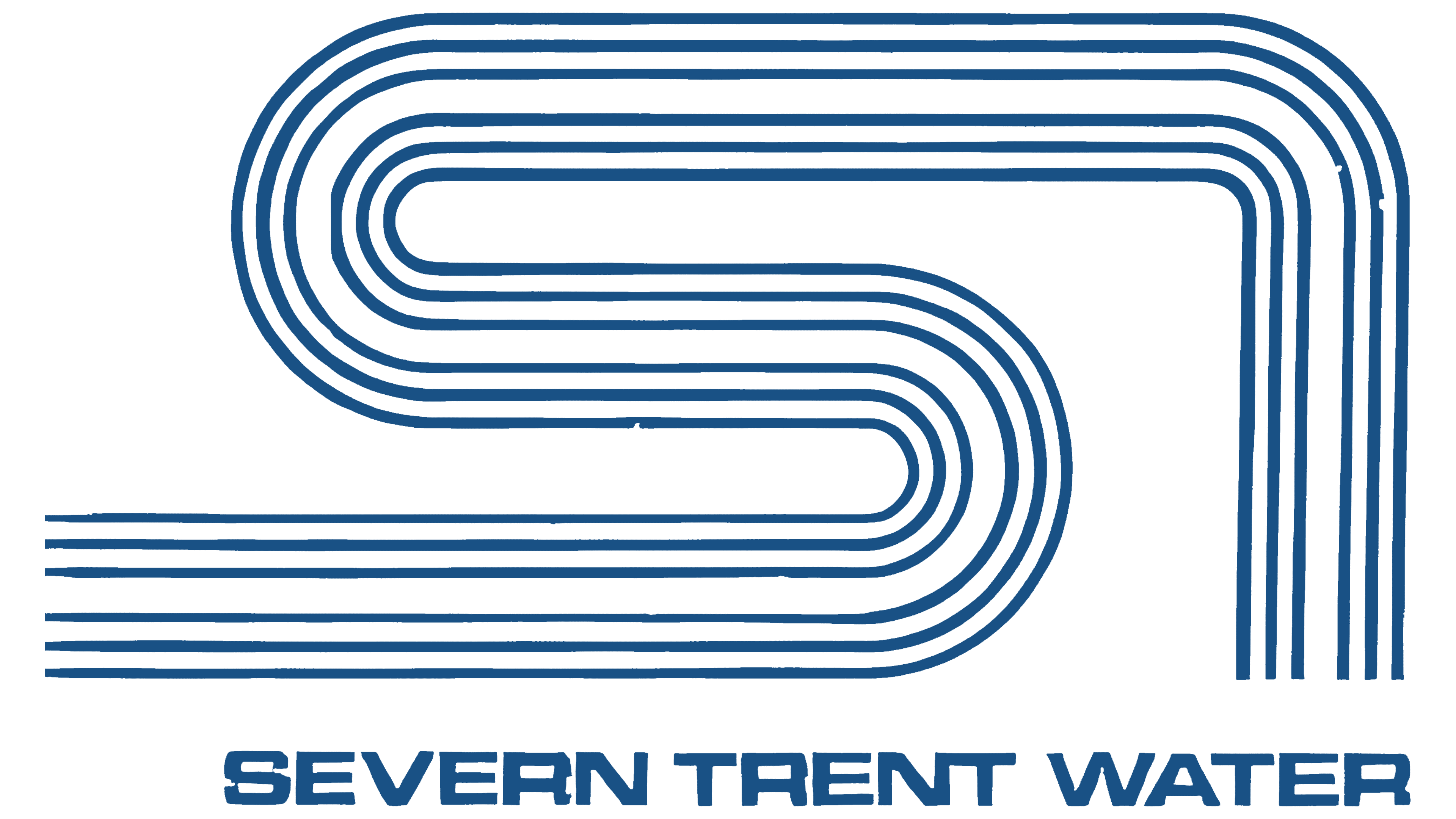
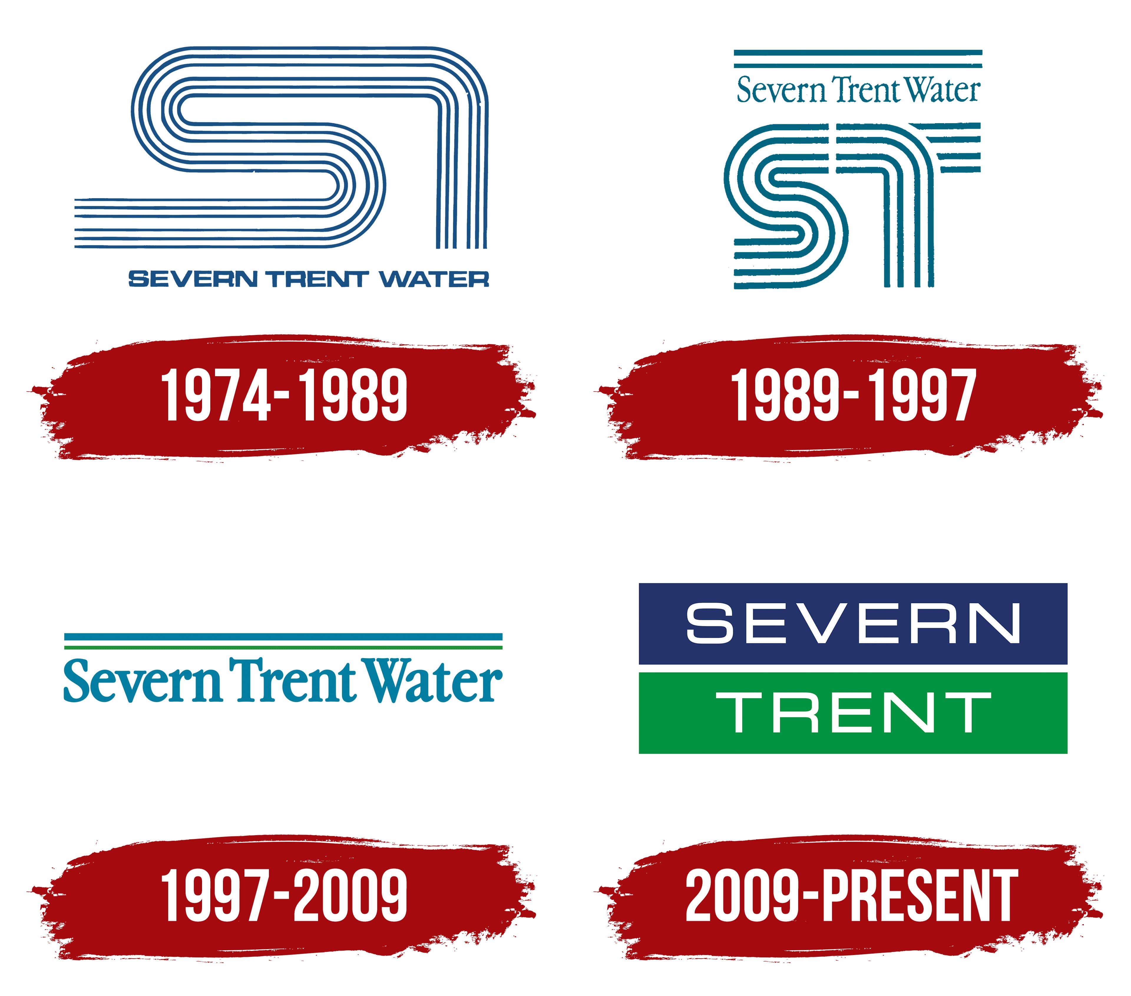
Two rivers gave Severn Trent Water its name, and their initials formed the basis of its early emblem. In 1974, the regional Severn Trent Water Authority brought together water services across the Severn and Trent river basins. The name connected the organization to the area it served. “Water” identified its purpose.
The letters “S” and “T” were formed from six parallel blue lines. On the left, the lines curved into an “S,” then extended along the upper edge and turned downward on the right to outline a “T.” The resulting monogram was elongated, with smooth bends.
SEVERN TRENT WATER appeared beneath the initials. Wide, squat sans-serif letters gave the name weight. Its angular letterforms contrasted with the monogram’s rounded curves, while blue connected both parts of the logo.
In 1989, after the privatization of the water industry in England and Wales, the company’s water supply and wastewater treatment operations passed to the privately owned Severn Trent Water. The name remained, preserving its reference to the two rivers and the region the company served.
1989 – 1997
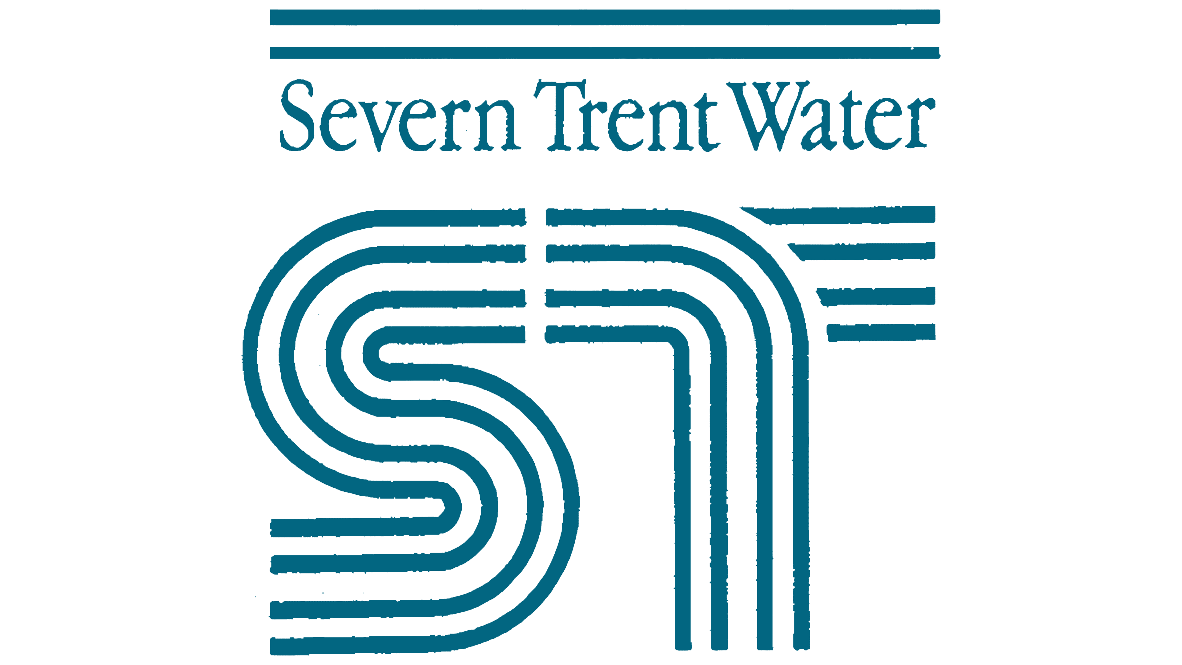
In the next logo, the name and monogram switched positions. Severn Trent Water moved above the initials, with two horizontal lines above the name. Their length matched the width of the emblem below.
The lettering changed as well. A serif typeface replaced the heavy sans-serif capitals. Each word began with a capital letter, “S,” “T,” and “W,” followed by lowercase letters. A blue-green shade unified the name, lines, and monogram.
The initials became more compact. Their previously elongated shape became almost square, and the number of parallel bands decreased from six to four. The bands became thicker, with gaps separating the letters. On the left, the curves still formed an “S.” On the right, a vertical stroke and separate short horizontal segments formed a “T.” The revised design still represented the names Severn and Trent.
1997 – 2009
In 1997, the large monogram gave way to the name. The logo became horizontal, with two bands remaining above Severn Trent Water. The upper band was thicker and used a turquoise-blue shade close to the lettering’s color. The lower band was thinner and green.
The name retained its serif typeface and initial capitals followed by lowercase letters. Heavier strokes gave the lettering the weight the large initials once carried. The full company name now formed the logo’s basis. Two bands ran along it, continuing the previous version’s color theme.
2009 – today
The next version divided Severn Trent into two lines. White SEVERN lettering appeared inside a blue rectangle, with TRENT in a green rectangle beneath it. A narrow white strip separated the fields. Instead of the monogram, the two river names now appeared in full, each on its own colored background.
The two-color logo had an earlier precedent. Parent group Severn Trent used a similar arrangement in 2006. At that time, the letters had serifs and wider spacing. A small “Environmental Leadership” tagline appeared beneath the rectangles.
By 2009, the tagline had been removed, leaving two colored blocks containing the group’s name. By 2010, the lettering inside them had changed. The letters became thinner, with uniform strokes and a sans-serif style. The rounded portions became rectangles with softened corners.
A three-panel version existed for the water company, Severn Trent Water. A blue rectangle with white WATER lettering was added beneath the green TRENT panel. Narrow white gaps separated the three lines, and the capitals shared the same lettering style. The full name appeared in this format in 2015. Later, the company established the two-line logo in its materials, with a dark blue SEVERN panel above a green TRENT panel.