The Sheridan logo reflects the expressiveness and transience of life. Although the company it belonged to lasted only a year, the emblem absorbed ambitious energy, leaving a lasting mark on automotive history.
Sheridan: Brand overview
In 1920, General Motors (GM) launched a new car brand, Sheridan, to close the pricing gap between Chevrolet and Oldsmobile. This marked the beginning of the company’s tale. GM established manufacturing operations in Muncie, Indiana.
General Philip Sheridan, a prominent American Civil War military commander, is the reason behind the name. This name was selected to evoke power, dependability, and American ideals.
Work on the first automobile began in 1920, Sheridan. GM engineers set out to design a vehicle that would offer the affordability of a Chevrolet together with a greater degree of luxury and refinement.
The first and only model was unveiled in 1921. This particular model had a 40-horsepower, 3.8-liter six-cylinder engine. It was available in sedan, coupe, and roadster body styles, with a wheelbase of 2946 mm.
The vehicle’s better interior finish and more contemporary styling set it apart from other GM vehicles of the era. In the early 1920s, this car included illumination and an electric starter, which were cutting-edge features for cars of this class.
The company had lofty goals, but it also faced several issues. The 1920s economic crisis had a detrimental effect on the US auto industry. Furthermore, placing the brand between Chevrolet and Oldsmobile was difficult because many customers favored either the more affordable Chevrolet or the more upscale Oldsmobile.
Production occurred at the Muncie facility, which GM purchased from Inter-State in 1918. The poor demand for Sheridan automobiles led to the underutilization of this plant, which had been upgraded for the new brand.
About 1,000 units were produced in 1921. Sales, however, continued to be modest despite GM’s efforts to market the new brand. Since buyers could not perceive any discernible benefits over other GM models, dealers found it difficult to move these vehicles.
GM management decided to drop the brand by the end of 1921. This action was part of a larger plan to reorganize GM’s brand portfolio, streamline the model lineup, and cut expenses.
Following the brand’s demise, the Buick division took over the Muncie facility. Later on, the design and technical innovations found their way into other GM vehicles.
The brief history illustrates automakers’ difficulties as the vehicle industry developed quickly. The process of starting and ending this brand had an impact on General Motors’ subsequent brand portfolio management tactics.
Meaning and History
What is Sheridan?
The headquarters of the American automaker was located in Muncie, Indiana. The company was known for producing high-quality luxury cars that competed with other renowned brands of the era. Modern engineering, elegant design, and powerful engines characterized these vehicles. The brand aimed to provide comfort and performance, targeting affluent buyers seeking high-end automobiles. Despite their products’ high standards and quality, the company’s career in the automotive industry was relatively short.
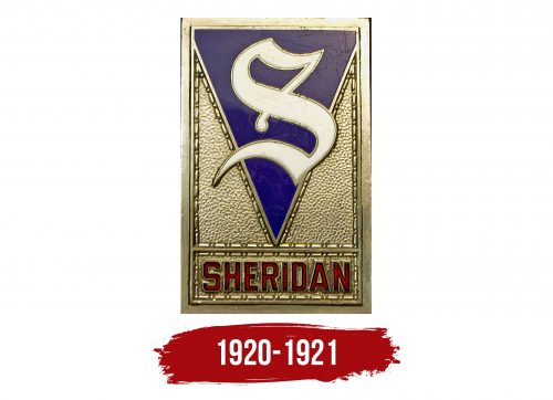
1920 – 1921
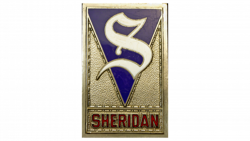
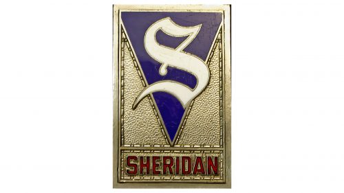
The Sheridan emblem was rectangular with a vertical orientation, giving it the appearance of a badge. The key feature was the “S,” the first letter of the name. This “S” was not a standard letter but a graphic element, more of an image than typography.
The glyph was ornate, elegant, and curved. However, the curves were directed inward rather than outward, making them appear overly intricate. The top and bottom ends had sharp elements, uncommon for an “S.” This design made it resemble the number 5 and the infinity symbol in a vertical position. Crescent-shaped figures added expression and dynamism to it.
The background for the single letter was a dark blue triangle pointed downward. It divided a golden canopy into two parts, forming two triangles. All geometric shapes were outlined with dashed borders, effectively defining the individual space of each element.
The automotive company’s name was below, on a separate field (a horizontal rectangle). The inscription was in an uppercase sans-serif font, emphasizing ambition and grand plans. The bold red letters stood out clearly against the golden background, adding sophistication to the logo. The color was so vibrant that the name immediately caught the eye, even though the stylized “S” was above it.


