 Shriners Hospitals for Children Logo PNG
The Shriners Hospitals for Children logo symbolizes the care and attention that young patients receive in the network of medical institutions. The charitable organization covers all expenses related to treating sick children, which is why its emblem is associated with the highest degree of humanitarianism.
Shriners Hospitals for Children grew from a proposal discussed at the Shriners’ Imperial Session in Portland in 1920. Texas member Freeland Kendrick called for free treatment for children with orthopedic conditions. A committee formed in 1921, and the network was approved at the 1922 session in San Francisco. Its first hospital opened in Shreveport, Louisiana, on September 16, 1922, treating clubfoot, polio, and related disorders.
By 1925, seven hospitals operated in the United States and Canada. Care continued through the Great Depression. The network later entered pediatric burn treatment, opening its first burn hospital in Galveston, Texas, in 1962. During the 1960s and 1970s, doctors adopted new treatments for scoliosis, spinal injuries, and orthopedic conditions. Cleft lip and palate care was added in 1980.
Research expanded in the 1990s through centers studying tissue regeneration, burns, and the genetics of orthopedic disorders. The organization adopted its name in 2001 and created spinal cord injury centers in 2005. Financial restructuring followed the 2009 crisis, while telemedicine and electronic records expanded during the 2010s. The millionth patient was recorded in 2015.
The First Lady program began in 2018, and telemedicine services expanded in 2019. Centennial events were held in 2020. Research findings on pediatric burns and orthopedic care appeared in 2021, rare-disease clinics opened in 2022, and webinars for parents and medical workers launched in 2023.
Meaning and History
What are Shriners Hospitals for Children?
It is a network of not-for-profit medical facilities across North America that provides specialized pediatric care. The organization specializes in treating children with orthopedic conditions, burns, spinal cord injuries, and cleft lip and palate, regardless of their ability to pay. The Shriners International fraternity founded these hospitals, offering comprehensive treatment, including surgery, rehabilitation, and support services. They are dedicated to research and education, striving to improve treatment methods and train healthcare providers in pediatric specialties.
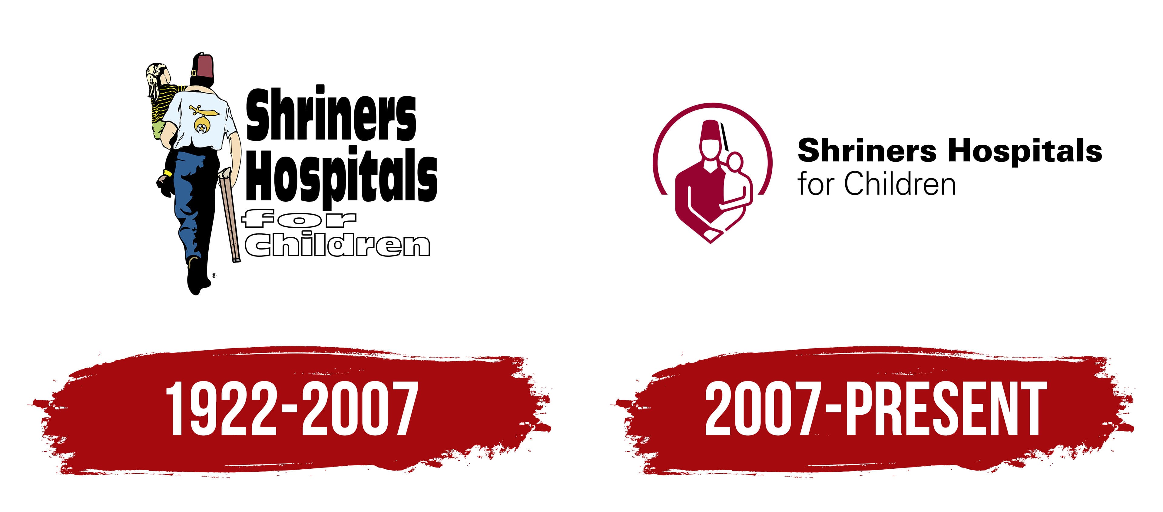
1922 – 2007
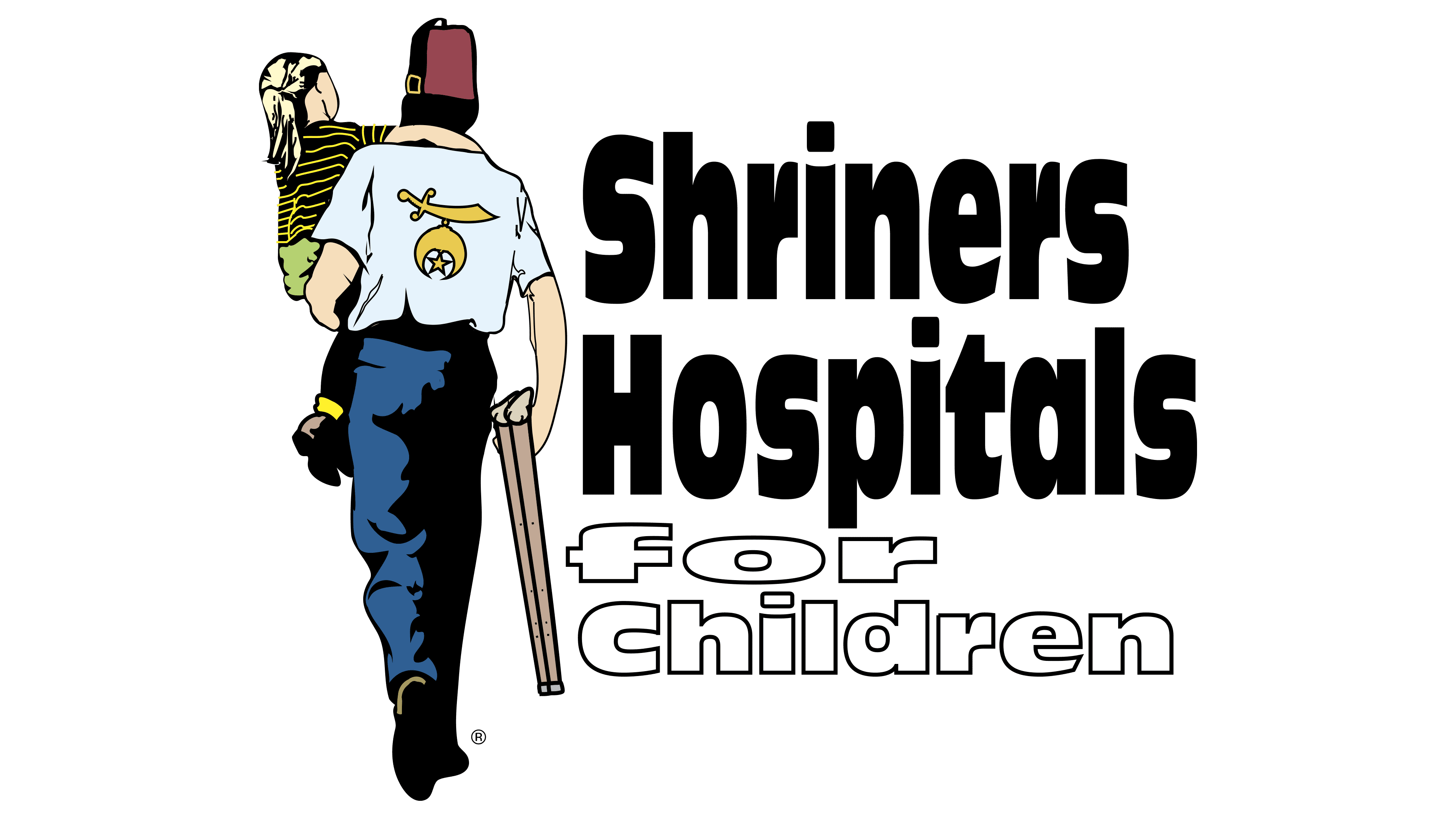
The old Shriners Hospitals for Children logo is filled with symbolic elements that convey the essence of the charitable organization, showing its commitment to humanity and mutual assistance. These qualities are embodied in the image of a person carrying a small child in their arms. Both figures are faceless, as they are turned away from the viewer. However, small details give clues as to who they are.
- The man is wearing a red fez, the official headwear of Shriners International. The back of his blue shirt is adorned with the logo of the same Masonic organization: a golden scimitar, an inverted crescent, and a five-pointed star. Everything points to the fact that the man is one of the Masons who support Shriners Hospitals for Children.
- The child is likely a patient of the network of medical institutions. This can be inferred from the man’s crutches and bandana, which suggest the child is undergoing treatment (for example, after surgery or chemotherapy). It seems the child cannot walk independently, which is why they are being carried.
The smaller Shriners International logo reminds us that this Masonic Society founded the nonprofit organization to treat children. The crutches, in turn, symbolize support, assistance, and improving the quality of life. They reflect the primary mission of Shriners Hospitals for Children to help young patients with orthopedic issues and spinal cord injuries, though the medical network’s specialization is much broader.
The drawing catches attention with its realistic style and vibrant colors, as the artist captures the natural skin tone, details the clothing, and makes the red fez stand out. However, the accompanying text is done in black-and-white monochrome:
- Black is associated with reliability, seriousness, and professionalism;
- White creates a feeling of care, purity, and innocence.
These colors strike a balance between seriousness and humanity, the core qualities on which the charitable organization operates. The simple color palette complements the straightforward font, characterized by bold strokes and the absence of serifs. The logo uses two versions of a sans-serif typeface: one with vertically elongated letters (“Shriners Hospitals”) and another with compressed glyphs (“for Children”). Since each word is placed on a separate line, combining different styles makes the text more expressive.
2007 – today
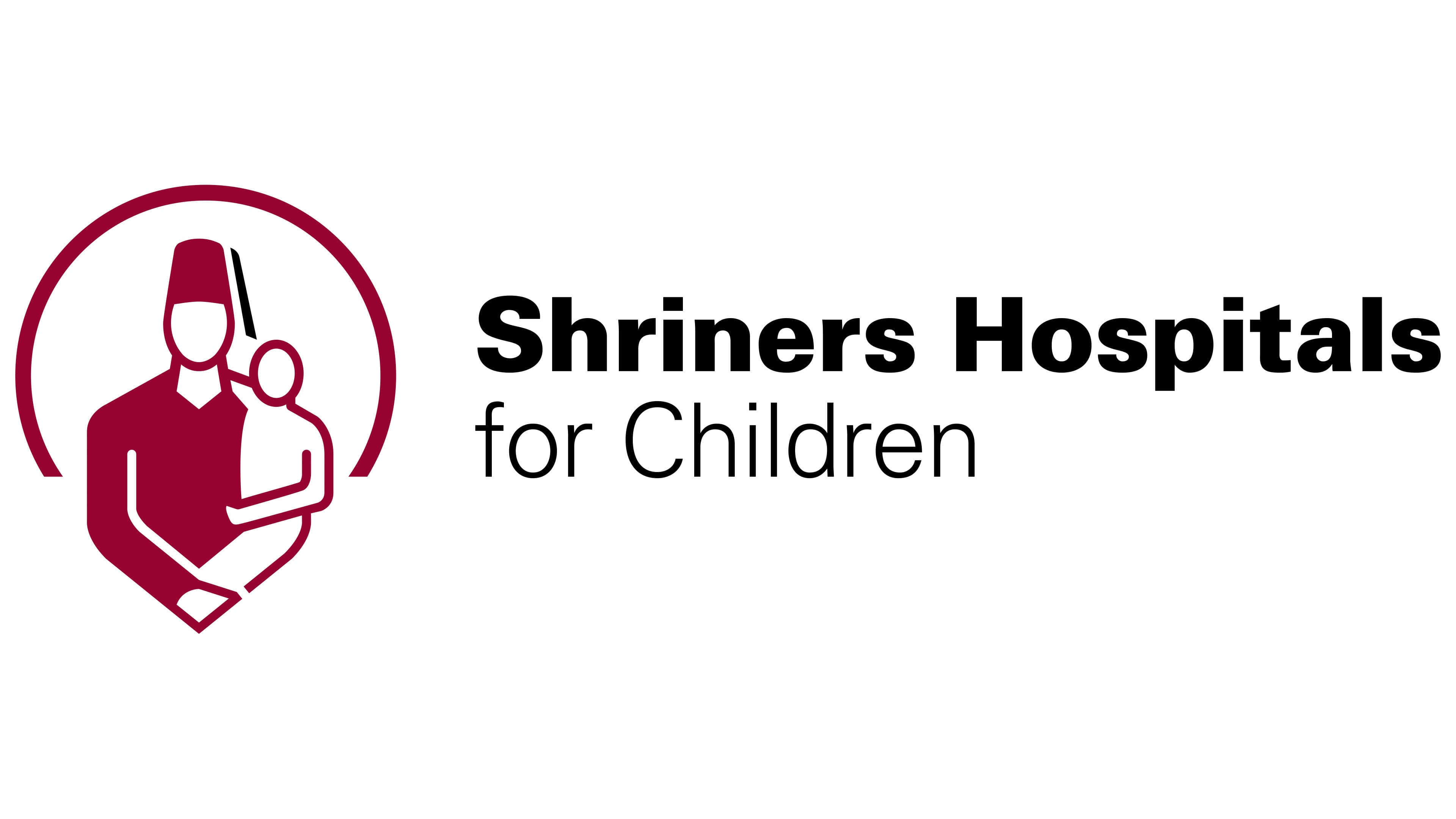
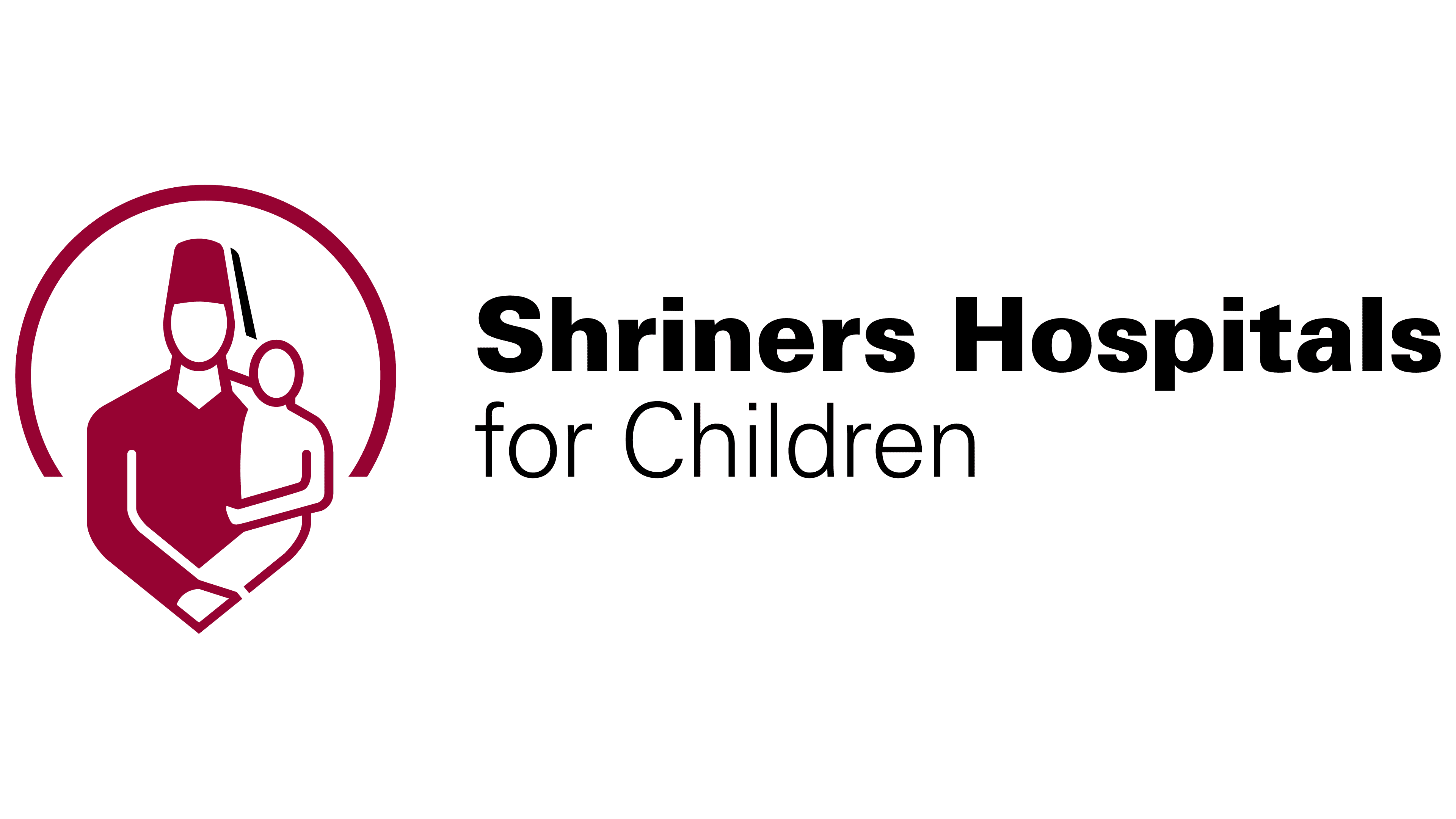
The network of medical institutions needed a new visual identity that would reflect its commitment to progressive treatment methods. The previous emblem appeared outdated due to an unbalanced font, and the overly detailed drawing didn’t look good on small screens. The digital era required simplicity and clarity, so designers completely overhauled the Shriners Hospitals for Children logo, adopting a minimalist style. However, they retained the old concept to keep the brand recognizable.
The organization’s primary symbol remains a person holding a child. Now, though, it is depicted from the waist up. The outline of the lower half of the pictogram resembles a heart, a sign of love, compassion, and tenderness. This visual represents the help that donors and doctors provide to sick children.
The drawing consists of geometric shapes in white and burgundy. Its style is so simple that the figures don’t even have faces; their heads are just empty ovals. This was done intentionally to avoid associating the logo with specific images. Anyone could be in the place of the child, as the network of medical institutions treats thousands of young patients every year.
The adult figure remains anonymous as a member of the secret Shriners Society, which owns the charitable organization. One distinctive detail points to their membership in the Masonic brotherhood: the tall headwear with a black tassel. This fez has become one of the key symbols of Shriners International.
Behind the human figures, a rising sun represents hope and the beginning of a new life. It is rendered in a minimalist style, consisting only of a semicircle resembling an inverted letter “C.” Both the sun and the figures are painted in two colors:
- White symbolizes openness, purity, calm, and safety;
- Burgundy represents energy, solidity, confidence, and prosperity.
The accompanying text is entirely black. The designers deliberately chose this color to emphasize the seriousness and professionalism of the medical institutions. For clarity, the brand’s long name is split into two lines: “Shriners Hospitals” on top and “for Children” below. Both lines use a geometric sans-serif font, with the first two words in bold and the second part in thin letters. The visual contrast enhances the sense of dynamism, evident in the diagonal cuts and rounded shapes.