Since 1996, the Smartwater logo has been associated with water’s quality and health benefits. The original vitamin-infused water was created based on physical strength and well-being. In various identity formats, words and symbols were conceptually important.
The goal of presenting the original water was to inform potential buyers about its composition. It was also crucial to permanently associate the brand name with purity, nature, and freshness. The concept proved successful: since the appearance of the first emblem, the popularity of the water has only grown, and there has never been a decline in sales.
Smartwater: Brand overview
Energy Brands, formerly Glacéau, was established in New York in 1996 by J. Darius Bikoff, an entrepreneur and former Reebok employee. This marked the beginning of Smartwater’s history. When Bikoff observed the growing popularity of leading a healthier lifestyle, he saw a chance to establish a high-end brand of water that would differentiate itself from conventional bottled water.
The brand aimed to simulate the natural water cycle process by producing electrolyte-enriched, filtered water. Bikoff used technology to replicate the idea of clouds gathering just water vapor as inspiration.
The product was formally introduced in 1998. It was created by vapor distillation, and the water was enhanced with potassium, magnesium, and calcium electrolytes. This procedure, known as “vapor distillation,” was a crucial component of the brand’s advertising plan.
One characteristic that set the product apart from other products on store shelves was its basic packaging, which consisted of a clear bottle with a straightforward design. This design decision highlighted the product’s superior quality and purity.
Initially, the brand concentrated on the New York market before progressively growing to include other significant American cities. The product became well-known very fast among metropolitan consumers who led busy lives.
The 2000s saw tremendous expansion for the brand. The product started to draw attention from celebrities, contributing to its popularity. Actress Jennifer Aniston elevated the brand’s profile and notoriety when she was named its face in 2007.
A significant development in the company’s history happened in May 2007, when The Coca-Cola Company paid $4.1 billion to acquire Energy Brands (Glacéau). This transaction enabled access to Coca-Cola’s extensive worldwide distribution network, opening up new avenues for growth and development.
Coca-Cola made significant post-acquisition investments to grow the product’s global footprint. The brand’s global expansion commenced with its launch in the United Kingdom in 2008.
More product line extensions and developments occurred in the 2010s. In response to the increasing demand for carbonated beverage alternatives, the company launched a sparkling version of its water in 2015.
As the brand celebrated its 20th anniversary in 2016, it strengthened its standing as one of the top premium water brands in the US and increased its footprint abroad.
When the sparkling variant was introduced in aluminum cans in 2017, the company opened new sales channels, including pubs and restaurants.
The brand launched the Flavors collection in 2018, carrying on its tradition of innovation. These goods were created to provide customers with a wider variety of flavor options while upholding the fundamental idea of clean water with electrolytes.
Following 2018, the company continued developing and adjusting to new market trends. In 2019, the brand added Antioxidant and Alkaline to its lineup of functional waters. Selenium was added to the list of antioxidants to meet the increased demand from consumers for antioxidants. With a higher pH, Alkaline was created for people considering an alkaline diet.
The company stepped up its sustainability efforts in 2020. In some markets, the brand aimed to utilize only recycled plastic (rPET) for their bottles. This choice was made as a part of The Coca-Cola Company’s larger aim to enhance packaging sustainability and reduce plastic waste.
In the United States, Smartwater+ was introduced in 2021. This new line included three water variations enhanced with extracts and vitamins: Clarity (including ginkgo biloba and green tea extract), Renew (containing dandelion extract and vitamin E), and Tranquility (containing ashwagandha and L-theanine).
In 2022, the company unveiled other packaging advancements. It presented a lighter bottle that uses less plastic without sacrificing form or function. In other areas, the brand started experimenting with paper bottles to show its dedication to eco-friendly solutions.
The brand initiated a global health and mindfulness program in 2023. This campaign featured interactive online activities and collaborations with wellness and health professionals to increase public awareness of the significance of adequate hydration for both physical and mental well-being.
In 2023, the company extended its range of functional waters by launching Immune Support, enhanced with zinc and vitamin C. This move was made in response to the increasing demand from consumers for immune-system-supporting products.
The company aggressively engaged in influencer marketing and produced wellness- and health-oriented content.
Securing a prominent place in the premium bottled water market, the brand successfully positioned itself as the preferred option for contemporary, health-conscious, and prosperous consumers.
Meaning and History
What is Smartwater?
It is a premium bottled water brand owned by The Coca-Cola Company. The brand is known for its parodistilled water, which is purified through a process that mimics the natural hydrological cycle. The water is enriched with electrolytes that give it a clean, crisp flavor. The product line includes a variety of options such as Original Steam Distilled Water, Smartwater Alkaline and Smartwater Antioxidant. The company focuses on purity and flavor, positioning itself as a quality choice for hydration. The brand has a strong presence in supermarkets, stores and online retailers, appealing to consumers looking for refreshing water.
1996 – 2006
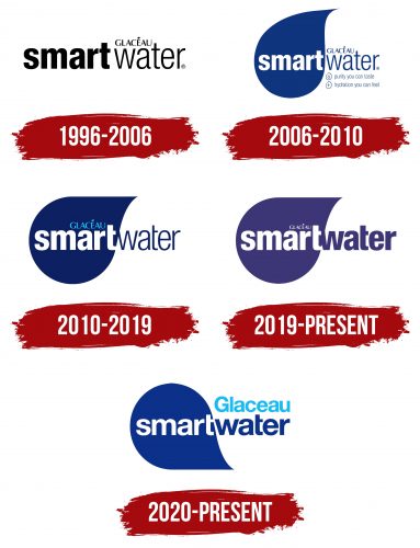
The identity of the initial phase of the SmartWater brand is simple and clear. The classic black and white colors indicate reliability and stability. Against a white background, they shine like lights at night, making the text noticeable and readable. Both words are expressively written, each in its font and color tone.
The word “Smart” is highlighted and placed at the logo’s center. The font is bold, with deep black letters. The letters are rounded and slightly tilted; all symbols are the same size and aligned horizontally. Next to it, the word “water” is written in a regular font. It is expressive and noticeable but appears light and weightless compared to the first word.
The logo’s creators put significant effort into emphasizing the quality of the water with beneficial microelements—Glaceau. They introduced a company that aims to care for Americans’ health without using a complex color scheme. The brand established the production of water that undergoes several natural cycles of transformation.
2006 – 2010
The change in the identity during the new period occurred after the brand was acquired by Coca-Cola, significantly impacting the graphics and design of the logo. Although some elements remained, the innovations and additions strengthened the brand’s positioning.
The logo’s colors were chosen from a water-inspired palette, with white and blue as the foundation. White was the background in one part of the emblem and the ideal fill for the graceful lowercase letters in another. Blue was multifaceted: it formed the base of a detailed drop and highlighted the main text elements on the white background. The white color always remained vibrant, while the blue varied in contrast.
The focal element of the logo was the water droplet positioned on the left. It symbolizes naturalness and the source of hydration, associating the product with relaxation and freshness. The combination of water and the word “smart” creates a symbolic tandem that is highly informative. The logo is complemented by two text elements emphasizing the water’s primary benefits.
2010 – 2019
The redesign of the third logo did not involve major changes but additions and accents. It has become larger and more expressive than the water droplets in the identities from 2006 and 2010. Its shape has become fuller and more elegant, with a sharp element pointing to the right and rising above the two letters of the second word—”water.”
The inscription “Glaceau” on the right side of the logo moved to the center of the graphic droplet and acquired a light, gentle blue shade. It has become subtly connected to the word “Smart,” emphasizing the unity of elements and meanings and the high quality of the water.
The word “Smart” remained unchanged, embodying the full meaning. The letters are uppercase and arranged in a single line. The placement remained the same – the bright text is in the center of the droplet.
A notable feature appeared in the new logo. The letter “t” now creates additional dynamism by extending beyond the outline of the droplet. In the earlier identity, it did not cross its boundaries, making this element especially noticeable and lively.
2019 – today
The diversity of fashion and trends influenced everything around, making the brand’s identity change seem natural to many. The vibrant colors attracted attention, and the brightness sparked interest. The color scheme needed updating to align with new trends. The blue color subtly shifted to a gentle purple, and the word “water” gained a new energy.
Now, the droplet looked elegant, acquiring its style and originality. The idea was to make the product stand out among competitors. The standard blue color did not highlight uniqueness, whereas the purple droplet drew attention more effectively. The two words inside the droplet were now written in white but in different fonts, creating a striking contrast.
2020 – today
In 2020, an interesting and somewhat unconventional event occurred: alongside the existing logo, another one was introduced. Both versions of the identity can now be seen on all types of the brand’s products.
What do they have in common? The number of informational blocks is the same, and the words “smartwater” fonts are identical. However, overall, the logos have more distinctive features than similarities.
The most significant change is the droplet’s position, which is now oriented with the “tail” down. It has once again acquired a vibrant blue tone. The word “Glaceau” is written in a delicate light blue shade and placed outside the droplet, positioned above the word “water.” The “Glaceau” font has become larger and more prominent. Elements in purple tones are absent from the logo.
