 SSE Logo PNG
Electricity and heat supply shape the familiar rhythm of life in homes and cities, where energy is delivered through extensive networks and distribution systems. In the UK and Ireland, this work encompasses both traditional sources and the development of wind power generation. The SSE logo represents an energy company that generates and supplies electricity, operates networks, and develops renewable energy projects.
SSE began operations in 1943. During that period, the British government created the North of Scotland Hydro-Electric Board. Its goal was to electrify remote areas of Scotland. In the postwar decades, the organization built dozens of hydroelectric power plants and supplied electricity to most of the Highlands.
After the energy sector’s privatization in 1989, the company was renamed Scottish Hydro-Electric. In 1991, the company was listed on the London Stock Exchange. In 1998, it merged with Southern Electric. The new company was named Scottish and Southern Energy. Its market value was about £ 3.5 billion.
By the early 2000s, SSE managed power supply networks in Scotland and southern England. The company developed generation based on hydroelectric and gas facilities. It also supplied electricity and gas.
In 2008, the company acquired the Irish operator Airtricity. In 2013, SSE sold part of its gas networks. In 2020, it exited the retail energy business and transferred it to OVO Energy. Since then, operations have focused on infrastructure and generation.
Since 2021, SSE has been investing in offshore wind projects. Among them is the Dogger Bank project, the world’s largest wind farm with a capacity of 3.6 gigawatts. In 2023, the company commissioned the first phase of this project. In 2024, the company continued developing combined-cycle gas power plants. This ensured grid balancing.
The company remains one of the UK’s leading energy providers. It operates hydroelectric, wind, and gas facilities. Its distribution networks serve about 3.9 million customers.
Meaning and History
What is SSE?
It is one of the leading energy companies in the United Kingdom and Ireland, managing large generation and network assets. Its structure includes thermal, hydro, and wind power plants that supply electricity to millions of customers. Its main activity involves producing, transmitting, and distributing energy, as well as developing offshore wind farms, and it is among Europe’s largest. The company controls the full cycle of electricity and gas generation and delivery to end users.
1998 – 2000
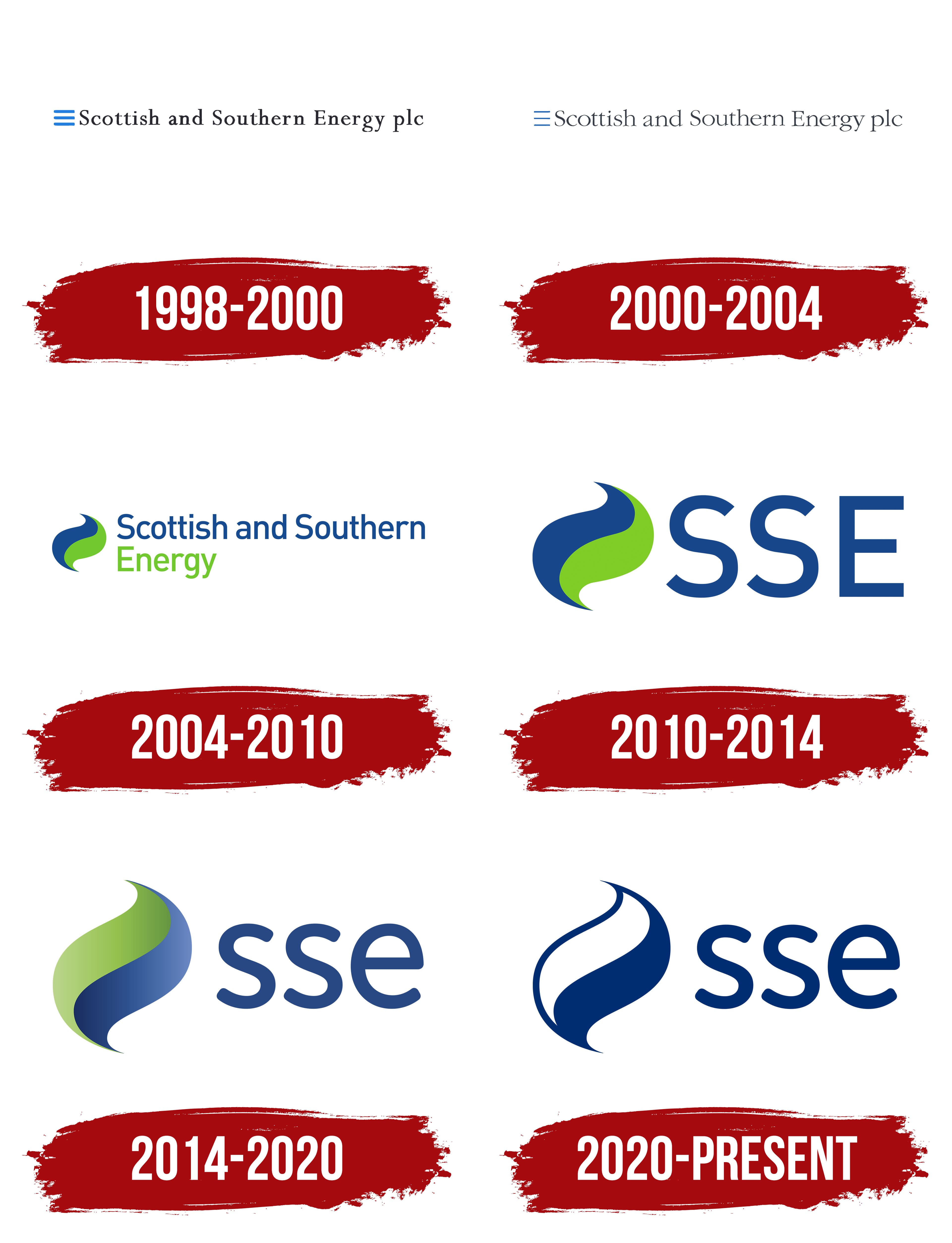
Scottish and Southern Energy plc was formed by merging Scottish Hydro-Electric and Southern Electric. The transaction was announced on September 1, 1998, and completed on December 14. The name brought together the Scottish and southern English parts of the business. The initial letters of Scottish, Southern, and Energy formed the abbreviation SSE. The full name represented the parent company, while the previous names continued to be used for regional gas and electricity supply.
The Scottish company’s history began in 1943. The British Parliament created the North of Scotland Hydro-Electric Board to build hydroelectric power stations and bring electricity to the Scottish Highlands. After nationalizing the electricity industry in 1948, the board took on additional responsibilities for generating and distributing power. That same year, the Southern Electricity Board was established in southern England. It managed the distribution network and supplied customers with electricity from third-party power stations. Privatization between 1989 and 1991 transformed the 2 boards into Scottish Hydro-Electric and Southern Electric.
The combined company introduced its first logo in 1998. The full name, “Scottish and Southern Energy plc,” appeared in black serif type on a single line. “Scottish,” “Southern,” and “Energy” began with uppercase letters, while “and” and the legal abbreviation “plc” remained lowercase. The long wordmark occupied most of the logo, preserving the name’s geographic references and its identification with the energy industry.
A small, bright blue emblem with 3 horizontal bands appeared on the left. The bands were equal in length, with rounded ends and equal spacing. Stacked one above another, they resembled a simplified “E.” The emblem matched the height of the text line. The color difference distinguished the compact image from the company’s full name.
2000 – 2004
In 2000, Scottish and Southern Energy continued integrating the group’s businesses while retaining regional names for customer-facing operations. SWALEC, acquired that year, joined Scottish Hydro-Electric and Southern Electric. The corporate logo’s full name represented the parent company. During the integration period, its visual treatment was updated, with the emblem remaining to the left of the text.
The main changes concerned the typeface. The letters became thinner and more elongated, and the serifs became lighter. The contrast between the main and connecting strokes increased. Letter and word spacing were reduced, allowing the long name to occupy less horizontal space. The legal abbreviation “plc” remained at the end of the line.
The blue emblem still consisted of 3 bands, but they were made thinner. The lighter design complemented the updated lettering. The placement of the 2 parts continued the arrangement of the first logo introduced after the merger.
2004 – 2010
In 2004, Scottish and Southern Energy updated its logo. It introduced a blue-and-green identity for the parent company and regional brands. The long name was divided into 2 lines, and the serif typeface was replaced with rounded sans-serif lettering. An emblem consisting of 2 curved sections replaced the 3 bands.
A blue upper shape and a bright green lower shape appeared to the left of the wordmark. Both widened in the middle and tapered toward ends pointing in opposite directions. The pair resembled 2 touching petals or a swirling stream. Smooth arcs formed the emblem’s outer contour.
The colors were also distributed between the lines of the name. “Scottish and Southern” was set in blue, while “Energy” beneath it was highlighted in bright green. Both lines were left-aligned. The main words began with uppercase letters, while the remaining letters and “and” stayed lowercase. The legal abbreviation “plc” was removed. Dividing the text into lines shortened the logo horizontally while preserving the full commercial name.
The shared color system was extended to Southern Electric and Scottish Hydro Electric. In 2008, the regional brands also adopted the two-color emblem, placing it beside the names Scottish Hydro and Southern Electric. It identified the businesses as part of Scottish and Southern Energy. At the same time, the familiar names continued to represent services for local customers.
2010 – 2014
By the late 2000s, Scottish and Southern Energy operated well beyond Scotland and southern England, as its name suggested. The group included SWALEC, Atlantic Electric & Gas, and Ireland’s Airtricity. Its business encompassed power stations, networks, energy supply, gas, and renewable energy. The company adopted the shortened SSE as a shared brand across different markets.
In January 2010, the abbreviation became the primary corporate identifier. Initially, the change affected the public-facing name and visual identity. The legal name Scottish and Southern Energy plc remained until September 30, 2011, when it became SSE plc.
In the logo, 3 large blue uppercase letters replaced the long wordmark. SSE used bold sans-serif lettering with rounded curves. The terminals of both “S” letters had angled cuts. The short name occupied less horizontal space while retaining the color and general lettering style of the previous version.
The two-color emblem remained on the left in its existing form. It was enlarged relative to the wordmark and aligned with SSE along a shared horizontal axis. The revised proportions gave the image additional weight beside the abbreviation. At the same time, the blue-and-green combination continued the identity of earlier versions.
2014 – 2020
In April 2014, SSE introduced an updated logo to unite its regional consumer brands. The company was already operating under the legal name SSE plc. The shared identity covered Southern Electric, Scottish Hydro, SWALEC, Atlantic, and SSE Airtricity, as well as corporate divisions, energy supply, networks, and renewable generation.
Preparations began with research by Pimento. The agency assessed the brand’s potential and the investment needed to raise its profile. The board of directors discussed the findings, which became the basis for a three-year brand development program.
The large uppercase “SSE” in the logo was replaced with lowercase “sse.” The letters received thin strokes, rounded contours, and compact proportions. The sans-serif lettering remained upright. The dark blue wordmark was placed to the right of the emblem and was shorter than the image.
The emblem inherited the shape of the 2004 version, with smoother contours. The upper section was colored green, transitioning from a light shade to a saturated one. In the lower section, light blue transitioned to dark blue. The gradients created an impression of depth within the 2 curved sections.
The phrase “Proud to make a difference” was used alongside the logo. It connected the SSE name to its work in energy, customer service, and community initiatives. The tagline was used separately from the primary arrangement of the emblem and “sse.”
2020 – today
In 2020, SSE began updating its brand after selling its British household energy supply business to OVO Group. The remaining group needed to be distinguished from the retail business transferred to the new owner. SSE focused on renewable generation, regulated electricity networks, and infrastructure for reducing carbon emissions.
Brand consultant Eileen Caskie led the project. The work included company positioning, audience communication guidelines, document and template design, and storing and using brand files. In April 2020, SSE created a permanent Head of Brand position to oversee the new system.
The main logo change concerned color. The green-and-blue gradient was replaced with a solid dark blue fill shared by the emblem and lowercase “sse.” The 2 opposing curved sections retained their previous arrangement. The white gap between them separated the shapes, while the matching color connected the image to the name.
Several arrangements were prepared for different purposes. The emblem was used alone or beside “sse” in a horizontal logo. In the extended version, the phrase “For a better world of energy” appeared beneath the name. The motto accompanied programs for network development, renewable generation, and decarbonization, conveying the company’s objectives through a promise to improve the energy sector.
The business divisions were named SSE Renewables, SSE Thermal, and SSE Energy Solutions. The shared blue emblem identified them as part of the group, while the additions to SSE explained their specialties.