


 Stanley Logo PNG
The Stanley logo is businesslike, practical, and serious, fitting for a company that produces hand tools. The emblem is authoritative and minimalist, supported by the high quality of its products and the manufacturer’s craftsmanship.
Stanley began in 1843 in New Britain, Connecticut, when brothers Frederick T. Stanley and William Stanley opened Stanley Bolt Manufactory. The business initially produced hardware, such as door bolts and latches, for a fast-growing industrial market. In 1857, it was reorganized as Stanley Works, which gave the company room to expand production and add tools for carpenters, builders, and other trades.
In 1869, Stanley acquired Leonard Bailey’s patent for the Bailey plane, making hand tools a major part of its identity. During the 1870s, the company added rulers and tape measures, then grew in the 1880s by purchasing other toolmakers. Its first foreign plant opened in Canada in 1907. In 1920, Stanley released a folding rule, a practical tool that became common among builders and craftsmen.
The company continued to develop its catalog throughout the 20th century. In the 1930s, it introduced electric drills and power equipment. At the same time, during World War II, part of its production shifted toward military needs. After the war, Stanley returned to consumer and professional tools. In the 1960s, PowerLock tape measures with automatic blade locking became one of its best-known products. In 1980, Stanley acquired Mac Tools, and in 1984, it launched FatMax tape measures with wider blades and longer reach.
In 2010, Stanley Works merged with Black & Decker, forming Stanley Black & Decker. The new company expanded through Niscayah in 2011, Infatech in 2013, Craftsman in 2016, Newell Brands’ tool division in 2017, Nelson Fastener Systems in 2018, MTD Products in 2021, and Excel Industries in 2022. In 2023, it introduced new cordless tools, while 2024 brought plans to reduce emissions and expand the use of recyclable materials.
Meaning and History
What is Stanley?
It is a well-known American brand that produces a range of tools, hardware, and storage solutions. Founded by Frederick Stanley, the company has a long history of manufacturing products used by professionals and DIY enthusiasts. The company’s product range includes hand and power tools, measuring tools, and tool storage systems. The brand is known for its durability and reliability, making it a trusted choice for users in construction, woodworking, and various other industries. The company produces a line of insulated bottles and food containers designed for outdoor use, known for their heat resistance and durable construction.
1857 – 1955

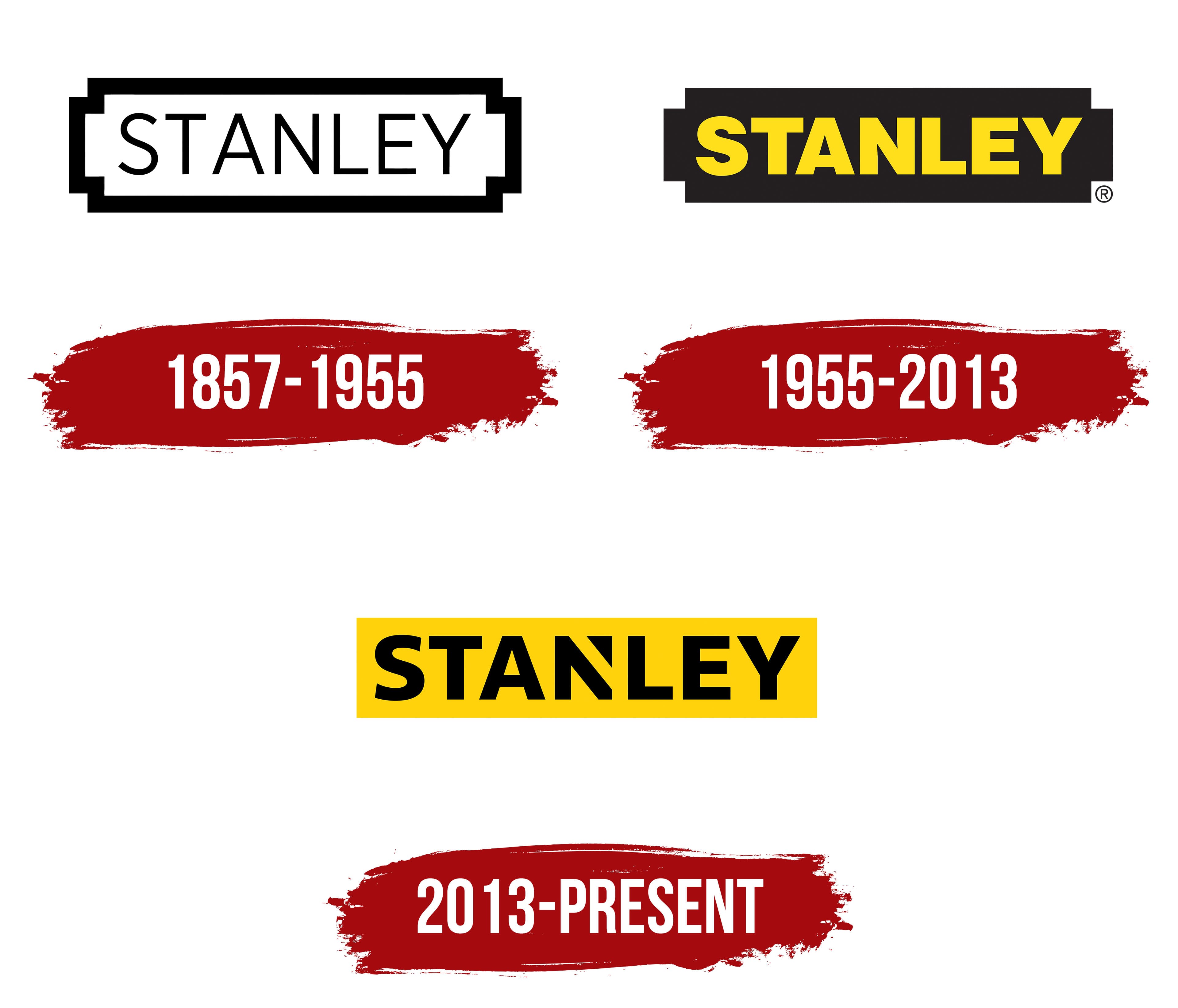
The emblem from this period features text enclosed in a dense, decorative frame. It belongs to an ambitious manufacturer of a new type of power tool that is confidently conquering the market, having transitioned from producing door hardware to creating complex devices. Therefore, the logo is concise and innovative for its time, designed to attract potential customers more effectively. At the same time, the wordmark demonstrates the company’s development path and the concept it applies to its work.
Accessibility and simplicity are what the Stanley emblem conveys to customers, emphasizing the idea of simplifying various labor-intensive processes that used to take hours. The brand makes it clear: its products save money, effort, and nerves, easing heavy tasks so consumers don’t have to spend days on them, as modern hand tools get the job done quickly. There’s no need to call in professionals with Stanley power tools; everything can be done at a professional level: accurately, perfectly, and meticulously.
Meticulousness and precision are the logo’s foundation, showcasing an innovative approach that makes the products easy to use and affordable. Just one word, enclosed in a decorative rectangle, simplifies complex processes. As a result, the emblem has become a mark of top quality.
- This sign is a horizontally elongated rectangle, outlined with a uniform-width black border and flanked by two side protrusions.
- In content, the Stanley logo features perfectly thought-out text, clean and smooth, with a harmonious set of capital letters elegantly arranged in a row on a white background.
- The emblem looks like an informational tag that introduces customers to the new brand name, which should be remembered for its simplicity and accessibility. It also resembles an AA battery.
The emblem presents a different view of familiar processes, helping to see classic concepts from an innovative perspective without extravagant elements and embellishments. It allows appreciation of the retro-style inscription from a modern angle. The modernized branding approach has led to the creation of an elegantly simple sign: the tall, thin letters create this exact impression.
The sans-serif glyphs have clear outlines: they are precise, even, smooth, and all in uppercase. The absence of serifs emphasizes the idea of accessible products. With this emblem, the hand tool manufacturer marks its branded products, unifying them under a common symbol. The black-and-white palette enhances the feeling of ease and simplicity.
1955 – 2013

This period is marked by a black-and-yellow emblem, which replaced the monochrome one and crossed the legendary millennium milestone with the renowned company. The AA battery (the logo had begun to resemble it even more clearly) received a full fill: no area was left uncolored, whereas previously the internal space had seemed empty. Therefore, the hand tool manufacturer decided to eliminate the sense of emptiness.
The black background is intersected horizontally by yellow text in an extra-bold font. The massive letters form an impregnable wall, instilling confidence in customers regarding the equipment’s power and excellent protective properties. The dense arrangement of the glyphs also suggests reliability: the inter-character spacing is so minimal that the letters almost touch, but this does not hinder normal readability, thanks to the high contrast between the background and the text.
The static font is sans-serif and does not taper, visually representing the strength, durability, and wear resistance of Stanley hand tools. However, the glyphs are lower than in the first version of the emblem, further confirming the stability of the power tools in any operating conditions. The lettering is geometric, precise, smooth, and center-aligned.
Replacing white with yellow is very important for the brand concept, as it is a warning color. It indicates that the power tool poses a danger and must be handled with caution because it is electrically charged. However, the manufacturer emphasizes this indirectly, without negatively impacting sales. On the contrary, the warm yellow attracts customers due to associations with energy, joy, and the sun.
2013 – today

The key task the designers aimed to achieve was to maintain the brand’s visual identity even after making changes. They succeeded in this. Thanks to this modernization, the emblem remains recognizable to customers.
- The color scheme remained unchanged.
- The rectangle is still horizontal.
- The shape of the letters retained their original outlines.
However, there have been significant changes to the Stanley logo’s design. One of them involves the palette: the colors were swapped. Now, the text is black, and the background is yellow. The dark background looked intimidating before the changes, but it became welcoming and friendly afterward, as yellow is associated with the sun, warmth, and joy. The text is written in black letters because it is a classic color and is easy for the human eye to perceive.

The second significant change is that the AA battery has become a standard rectangular shape. Although it remains horizontal, it looks neater. This simplification played an important role, as it changed the polarity of the emotions it evokes: the battery became positive, reflecting the hand tool manufacturer’s concept. Their tools make life easier and bring joy to work.
The glyphs also changed. They retained their original shape but now look slightly thinner and more elegant. The most radical change affected the “N”: it now features a triangle, turning it into a miniature geometric figure. The triangle also resembles an upward-pointing arrow, hinting at the company’s continuous growth, its aim to become a leader, and the innovativeness of its products.
As a result, the battery theme disappeared, and the Stanley emblem gained more recognizability. The text is in a bold sans-serif block style, with each letter being massive and tall, making the name look like a reliable barrier (presumably against problems). The colors now better align with the concept: yellow brings energy and strength to the logo, while black symbolizes perfection and quality.