 This Old House Logo PNG
The This Old House logo focuses on renovation, construction, and visual appeal, as the TV show’s name needs to catch the eye. At the same time, the emblem appears timeless, friendly, and stylish.
This Old House debuted on Public Broadcasting Service (PBS) on February 20, 1979. Producer Russell Morash created the program to show real restoration work on historic homes. The first season followed the renovation of an 1860 Victorian house in Dorchester, Massachusetts, with builder and writer Bob Vila as host.
In its early years, the show focused on long renovation projects around Boston, showing the planning, construction, repair, and finishing stages. Master carpenter Norm Abram joined in 1982 and became one of the key figures of the program. During the 1980s, the series grew into one of the channel’s most-watched home improvement shows and won multiple Emmy Awards.
A woodworking spin-off, The New Yankee Workshop, launched in 1989 with Abram as host. The same year, Bob Vila left the program, and Steve Thomas became host until 2003. The brand expanded in 1995 with a magazine about renovation and home design, then launched a website in 2002. Kevin O’Connor replaced Thomas in 2003 and continued leading the main show.
The program marked its 30th anniversary in 2008 and adapted to digital media during the 2010s. Ask This Old House expanded its format to include expert answers to viewer questions. In 2021, Roku acquired the brand’s parent company and digital assets, while the show remained on television. In 2022, the brand added a podcast and short educational videos for Instagram and TikTok. A new spin-off, This Old House: Next Gen, appeared in 2023, followed by an interactive learning portal in 2024.
Meaning and History
What is This Old House?
It is a popular American television series focusing on home renovation and remodeling. The show provides viewers with practical advice, expert tips, and step-by-step instructions on various aspects of home remodeling, including carpentry, plumbing, electrical work, and landscaping. A team of skilled craftsmen and contractors works on various projects, transforming old and outdated homes into beautiful, functional living spaces. In addition to the TV show, a magazine and website are produced, featuring additional content, including articles, videos, and guides for DIY enthusiasts and homeowners seeking home improvement tips.
1979 – today
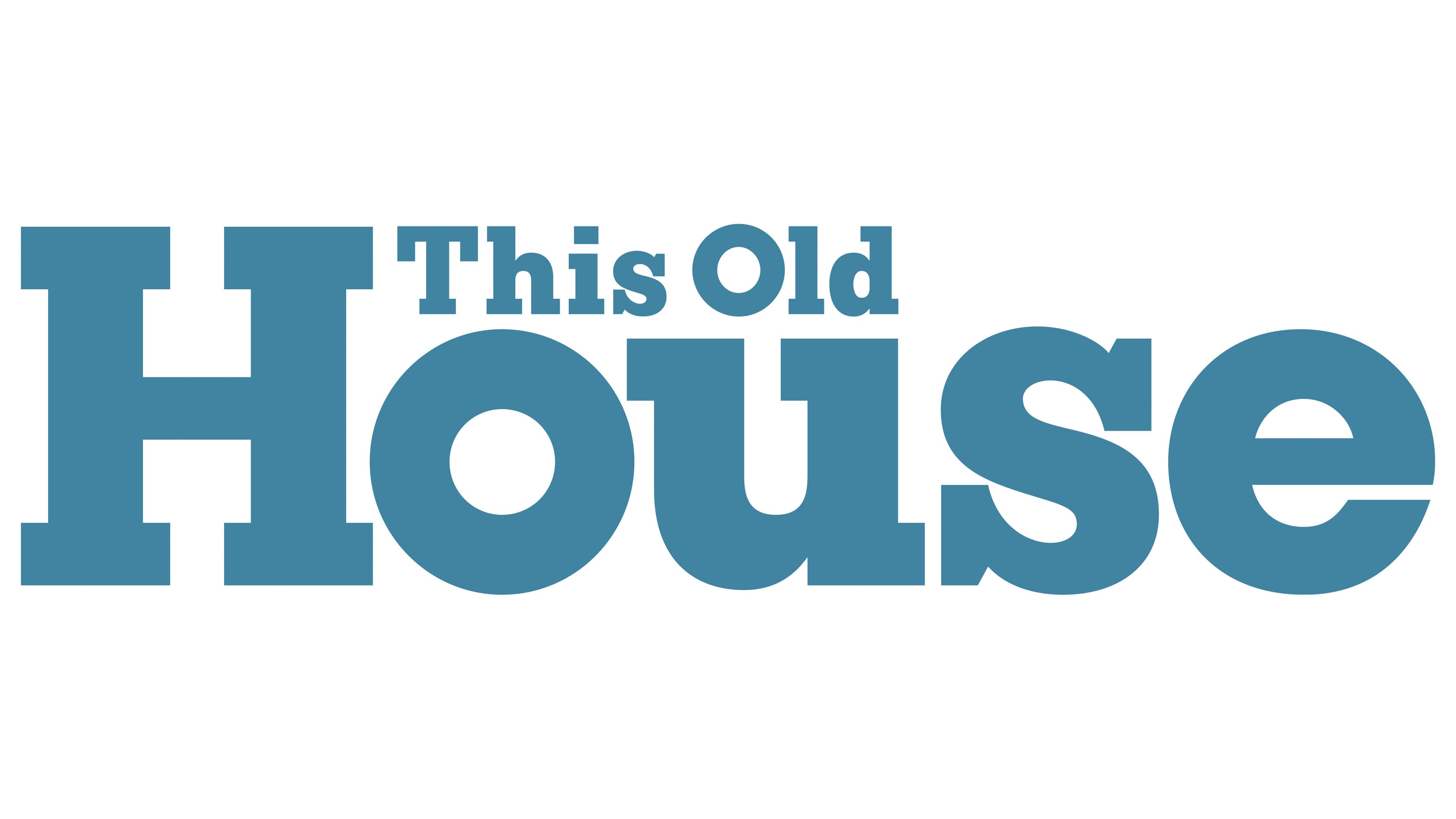
The This Old House emblem is both carefree and serious: carefree in its color palette but complex and serious in its structure. This symbol embodies the dream everyone aspires to of a cozy, beautiful, easy, and pleasant environment. This principle perfectly conveys the essence of the TV show, which focuses on restoring old homes. It’s no wonder the show has gained immense popularity, and its logo has become widely recognizable.
In this wordmark, everything carries significant meaning, making it both practical and philosophical in its depth. Several key aspects stand out:
- A progressive design with a touch of antiquity shows that even the oldest house can look modern after restoration and professional repair.
- A light style that confirms that work can be enjoyable if approached with passion and proper preparation, as demonstrated by this TV project.
- Monotony indicates that excellent results can be achieved even with minimal resources. What matters is the inspiration, motivation, and knowledge gained from the show.
- Combining large and small letters in the same font makes the logo harmonious and original, even without using different typographic styles.
Each detail in the logo is crucial, making it meaningful, in-depth, and minimalist. This contrast reflects an excellent marketing approach for promoting the show. The emblem is primarily intended to intrigue viewers, encourage them to watch, and keep their attention for a long time.
Visually, the wordmark looks simple, but its hidden content is anything but. It fully captures the show’s character, which seems to discuss simple and utilitarian things but does so playfully and spectacularly. This is what optimal advertising should be.
The text is arranged on two levels, emphasizing the word “House” in the lower line. It is so large that it dominates almost the entire space, leaving minimal room for “This Old.” Overall, the text has a very creative structure.
- The first part of the name is incredibly small and compact. It is nestled between the “H” and “s,” perched on a pedestal on the letters “o” and “u.” The initial glyphs in both words are uppercase, while the rest are lowercase, adding a touch of realism to the logo as the text follows grammatical rules.
- The second line is rendered in mega-large characters. The font here appears blocky, as it lacks small elements; instead, all the glyphs seem solid. Even the presence of curves does not disrupt this harmony. The first letter is also uppercase, while the others are lowercase.
Massive left-pointing serifs unify both lines. They are absent only from the rounded glyphs “o” and “e.” Another common factor is the color. All words are colored in a pastel shade of cornflower blue, as if they have faded in the rain and sun, becoming muted and soft. This perfectly underscores the brand’s concept, representing a TV show about restoring homes worn by time.
The “This Old House” emblem is a brilliant example of traditional form and original color working together perfectly. It is ideally balanced and not overloaded with elements, making it strong, powerful, clean, and trustworthy.