


 Stoke City Logo PNG
The Stoke City logo reflects the rich history of the English football club, the second oldest in the United Kingdom, founded in 1863. Its emblem is a model of expressive content and modest design, which has evolved over the years, transforming a simple symbol into an honorable crest.
Stoke City traces its history to Stoke Ramblers, founded in 1863 by Charterhouse pupils working for the North Staffordshire Railway. After merging with Stoke Victoria Cricket Club, the team became Stoke Football Club in 1878 and turned professional in 1885. It joined the Football League as one of its 12 founding members in 1888, moved to the Victoria Ground in 1908 and adopted the Stoke City name in 1925.
The club won the Second Division in 1932 and finished fourth in the top flight in 1936, its best league position. Stanley Matthews became the leading figure of the postwar era, although the 1950s and 1960s brought repeated promotion and relegation. Stoke’s only major trophy arrived in 1972, when it beat Chelsea 2-1 at Wembley in the League Cup final.
After difficult decades in the 1980s and 1990s, the club left the Victoria Ground for the 30,000-seat bet365 Stadium in 1997. Promotion in 2008 ended a 23-year absence from the top division and began a ten-season Premier League run. Under Tony Pulis, Stoke became known for direct football, mid-table finishes and a 2011 FA Cup final defeat to Manchester City.
Mark Hughes replaced Pulis in 2013 and moved the team toward a more technical style. Relegation followed in 2018. Stoke finished 16th in 2018-19, 15th in 2019-20, 14th in both 2020-21 and 2021-22, then 16th again in 2022-23 under Alex Neil. The club reduced wages, rebuilt the squad, invested in academy players and adapted its finances to Championship football.
Meaning and History
What is Stoke City?
A professional football team is known for its dedicated fan base and distinctive red-and-white striped kit. The group, called “The Potters,” has a long and proud history closely linked to the once-dominant local pottery industry. Their home stadium is well known for its intimidating atmosphere and is often cited as one of the loudest in English football. The team is recognized for playing a tough, no-nonsense style of football. It has participated in English football at various levels, experiencing both the highs and lows of Premier League seasons and the challenges of striving for promotion in the lower divisions. The team’s academy continues to produce talented young players, blending local skills with seasoned professionals to remain competitive on the evolving stage of English football.
1953 – 1957
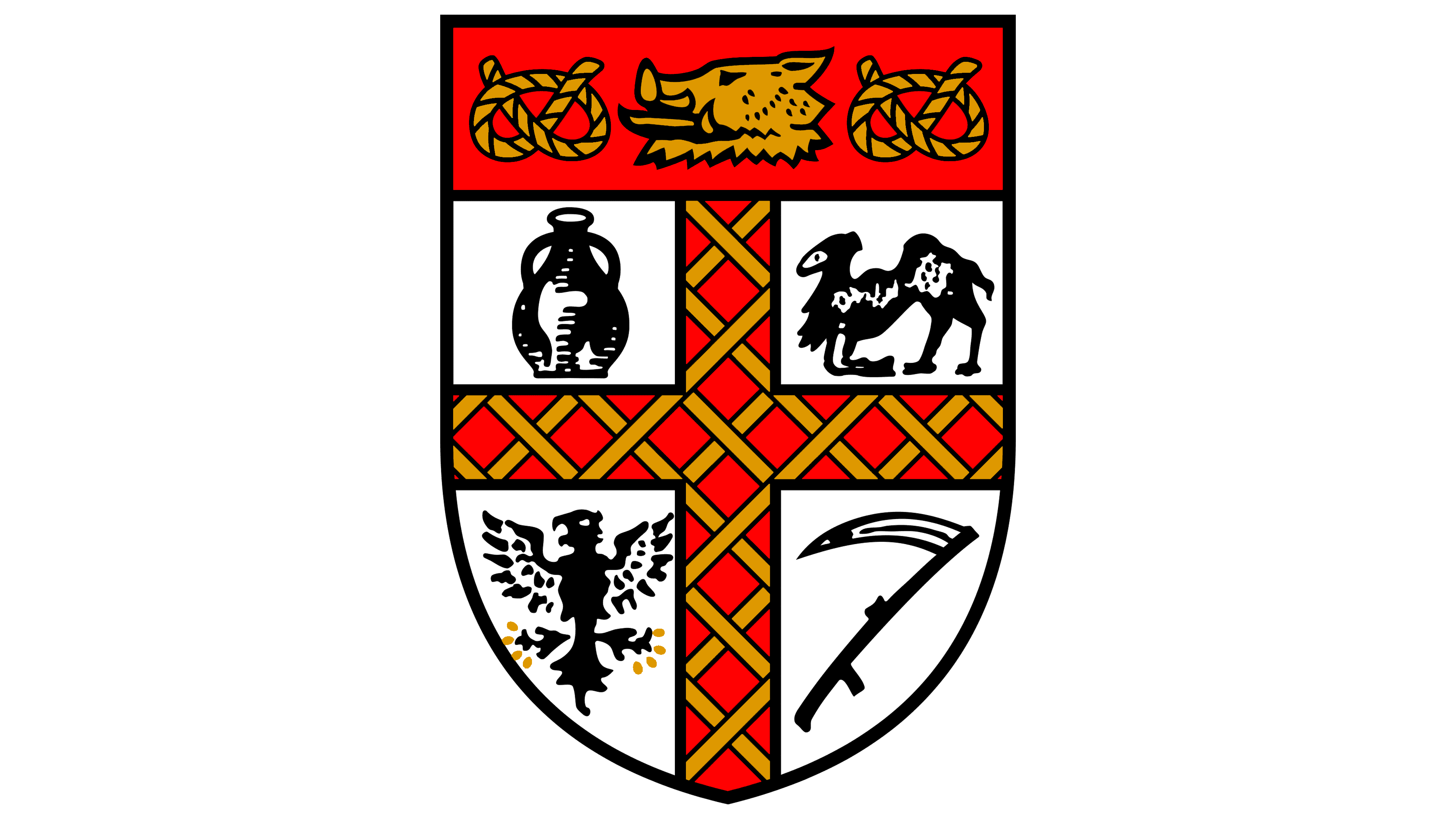
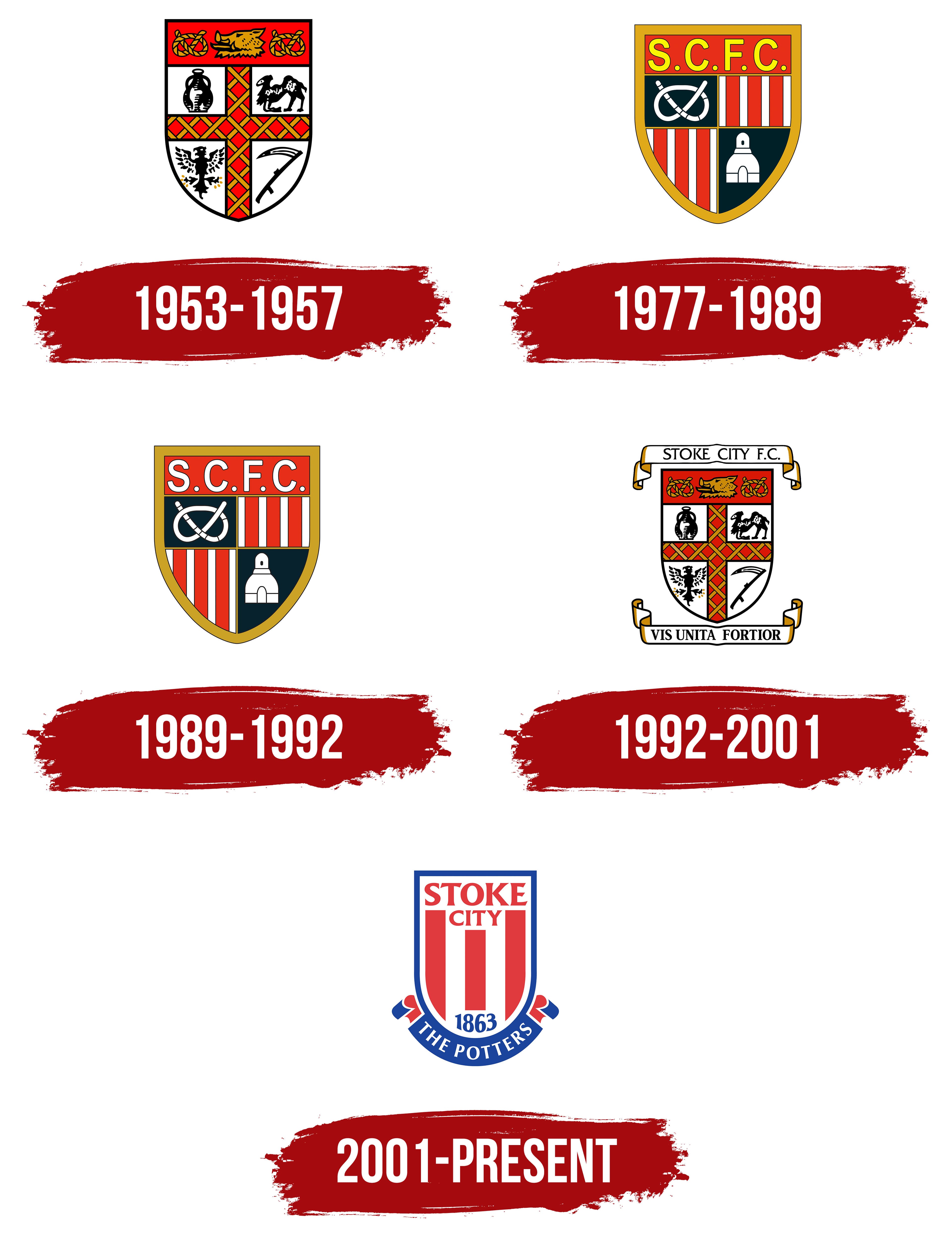
The Stoke City logo from this period is a bright heraldic symbol, the crest of Stoke-on-Trent, the football team’s hometown. It borrowed many details from the city’s symbolism but did not copy the crest entirely. It was overly ornate and pompous, surrounded by feathers, a knight’s helmet, and ribbons. The rest included understandable elements that were significant to the region. These elements made their way into the football team’s emblem.
The foundation of the visual identity is an oval shield with a cut-off top. It is divided into several sections, each representing something special from the city’s history. For example, a jug symbolizes that Stoke-on-Trent has long been a center of pottery production in the United Kingdom, so the football players are still called the Potters. The clay vessel occupies the upper-left corner. Opposite it, on the right side, is a camel; below it is a scythe as a symbol of the agricultural industry, and next to it is a heraldic eagle.
The white background squares are divided by a broad red cross with gold patterns, which harmonize well with the black-outlined illustrations, elevating them and highlighting the team’s high status. Above them rises an arch painted in dark red. Two ropes are twisted in knots. Between them is the head of a fierce boar.
The Stoke City emblem from this period is rich in specifics, originality, and utilitarianism, but lacks elements of football, sports, and the team. There is an explanation for this: in the club’s early years, it struggled to survive, so various local companies and organizations took over its financing. In gratitude for the financial support, the footballers used a modified city emblem that depicted the region’s key values.
Some colors from the crest’s palette became part of the team’s visual identity. For instance, red, gold, and white appear in different logo versions. In this context, red symbolizes intense emotions and passion on the field; gold represents belonging to a country ruled by a royal dynasty; and white represents honesty, openness, and purity.
1977 – 1989
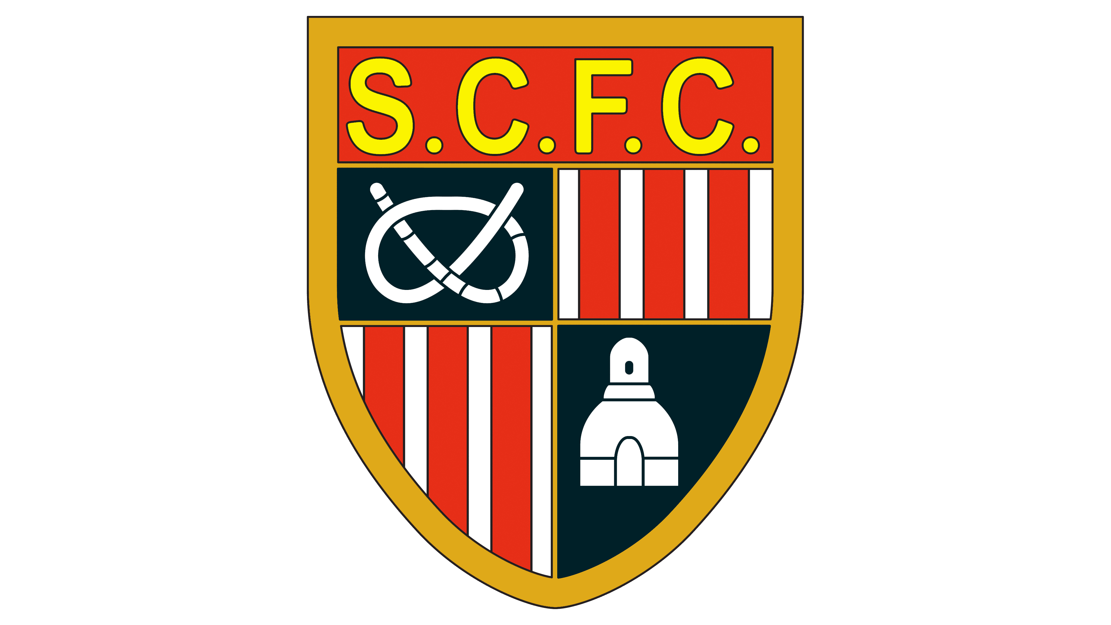
After the modernization, the Stoke City emblem lost its pomp but retained its historical values. In particular, it kept the shield, which, with its pointed end, gained a more defined shape. The outline also played a role: a wide golden band running around the entire perimeter of the logo added a sense of formality and high status, giving it the appearance of a genuinely valuable item.
Another important aspect was removing visual noise: many unnecessary details that British team fans never considered significant. As a result, the camel, scythe, eagle, and boar disappeared from the emblem. Yet the shield remains divided into five separate zones with essential elements meaningful to the city and football.
For instance, one rope tied in a knot remains, hinting at the pottery craft. However, it is now represented by a jug and an entire workshop where pottery is produced and fired, symbolized by a tall, wide chimney. The other two sectors feature red and white stripes, which are characteristic of knightly and sports heraldry.
The upper rectangular field is designated for the inscription “S.C.F.C.,” the abbreviated name of the team formed from Stoke City Football Club. The abbreviation is set in tall, bold, uppercase letters. There are no serifs to avoid cluttering a space filled with small elements. The text is bright yellow to make it clear and instantly noticeable.
For greater clarity, each detail is outlined with a thin black line. This outline divides the spaces and makes the Stoke City logo distinct. All zones and the frame are highlighted in the same way. This version of visual identity looks professional and creates the impression of a unique symbol, something it previously lacked.
1989 – 1992
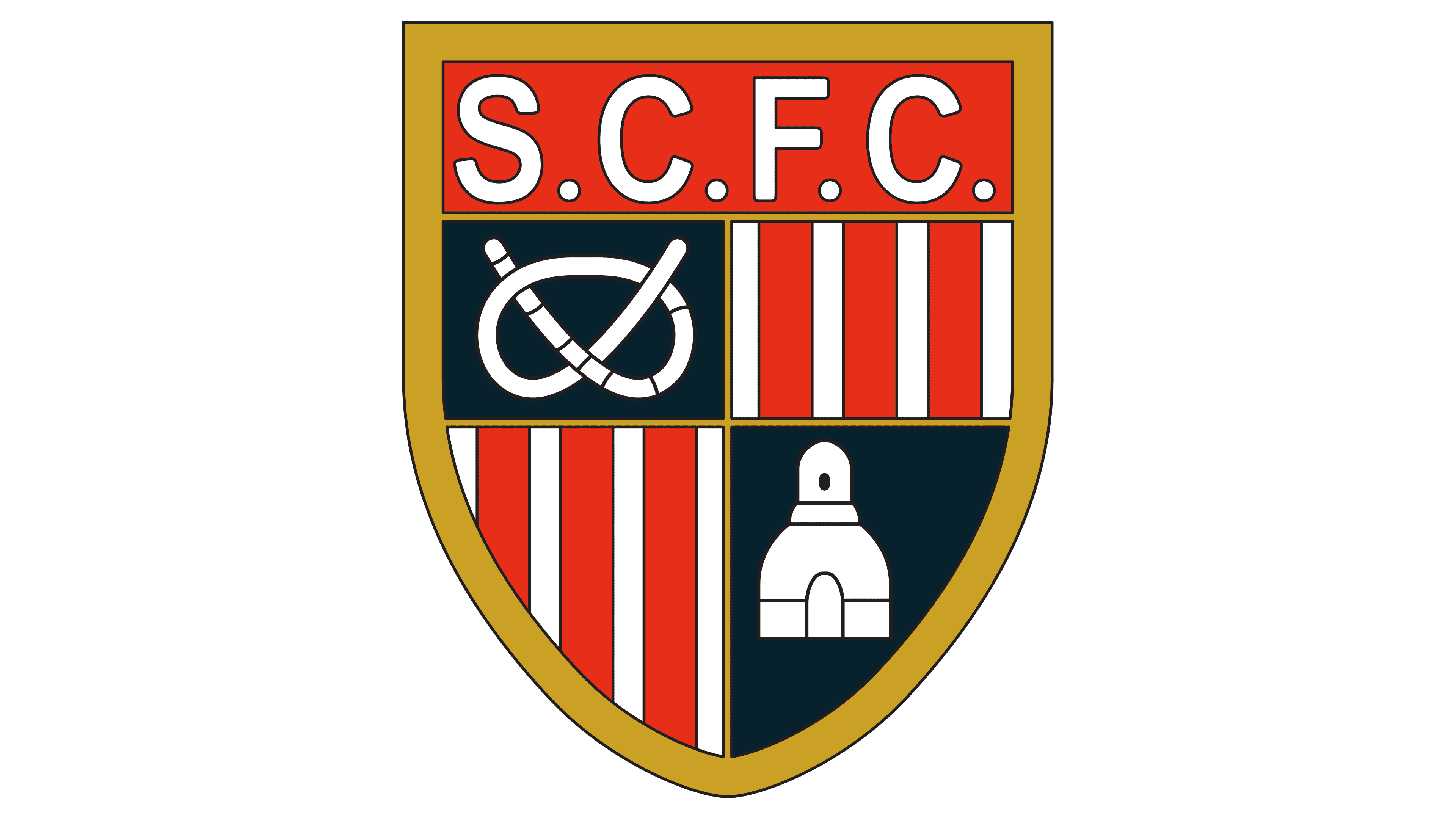
Another intervention in Stoke City’s visual identity deteriorated the design: the emblem faded. The colors seemed washed out and dull, as if drastic changes had been made. But in reality, the changes were minimal. The faded effect came from just one detail: the team removed the bright yellow.
The white lettering brought neither clarity nor distinctiveness; it only disrupted the harmony and cooled the warmth that used to emanate from the letters. However, they remained the same as before: tall, bold, sans-serif, with large internal gaps and wide spacing between characters due to the separating dots. Yet, the light in the emblem has dimmed, and it no longer creates the positive impression it once did. Now, it’s a business-like and strict symbol without a spark. It merely conveys information to fans rather than engaging them emotionally.
Even the golden frame suffered from the absence of the sunny color. It stopped looking noble. No other steps were taken. All elements remained in place: the red and white stripes in the upper and lower quarters of the shield, the rope tied in a knot, and the building where pottery is made. The background under the illustrations also stayed the same: it remains dark green.
1992 – 2001
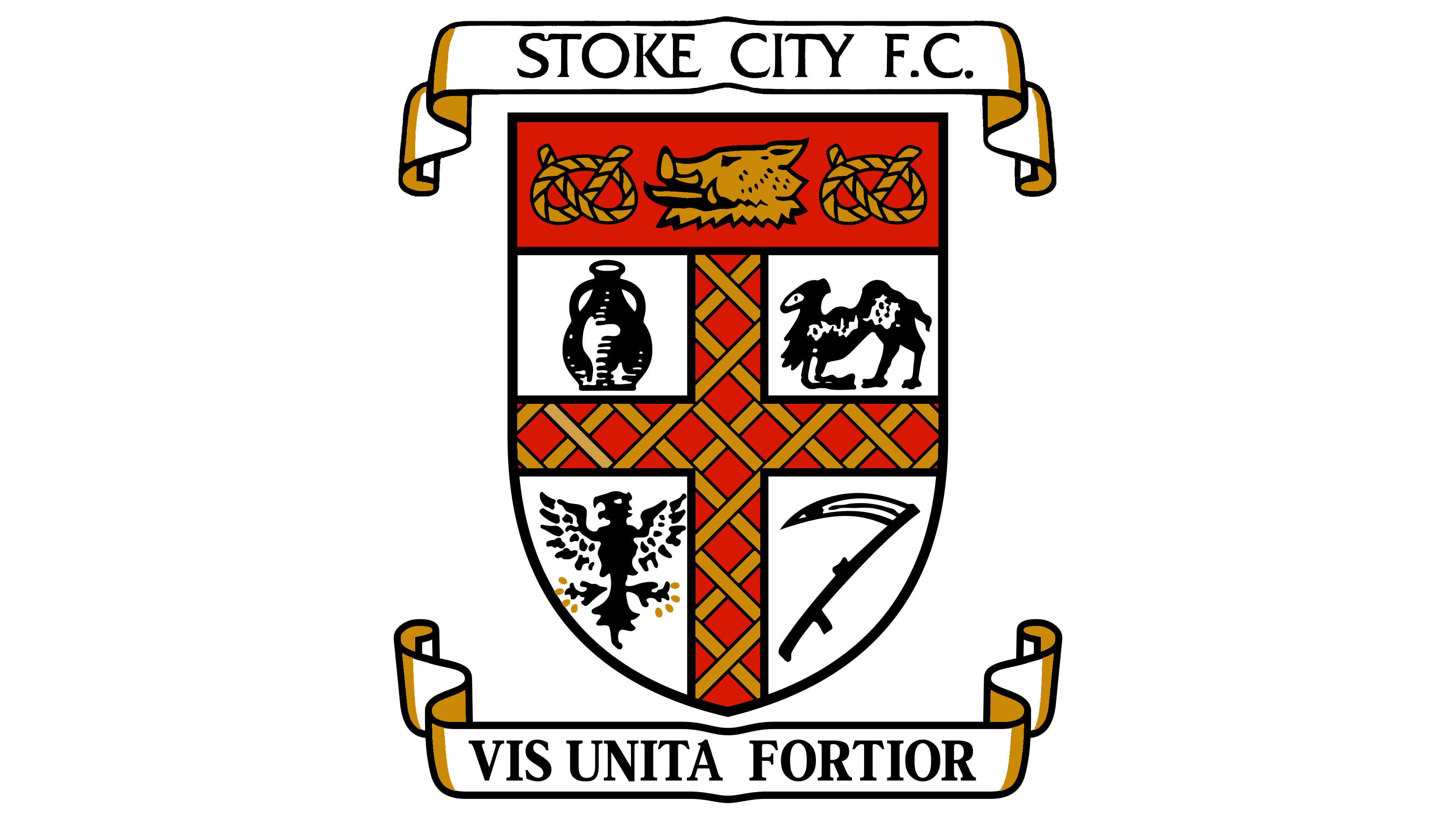
To make Stoke City’s visual identity striking, emotional, and appealing, the British team returned the original logo featuring the coat of arms of Stoke-on-Trent. This time, they went even further: they used the shield and a ribbon with a Latin motto at the bottom, turning it into the team’s slogan. It fits seamlessly with the team’s activities, reflecting reality, instilling confidence, and providing psychological support. However, there are two ribbons, not one.
- The first wide ribbon with text is positioned directly above the shield. It displays the football club’s name in a thin serif font, adding a touch of formality to the letters. The letters look more official with these serifs because of their thin strokes, which do not convey trustworthiness. The phrase “Stoke City F.C.” is in uppercase glyphs, so tightly packed that they sometimes merge. This is particularly noticeable in “ST” and some other spots.
- The lower line features the motto “Vis Unita Fortior,” borrowed from the city’s emblem. It fits the players perfectly, translating to “Together We Are Strong.” This means the team is unbeatable and powerful, with the fans’ support and the unity of the city and the athletes. The slogan is set in a bold sans-serif with expressive letters spaced far enough apart not to blur into one.
Both ribbons have long, winding edges with golden shadows, turning ordinary heraldic elements into something formal and significant, adding importance to the emblem. Gold also pairs well with red, abundant in the football club’s identity. Sports are always about peak emotions, intense moments, and passion, so red is entirely justified here, even if it’s part of the city’s symbol.
The sporting logo of Stoke City also saw the return of the boar’s head, the seated camel, the eagle with spread wings, and the scythe. These are key symbols of the region where the team originates and play an important historical role. For instance, the pottery industry sponsored the players, aiding them during a difficult time. The shield now lacks the pointed bottom and resembles a semi-oval, bordered by a thin black line.
2001 – today
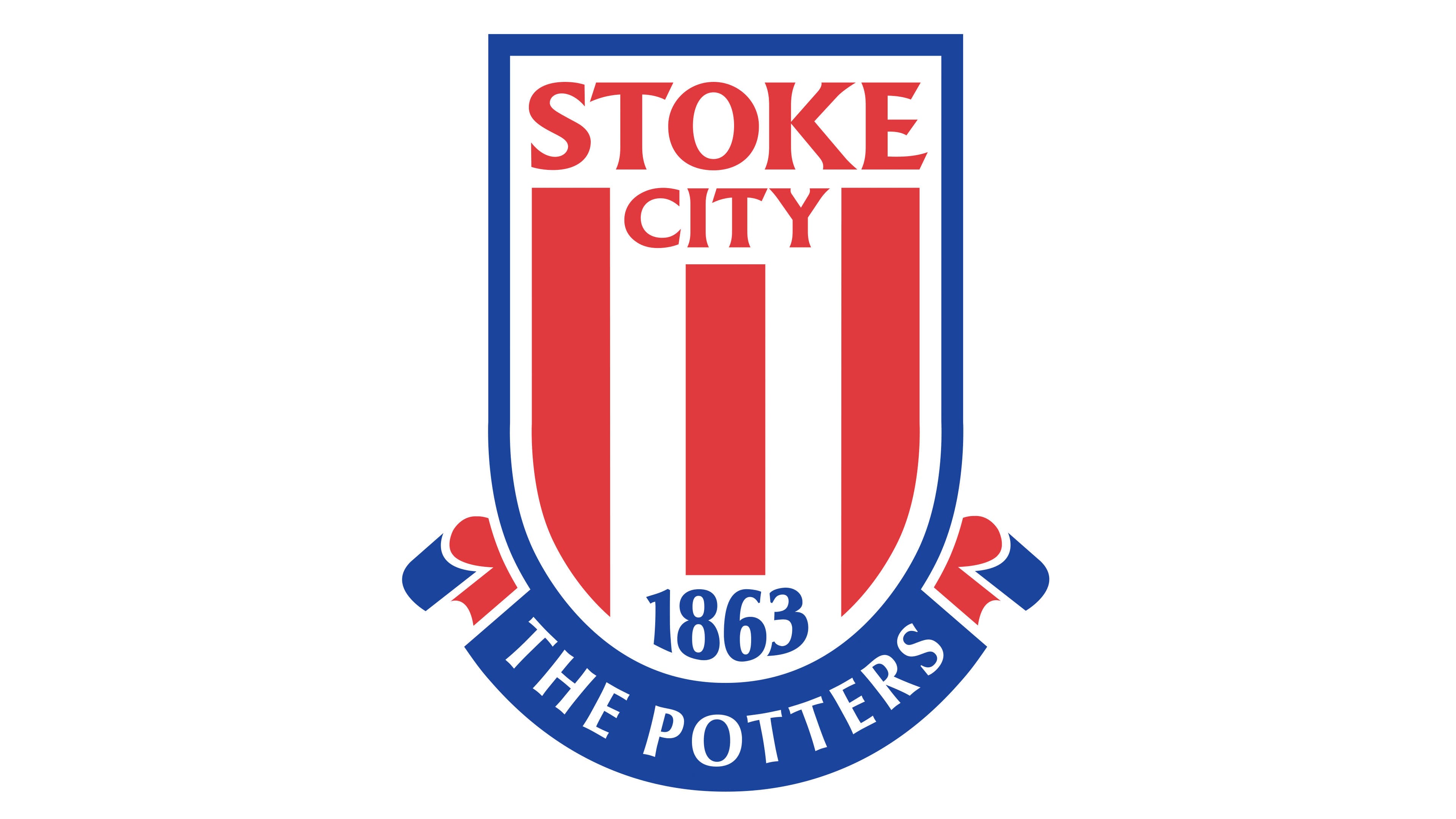
The British football team’s logo was given a different look while maintaining its shape to enhance individuality. How is that possible? After the designers’ intervention, all non-thematic elements were removed, those that, in reality, conveyed nothing to the fans about the team and did not characterize it in any way. They only represented the local area. So, between uniqueness and professionalism, the athletes chose professionalism.
Thus, the Stoke City emblem was significantly simplified: only the red and white stripes, the name, the shield, and the ribbon remained from the variety. However, the content of some of these elements changed, and a new design was received.
- The shield now resembles a classic chevron, elongated vertically.
- The red and white stripes occupy almost the entire internal space.
- The name was shortened to the current version and enlarged.
- The ribbon is now semi-oval and contains the inscription “The Potters.”
The logo is outlined with a blue border that replaces the frame and smoothly transitions to the ribbon at the bottom, with outward-curving edges. Inside the shield, the founding year of Stoke City is displayed, something that was not present before. It points to the club’s remarkable characteristic: it is incredibly old, the second oldest in the country. Hence, the numbers are styled antiquely, with slightly curved ends and thickened lines.
The name is done similarly: the font has extensions that replace serifs. The ends of the letters are sharp and smooth, with straight or diagonal cuts, making them distinctive. The lower inscription has very subtle serifs, miniature and almost invisible. At the same time, all the glyphs share one common trait: they are all uppercase.
The alternating red and white stripes, blending into the background, speak of leadership, honesty, expressiveness, passion, openness, and sportsmanship. The blue color symbolizes sincerity, nobility, generosity, and the pursuit of glory. Unsurprisingly, these colors are among the most commonly found in football identity.