![]() Texas Stars Logo PNG
Texas Stars Logo PNG
The Texas Stars logo symbolizes a hockey team that brought the northern game to the hot South. The club combines a tough northern style with bold Texas character, earning respect and becoming part of local sports culture.
The Texas Stars’ history began in 2009, the result of a prolonged search for a stable American Hockey League affiliate for the Dallas Stars of the National Hockey League. Their previous affiliate, the Iowa Stars, ended cooperation in 2008, prompting management to find an urgent solution. The new team was established in Cedar Park, near Austin, in conjunction with the construction of the 6,800-seat H-E-B Center arena.
Their debut season in the American Hockey League (AHL) exceeded expectations: the team won the Western Conference and reached the Calder Cup finals, ultimately losing to the Hershey Bears. In 2014, the Texas Stars repeated their success, earning the MacGregor Kilpatrick Trophy for the best regular-season record and winning the Calder Cup.
A significant step occurred in 2014, when ownership transferred to Tom Gaglardi’s group, which owns the Dallas Stars, reinforcing ties between the clubs. In 2015, the Texas Stars updated their logo and uniforms, aligning their identity with the Dallas Stars.
The team consistently performs at a high level, regularly qualifying for the playoffs, most recently in the 2023-2024 season. The Texas Stars remain a vital farm club, preparing many talents for the Dallas Stars, including franchise legend Travis Morin.
Meaning and History
![]()
What is Texas Stars?
It is a professional American hockey team competing in the second-highest division in North America. Based in the southern US, the club develops players for the top league. The team colors are green, black, and white with star symbolism. Known for their fast-paced, attacking style, many club athletes advance to higher levels of professional play.
1999 – 2001
![]()
The Louisville Panthers’ hockey logo, introduced in 1999, featured a snarling panther with red eyes, creating an aggressive team identity. The central element was a gold-brown panther, symbolizing speed and strength, outlined in red.
The word “Panthers” appeared in Brush Script. This dynamic font features brushstroke-inspired strokes, with an elongated tail on the letter “S.” The city name “Louisville” is in white, italicized, sans-serif lettering.
The palette (red, gold-brown, white, dark blue) reflected the team’s energetic character and Louisville’s sports heritage. The logo emphasized the club’s competitive spirit and exciting hockey style.
2005 – 2008
![]()
A comet crossing the name defined the Iowa Stars’ visual identity in 2005. The club combined emerald green and gold, referencing the NHL’s Dallas Stars and highlighting their affiliation.
The logo features a green star with a prominent gold outline at its center. “Stars” was set in a distinctive font with sharp, elongated letters. The initial “S” resembled a comet’s tail, expressing speed and hockey energy.
“Iowa” appeared in a compact format above the main lettering, maintaining visual clarity. The emerald-and-gold palette added elegance, underscoring the club’s high status.
2008 – 2009
![]()
In 2008, Iowa Chops replaced stars with a pig, moving away from the Dallas Stars’ symbolism. The aggressive, memorable style featured a pig’s head with an open mouth in red and gray, a reference to Iowa’s renowned pork industry.
The team’s name appeared beneath. “Iowa” was smaller and spread widely, while “Chops” appeared in strong, serif letters outlined in white and red, separated by prominent dots for clarity.
The red-gray scheme was bold, symbolizing fans’ passion.
2009 – 2015
![]()
In 2009, the Texas team joined the AHL with new symbolism: a green five-pointed star outlined in gold, inspired by Texas symbols and Dallas heritage. The green color indicated continuity with the Dallas Stars hockey team.
Above the star appeared “STARS” in a bold, sans-serif gold typeface, harmonizing with the shape of the star. “Texas” appeared in lowercase green letters at the top, emphasizing regional identity.
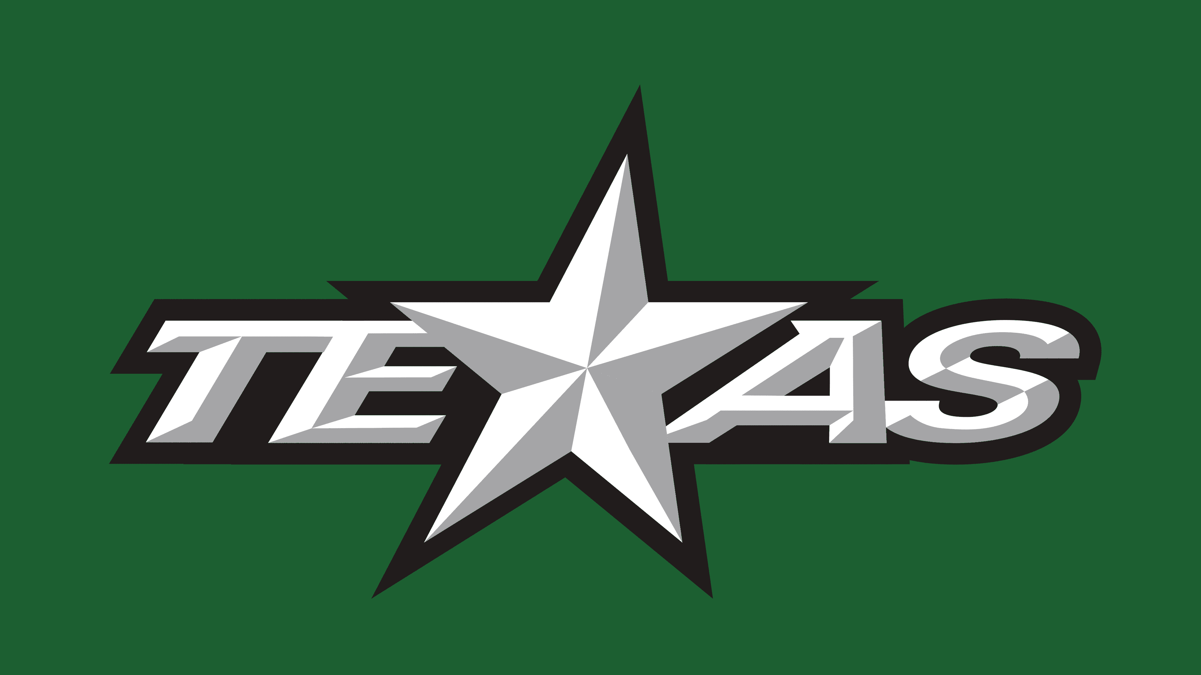
2015 – today
![]()
The Texas Stars club introduced a new logo, created in collaboration with the Reebok studio, that strengthened the team’s connection to the main franchise, “Dallas Stars”. The changes affected the rendering of the word Texas. At the center, the letter “X” was replaced by a five-pointed star, emphasizing regional identity and hockey tradition.
The star stands out with three-dimensional facets in a silver-white shade, creating an illusion of relief. Each ray is divided into light and dark areas, achieving a sense of depth.
The word Texas is set in a heavy typeface. The letters echo the star’s style, with three-dimensional facets. Around the letters is a black outline and an outer green layer. The colors were selected in accordance with the Dallas Stars palette. They connect the two teams. Green and black emphasize the club’s energy and professionalism.
In the updated Texas Stars image, a sense of restraint is evident, with the central star serving as the team’s symbol and referencing the state’s hockey heritage.