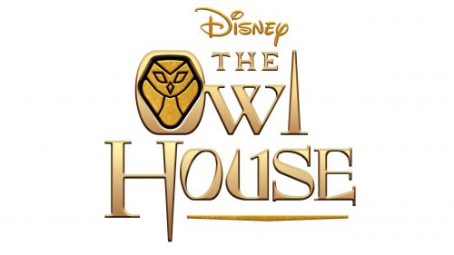
The Owl House logo carries a solemn and mysterious atmosphere, perfectly conveying the world of magic and enchantment in which the story unfolds. The emblem reflects life in a mystical kingdom where sorcerers and witches freely practice their spells. The journey to the mysterious and dangerous Boiling Isles changed the main character’s fate, allowing her to discover an amazing world full of secrets and adventures and find the most valuable treasure — a true understanding of herself and the world around her. The logo invites viewers on this incredible journey, promising many unusual discoveries and magic.
The Owl House: Brand overview
The story of The Owl House began in 2016 when talented writer and animator Dana Terrace started developing the concept for this original animated series. Terrace, who had worked on shows like Gravity Falls and DuckTales, drew inspiration from her childhood in Connecticut, her love for fantasy and art, and her visits to antique shops.
In 2018, Dana Terrace pitched the idea to Disney Channel. The network executives were immediately captivated by the concept, which blended humor, drama, and fantasy. They saw potential in the project and greenlit it for development, targeting a teen audience.
Throughout the next year, Terrace and her team focused on world-building, carefully designing characters, and creating the magical system of the Boiling Isles. They paid special attention to the protagonist, Luz Noceda, ensuring she would be relatable to modern teens.
The first teaser for the show premiered at San Diego Comic-Con International in July 2019, generating excitement among animation fans. Combining traditional and modern animation elements, the unique visual style immediately set it apart from other Disney projects.
The series debuted on Disney Channel on January 10, 2020, and quickly gained attention for its engaging plot, well-developed characters, and detailed world-building. The story of Luz, a regular teenager who stumbles into a magical realm and aspires to become a witch, resonated with many viewers, especially those who felt different or misunderstood.
Even before the first season concluded, Disney renewed the show for a second season in November 2019, following positive reviews and strong ratings. Critics praised the series’s originality and depth, recognizing it as a standout in children’s animation.
The year 2020 brought challenges and major milestones for the series. Despite global production hurdles, the team continued work on the second season. Around this time, the show gained recognition for its groundbreaking LGBTQ+ representation, which is rare in children’s programming.
Season two premiered on June 12, 2021, deepening character relationships and expanding on the themes introduced earlier. The season received even more praise than the first, especially for its bold portrayal of a growing romantic relationship between two main characters and its approach to sensitive topics.
In May 2021, Disney announced a third season with a significant format change—three extended special episodes instead of a full season. Fans had mixed feelings about this, with many hoping for a longer final season.
Despite this change, Dana Terrace and the team focused on delivering a strong conclusion. The first special episode of season three premiered on October 15, 2022, continuing the show’s high standard of storytelling and animation.
By the end of 2022, the series had become one of the most discussed animated shows, earning critical acclaim and multiple nominations, including for the prestigious Peabody Award.
Throughout its run, the show impacted the animation industry, proving that children’s shows could tackle complex themes and showcase diverse characters. The fanbase remained passionate, supporting the show even after announcing its conclusion.
As the series approaches its final chapter in 2023, its influence on animation history is clear. The show has paved the way for more inclusive and diverse narratives in children’s media. It continues to inspire viewers and creators, emphasizing the importance of representation and unique storytelling.
Meaning and History
What is The Owl House?
This intriguing animated series skillfully blends comedy, horror, and fantasy elements, creating a unique experience for viewers. The story centers on Luz Noceda, an eccentric teenage girl who accidentally ends up in the mystical Demon Realm. This world is filled with demons, witches, and various otherworldly creatures. Despite lacking magical abilities, Luz decides to become a witch, studying under the rebellious witch Eda, also known as the Owl Lady, and a small demon named King, who loves to act like a great ruler. The series stands out for its deep fantasy world, dark atmosphere, and diverse, complex characters. It also touches on important themes such as self-realization, finding one’s path, and accepting different family forms.
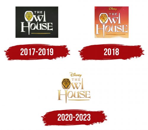
2017 – 2019
The logo on a black background emphasizes the horrors that permeate the show’s plot. The white letters, designed in a fantasy style, enhance the atmosphere of mystery. The letters “L” and the elements of “H” and “E” resemble sharp blades, indicating upcoming trials and dangers. The “U” curves smoothly, like campfire flames, adding a sense of instability and unpredictability. These details create an aura of adventure and risk.
The first letter, “O,” contains an image of a golden owl, symbolizing the central element of the plot — the Owl House. Here, through a magical portal, Luz Noceda enters a new world and begins learning magic. The white letters also convey the purity and youth of the main character, highlighting her new, magical life.
2018
The emblem underwent noticeable changes a year after the pilot episodes were released. The background was replaced with an orange-red gradient that diagonally crosses the image, starting from the bottom right and moving upward to the left. This gradient background completely removed the sense of gloom and gave the logo more warmth, romance, and a magical atmosphere. Instead of the previous dark background, a play of light and shadow appeared, emphasizing the fairytale nature of the story.
The Disney trademark was added to the top of the logo, drawing attention to the show’s childlike and magical themes. This element also enhances the sense of fantasy, emphasizing the lightness and magic of the world where the events occur.
2020 – 2023
The “The Owl House” logo is designed in gold, creating a sense of magic and mystery. Gold is associated with something valuable, like the show, combining elements of magic, adventure, and deeply personal stories. The inscription is done in an elegant font with clear lines and fine details, emphasizing the style and seriousness of the project.
The central element is a stylized image of an owl — a symbol of wisdom and magic. The owl is shaped like a mask, adding mystery, and the black outline on the gold background enhances the contrast, making the image more striking. This design choice visually reflects the show’s themes: the interaction of light and darkness, good and evil, wisdom and power.
The letters in “Owl” and “House” appear majestic, as if carved from stone or precious metal. This hints at the ancient world where the show takes place — a world full of secrets and hidden knowledge. The letter “I” in “House” is shaped like a spire, symbolizing a magic wand or a mysterious structure significant to the show’s context.
Despite its simplicity, the logo creates an atmosphere of anticipation for something grand and magical, perfectly aligning with the theme of “The Owl House.”
