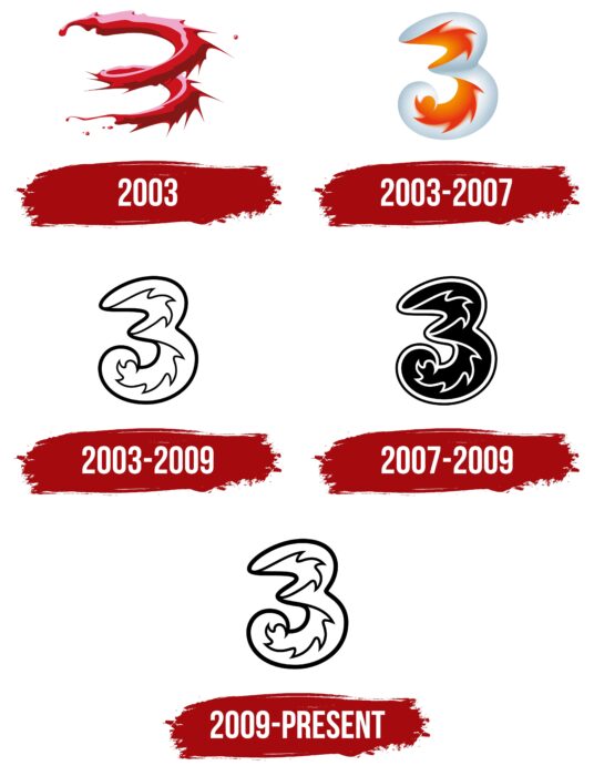
Although the Three UK logo is simple and minimalist, it has a lot of substance. The telecommunications company has embodied its concept in the logo: to provide quality services under the brand. And in the first place are clarity, humanity, and openness.
Three UK: Brand overview
| Founded: | 3 March 2003 |
| Founder: | CK Hutchison Holdings Limited |
| Headquarters: | Reading, England, UK |
| Website: | three.co.uk |
Meaning and History
The British service Three UK appeared on a symbolic day – 03.03.2003. But the trademark itself, known as 3, was registered a little earlier in 2002. At that time, it represented only 3G services, which is why the choice of name. According to Canning Fok, who was one of the leaders of the Hutchison Group, the word “Three” does not need to be deciphered and sounds almost the same in many languages, regardless of dialect. He said that this name would allow the brand to work anywhere globally; that is, it will make it global. However, the name three did not limit the company’s range of services: it was originally assumed that 3G technology could evolve to 4G, 5G, etc.
The Three logos were unveiled three months after the naming results were announced. The Global Brand Group, owned by Hutchison Whampoa Limited, worked on its creation and branding in general. Its leaders are Keith Kirby and Doug Hamilton. The concept is based on the principles of creativity, positivity, openness, humanity, and simplicity. Senior designers Michael Wallis and Daren Cook handled the overall brand identity, typographer Miles Newlyn designed the brand’s font set and logo, and brand strategist Simon Jameson handled the overall positioning of Three.
What is Three UK?
Three UK is a British company also known as Hutchison 3G UK Limited. She works in the telecommunications industry and provides services under the Three (or simply 3) brand. At first, this brand was associated only with third-generation 3G networks.
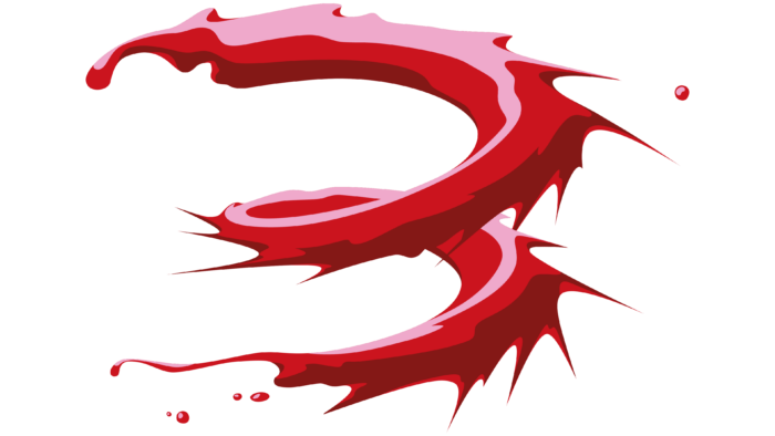
2003
Before the project’s official launch, the logo was in the form of a red number “3”, which looked like a spiral stripe. Judging by the splashes flying in different directions, it was supposed to imitate a paint stain. But due to the combination of three colors (pink, scarlet, and burgundy), it seemed as if the figure consisted of a three-dimensional plastic material with a glossy sheen.
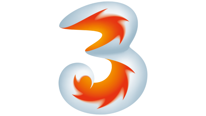
2003 – 2007
The final version of the Three logo, introduced in 2003, was designed by the Global Brand Group. The creative team, which belongs to Hutchison Whampoa Limited, proceeded from three fundamental principles. As Doug Hamilton admitted, the graphic symbol had to be recognizable, memorable, and, at the same time, have inner potential.
The designers kept the main element – the number 3, but presented it in a new form. The three became big, wide, and bubbly. Its outer side (right) was silvery white. Keith Kirby explained that she symbolized the titanium shell and represented the brand’s goodness. As for the interior, it was decorated with flames with a red-orange gradient. This element was supposed to convey dynamics – moving colors, which were associated with the pleasure of using mobile communications. The developers made the logo three-dimensional and expressed the idea of ”cold outside, hot inside” in it. In the digital world, the image was animated: the hues were constantly changing, flowing into purple, blue, green, yellow, orange, and red.
2003 – 2009
In addition to the colored Three emblems, there was a monochrome version. It was used for black and white applications. The figure looked like a child’s coloring book because it had only black outlines, and the main part was left blank.
2007 – 2009
In 2007, the brand introduced a monochrome version of the logo with reflected colors. Everything white became black, and vice versa. At the same time, an additional dark outline appeared along the edge of the number so that it could be placed on a light background.
2009 – today
In 2009, the graphic symbol was returned, used from 2003-to 2009 as a secondary one. The current version also contains a white 3 with a black outline. But now, the lines imitating flames and drawn along the outside of the three are a little thicker than before.
Font and Colors
The telecommunications brand Three UK logo reflects its name because it consists only of the number 3. This number symbolizes fun, entertainment, optimism, creativity, adventure, and moving forward in numerology. In Chinese, the word for “three” is consonant with the word for “life.” There is a reference to inexhaustibility, infinity, and eternity. But initially, the trio was associated with 3G because the Three trademark appeared precisely with the launch of this service.
The official font of the UK mobile operator is Helvetica Neue. At the same time, there is not a single inscription on the logo to demonstrate it. And the palette is limited to only two colors: black and white. Such minimalism contradicts the early version of the emblem, where the trio was very colorful.
Three UK color codes
| Black | Hex color: | #000000 |
|---|---|---|
| RGB: | 0 0 0 | |
| CMYK: | 0 0 0 100 | |
| Pantone: | PMS Process Black C |

