


 TIAA Logo PNG
The TIAA logo radiates confidence. Its balanced shape optimally blends with the calm color. The harmonious balance inspires trust, presenting the company as a reliable provider of financial services.
TIAA was founded in 1918 by industrialist and philanthropist Andrew Carnegie and Henry S. Pritchett, head of the Carnegie Foundation for the Advancement of Teaching. The Teachers Insurance and Annuity Association was created to provide retirement support for college and university teachers, many of whom had weak pension protection. Carnegie funded the launch with a $1 million donation.
The organization began as a nonprofit, a structure that allowed it to focus on participants rather than short-term financial returns. Its first product was a fixed-income annuity, offering stable retirement payments with limited growth potential. During the 1920s and 1930s, TIAA slowly expanded as more educational institutions joined its programs. The Great Depression created pressure, but the company continued through a cautious investment policy.
In 1952, TIAA created CREF, adding equity-based retirement plans to help participants respond to inflation and seek stronger long-term returns. In the 1960s and 1970s, the company added life insurance, supplemental retirement plans, real estate, and other alternative assets. In the 1980s, it expanded into broader financial products, including individual retirement accounts.
In 1997, TIAA received permission to serve a wider public connected with education and research. The 2000s brought growth in banking through TIAA Direct and in asset management. Later milestones included the 2016 rebrand to TIAA, the 2017 purchase of EverBank, the 2018 launch of TIAA Personal Portfolio, alternative investment growth in 2019, a 2040 carbon-neutral goal in 2020, Nuveen updates in 2021, financial education programs in 2022, a stronger mobile app in 2023, and ESG products in 2024.
Meaning and History
What is TIAA?
It is a leading financial services organization that provides retirement and investment solutions for individuals and institutions in the academic, research, medical, cultural, and government sectors. It offers a range of products and services, including retirement plans, annuities, mutual funds, life insurance, and brokerage services. The company is known for its commitment to helping clients achieve financial well-being and secure their financial futures through sound strategies and personalized financial advice.
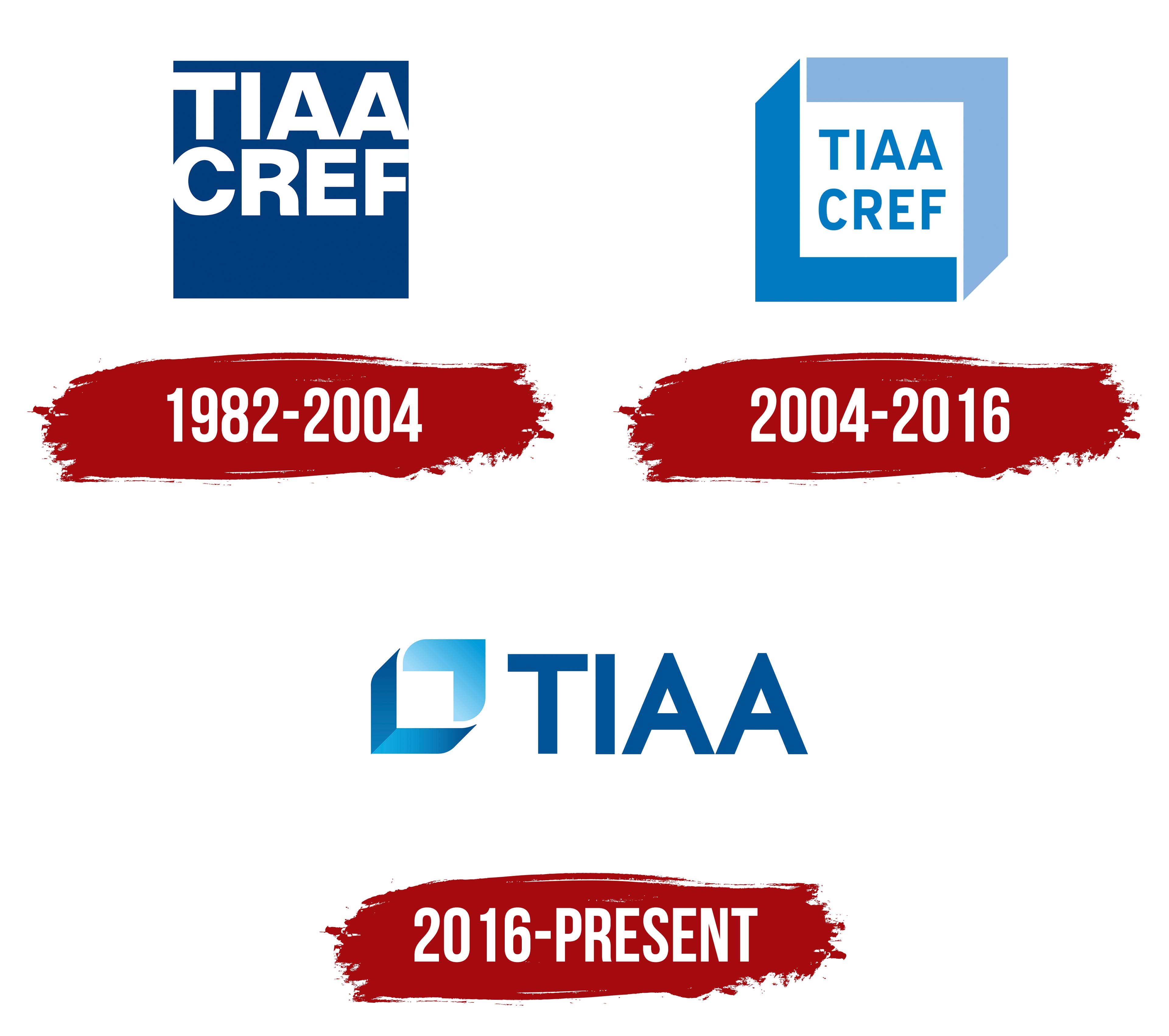
1982 – 2004

The deep blue shade and minimalism are the main features of the TIAA emblem from this period. Since the company deals with retirement issues for older adults, its branding was chosen accordingly: simple yet meaningful. Essentially, the style that emerged during this time significantly impacted the history of its visual identity because it hit the mark perfectly. What makes this match so fitting?
First, the organization opted for strict geometry, which resonates well with older individuals because it conveys trust and openness and appears straightforward and understandable. This is how the square became the foundation of the logo.
The designers placed the brand name inside the square, splitting it into two levels. The font was also chosen based on clarity and simplicity, as all the letters are smooth, even, and distinct. The side glyphs (on both ends) blend into the surrounding space since the square lacks a frame, and the text touches the edges. This was done to convey the message to clients: we cannot exist without you, and you cannot exist without us, as we are essentially one.
The text occupies the upper half of the geometric shape, leaving space below. This seems like a psychological technique because it’s easier for people to read something at the top; it naturally catches the eye. The letters are bold, blocky, and sans-serif. They are colored white, adding expressiveness and clarity to the emblem, as the dark blue and white form a striking contrast.
To fit the name “Teachers Insurance and Annuity Association of America-College Retirement Equities Fund” into the logo, the designers shortened it to a compact size using the abbreviation TIAA CREF and positioned it across two levels. This abbreviation became a permanent part of the financial organization’s identity and official name. The sans-serif font exudes confidence, stability, and reliability because it aligns perfectly with the square and fits seamlessly into its shape.
The blue color also gained timeless status, fitting perfectly with the fund’s theme. This shade positively affects people: it soothes, balances, reduces anxiety, relaxes, and gives a sense of peace and harmony, which is especially important for those reaching retirement age. Meanwhile, white symbolizes renewal, sincerity, virtue, and faith. They work well together, showcasing the company’s high level of professionalism.
2004 – 2016

The financial organization has remained committed to a clean sans-serif font, a simple geometric shape, and a bluish palette. As a result, even after significant changes to its visual identity, the characteristics of the old logo have been preserved, which is evident upon closer inspection. The resemblance operates on multiple levels, from typography to color.
- First, the previous version was recolored white and placed within an original frame of two shapes resembling an inverted letter “L.” These shapes feature a 90-degree angle and a diagonal cut on one side.
- Second, the emblem introduced two shades of blue: light blue and cornflower, both of which appear softly muted (within a pastel spectrum). They complement each other harmoniously, representing the shadowed and lit sides of the frame.
- Third, the text has been centered within the square and recolored in blue, standing out clearly against the white background. This transformation helps draw attention to the financial company’s name.
The text still includes the abbreviation “TIAA CREF,” split into two levels. This version’s font appears more refined because it is smaller and thinner. The neat letters are perfectly aligned, creating a positive impression on clients because they lack curves or serifs. They convey a sense of straightforwardness, honesty, and reliability. Both words are colored identically, indicating their equal importance to the company.
The emblem’s complex structure presents a simple geometric shape, a square. In this case, however, it is three-dimensional, appearing as a cube with two distinct sides: inner and outer. This suggests the protection the retirement fund provides its clients and the financial security guarantees it offers. The soft, calming colors that evoke peace and confidence reinforce the concept.
2016 – today

After the rebranding, the company decided to redesign its emblem. In early 2016, it dropped the two-part name and kept only the first half. The logo underwent a complete modernization, drastically changing its appearance. However, the square theme remained, taking on a new form. The geometric shapes became softer and more fluid, featuring curved lines and internal illumination.
The square is easily recognizable in the gap between two angular brackets: they gently enclose it from all sides, as if protecting it from life’s challenges. This reflects patient care, an essential part of a financial company focused on pension payments. The company emphasizes the theme of protection, visualizing it in the emblem.
In addition, the wide triangular shapes resemble arrows pointing in different directions: one points up (light blue), and the other points down (dark blue). Thanks to the gradient, they also resemble the sides of a square: two dark sides and two light ones, representing the illuminated and shadowed parts. This graphic technique draws attention to the white center, which may seem empty but represents a zone of peace and tranquility. It’s like the eye of a hurricane, calm despite any external circumstances.
The triangular geometric figures no longer resemble a frame; they look like curved brackets. Their refined shape symbolizes the company’s high activity and professionalism. To achieve this effect, the designers rounded and slightly elongated the corners. As a result, the logo gained a dynamic quality that captured attention. A soft energy surrounds each stroke, making the design more effective.

Next to the emblem is the abbreviation “TIAA.” Separating the text and graphics had a positive effect, as the font became larger and the lettering more readable. Previously, the size of the letters was limited by the background size. But that’s not all: upon closer inspection of the “A,” you’ll notice that it has been changed. The white triangle (the inner space) has been reduced, and the top of the letter has been enlarged. Despite these changes, the overall style of the lettering remains intact.
The company has also remained committed to blue, as evidenced by its abundance of emblems. The mood it creates aligns perfectly with the mission and vision of a pension organization, conveying confidence, relaxation, and calm. Paired with white, it effectively conveys an atmosphere of ease and openness, maintaining the trademark’s minimalism.