The Topps logo symbolizes the delightful fusion of sports, art, and collecting, embodying the passion for capturing moments and heroes on trading cards. This emblem reflects the company’s mission to bring to life the greatest moments in sports and pop culture, allowing fans to own a piece of history. It represents Topps’ commitment to creating products that inspire, educate, and entertain, making each card a collectible that connects generations.
Topps: Brand overview
Topps, an American company renowned for its collectible cards, gum, and candies, was founded in Brooklyn, New York, in 1938 by Morris, Eli, Joseph, and Abram Shorin. The company started by selling gum wholesale.
In the 1940s, Topps introduced its first collectible card series, “World War II,” featuring 252 cards with images from the conflict. The year 1949 saw the launch of Bazooka Bubble Gum, which included comics in its packaging, marking a significant step in engaging with consumers.
The 1950s were a pivotal decade for Topps, with the release of iconic series of baseball, football, and TV star collectible cards. The 1952 baseball card series became a flagship product, establishing a lasting legacy in the collectible card industry.
During the 1960s, Topps expanded its collectible card range to include hockey players, racing stars, and monsters. The Wacky Packages series, parodying well-known consumer brands, emerged as a popular product, showcasing Topps’ creative versatility.
The 1970s and 1980s were periods of further expansion into new markets and product categories. In 1975, Topps acquired Ringpop, a beloved candy brand. The 1980s introduced cards featuring movie characters, musicians, and celebrities, diversifying Topps’ collectible offerings.
The 1990s and 2000s witnessed Topps reinforcing its position as a leading sports card manufacturer amid growing popularity. The company secured exclusive licensing agreements with major sports leagues, including MLB, NFL, and NHL.
During this time, Topps embraced new collecting technologies like hologram cards and gaming cards, transitioning into the digital era with an online card trading and collecting platform.
In 2007, Topps purchased The Upper Deck Company, its main competitor in the sports collectible card market, for $385 million, further solidifying its industry leadership.
From the 2010s to the present, Topps has continued to innovate and adapt to the evolving collectibles market. In 2012, the company introduced Topps Bunt, a mobile app that allows users to collect and trade digital baseball cards.
Topps has collaborated with major organizations such as Lucasfilm, Marvel, and World Wrestling Entertainment to create collectibles for fans. A notable highlight came in 2018 when a collectible card featuring rookie Shohei Ohtani was auctioned for over $180,000.
In April 2022, Fanatics, a global digital sports platform, acquired Topps for approximately $500 million. This acquisition marks a new chapter for Topps as it seeks to grow and evolve in the digital collecting age.
Meaning and History
What is Topps?
Topps is a well-known international brand that creates and sells collectible cards and related merchandise featuring sports and entertainment themes. The company offers various collectible cards featuring famous athletes, actors, musicians, and other popular figures. Additionally, Topps produces various collectibles-related items such as storage albums, collector’s sets, and other accessories. Topps is a leading brand in this field and has a long history in the collectibles industry.
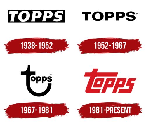
1938 – 1952
From 1938 to 1952, Topps chewing gum featured a robust and masculine design, influenced by the company’s experience with tobacco products. The product, named Bazooka Bubble Gum, conveyed strength and power, matching the expectations of that era. The company aimed to market the gum through tobacco sales channels, creating an image of seriousness and reliability to appeal to adult male consumers.
The packaging included a large black rectangle, symbolizing the gum’s strength and unique flavor. This design choice emphasized the gum’s high quality and the company’s goal to offer something exceptional and distinct from competitors.
The product name was displayed in white capital letters on a black background, emphasizing the uniqueness of the company’s offering. The white letters signified purity and high quality, and the capital letters conveyed the grandeur and scale of the product.
An innovative feature was the comic strips on the wrappers, which became popular among young people. These comics added originality and deepened consumer engagement by providing a unique taste and entertainment. Each packet of gum offered a mini adventure, adding to the fun and enjoyment of the product.
1952 – 1967
Although chewing gum was popular across various groups in the 1950s, the Topps company primarily targeted male consumers in its marketing efforts. One effective tactic included trading cards with scenes from popular Western films in the gum packages. This strategy connected the product with traits like bravery, adventure, and masculinity associated with Westerns.
Building on this idea, Topps began adding baseball cards to the gum packaging, introducing a theme of sportsmanship and victory. This move enriched the product’s cultural appeal and brought consumers closer to the allure of fame and success. Topps gum has become a way for consumers to feel part of something significant.
To modernize the brand, the company updated its logo. They removed the heavy, dark background, opting for a lighter, more contemporary look. The logo’s remaining capital letters, now in a clear black font, marked a new chapter for the brand. These stylish, prominent symbols highlighted Topps’ strong market presence and symbolized the gum’s long-lasting flavor, a key aspect of its success.
1967 – 1981
In the 1960s, Topps revamped its visual identity to align with changing tastes and interests. During this time, the company began including inserts about The Beatles in their gum packages, capitalizing on the band’s peak popularity. This strategy attracted new audiences and helped shape a more playful and friendly brand image mirrored in the logo’s new style.
The updated logo was designed to be softer and more welcoming. Notably, the letter “T” was reshaped to look like it was smiling, making the logo feel more approachable. This change reflected the company’s openness to innovation and readiness to diversify its product offerings.
Additionally, during this period, Topps relocated its operations to Pennsylvania. This move, both logistically and strategically, marked a new chapter in the company’s history, emphasizing its commitment to growth and adaptation to market changes. The logo incorporated a design element that symbolized this move, underscoring the company’s dynamic approach and ongoing search for new opportunities.
1981 – today
In 1981, Topps introduced a new logo that marked a significant moment in its branding history, reflecting its achievements and leadership in the global chewing gum market. The red logo, linked to strength, passion, and confidence, mirrors the company’s position as a top gum producer. The color also emphasizes the brand’s energy and dedication to innovation and quality.
The inserts produced by Topps became sought-after collectibles, adding value and uniqueness to its products and transforming each pack of gum into a collectible item desired by both gum lovers and collectors.
Curved stripes around the logo add a touch of sports, symbolizing the company’s focus on athletic achievements, a key part of their marketing. These elements, resembling hockey sticks, baseball bats, and goals, reflect Topps’ incorporation of a sports theme into its products, especially its cards featuring sports stars, which became a distinctive aspect of the brand.
The logo’s vibrancy and dynamism underscore Topps’ proactive stance in the market, drive for innovation, and ongoing goal to surprise and delight customers. The logo retains square shapes, maintaining a serious and business-oriented look to continue appealing to a male audience that values quality, originality, reliability, and stability.
Font and Colors
The Topps logo uses a bold, custom-designed sans-serif font with geometric contours, giving it a distinctive look. It resembles fonts like Liquorstore Bold Italic or Mesquite Italic but has been modified to stand out.
The vibrant red logo symbolizes strength, energy, and passion, likely to energize and excite those who see it. This color reflects the brand’s lively personality.
Each letter of the logo is carefully shaped to include unique features. The letters’ italic slant suggests movement and progress.
The logo’s design uses just one shade of red and avoids multiple text lines, making it straightforward and clean. The spacing between letters is precisely managed to match the italic style, ensuring the logo looks unified and well-balanced.
The font and color make the logo visually appealing and strengthen Topps’ image as an innovative leader.
FAQ
Why is it called Topps?
Topps, a company known for its trading cards and sweets, got its name because the Shorin family wanted it to stand out in its industry. They started the company in 1938, aiming to make it a leader. At first, Topps didn’t focus on trading cards. They were more into other business areas. But things took off for them when they started making trading cards and bubble gum. This change was a big deal because it made Topps a key player in the trading card market and a big part of American culture.
Baseball cards from Topps became very popular, especially with young people, and are now seen as classic American items. The move to trading cards was a smart one. It showed the company could change its direction and still be successful. Topps came to mean high quality and leadership in the trading card world. The reason behind Topps’ name is all about the founders’ big dreams and how the company reached those dreams in a way they didn’t expect. This journey made Topps a much-loved name in American history.
Where are Topps baseball cards located?
Topps Company, famous for baseball cards, is based in New York, NY. It started 1938 as a chewing gum company and has since become a big name in entertainment products. Topps now makes trading cards, collectibles, novelty candy, gum, and stickers. Some of its well-known brands include Ringpop, Bazooka, and Push Pop. Over the years, Topps has grown from making just gum to offering various fun and collectible items. Its headquarters are in New York, where it keeps creating products that people worldwide enjoy, sticking to its roots in sports and collectibles and bringing in new ideas.


