


The Toronto Symphony Orchestra is preparing for its 2026/27 season with a new identity by local agency Underline Studio. Unveiled on July 10, 2026, ahead of ticket sales, the update aims to reach people who encounter classical music outside concert halls and encourage them to attend a performance. The logo features music in the letter “S,” which can respond to the piece being played.
Research by Slover Linett and Unity Insights helped define the brief. Toronto residents held the orchestra and its cultural contributions in high regard. Yet, that appreciation did not necessarily translate into ticket purchases. People considering their first TSO concert saw it as a prestigious institution removed from their everyday interests. The new identity needed to make the orchestra feel more approachable to prospective audiences while preserving its connection to its musical heritage.
More than 10 years had passed since the previous redesign. During that time, the TSO’s activities grew to include educational projects, community partnerships, recordings, and international tours. The orchestra gives more than 120 concerts annually at Roy Thomson Hall and George Weston Recital Hall, with community programs reaching across the Greater Toronto Area. The identity needed to bring it all together. Musicians, staff, trustees, donors, subscribers, and partners contributed through interviews and discussions.
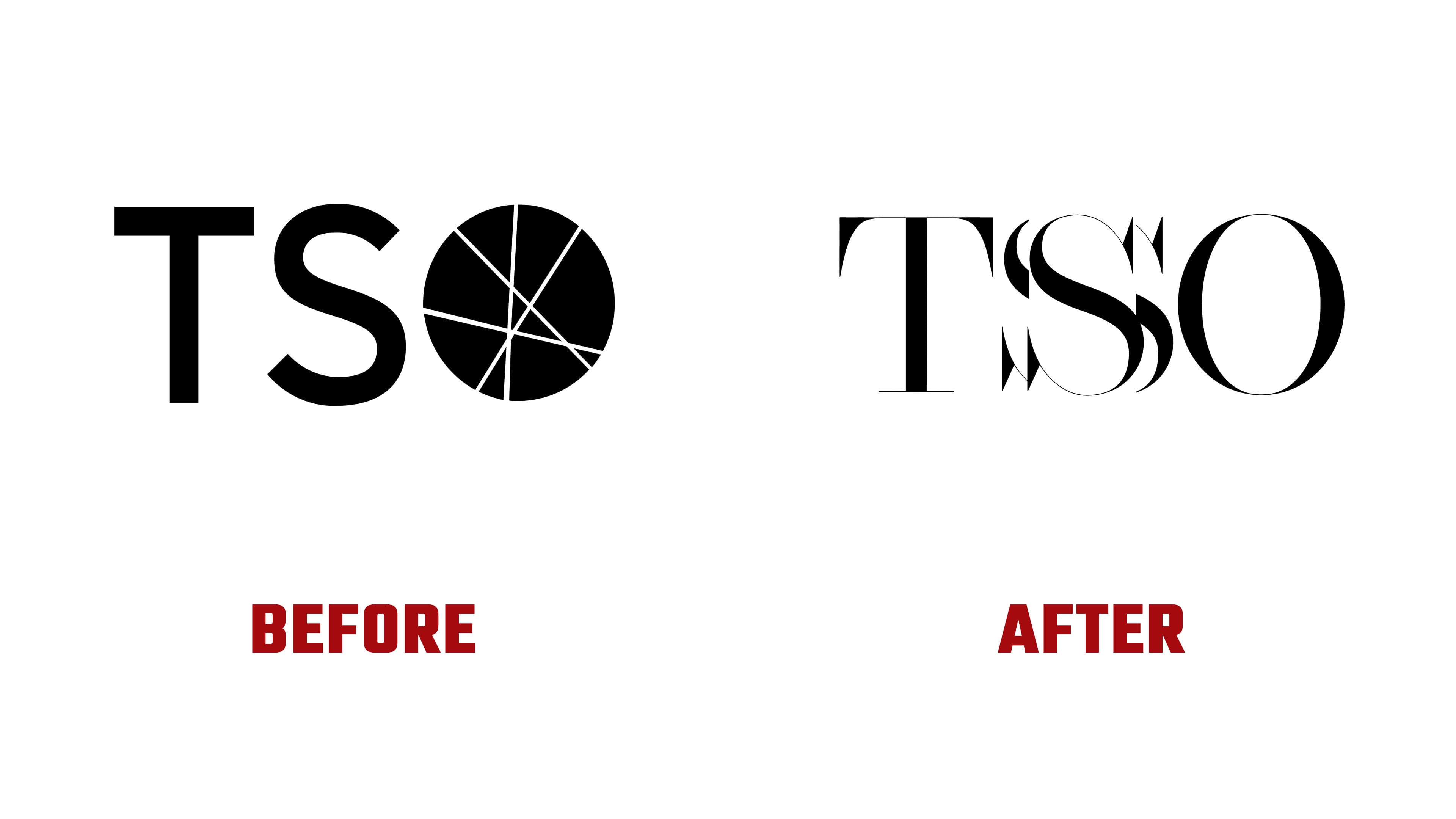
The TSO monogram’s visual focus has shifted from the final letter to the middle one. Previously, the “O” was a solid circle crossed by thin lines, paired with a sans-serif “T” and “S.” The new “O” is oval with an open center. All three letters were custom-designed in a Didone style, pairing heavy main strokes with fine connecting lines.
The long top bar of the “T” ends in downward-facing points, while a thin serif runs along its base. In the “O,” thick sides taper to near-hairline strokes at the top and bottom. The “S,” referring to “Symphony,” is surrounded by several offset repetitions of its curves and pointed terminals. These overlapping outlines suggest vibration even in print. In animation, the “S” responds to music while the “T” and “O” remain stationary. Underline Studio connects this musical response to the emotions of a live performance and the sense of connection among people in the hall.
The full name, Toronto Symphony Orchestra, is set in the sans-serif typeface Neue Haas Grotesk. On posters, the monogram appears large enough for viewers to see its fine lines and the repeated contours of the “S.” The logo appears in black against a red background and in white over photography.
The messaging centers on the phrase “It All Starts With a Feeling.” It speaks to curiosity, excitement, surprise, and a sense of belonging that can emerge before someone attends their first concert. Studio Good Form developed the tone of voice, key messages, and launch materials. For the 1-minute, 31-second launch film, the team created the storyboard and edited footage from the TSO and Juniper Island.
The rollout spans the 2026/27 season. The team released a brochure promoting single-concert ticket sales as one of the first materials. The website update was scheduled for July 15, 2026. The team is updating printed publications, signage, and other materials in stages.