 Travelocity Logo PNG
The Travelocity logo reflects the scale of operations of the most renowned travel services provider. It shows that the company has vast capabilities and ensures that any trip or vacation with them will be carefree, peaceful, and enjoyable.
Travelocity was founded in 1996 as a division of “Sabre Holdings Corporation”, a major airline reservation system provider. The company entered the market when internet travel booking was still new, and most trips were arranged through agencies. Its platform allowed users to book flights, hotels, and rental cars online, while using Sabre’s database to compare prices and travel options.
In 1997, Travelocity launched Fare Watcher, giving customers a way to track airfare changes. In 1998, it merged with Preview Travel, strengthening its position in online travel. The company expanded outside the United States in 2000, launching websites for Germany and the United Kingdom. In 2001, the Roaming Gnome became its most recognizable advertising figure and helped define the brand’s public image.
The next stage focused on services and acquisitions. In 2002, the company introduced a Best Price Guarantee, and in 2004 it acquired lastminute.com for $1.1 billion, strengthening its position in Europe. A corporate travel division followed in 2005, while user reviews and destination recommendations were added in 2006. In 2009, Travelocity released its first mobile app for booking trips by phone.
In 2012, Travelocity signed a booking technology agreement with Expedia, which completed its purchase of the brand from Sabre in 2015. After the integration, the platform gained broader access to hotels and flights, updated its mobile app in 2017, added customer guarantees in 2018, and introduced machine-learning personalization in 2019. Later updates included supplier expansion in 2020, virtual tours in 2021, eco-travel content in 2022, an AI trip planner in 2023, and a gamified loyalty program in 2024.
Meaning and History
What is Travelocity?
It is an online travel agency that provides various travel-related services, including booking airline tickets, hotels, rental cars, vacation packages, and cruises. The platform allows users to compare prices, find travel deals, and book tickets conveniently online. The company is known for its user-friendly interface, extensive travel options, and customer service. It aims to help travelers plan and book their trips easily and efficiently by offering tools and resources, including travel guides, destination information, and customer reviews. The brand is part of Expedia Group, one of the largest travel companies in the world.
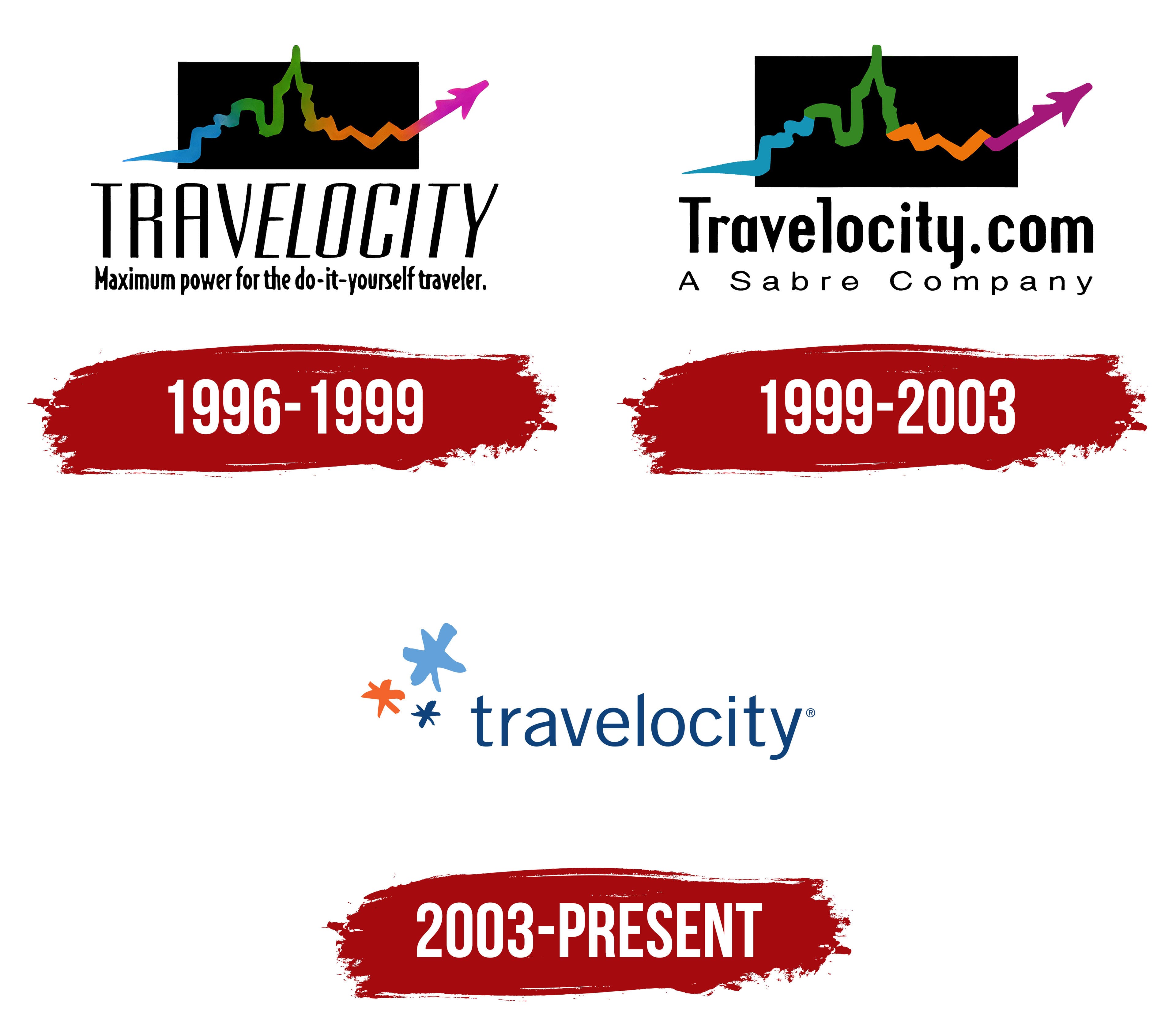
1996 – 1999
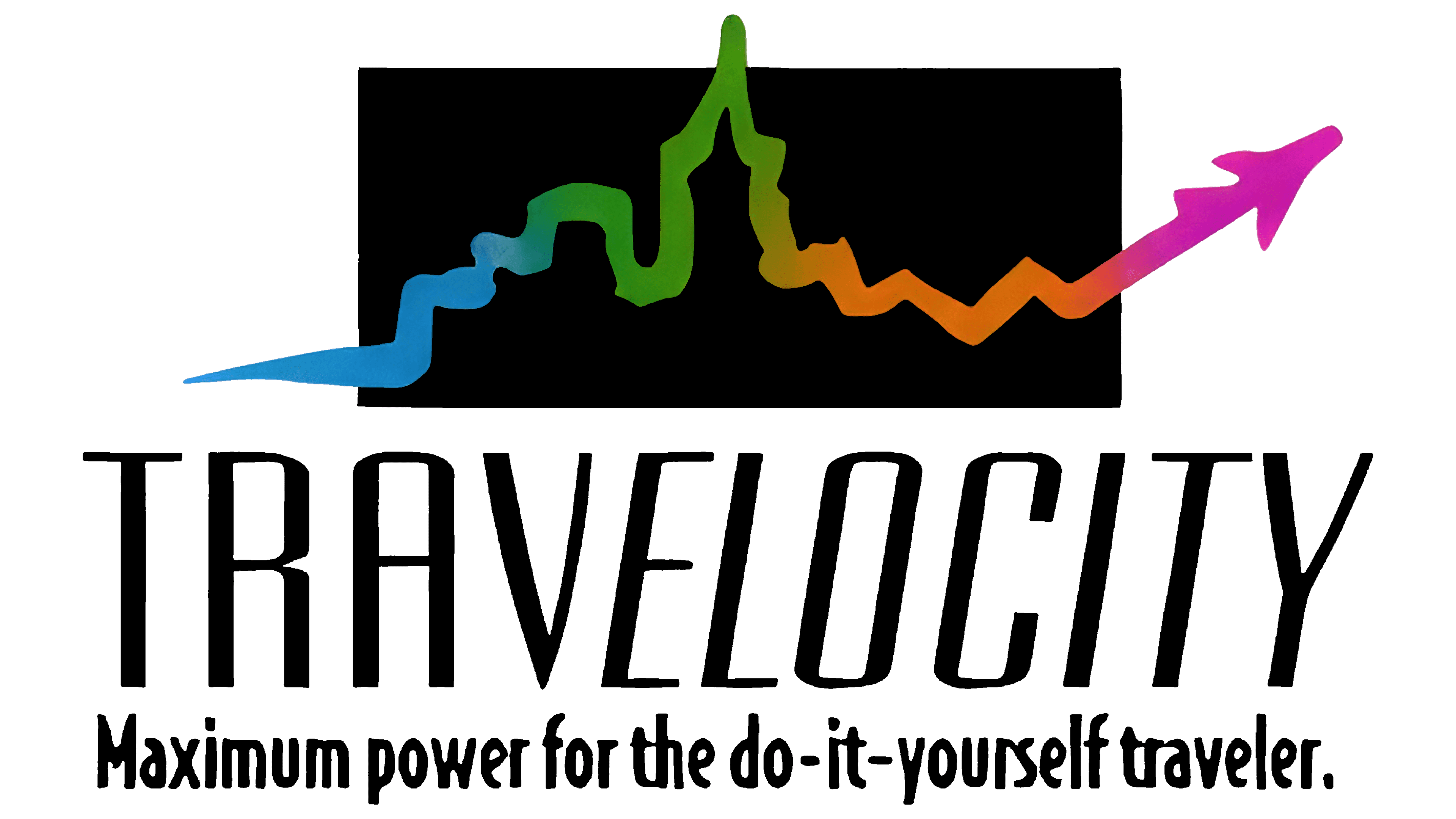
The theme of comfortable travel is deeply embedded in the Travelocity emblem: it is infused from the first colorful stroke to the last elegant letter. Its composition is quite interesting, showcasing both the company’s distinctiveness and the uniqueness of its identity. The reason lies in the harmonious tandem of form and color, which creates the logo’s original content.
First, attention should be drawn to the shape. Against the backdrop of a horizontal rectangle, a wavy line outlines a cityscape: the contours of buildings, canals, towers, and roads. It also resembles a route drawn on a map with an open ending. This is emphasized by a plane ascending at the end of the line, following a complex trajectory.
The line’s unique configuration symbolizes the travel route offered by the famous American tour operator. It’s an allegory for selecting the best path, where everything is carefully planned by the company’s experts, allowing customers to enjoy their vacation. The agency can do everything for them:
- Choose a carrier.
- Suggest accommodation.
- Book a room.
- Show the sights.
- Send them off on a comfortable plane toward their dream destination.
The second noticeable feature is the vibrant color. The designers used a complex color scheme with a gradient for the wavy line, incorporating blue, green, orange, and purple. The borders between them are effectively blurred, making them invisible against the black rectangle, which contrasts perfectly with the rainbow palette.
Form and color create a harmonious combination that accurately conveys movement, making the image a symbol of travel. The multicolored line is incredibly dynamic, resembling a chart with natural peaks and valleys. It is beautifully complemented by the text placed below, which consists of two parts:
- The first part is the name of the travel agency, Travelocity.
- The second part is the slogan, “Maximum power for the do-it-yourself traveler.”
The upper line uses a very tall geometric font: the capital letters are vertically stretched, making them appear light and graceful. Their uniqueness is enhanced by visual separation into two parts, one in italics and one without. The final part of the word (“elocity”) is in italics, while the initial part (“Trav”) stands upright. This makes the logo even more dynamic. Incidentally, the first row gives a strong sense of airflow, thanks to the absence of serifs and the thin strokes used in the letters.
The lower line is denser due to the small, bold glyphs. They are placed so close together that they resemble seeds in a sunflower head. This line is hard to read because it is not easily distinguishable from a distance. To make it at least somewhat clearer, the designers colored the letters black and chose a white background. Both rows are center-aligned, which makes the logo look balanced.
1999 – 2003
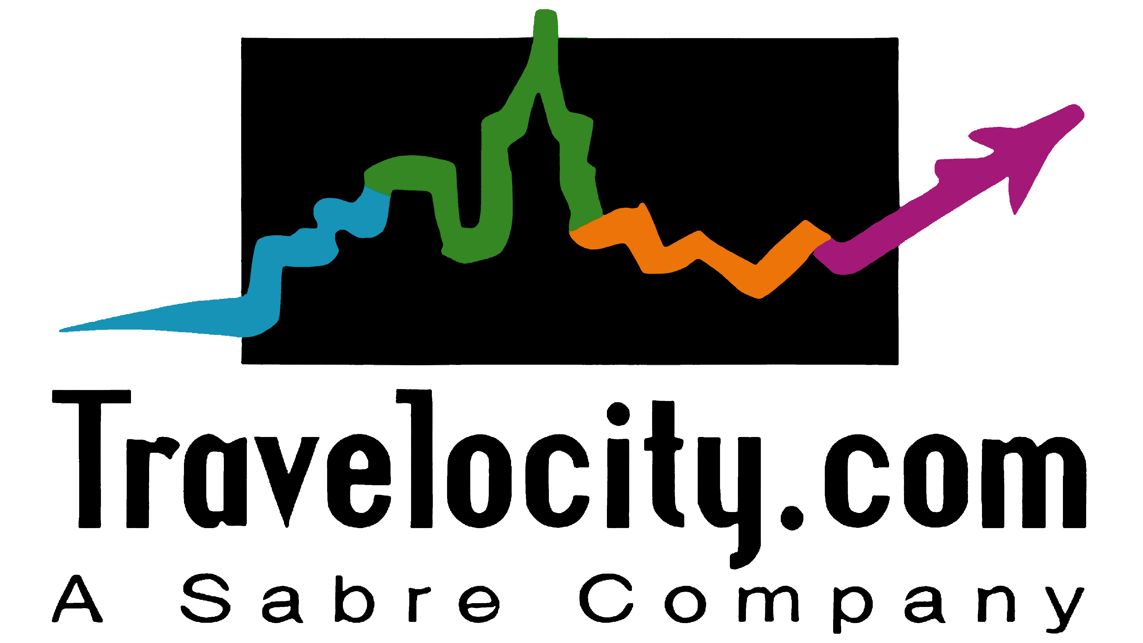
When the travel provider launched its website, it redesigned the logo. The result was a modernized version featuring the text “Travelocity.com.” It retains the previous emblem, but some changes significantly affected its appearance.
For instance, the text is now in a bolder and more elegant font. Instead of uppercase letters, the designers used lowercase ones, sharpening the ends and neatly trimming the elongated strokes. This is seen in several characters: “r,” “v,” “t,” and “y.” The extravagant symbols appear light because the spacing between them and the inner letter spacing is quite large. This adds an airy feel to the logo, which is essential for conveying the concept of a tour operator offering comfortable travel.
Another significant change is the introduction of clear boundaries between the colors, as the gradient has been removed. However, this did not diminish the travel atmosphere; it enhanced the spirit of tourism, as the colorful segments of the wavy line now resemble marked road sections on a map. The airplane still soars upward at the end of the line, though it is now slightly darker than before.
Changes also affected the second line, where the slogan was removed and replaced with the phrase “A Sabre Company.” This phrase is written in a rounded font with sans-serif glyphs spaced widely apart to create a sense of casual lightness and openness.
2003 – today
The era of the new Travelocity logo has arrived, featuring a more refined and joyful design dominated by positive emotions and completely free of black strokes. The redesign was prompted by a shift in the travel agency’s concept, as it decided to focus on the pleasant experiences customers can have from a well-organized vacation. This led to the creation of an elegant wordmark paired with an abstract, life-affirming emblem that includes:
- The company name;
- Stylized stars.
The minimalist image is crafted professionally, conveying many ideas despite having few elements. The logo’s simplicity and clarity reflect an authoritative, representative presence in the global tourism industry, one that truly cares about how its customers travel. This level of care has made the tour operator widely sought after and enabled it to surpass competitors.
The text is written in lowercase using a two-dimensional, thin, sans-serif, and precise font. It harmoniously combines straight edges, angles, and curves, creating no visual dissonance. The logo comes across as charming and friendly. The elegant letters resemble those from the Iwata G Gothic Pro Medium typeface, but certain alterations prevent this from being stated with complete certainty. For instance, the top of the letter “l” is cut diagonally, and the end of “v” is not pointed; it is flat, symbolizing the company’s stability. The absence of serifs signifies openness.
To the left of the company name, three stylized stars shine. Their shape is highly abstract, composed of three short strokes stacked atop one another, resembling snowflakes rather than stars. At the same time, they also look like sparks from fireworks. Either way, these elements reflect the joyful, carefree feeling customers experience when choosing this company. For symmetry, the designers depicted one large star and two smaller ones, adding dynamic energy to the logo.
The positive mood is also reflected in the color palette. In this version of the visual identity, there isn’t a single dark stroke: neutral blue dominates, complemented by light blue and orange. These colors symbolize the sky, sea, sun, warmth, fun, carefreeness, and calm, representing Travelocity as a reliable and authoritative travel provider that truly understands travelers’ needs.
The smooth strokes of the glyphs and the pleasant color scheme embody a passion for travel and relaxation in a comfortable environment. They also express the safety that the agency strives to provide its clients, opening up new opportunities and interesting places for them to explore. Freshness, dynamism, gentleness, and ease are the feelings evoked when looking at this bright and simple emblem.