The TUI logo conveys joy and optimism. The bright symbol instills confidence that tourists will receive excellent service to enjoy their vacation or trip to any desired destination. The friendly emblem assures customers that the company will do everything possible and beyond to make it happen.
TUI: Brand overview
TUI’s history predates the company’s official establishment in 2001. The founding of Touristik Union International (TUI) in 1968 as a coalition of various travel businesses in Hanover, Germany, served as the foundation for the company.
The organization began aggressively growing in the 1970s by purchasing other travel agencies and entering new markets. In 1977, it took an important step toward vertical integration of its business when it purchased a majority interest in the airline Hapag-Lloyd.
The 1980s were marked by continued development and expansion for the firm. As it expanded into foreign markets, the business opened operations in other European nations. Growth outside of Germany began when it bought the Dutch tour company Arke Reizen in 1988.
The 1990s brought upheaval. In 1997, Preussag AG, a sizable German conglomerate with holdings in numerous industries, purchased the company. With this acquisition, Preussag transitioned from an industrial to a tourism enterprise.
Preussag purchased Thomas Cook AG, a significant player in the tourism industry, in 1998. However, due to antitrust laws, the firm was compelled to sell Thomas Cook in 1999.
The British tour operator Thomson Travel Group was acquired in 2000, greatly improving the company’s standing in the UK market.
After merging tourism assets in 2001, the firm was formally established as TUI AG. This change officially made Preussag a tourism firm, marking a new chapter in its history.
Following a makeover in 2002, travel brands were combined under a single banner.
In 2004, the company and Royal Caribbean Cruises Ltd. formed a joint venture to grow the cruise industry.
2007 was significant as the organization formed TUI Travel PLC by merging tourism holdings with First Choice Holidays. This merger created one of the biggest travel agencies in the world.
Despite the world financial crisis in 2009, growth continued with the acquisition of more cruise ships and hotels.
2014 saw another significant restructuring. After merging with TUI Travel PLC to become TUI Group, the management structure was streamlined, and operational effectiveness increased.
The group divested its wholesale hotel room business, Hotelbeds Group, in 2015 to concentrate on its main travel operations.
The specialized Travelopia branch, which contained several niche travel brands, was sold in 2016.
In 2018, Hapag-Lloyd Cruises’ ownership was sold to Royal Caribbean Cruises Ltd. to concentrate on creating its cruise brands.
In 2019, the firm made increased technology investments—the aggressive digital platform development aimed to boost operational effectiveness and user experience.
The company carried out its digital transformation plan in 2020. Large investments were made in growing consumer customization choices and improving user experience on its web platform.
In 2021, the company set the standard for sustainable development. The “TUI Care Foundation” program was started to fund social and environmental initiatives in popular tourist locations. The firm began working with local communities to promote ecotourism and protect cultural assets.
In 2022, the cruise industry’s market share increased. Two brand-new cruise ships were put into service, outfitted with cutting-edge environmental features, such as the capacity to burn liquefied natural gas as fuel and exhaust gas cleaning systems.
In the hotel sector, 2023 was a year of innovation. The concept of “smart” hotels was unveiled, featuring smartphone apps for contactless services, customized in-room entertainment systems, and artificial intelligence for energy management.
A new branch specializing in planning business travel and corporate events was established in 2024, marking a step towards diversifying operations. This decision allowed the company to leverage its infrastructure and experience in a new market sector, responding to the growing demand for all-inclusive business travel solutions.
The organization persisted in fortifying its standing as a global tour operator, providing customers with an extensive assortment of contemporary vacation merchandise.
Meaning and History
What is TUI?
It is a multinational travel company based in Germany. It is one of the world’s largest leisure, travel, and tourism companies, providing package holidays, flights, cruises, hotels, and resort operations. It operates well-known travel brands, airlines, and cruise lines that serve millions of travelers worldwide. The company offers all-inclusive vacation packages, sightseeing tours, and customized travel.
Before 1997
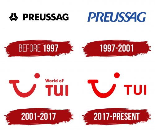
In the company’s early years, its visual identity was characterized by seriousness: a black logo featured a plain inscription with a simple symbol. The utilitarian emblem belonged to a Prussian brand from a completely different industry (not tourism), as it represented services related to the energy sector, including coal mining and supply. Hence, the company initially used a different name—Preussag AG.
The foundation of the TUI logo is a wordmark with a small graphic element. The text was written in a bold, uppercase font to convey a professional atmosphere and reflect the coal mining industry. All the letters were of equal height: bold, straight, and smooth. Without serifs, the company conveyed that it had no limitations and was fully capable of doing its job and effectively collaborating with all stakeholders.
Despite the logo’s early origin, it looks modern. No, it doesn’t feature realistic 3D graphics, massive details, or innovative elements—it’s simple. But it’s this simplicity that makes it relevant: two-dimensional symbols are characteristic of the visual identity of the early 21st century, so this logo can be considered ahead of its time. Its two-dimensional, compact design fits well in any medium.
The clear glyphs maintain good readability thanks to their optimal spacing and large inner letter space. Neat, straight, and smooth symbols take up almost the entire emblem. They evoke a sense of precision, as every stroke is perfect and every curve symmetrical. Despite the simplicity of the inscription, it appears solid, immediately drawing attention to the name.
The black letters stand out against a light background, making them eye-catching. This color choice is linked to the company’s industry: coal mining and supply inevitably evoke associations with blackness. The graphic symbol located to the left of the text is also coal-black.
The TUI symbol is formed from three curved lines arranged into a unified structure. They resemble the dozer blades used to move and load mined coal. A three-pointed star is visible in the negative space between the arcs, symbolizing light at the end of a dark tunnel.
1997 – 2001
As a result of the redesign, a simpler logo has emerged, completely omitting the drawn symbol. It was removed because the designers incorporated graphic elements into the typography: stylized letters convey a lot of important information, signaling the business nature of the brand. What exactly has changed?
- Instead of perfectly smooth and even glyphs, italic symbols have appeared. The text is diagonal, indicating the company’s steady development, growth, and expansion aspirations. Italics brought the logo to life by adding energy and motion.
- The uniform charcoal black has been replaced with a pleasant sky blue. The deep blue shade refined the emblem, showing the company’s confidence, calmness, and stability. Additionally, this shade improved the emotional tone of the visual identity, conveying a positive attitude.
- Although the TUI logo remains text-based, it feels simpler and lighter now that the new structure has added modernity. Nothing is superfluous—only the name. The minimalist design reflects the brand’s practicality and desire to evolve positively.
Particular attention is drawn to the font, which has several unique features. First, it’s worth noting the sharp edges on several glyphs. These are especially pronounced in “G,” “S,” “A,” “P,” and “R.” Additionally, the connection between certain letters stands out, symbolizing comprehensive customer support and the aim to work as a cohesive whole, providing quality service. This connection is seen in “EU” and “SA.” The bond between the characters is so close that they share strokes.
Moreover, all the glyphs exhibit a balanced combination of straight and rounded lines. This benefits the visual identity, which now appears friendly, soft, and pleasant. This way, the company expresses a determined outlook toward the future despite various challenges. The blue palette effectively supports the sense of confidence and calm. Thanks to it, the lettering looks refined and light. Here, we see an example of how color has drastically transformed the style of the wordmark, evoking positive emotions.
2001 – 2017
After several resales, TUI Group, formed in 1968 by four German travel companies, came under the management of the restructured company Preussag AG, which changed its name. It received a new logo, where the theme of friendship dominates. The core of the logo became the short name of the tour operator, TUI, which stands for “Touristik Union International.” Thus began the era of the smile logo.
The text represents more than a name: it is part of the phrase “World of TUI.” The designers seamlessly combined the slogan and the company’s name, placing them on different levels:
- The first line contains the beginning of the slogan;
- The second line features the word “TUI.”
The upper inscription is in a small, sans-serif lowercase font. The letters have rounded strokes, giving them a bubble-like appearance. The abbreviation in the lower line is in an uppercase font. There are no serifs here either, creating a friendly impression. The letters are oversized to catch the eye immediately and attract interested customers. This is the primary purpose of the logo.
The harmonious combination of straight edges and rounded ends supports a positive atmosphere. This is crucial for a tour operator because people who turn to it expect a pleasant vacation, a fun journey, and comfortable conditions. To reinforce this, the company placed its mark next to the slogan—the iconic smile formed from the stylized abbreviation.
Amazingly, the word “TUI” instantly turned into a graphic element. The unique design creatively represents the short name of the travel company: the “T” with its top bar resembles the left corner of a smiling mouth, the “U” resembles a sweet smile, and the “I” is perceived as the right corner of the mouth with a round eye above it. Each detail successively represents the glyphs in the order they appear in the text.
The emblem is painted in a vibrant color — bright red. It stands out clearly against a white background, enhancing the positive mood. This combination signifies purity, openness, joy, and a cheerful spirit. Together, they create a bold and confident image of one of the European leaders in the tourism market.
2017 – today
The tour operator redesigned it to breathe new life into the logo and make it more appealing and noticeable. The result is minimalistic and light, as the slogan, specifically its first half, “World of,” which carried the main message, was removed from the emblem. Only the stylized element in the form of a smiling face remains, expressing:
- a warm welcome to customers,
- joyful emotions,
- friendly disposition,
- the company’s name.
It conveys everything the brand values and prioritizes in its concept. The emblem’s key goal is to bring smiles to customers’ faces and evoke them in travelers through positive experiences with the company’s services and the happy moments enjoyed during vacations.
In the stylized face, the difference between the old and new versions is minimal—just the distance between the base and the dot, slightly farther from the lower stroke in the current version. Most of the changes occurred with the font, as it was replaced. The large, bubble-like letters are gone, replaced with small, clean glyphs in a stricter style resembling Darwin Essential Alt Rounded Black or Fruitygreen Pro Black, with minor contour adjustments.
The new version fits better with the concept of a friendly company and more clearly conveys its name, as the “U” lost its tail, and “T” and “I” became straighter and neater. Overall, the glyphs are uppercase, bold, rounded, and sans-serif. The lack of serifs adds friendliness to the logo and presents the tour operator as having no barriers in its work or limits in planning trips. The logo demonstrates its vast capabilities — that it can accomplish anything.
The iconic TUI emblem is based on a perfect color combination, as red on white works flawlessly. It’s a simple but effective pairing. For greater impact, designers changed the deep dark shade to scarlet to express the logo’s expression. This color palette enhanced the design, making it even cleaner, more open, and inviting.
