 Thomas Cook Logo PNG
The Thomas Cook logo is an example of timeless visual identity. It perfectly adapts to any era and absorbs the spirit of the times, remaining relevant and understandable to the public. The emblem breathes history, connected to the legendary traveler who shares the founder’s surname.
Thomas Cook’s history began on July 5, 1841, when Baptist preacher and temperance campaigner Thomas Cook arranged a train trip for 570 members of the temperance society from Leicester to Loughborough. The 12-mile journey cost one shilling and included dinner. In 1845, he ran his first profitable tour to Liverpool, seeing travel as a way to educate working-class people and improve social life.
In 1851, Cook organized transport for 165,000 people from Yorkshire and the Midlands to the Great Exhibition in London. In 1855, he arranged his first continental tour, taking British travelers through Paris, Brussels, Cologne, Heidelberg, Baden-Baden, and Strasbourg. A London travel office opened in 1866, followed by the first Nile tour in 1869.
After John Mason Cook joined in 1871, the business became Thomas Cook & Son. In 1872, it organized a 222-day round-the-world journey through the United States, Egypt, Ceylon, Japan, China, and Singapore. In 1874, the company introduced circular notes, an early model for modern traveler’s checks. The Cook family sold the business in 1928 to Compagnie Internationale des Wagons-Lits.
After disruptions during both world wars, Thomas Cook adapted to mass tourism and air travel. The company was nationalized in 1972, then sold in 1992 to Lufthansa and Karstadt. Later milestones included Thomas Cook AG in 2001, the merger with MyTravel in 2007, acquisitions in Russia in 2008, airline restructuring in 2009 and 2015, and Cook’s Club hotels in 2018. The group collapsed on September 23, 2019, and Fosun Tourism Group relaunched it in 2020 as an online travel agency.
Meaning and History
What is Thomas Cook?
It is a British travel company that operates as one of the world’s oldest and best-known travel agencies. Founded by Thomas Cook, the company pioneered organized travel and tourism by offering package holidays, flights, hotel bookings, and other travel-related services. The brand has been instrumental in making travel accessible to a wide audience by offering comprehensive vacation packages that include transportation, accommodations, and excursions. Despite its long history and reputable brand, the company faced financial difficulties and eventually ceased operations.
1880 – 1914
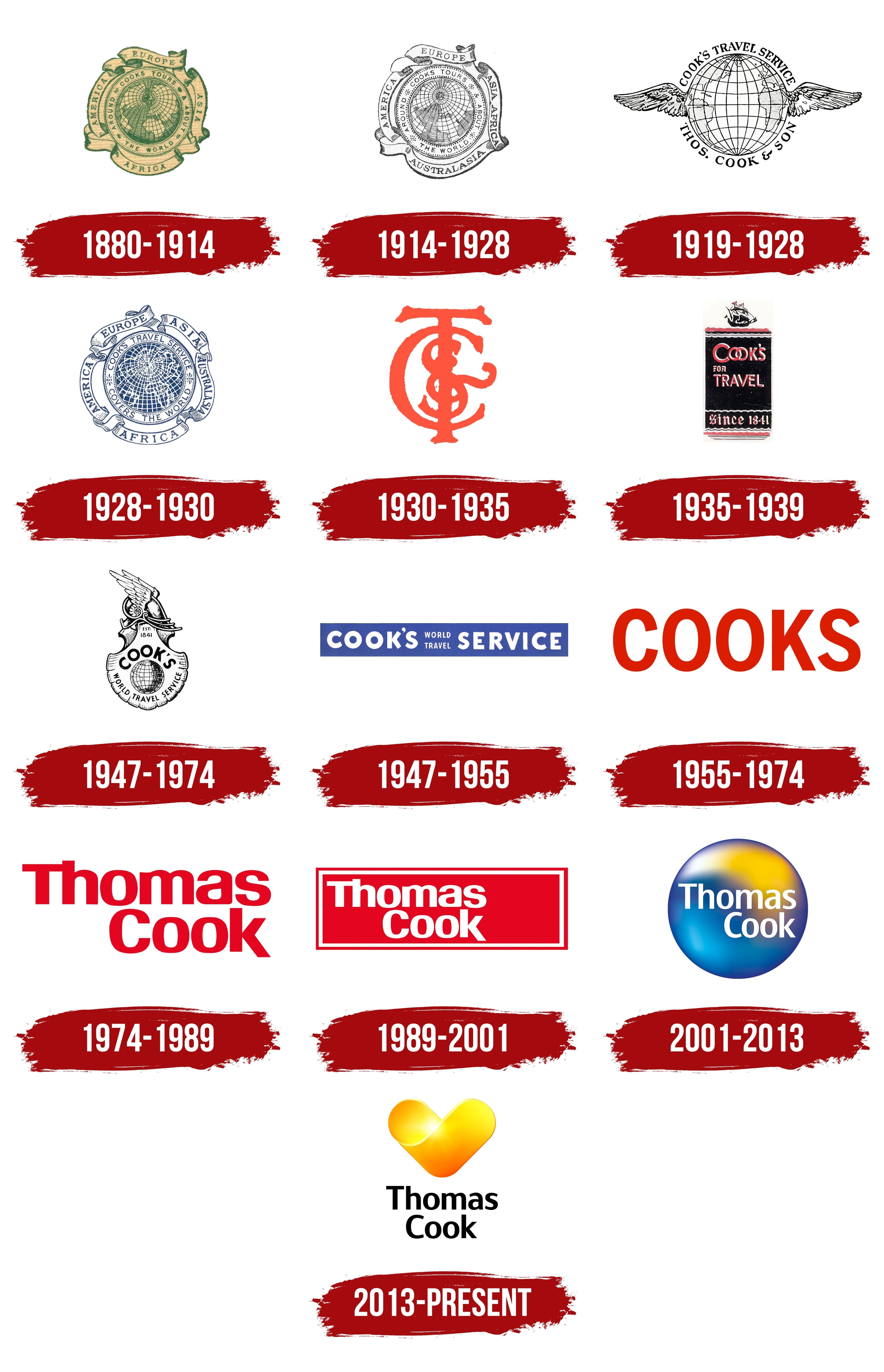
The Thomas Cook emblem is renowned as the visual identity of the world’s first travel company. This legendary logo will be remembered for centuries, making it a must-know for all travel enthusiasts. By the late 19th century, significant branding events were already taking place, leveraging the progressive capabilities of graphics, typography, and timeless imagery.
The emblem served as an advertising tool: it was used as printed material distributed to interested parties or appeared on brochure covers. The core element of the logo is a globe. It is depicted from above with a slight tilt as if showing a real view of the planet with an imaginary axis. Fragments of four continents are represented, with their names inscribed on a ribbon that functions as an ornate frame:
- “Europe” (at the top);
- “Africa” (at the bottom);
- “America” (on the left);
- “Asia” (on the right).
The inscriptions are in a thin, elegant font with wide letter spacing, ensuring good legibility even in small formats. All letters are uppercase and feature old English-style serifs. Closer to the center is a band with additional information, reading “Cooks Tours,” “Around,” “About,” and “The World.” The words in the final phrase are separated by a typographic asterisk, a six-pointed star resembling a snowflake.
The circular ribbons, styled like scrolls, uphold the official tone of the visual identity, and the details presented on them emphasize the global nature of the company’s services. When the travel agency was founded, the logo’s design was considered innovative, as it encapsulated knowledge of every corner of the world, a thirst for travel, and a love for it. The green color highlights a close connection with the environment, which can be explored by contacting the British company Thomas Cook.
1914 – 1928
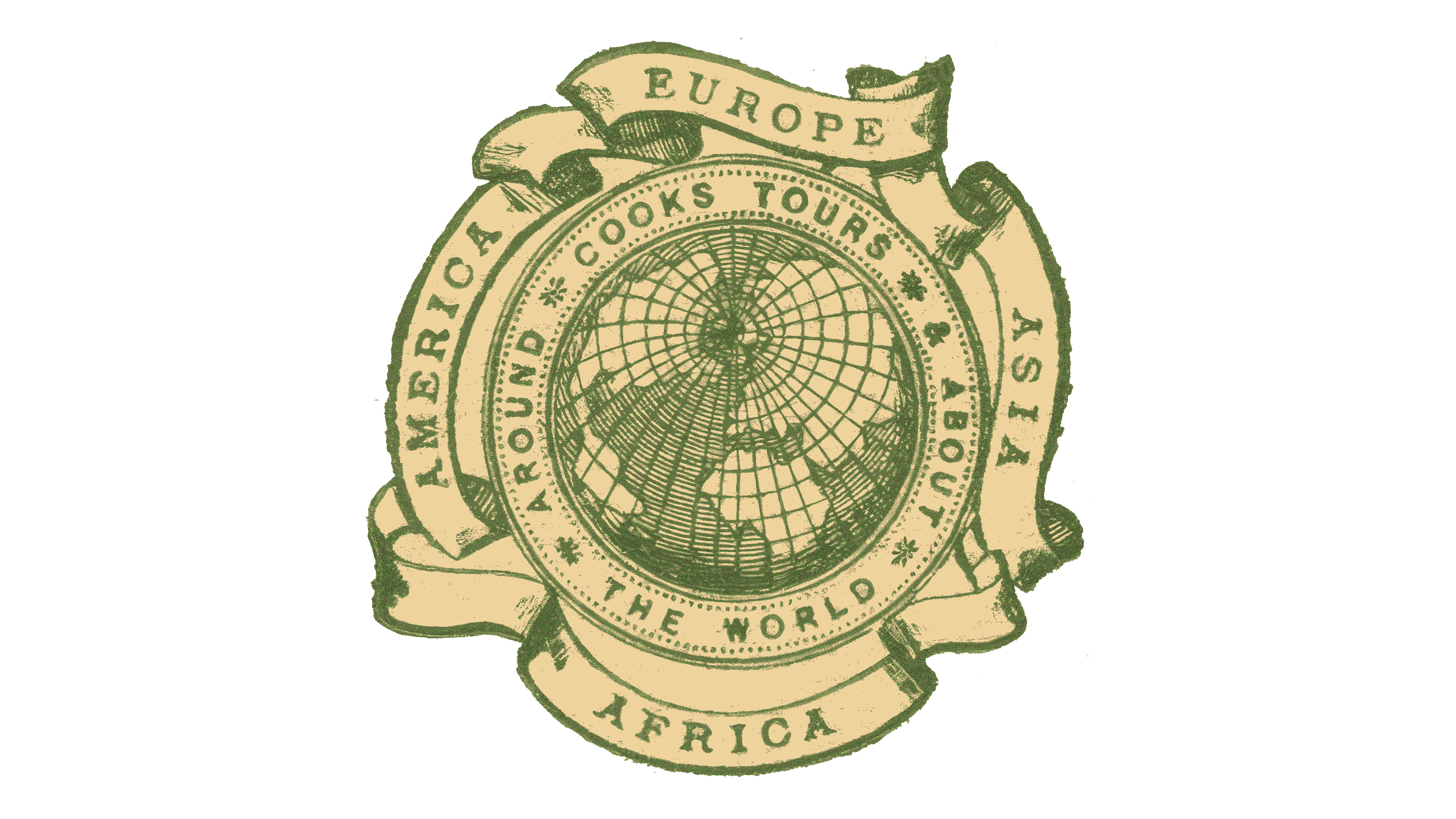
After many years, the travel company decided to update its logo to reflect its expanded services. At that time, it had opened travel routes to nearly all possible destinations, providing quality service in the most interesting spots on the planet.
The result of this active development was the modernization of the emblem, with the addition of another continent to the list of serviced regions. Now, the inscriptions “Asia” and “Africa” are combined and placed on the right side, while a new line with the word “Australia” appears at the bottom. However, the designers didn’t add a new ribbon; the remaining four were slightly rearranged. They were shifted to the side, creating an impression of chaos and disarray that negatively affected the brand’s visual perception.
The font remained the same: light, thin, and legible. All letters are uppercase and feature elegant serifs. However, the color scheme changed to monochrome. The combination of black and white shifted to a lighter palette, giving the Thomas Cook logo a welcoming appearance. Only the contour lines are in black, while the background is white with a subtle blue gradient.
1919 – 1928
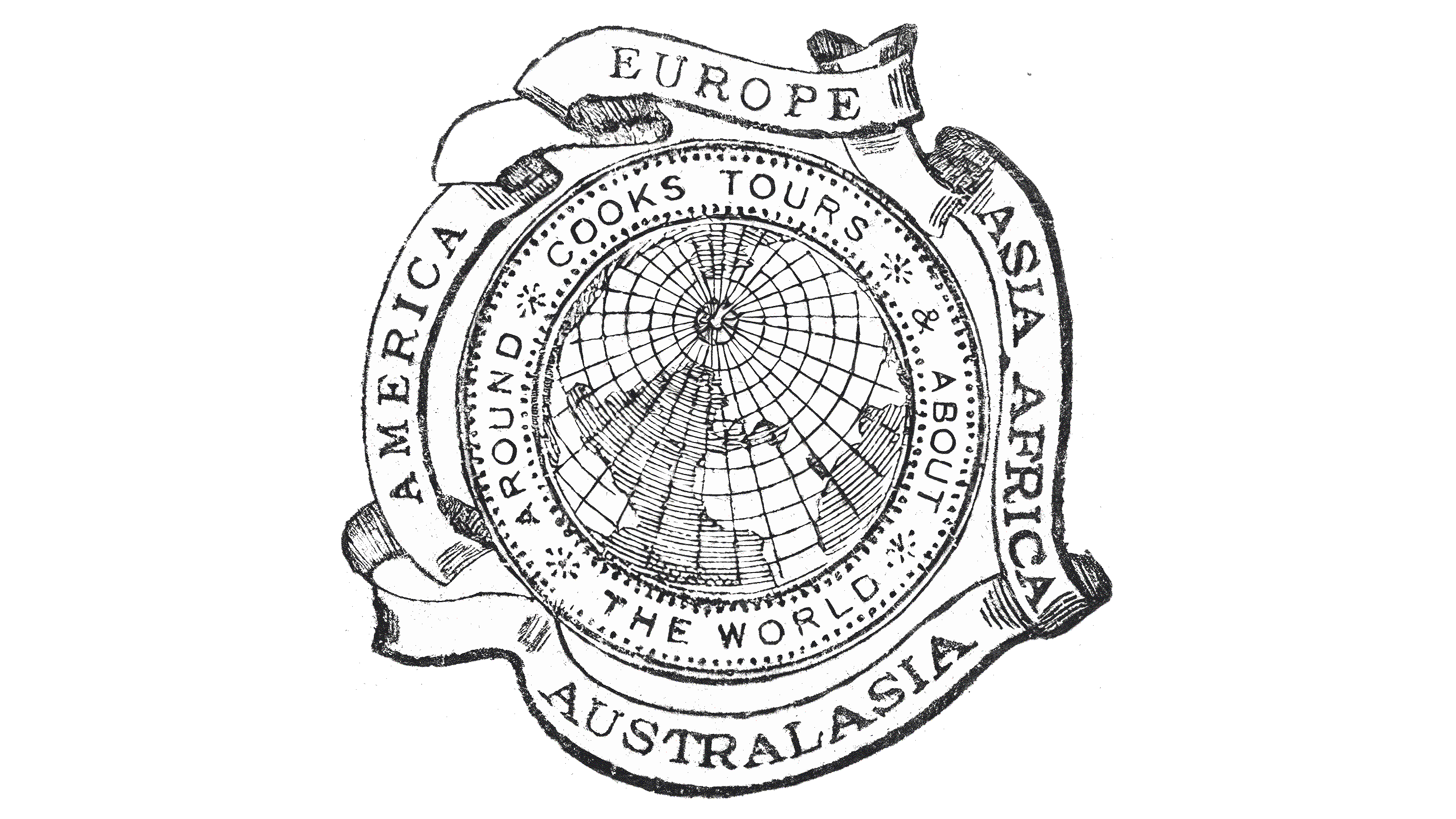
The Thomas Cook logo introduced at this time resembles an elegant badge featuring a globe at its center. The planet is now depicted from the side, showing North America, South America, Eurasia, and Africa. Australia is absent, as it is geographically located on the other side of the Earth and is only present here hypothetically. This emblem hints at the extensive reach of travel routes and the possibility of visiting any point on the globe. The logo prominently features large, wide-spanning wings, symbolizing the ability to reach desired destinations quickly, easily, and comfortably.
The white-silver wings are on either side of the globe, marked with meridians and parallels. All the lines are thin, elegant, and unobtrusive, giving the impression that clients are soaring in the sky with happiness. The wings are so harmoniously integrated with the image of the globe that the transition between them is almost seamless. This suggests the ease of travel arrangements and the ability to embark on a journey to any corner of the world based on the travelers’ desires. And Thomas Cook will help them get there, as indicated by the inscription:
- At the top, the new name “Cook’s Travel Service” is presented in an arched format;
- Below is the continuation of “Thos. Cook & Son,” which is also in an arc.
Both lines are set in the same serif font. The smooth, semi-bold glyphs create a sense of lightness and ease. To further reinforce this feeling for clients, the designers positioned the text away from the Earth, making it feel weightless and airy. The lower phrase has more space between the letters, as it is shorter than the top line. This was necessary to create a tight ring around the globe.
1928 – 1930
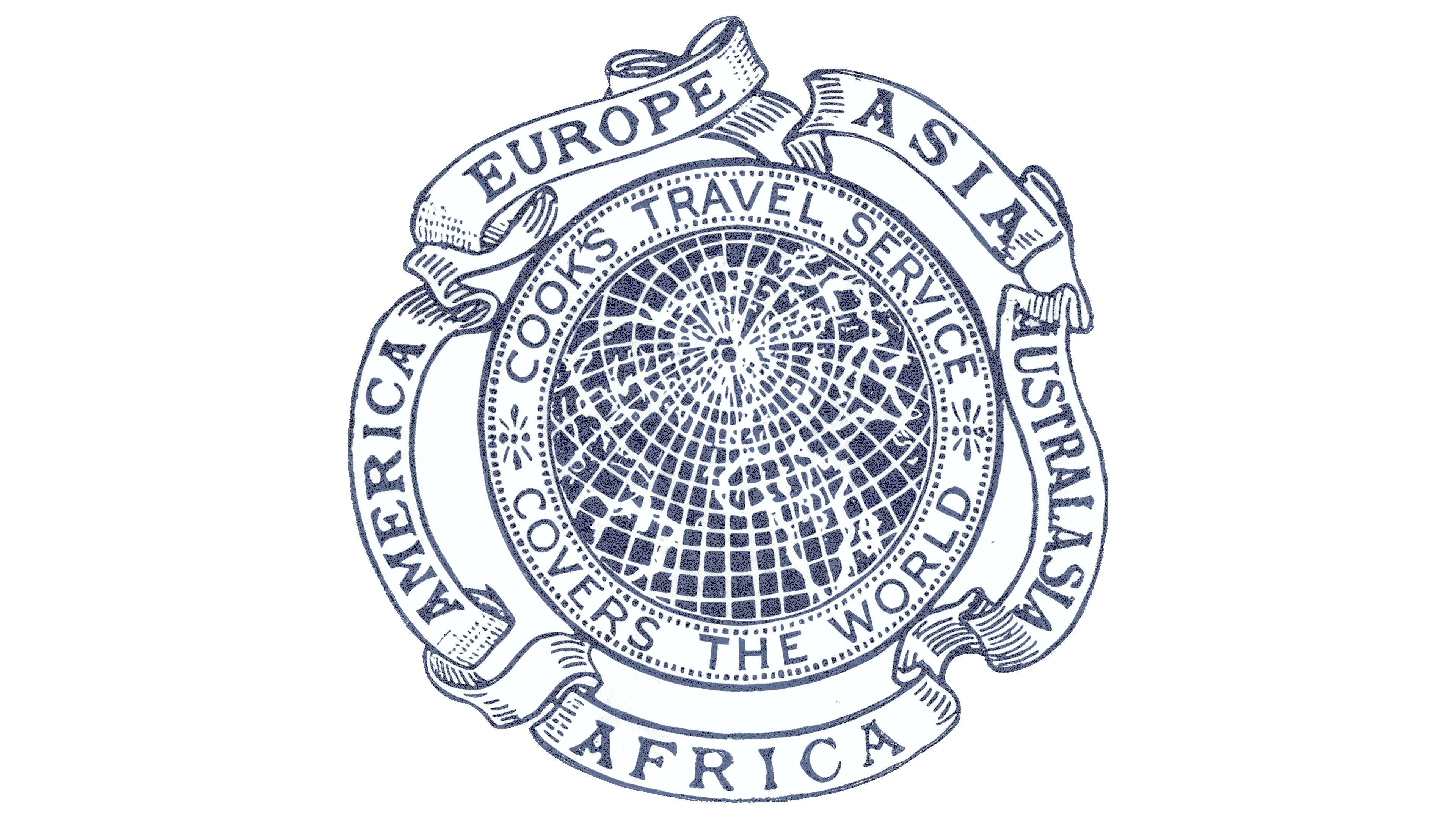
The emblem of this period aligns in design with one of the older versions of Thomas Cook’s visual identity as a travel operator. However, it includes several changes that have contributed to the company’s increased popularity and service demand.
- The logo firmly establishes the new name: Cook’s Travel Service. It has taken the top spot, replacing the phrase “Cooks Tours.”
- The chaotic (at least visually) cluster of the words “Around,” “About,” and “The World” has been organized. Now, a clear inscription “Covers the World” is placed there.
- A fifth ribbon has appeared on the right, where the word “Australia,” previously at the bottom, is now positioned separately. Designers allocated individual space for each continent.
- The font in the border inscriptions, which form a symbolic frame, has changed. The letters have adopted an Old English style with curved crossbars and decorative serifs.
- The color palette has been updated: Black outlines have turned white, highlighting the continents against a dark blue background. The font is also blue.
These changes hint at the company’s ability to encompass the world, offering much more than standard package tours. Its mission is to change perceptions of the surrounding space, which might seem entirely known. Thus, the planet remains a key element of the travel brand’s visual identity.
This modernization clarified the Thomas Cook logo, making it look professional and sophisticated, almost like an emblem of a scientific or geographical society. The white curling ribbon resembles a scroll, adding a sense of solemnity.
1930 – 1935

The era of the legendary globe in the brand identity has ended: minimalism, classic elements, and text prevail. This has caused some confusion in individual branding, as the logo now resembles a vignette. The travel company shortened the name “Thomas Cook and Son” to the abbreviation “TC&S,” presenting it in a distinctive form and making the emblem incredibly simple.
The monogram occupies all the space, with no other graphic or verbal elements nearby. The glyphs are stretched vertically and overlapped, merging at their intersection points, making it impossible to determine which letter comes first and which comes last. Judging by that, they differ only in size; the inscription reads correctly: the tallest letter is “T,” and the smallest is “S.”
The font chosen for the emblem is bold, antique, and soft, vaguely reminiscent of Old English, as seen in the ornate serifs. The curves, smooth lines, and rounded shapes create a prim atmosphere typical of retro companies. The deep historical influence is intentional, as the travel agency, with its broad range of services, aims to demonstrate that it has long existed and knows every place on the planet where one can have a wonderful vacation.
The vibrant color palette conveys joy, positivity, and happiness. Orange symbolizes warmth, energy, and optimism. The tour operator wants to show that it puts people in good moods and inspires them to embark on new journeys. The world has many beautiful sights, and Thomas Cook helps people reach them.
1935 – 1939
The travel agency abandoned the monogram and adopted a thematic design for the logo, which appears more professional than the previous emblem. The result of this modernization is an emblem featuring a ship, a slogan, and the year the company was founded.
- The sailing ship occupies the highest point at the top edge of a vertical rectangle. It sits on multicolored wavy lines representing waves.
- The inscription “Cook’s For Travel” is divided into three lines: two large and one barely noticeable (in the middle row). The name is set in a geometric font with capital letters.
- The brand’s founding date is placed at the bottom of the rectangle, separated by a wavy line. This inscription uses ornate glyphs in a retro style to emphasize the travel agency’s long history.
The slogan introduces potential customers to the tour operator’s field of activity, highlights the wide range of services, and promotes the tour operator. In other words, the logo serves as both an advertising tool and a means of conveying the company’s reliability, as it once offered tours by land, air, and sea. The sailing ship effectively highlights this, connecting well with the mission of the famous namesake, explorer and navigator Cook, who circumnavigated the Earth three times.
The inscription in the center is set in bold type. For a touch of intrigue, the letters “OO” are connected to form what visually appears as a link in an anchor chain. The letter spacing in the slogan is so tight that the glyphs almost touch, with the apostrophe joined to the “S.” The letters are of particular design interest: they feature a white outline that gives them a three-dimensional effect. The lower line, displaying the year the agency was founded, is rendered in a Gothic style with intricate strokes and elegant, sharp points.
The Thomas Cook logo’s contrasting color palette makes it bright and attention-grabbing for tourists. The black background sharply highlights the pastel pink shade, complemented by white stripes. This combination is timeless and universal, embodying elegance, dreaminess, and tranquility. It resembles the play of light on water during sunrise or sunset.
1947 – 1974
During this period, the globe returned to the identity of the world’s first tour operator, symbolizing global service coverage and accessibility to every corner of the planet. The Earth is placed in the center of a scallop shell and drawn with a thin outline: black lines stand out clearly against a white background. Dark shading on the right side emphasizes the left, unshaded side of the globe. Two inscriptions surround the globe:
- Cook (this word is elongated and arched, with the ends curving downward);
- World Travel Service (the phrase forms an upward-facing arc).
The text seems to squeeze the planet into a smaller space, demonstrating that the travel agency has no barriers and can take travelers to any place of interest on favorable terms. The winged helmet of Hermes tops the emblem of the god of commerce, travel, luck, and wealth. With this attribute, the composition of the seashell appears noble and refined.
Beneath the helmet is the company’s founding date EST. 1841.” This mark is set in a small, thin, sans-serif font. The other inscriptions are in bold and semi-bold letters at the top and bottom. The emblem’s color scheme is monochromatic, adding simplicity and classicism. Black-and-white combinations are most common in graphics and typography. It reflects the tour operator’s commitment to tradition and showcases its age, experience, and professionalism.
1947 – 1955

Creativity gave way to utility, leading the Thomas Cook logo to shed its imagery in favor of text elements. The logo now takes the form of a narrow, horizontally stretched rectangle. While it may not appear intriguing, the inscriptions within it are:
- Divided into three blocks,
- Set in a playful font,
- Crafted with thoughtful content.
The first part of the text includes just one word, “Cook’s.” It is rendered in large, extra-bold, grotesque, and slightly childlike letters. This impression comes from the exaggerated roundness of the “O,” the disproportionate “K,” and the wide spacing between the glyphs.
The central element is the phrase “World Travel,” set in small, uppercase letters. Each word occupies a specific position and is arranged on two levels. The small letters allow both parts to fit into the limited space while maintaining readability.
The third segment of the rectangle is entirely dedicated to the word “Service.” It is written in the same font as the first word in the emblem. With a slightly playful feel, the smooth letters create an informal, friendly atmosphere that aims to attract more clients.
Overall, all three parts are united by a common style that effectively engages travelers. Fonts are important marketing tools that convey the right messages and elicit positive emotions from clients. Visually, the letters resemble bubble-like glyphs often used in children’s content.
Thomas Cook’s color palette is welcoming, as the combination of blue and white symbolizes stability, calm, reliability, and purity. These colors also carry significant meanings: Blue represents water and the sky, through which the tour operator transports travelers, while white symbolizes unexplored places. This emblem appears clean, light, neat, and unpretentious, and despite the absence of images, it impresses with its warmth.
1955 – 1974

This period marks the most minimalist yet professional and powerful logo. With a thoughtful combination of color and form, it brings to life the concept of traveling in comfort, offering everything from accommodations to cuisine. Travelers could choose from various packages, regardless of destination, as the agency had extended its services across nearly the entire planet by this time. For this reason, the globe was omitted from the visual identity, as it was already implied.
The core of the logo is the text, unrestricted by any boundaries, a symbol of the company’s global reach and the complete freedom of choice for its clients. The text is rendered in uppercase letters with slightly condensed, sans-serif characters. The absence of serifs further suggests blurred borders and the accessibility of every corner of the world.
The entire new emblem is encapsulated in the single word “Cook.” No additional inscriptions or graphic elements indicate the company’s business line. The thick, smooth lines appear solid and unyielding, shaping the image of a reliable tour operator ready to organize trips to any part of the Earth. The logo exudes confidence, embodied in the even strokes and the color choice, with red symbolizing passion, determination, and leadership.
The emblem looks stylish in this new vibrant color. The bold, eye-catching glyphs create an atmosphere of determination, drawing tourists’ attention worldwide. Red is considered a totemic color in almost every culture. It inspires activity, positive emotions, passion, and genuine loyalty to the brand for well-organized vacations.
The slightly condensed font adds a unique charm to the Thomas Cook logo, with the tall, elongated, sans-serif glyphs appearing elegant. The optimal combination of straight edges and curves gives the textual emblem a remarkable harmony, making the single word feel like a complete element. Only the “K” has angles, while the other letters feature smooth curves.
1974 – 1989

The Thomas Cook emblem received a new textual element after returning to red. However, it did not become longer, as the font size was reduced. The company’s full name, including its founder’s first and last name, was used in the text. As a result, the wordmark expanded, now displaying a two-level inscription against a white background. The lines are right-aligned, so the position of the capital letters at the beginning of the words does not match: in the lower line, the capital letter is further to the right.
For the new logo, the designers chose a strict font. As before, it is sans-serif, giving the visual identity a modern look, with the smoothness adding simplicity and ease to the emblem. It is also characterized by:
- Rounded corners,
- Clear edges,
- Connected symbols.
Regarding the last point, it’s immediately clear that this refers to the connection between the “T” and “h.” In other instances, there is minimal spacing between the symbols. The bright background prevents them from merging, making the deep red letters’ boundaries visible. This color symbolizes the emotional impact of experiences gained while traveling to a desired destination.
The concise Thomas Cook logo strongly conveys a comfortable atmosphere, where only what is necessary is present and unnecessary elements are omitted, just as travelers bring only the essentials on a trip. In this context, the most essential element is the travel agency, without which a good journey is impossible. This approach demonstrates the company’s position as the number one tour operator. The palette choice further confirms this, as red is the color of leadership.
1989 – 2001

During this period, something improbable happened with the Thomas Cook brand identity:
- The company adopted a text-based logo that, according to many, is entirely unsuitable for the tourism industry.
- It made the logo heavier by adding a bright, solid-colored background.
- It enhanced the modest inscription with a double border.
The fiery red mark became more striking because the designers chose a scarlet shade for the background, usually associated with blood and unrelated to tourism. While it’s clear that red is a color of leadership, it disrupts the harmony of the renowned operator’s emblem and almost seems to signal danger. This is further emphasized by its brick-like shape, a horizontally stretched rectangle. As is widely known, a brick, according to traffic regulations, is a prohibition sign. For most modern people, it evokes a sense of caution and unease.
Thus, all attention is focused on the name. It’s rendered in the same style as before, featuring connected “T” and “h,” a rounded “m,” an “a” without a tail, and a “k” with an elegantly extended leg. The inscription spans two lines, which are right-aligned, making them appear uneven as if they are slightly shifted relative to each other. The glyphs are colored white, allowing them to stand out against the aggressive red background, as the calm white effectively balances the expressive red.
A double border runs around the perimeter of the rectangle, symbolizing protection for clients from any external problems. The tour operator offers various packages, including comprehensive ones that cover everything. However, these lines come across as a restriction for tourists. In other words, this logo lacks professionalism, concept, and thematic immersion, failing to convey travel and leisure effectively.
2001 – 2013
Crossing the millennium threshold, the travel company aligned with the new era and moved away from the text-based logo. This move aimed to expand its customer base, recognizing that younger generations place a high value on emblems and trademarks and pay close attention to them. Consequently, the tour operator aimed to engage more actively with modern travelers, prioritizing the variety of destinations over mere comfort.
As a result of this conceptual shift, the agency redesigned its logo, removing the aggressively red brick from signs, brochures, and leaflets. To soften the atmosphere, inspire trust, and demonstrate the accessibility of any travel destination, it chose a circle for its identity because it:
- Symbolizes the globe,
- Conveys friendliness,
- Indicates a willingness to compromise,
- Suggests a desire to avoid sharp edges in service,
- Emphasizes safety,
- Highlights comprehensive care,
- Represents a circle of interests.
Overall, the emblem achieved the necessary softness for such a service industry, helping retain clients and maintain the brand’s reputation. The visual identity became more professional and thematic. The company name was placed at the circle’s center, making it appear much more harmonious despite the previous rightward shift of the second word in the inscription. This effect now looks expressive, conveying the dynamic nature inherent in the name, connected with the founder and his famous seafaring namesake.
The designers aimed to evoke the themes of water and sky, and they succeeded, especially in the way the sunlight concentrated beneath the blue gradient. The palette is subtle yet impressive on the edge of reality and illusion, inviting you to dive headfirst into a vacation. The Thomas Cook logo is infused with a sense of nirvana, supported by soft color transitions, golden glow, white glyphs, staggered lines, and a thin dark blue border along the circle.
The combination of blue and yellow signifies timeless imperial classicism, as these colors are traditionally associated with royalty. They work beautifully together, creating a magical quality that imbues the identity with an air of mystery. The warm gold radiates like the sun, while the cool blue refreshes like seawater and astonishes with the purity of a cloudless sky. The absence of serifs in the white inscription reinforces the limitless possibilities the world’s first tour operator offers.
2013 – today

The travel company delved into warmth and sunny emotions, settling on a gold logo conveying deep affection for travelers worldwide. Although the blue circle disappeared, this did not negatively impact the visual identity. On the contrary, it took on an iconic form, expressing immense gratitude to past and future clients. To achieve this, the designers gave the sun’s rays a distinct shape, making it resemble:
- A downward-pointing arrow,
- A golden (symbolically kind) heart,
- A neat checkmark as a reminder.
In this way, the brand aimed to showcase maximum friendliness and warmth toward its clients. The creator of the updated logo introduced a unique symbol with multiple meanings. It encapsulates positive emotions, warmth, and dedication. The gradient, enhanced with bright highlights, makes the heart appear three-dimensional and glowing.
The emblem contains only one drawn element, a wide ribbon that curves in the middle, forming a heart shape. All three ends are rounded, giving it a positive impression despite its resemblance to an arrow pointing to the inscription below.
The travel agency’s name is presented there. It is split into two levels and set in a classic black font. The smooth, sans-serif letters add a sense of formality to the logo, hinting at a responsible approach to work. The balanced combination of rounded and straight strokes in the glyphs reflects the tour operator’s reliability and commitment to providing comfortable travel and vacations anywhere in the world.
The strict text, complemented by the warmth of the heart, perfectly aligns with the travel company’s concept. They demonstrate seriousness, friendliness, professionalism, approachability, safety, and kindness. The lines are centered so that the arrow’s tip points directly to the agency’s name, emphasizing its ability to deliver on all these promises.