The UD logo clearly reflects the rich and successful heritage of the Japanese company, known for its reliable specialty equipment, premium-class trucks, and buses. Each emblem element serves as a historical marker, commemorating what has led the brand to success.
UD: Brand overview
On December 1, 1935, Kenzo Adachi established Nihon Diesel Industries, Ltd. in Japan, marking the beginning of UD Trucks’ history. Adachi, a professional engineer, was motivated to develop dependable and effective diesel engines for commercial use. Japan was modernizing quickly, creating a great need for cutting-edge technology.
Diesel engine development and production for various industrial applications occupied the company’s early years. Adachi and his engineering team aimed to produce engines that would be both efficient and high quality, comparable to those made in other countries.
1938, the company succeeded with the ND1, its first proprietary diesel engine. This engine demonstrated the company’s technical prowess and potential, marking a significant turning point in its history.
Like many other Japanese businesses, Nihon Diesel Industries was compelled to focus its production on military requirements during World War II. However, after the war, the company swiftly resumed producing goods for civilian use.
The business significantly advanced in its growth by manufacturing full-scale vehicles in 1950. UD, an acronym for “Uniform Diesel,” was the first truck made available to the public. The company’s dedication to producing dependable and widely used diesel engines and vehicles was reflected in its name.
The company experienced remarkable expansion in the 1950s and 1960s. Japan’s economy was booming then, and the need for trucks to move goods and materials sharply increased. The trucks quickly gained a reputation for their dependability and efficiency.
In 1960, the business renamed itself Nissan Diesel Motor Co., Ltd., highlighting its strong relationship with Nissan Motor Company. This partnership allowed the company to penetrate new markets and increase its manufacturing capacity.
In the 1970s, the company began to enter foreign markets. Trucks started to be exported to various countries, primarily in the Middle East and Southeast Asia. Additionally, the business began to build a network of dealerships and offices abroad.
Introduced in 1975, the UD Engine RF8 series became a legendary symbol of efficiency and dependability. This engine strengthened the company’s position in the market and was utilized in numerous truck models.
The 1980s were a time of technological progress for the company. New engine management systems were created and implemented, improving performance and reducing harmful emissions. Additionally, the company started to enhance truck cabin design, emphasizing driver comfort.
Throughout the 1990s, the business continued expanding its global footprint. Opening new manufacturing facilities in several countries made better services available to local markets possible. The company also began actively working during this time to develop more environmentally friendly engines, aiming to lessen the environmental impact of its products.
The company’s ownership structure saw major changes during the 2000s. In 2006, the Volvo Group acquired a majority stake in Nissan Diesel. This acquisition gave the business access to the Volvo Group’s global resources and technologies, creating new potential.
A significant change in the company’s history occurred in 2010 when it changed its name to UD Trucks Corporation. This shift reflected the company’s aim to emphasize its distinct character within the Volvo Group and return to its roots.
The 2010s saw the rapid advancement of new technologies. The company began developing electric and autonomous vehicles to meet the rising demand for efficient and eco-friendly transportation.
In 2019, the company unveiled the “Fujin & Raijin. Vision 2030” concept, outlining its future goals, including creating fully electric and autonomous trucks.
Another significant shift in the company’s history occurred in 2020 when it was announced that the Volvo Group and Isuzu Motors had agreed that Isuzu would take ownership of the manufacturer. This deal aimed to forge a strategic collaboration between the two businesses and provide fresh avenues for the company’s advancement.
Since the company’s founding, quality, dependability, and efficiency have always been prioritized—from the earliest diesel engines to today’s advanced vehicles. The brand’s history is characterized by technological advancement, flexibility in response to shifting market dynamics, and an unwavering pursuit of excellence in the truck transportation industry.
Meaning and History
What is UD?
This Japanese company, formerly known as Nissan Diesel, produces buses, heavy trucks, and other commercial vehicles. The corporation is known for creating reliable, durable vehicles that meet the requirements of global organizations and industries. It offers a wide range of products, such as buses and special-purpose vehicles, as well as light, medium, and heavy-duty truck models. The company’s innovative designs, excellence, and commitment to customer satisfaction have earned it recognition and helped it achieve success and a strong presence in markets worldwide.
1935 – 1999
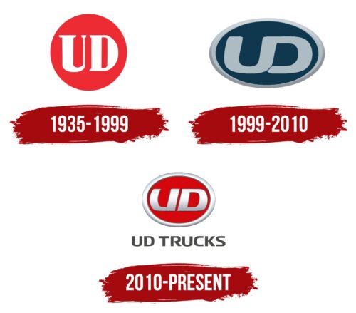
Initially, the Japanese company focused on various heavy-duty vehicles, unified by their engine type. They always used diesel engines, making this the defining factor influencing the branding. The name initially included the full word “Diesel,” later shortened to the first letter, “D.” This letter was incorporated into the logo as a reminder of the operating principle of the brand’s trucks and tractors. The “U” emerged from the successful U10 bus series, which brought the manufacturer wide recognition.
The abbreviation is presented within a large red circle with a solid fill and no border. This color symbolizes immense strength, persistence, unyielding energy, and determination—qualities typical of heavy-duty equipment, which handles most of the hard work in any sector, from municipal to construction. Additionally, it represents joy, freedom, courage, and celebration.
In this context, red also provides a strong contrasting background for the white lettering. The light glyphs stand out clearly on any display and catch the eye immediately. They are rendered in a bold, serif font. The serifs indicate the company’s commitment to strictly adhering to technical rules and standards in manufacturing equipment, a dedication that has propelled it to a leadership position.
1999 – 2010
The UD emblem of this period underwent significant changes and adopted a modern design. The result is a sign that is strict, light, and elegant at the same time. The logo’s unique feature is its exclusive shape, which is rarely seen among similar brands. It is soft, smooth, and yet professional, representing the manufacturer of trucks and traction machines originally. It exudes a wealth of positive energy through:
- Wide lines
- Extra-bold glyphs
- A solid frame
- Harmonious letter connections
- Calm colors
This symbol inspires trust, confirms reliability, and demonstrates the flawless operation of the produced equipment. Its key feature is the smooth transition between neighboring letters. To achieve this effect, designers connected the top parts of the “U” and “D” using a single stroke, resulting in a double glyph with a shared side. The sinuous line contains no angles, only rounded edges. This signifies attentiveness to clients, a desire to please them, and a commitment to maximizing the safety of the specialized equipment.
Additionally, the curve forms an infinity symbol, representing confidence in the future, the long lifespan of the vehicles, and their limitless capabilities. The letters are colored in a gray-blue hue, harmoniously matching the frame. The background is a dark blue ellipse, symbolizing strength, reliability, and stability.
The oval shape of the UD logo conveys a business-like atmosphere, strict adherence to technical standards, active implementation of innovations, and the use of proven technologies. It is a circle (wheel), easily adaptable to necessary requirements and quickly changing depending on external circumstances. It highlights the lettering, draws attention to the brand, and signals the durability of the machines. The frame has a three-dimensional effect.
2010 – today
In this version, the UD emblem lost its three-dimensional aspect. However, it still appears convex, especially evident in the chrome letters set against a red background. The dark gray outline adds shadows, giving a raised appearance. The glyphs are separated and lack a shared part, which makes the text clear but removes its deeper symbolism, turning it into a textual element rather than a graphic one.
As before, the letters are massive, extra-bold, and blocky. This time, designers emphasized the similarity between the “U” and “D,” making them look like mirror images of each other, except for the absence of the upper stroke in the “U.” The glyphs are gray with a gradient, resembling light reflections on metal, creating the impression of smooth and shiny letters.
The oval has changed significantly: it is now less elongated and closer to a circle. The red remains but has acquired a richer shade, making the chrome abbreviation stand out prominently. The frame is also silver, with dark shadows and bright highlights.
Below is the brand’s full name, which is dark gray. The text is in an uppercase sans-serif font, symbolizing closeness to the customers. The balanced combination of rounded and angular shapes enhances readability and adds uniqueness, as the “R” has an unusual gap between its left and right parts. The “S” also looks distinctive with its narrow ends and wide middle.


