


 Isuzu Logo PNG
Stylish, quiet, and safe cars embody the Isuzu logo. The emblem suggests modern design and powerful engines. Their impressive size helps them overcome obstacles with ease.
Meaning and History
Isuzu is Japan’s first car manufacturer. It began in 1916 as a partnership between Tokyo Gas and Electric Industrial Company and Tokyo Ishikawajima Shipbuilding and Engineering Co., Ltd. Their goal was a joint project: producing passenger cars.
In 1923, the country was shaken by the strongest earthquake, which destroyed much of its infrastructure. Heavy vehicles were needed to rebuild the cities. American firms Ford and GM supplied them. But the state wanted to develop domestic production, so a special committee recommended starting the production of a “people’s car.” They named it Isuzu after the river that flows past the Grand Shrine of Ise. Nobody wanted to implement this plan: some companies assessed their strengths and realized they could not cope, while others feared the car would be uncompetitive.
The first Isuzu truck entered the market in 1934. At the same time, its manufacturer, Ishikawajima Automotive Works, renamed itself Isuzu, underscoring its commitment. Subsequently, the Japanese company underwent several mergers and restructured to focus on diesel engine manufacturing. In fact, from 1949 to 1953, it did just that. Its name was appropriate: Isuzu Motors Ltd. The company then returned to the automotive business with the Hillman Minx (licensed by the Rootes Group) and Bellel (the first self-developed model).
The company’s full name is Isuzu Jidōsha Kabushiki-Kaisha, and it has an allegorical translation: “fifty bells ringing in harmony and celebration.” Perhaps this refers to a local shrine – the Grand Shrine of Ise, located on the Isuzu River. The temple symbol in the form of hieroglyphs adorned the hoods of some cars in the second half of the 1900s. The modern logo looks much simpler: it contains only red English lettering.
What is Isuzu?
Isuzu is a Japanese company established in 1934 and named after the river that flows near the Ise Grand Shrine. Until 2002, it produced passenger cars, but now it focuses on manufacturing commercial vehicles and diesel engines. Its passenger buses and fire trucks are popular worldwide. Many famous brands, such as Opel, Renault, Chevrolet, and GMC, use Isuzu engines.
1916 – 1949
Historically, Isuzu trucks were created only in 1934. Moreover, the manufacturer did not protect its identity, so it had no visual symbols.
1949 – 1974
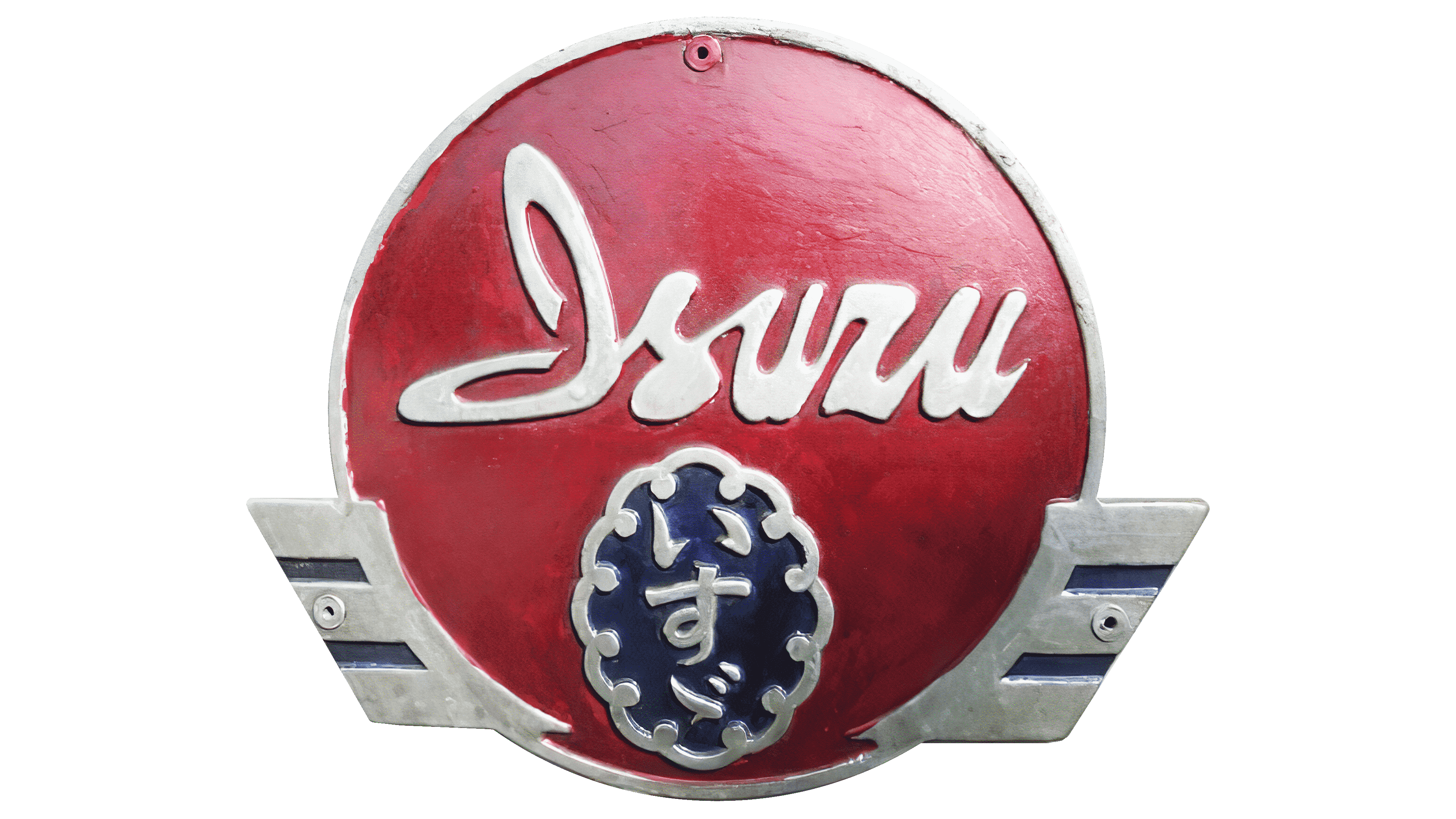
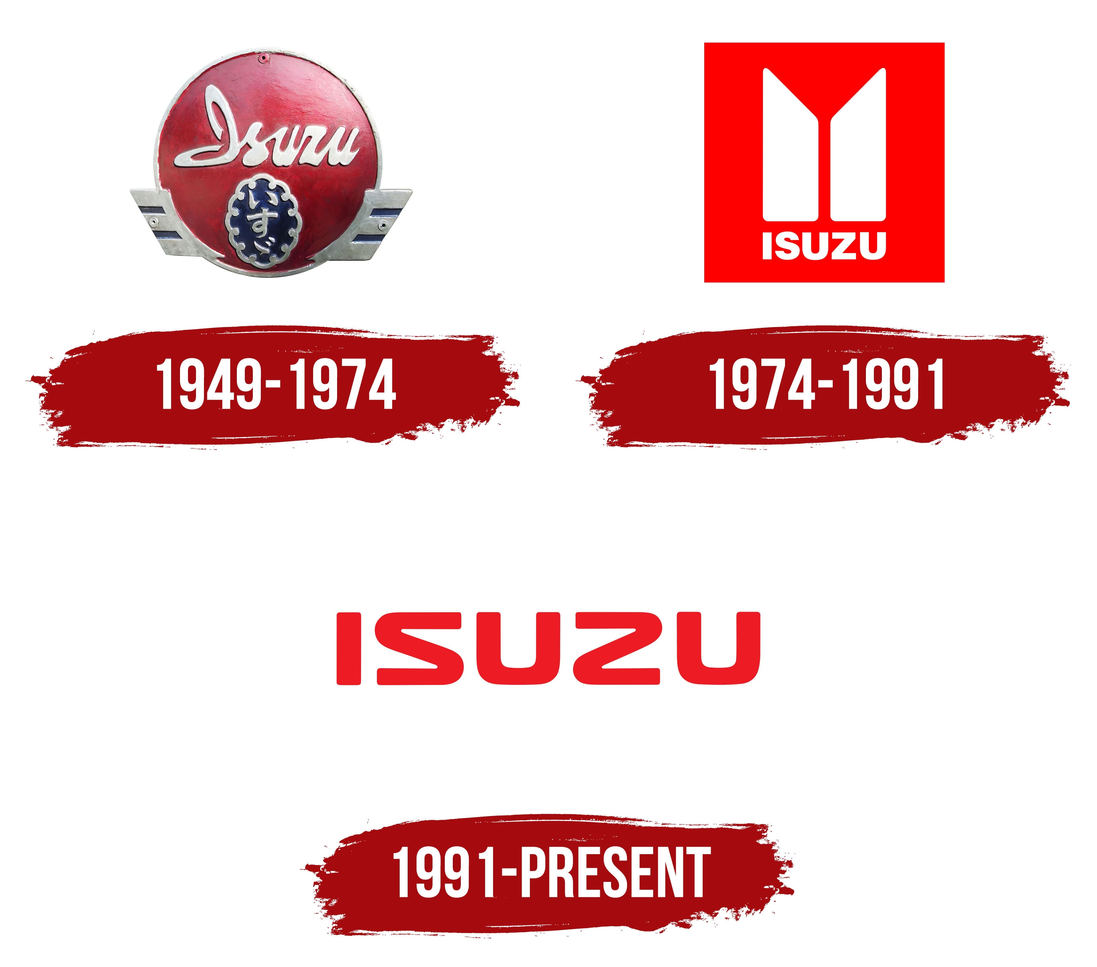
The first brand logo appeared after Isuzu Motors Ltd. entered the market. It emerged in 1949 through a series of mergers but did not begin producing cars until 1953. At that time, it used a multi-piece logo with a round red base. It contained a handwritten inscription “Isuzu” (above), the symbol of the Grand Shrine of Ise, the oldest shrine, and hieroglyphs (below). The Japanese written characters were inside a blue oval with a white knotted border. Small wings with three “feathers” lined the circle’s edges.
1974 – 1991

Changes to the company’s structure preceded the new logo’s creation. In 1971, Isuzu sold slightly less than half of its shares to GMC to access the American car market. In 1974, it introduced the Isuzu Gemini car, based on the GM T platform. Designers had to develop a new brand name, especially for it, because the old one was disproportionately narrow.
This is how a red square with the image of two white “pillars”, rectangular trapezoids directed with their sharp sides upwards, appeared. The internal geometric shapes mirrored each other and symbolized the brand’s development and its desire to keep up with the times. Slightly lower in the square was the white word “ISUZU.” This emblem adorned cars until the early 1990s.
1991 – today

The logo has been simplified to short red lettering. Now, the company uses only the text “ISUZU” on the tailgate, body, and radiator grilles. The letters are slightly flattened, with rounded ends. At the same time, “S” and “Z” are very similar, like mirror copies of each other.
Font and Colors

The old brand symbol adopted at the beginning of the collaboration with General Motors has several meanings. According to the official version, it graphically expresses the company’s growth. Others see it as the author’s interpretation of the quality mark. Some consider the two white “columns” a stylization of the first hieroglyph in the Japanese word Isuzu. It doesn’t matter anymore because the automaker now uses a text logo that doesn’t confuse.
When designers created the Isuzu wordmark, they built the letters from scratch. The result is stylish lettering with rounded corners. The “S” and “Z” share the same shape, just oriented differently. Based on the brand’s logo, Iconian Fonts’ typographers created a similar typeface called Usuzi.

Japan’s Sun Circle flag partly inspires the attention-grabbing red color. In local tradition, it symbolizes prosperity and peace.