 UL Solutions Logo PNG
Product safety verification involves testing technology, materials, and equipment for compliance with standards. These procedures help confirm product performance before market release. The UL Solutions logo represents a company that tests, certifies, and inspects products across various industries.
UL Solutions began in 1894. Engineer William Henry Merrill, a Massachusetts Institute of Technology graduate, founded a Chicago laboratory focused on testing fire and electrical safety. The first test was conducted on March 24, 1894. In 1903, the company developed the first standard, called Tin Clad Fire Doors. In 1904, UL introduced the UL mark. In 1905, the company launched the Label Service and began factory inspections.
In 1916, Merrill became the company’s first president. In 1918, during World War I, he headed the Fire Prevention Section of the U.S. War Industries Board. From the 1920s to the 1950s, the company expanded its testing scope. It began testing automobiles, household appliances, plastics, and building materials.
After World War II, the company strengthened its reputation as a leading developer of safety standards. In the 1980s, the company began expanding internationally. The company opened offices in Hong Kong, Singapore, and Taiwan.
In 2010, the company shifted its development strategy to focus on acquisitions and service diversification. From 2010 to 2024, UL acquired fifty-four organizations and strengthened its position in risk management and regulatory compliance. In 2012, the company restructured as a commercial corporation.
In 2021, the company was divided into three divisions. The new units became UL Research Institutes, UL Standards and Engagement, and UL Solutions. In April 2024, UL Solutions listed its shares on the New York Stock Exchange under the ticker ULS.
The company serves 80,000 clients and covers 35 industries. Operations are conducted in 110 countries. The company operates 140 laboratories.
Meaning and History
What is UL Solutions?
An international scientific organization based in the United States that operates in safety and quality and manages a network of 95 laboratories in 100 countries. Its main activities include testing, certification, inspection, and product audits, including electronics and medical devices. The company evaluates compliance with standards, verifies environmental claims, audits manufacturing processes, and provides software for regulatory compliance management. Its work covers electrical and fire safety, chemistry, water quality, food standards, and environmental protection.
1992 – 2012
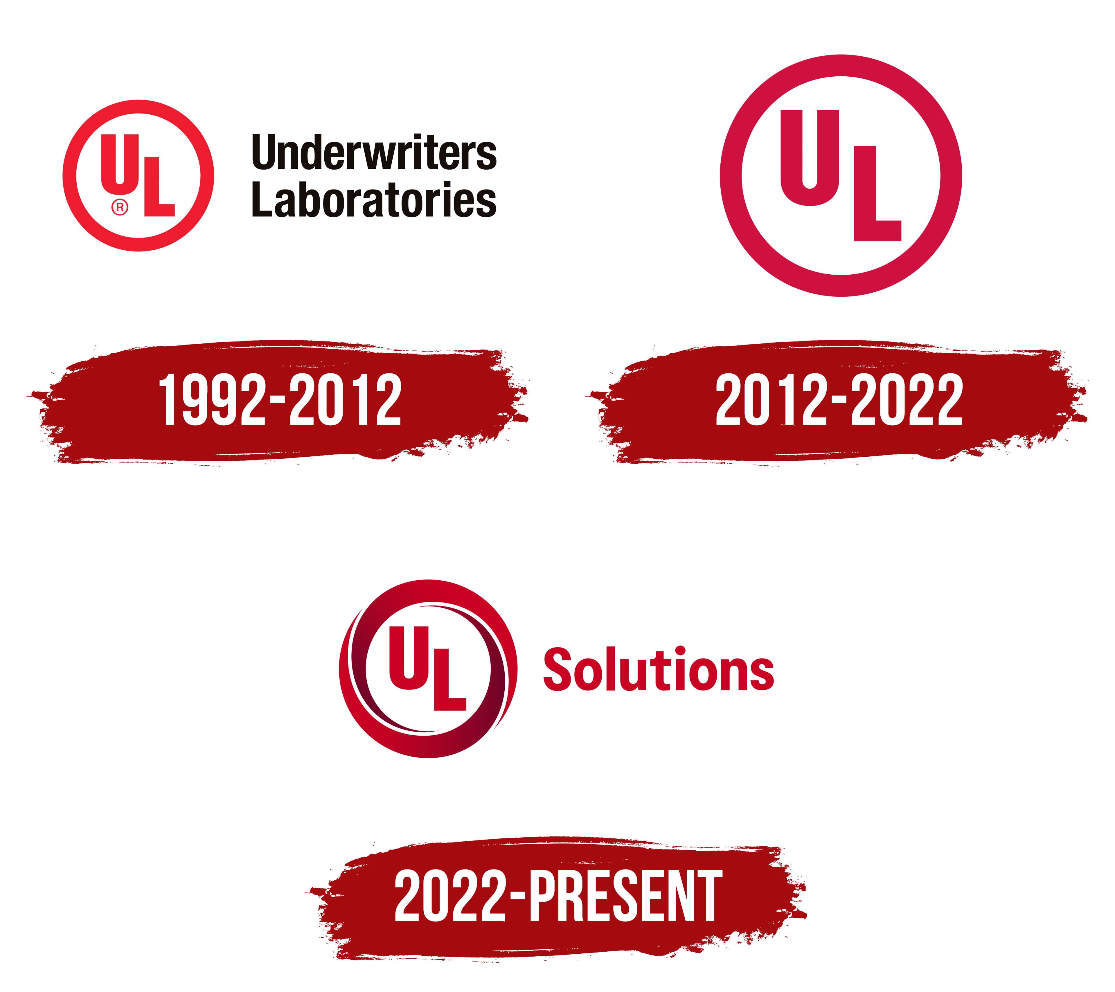
In September 1992, Underwriters Laboratories introduced a corporate logo combining the red UL emblem with the organization’s full name. Lippincott & Margulies developed the design. The circular symbol maintained a connection to the marks used on tested products. At the same time, two lines to the right spelled out the initials. The name Underwriters Laboratories refers to laboratories established with insurers’ support.
Its origins lie in fire insurance. In 1894, engineer William Henry Merrill opened a testing laboratory in Chicago with support from two fire insurance associations. Its first name, Underwriters’ Electrical Bureau, identified its work examining electrical risks. As its fire safety research expanded, the name Underwriters’ Laboratories appeared in 1901. In 1906, Merrill established the UL Label Service and introduced labels for products that had passed testing against safety requirements. These allowed buyers to identify tested equipment. The circular UL initials later became a certification mark and part of the corporate identity. Today, UL Solutions continues product testing, inspection, and certification.
The 1992 logo featured a thick red circle enclosing a white field. Red capital “U” and “L” letters appeared inside, slightly offset. The “U” sat above and to the left, with the “L” below and to the right. Their straight strokes had similar thicknesses. The “U” curved at the bottom, while the “L” ended in a rectangular horizontal foot. Black Underwriters lettering appeared on the upper line to the right, with Laboratories below. The heavy sans-serif lettering was based on Helvetica Condensed, with only the initial “U” and “L” capitalized.
2012 – 2022
In the next corporate version, UL dropped the full Underwriters Laboratories name. They also removed the ® symbol, leaving the red circle and two initials. UL alone was sufficient to identify the organization. The circular form continued in use throughout the 2010s.
A white field remained inside the thick ring. The capital “U” sat above and to the left of the “L,” which was offset slightly to the right. Both letters used upright sans-serif forms with heavy, even strokes comparable in thickness to the outer circle. The primary red was dark, taking on a crimson tint in some reproductions.
2022 – today
With the introduction of the UL Solutions name in June 2022, the company adopted a new corporate identifier while retaining the existing circular UL marks on certified products. Their purposes differed. A mark on a product confirmed compliance with established requirements, while the Solutions-lettered emblem represented the organization. The added word reflected the expansion beyond testing and certification into software products and advisory services.
At the same time, three names were established for organizations with a shared history. UL Solutions identified the commercial business, UL Research Institutes covered independent research, and UL Standards & Engagement represented standards development and engagement with the professional community. Within the shared system, red was assigned to UL Solutions, blue to UL Research Institutes, and green to UL Standards & Engagement.
The corporate logo retained red initials against a white field, with the “U” above and to the left of the “L.” The upright sans-serif letters have equally thick strokes. Two open, curved outlines inspired by a Möbius strip surround them instead of a uniform circle. The bands widen through the middle, taper to pointed ends, and are separated by thin white gaps. A red-to-burgundy transition strengthens the impression of a twisted ribbon.
Red Solutions lettering appears to the right of the symbol. A capital “S” begins the word, followed by lowercase letters. The bold, upright sans-serif style resembles Helvetica Rounded. The wordmark is shorter in height than the emblem, leaving the circular UL symbol dominant in the horizontal logo.