 Unicharm Logo PNG
Hygiene products are used at various stages of life, from childcare to supporting the elderly. These products include diapers, hygiene products, and daily care solutions. The Unicharm logo is associated with a Japanese company that manufactures personal hygiene and family care products.
Unicharm Corporation was founded in 1961 in Tokyo. Koichiro Takahara established it. The company began as a manufacturer of hygiene products. In its early years, it specialized in producing feminine sanitary pads. Gradually, the firm built a reputation as an innovator in personal hygiene. In 1974, the product range was expanded. That year, production of pet products began.
In 1981, the Moony baby diaper brand appeared. It became the company’s flagship and a market leader in Japan. In 1987, international expansion began. The first destination was the Taiwanese market. Later, the company entered South Korea, Thailand, and Indonesia.
By 1997, the company entered the Chinese market. Plants were built there, and products were adapted to local consumers. In 2001, the Lifree brand for elderly people was introduced. This was a response to population aging and strengthened the company’s position in the adult care category.
In 2006, Unicharm acquired Pet Pacific, an Australian company. In 2011, it purchased a Brazilian pet product manufacturer. In 2012, the organization launched diaper production in India. In 2015, it acquired DSG International Brazil for $ 1.2 billion.
In 2018, Unicharm announced plans to expand its production facilities in Southeast Asia. In 2020, the company reported large-scale investments in Asian markets. The total amount exceeded 100 billion yen.
The company operates in more than 80 countries. It maintains leadership in Asia across baby, feminine, and adult hygiene, as well as in pet products. Unicharm is listed on the Tokyo Stock Exchange and continues to expand its international presence. Particular focus is given to the rapidly growing markets of Asia and Latin America.
Meaning and History
What is Unicharm?
A Tokyo-based Japanese corporation that ranks among the world’s largest producers of personal hygiene products and pet care goods. It manufactures diapers, feminine hygiene products, wet wipes, pet food, and litter under the brands Moony, MamyPoko, Sofy, and Charm. The Peparlet division produces pet products. Main competitors include Kao, Procter & Gamble, and Kimberly-Clark.
1974 – 2001
The Unicharm name appeared in 1974 after the Japanese company shifted to personal hygiene products. The business began in 1961, when Keiichiro Takahara established Taisei Kako Co., Ltd. and began manufacturing construction materials made from wood wool and cement.
A trip to the United States introduced the company’s leader to a market segment that was still new in Japan. American supermarkets displayed feminine hygiene products in their main retail areas. Japanese pharmacies placed these products on shelves at the back of the store. The company began producing similar goods in 1963 and later made them its primary business.
The brand name was created for a line of women’s products. “Uni” combines the words “Universal,” “Unique,” and “United.” The name was based on the idea of original, world-class products for customers in different countries. “Charm” refers to attractiveness and is associated with comfort and appeal in daily life. The brands Sofy, Moony, MamyPoko, Lifree, and Silcot were developed under the new company name.
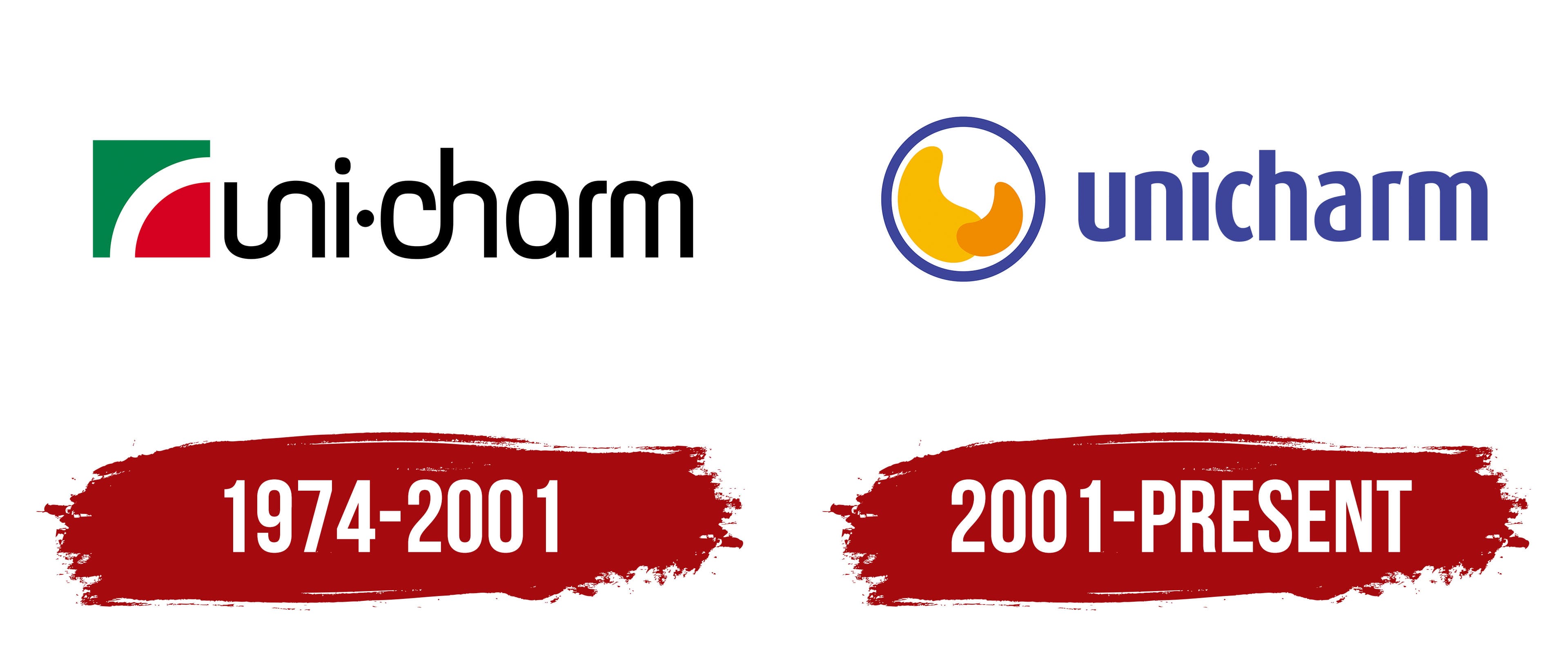
The first logo included an emblem and a wordmark. On the left was a square divided by a white arc into a green upper section and a red lower section. The black inscription “uni・charm” appeared on the right in rounded lowercase sans-serif letters. The forms resembled Helvetica Rounded, Varela Round, and Nunito. The letter combinations “un” and “ch” were connected in pairs, creating a compact wordmark. The logo accompanied the brand during its early years in the hygiene products market.
2001 – today
The Charm Ring emblem appeared for the company’s 40th anniversary. It was introduced in 2001 as part of an updated corporate identity. The logo has retained the same structure since that period.
A blue-outlined circle appears to the left of the name. Two warm-colored forms make up its interior. The large yellow shape resembles a drop, while the smaller orange form looks like a curved arc. Their partial overlap represents a connection between people involved in care and support. The company gives examples such as a mother and child, a caregiver and an older person, and an owner and pet. The outer circle represents protection and care.
Yellow is associated with energy and the joy of daily life. Orange represents warmth and vitality. Blue refers to scientific knowledge, technology, and trust. Together, the colors connect the theme of care with the technological foundation of the products.
The unicharm name appears on the right in lowercase blue letters. The rounded sans-serif typeface resembles Frutiger and Myriad. The letterforms complement the circle and the shapes inside it.
In 2001, the company updated its NOLA & DOLA system. Its principles later became part of The Unicharm Way, which combined management principles with corporate culture standards. New provisions were added to the system over time, while the Charm Ring emblem retained its original appearance.