


 Mammoth Mountain Logo PNG
The Mammoth Mountain logo symbolizes one of the leading ski resorts in the United States, where a premium level of service harmoniously combines with mountains perfectly suited for skiing. This resort is known for its excellent service, offering guests comfort and a variety of opportunities for outdoor activities. The emblem reflects the grandeur and scale of this unique place and nods to the area’s rich history, which has made it a favorite destination for thousands of skiers and snowboarders.
Mammoth Mountain’s ski history began in the 1930s in California’s eastern Sierra Nevada. Dave McCoy first visited Mammoth Lakes in 1935 while working for the Los Angeles Department of Water and Power. In 1938, he built a primitive lift on McGee Mountain from parts taken from an old Ford truck. A US Forest Service permit followed in 1941, but World War II delayed construction.
In 1946, McCoy opened the first permanent rope tow, powered by a gasoline engine. The first chairlift arrived in 1953, and by 1955 three lifts served about 10,000 visitors per season. A summit restaurant opened in 1960. In 1967, the resort installed North America’s first gondola lift, carrying up to 720 passengers per hour.
Snowmaking began in 1973 and extended the operating season. McCoy acquired nearby June Mountain in 1979. During the 1980s and 1990s, Mammoth added shops, restaurants, hotels, a visitor center in 1988, faster lifts, and a snowboard park in 1996. The main hotel building was renovated in 2011.
In 2005, McCoy sold a controlling stake to Starwood Capital for $365 million. Bear Mountain and Snow Summit joined the business in 2014. Aspen Skiing Company and KSL Capital Partners acquired Mammoth Resorts in 2017, leading to Alterra Mountain Company, and Mammoth joined Ikon Pass in 2018. Investment continued in 2020. By 2023, the resort operated 28 lifts across more than 3,500 skiable acres and averaged over 400 inches of snow annually.
Meaning and History
What is Mammoth Mountain?
This is a world-class ski resort that attracts both winter sports enthusiasts and year-round travelers. With over 3,500 acres of ski terrain, this volcanic resort offers one of the longest ski seasons in North America, suitable for skiers and snowboarders of all levels. The resort is known for its diverse terrain parks, abundant snowfall, and breathtaking natural views. In addition to skiing and snowboarding, activities such as cross-country skiing, snowmobiling, and scenic gondola rides are available. The resort transforms into a hub for mountain biking, hiking, and fishing in the summer. The nearby town of Mammoth Lakes complements the experience with its blend of modern amenities and a cozy alpine atmosphere, making this location appealing for year-round recreation.
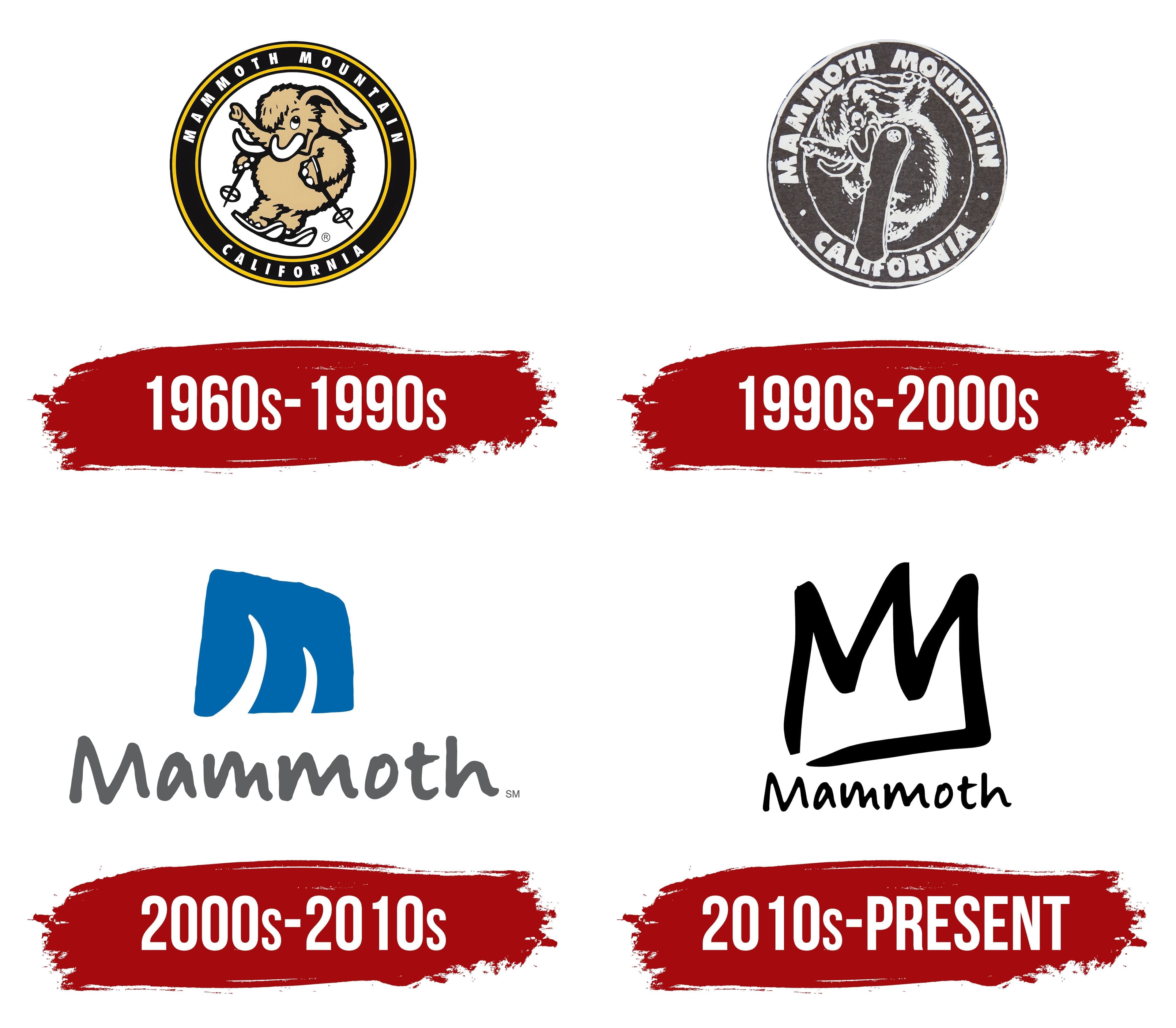
1960s – 1990s
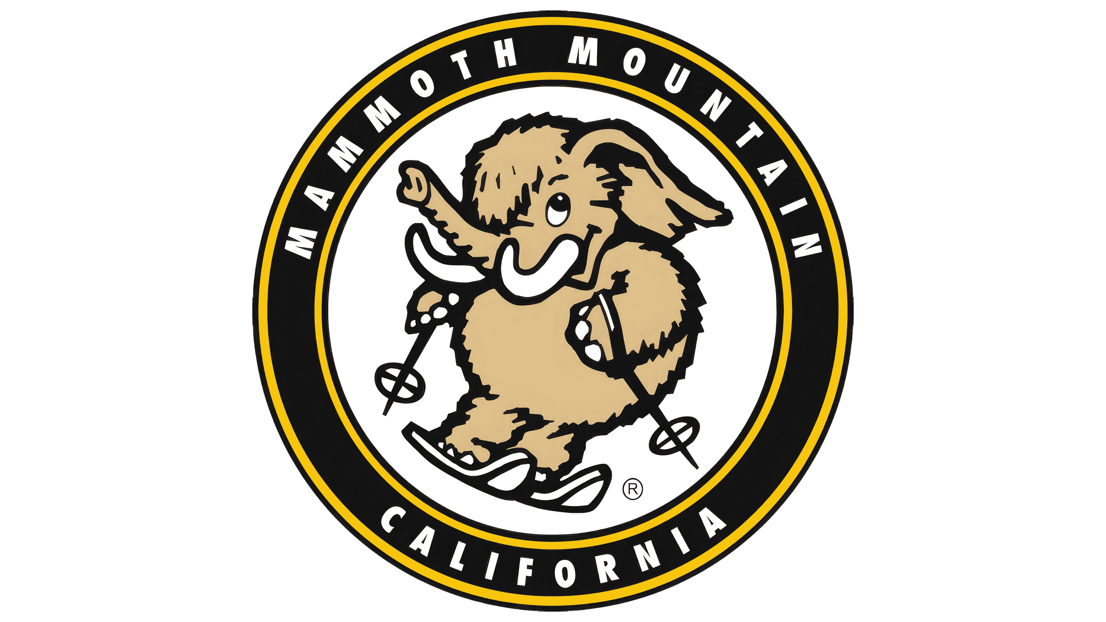
The resort’s first emblem features a mascot, a little mammoth skiing. This image and the resort’s name were chosen to honor the rocks formed by solidified lava, whose silhouette resembles a mammoth. Living in harsh, cold conditions, this animal is a perfect symbol for a winter resort. The choice of a baby mammoth highlights Mammoth Mountain’s family-oriented approach, showing that it is a safe and convenient place to teach children to ski.
The baby mammoth is depicted on a round white background with a thin black outline, with the resort’s name and location written along the outline. The white background symbolizes the snow and icy freshness of the mountains. At the same time, the black represents solidified lava and majestic mountain slopes, creating a harmonious combination of natural elements characteristic of the area. The logo emphasizes a cozy and safe atmosphere while maintaining a connection to the natural environment and the region’s history.
1990s – 2000s
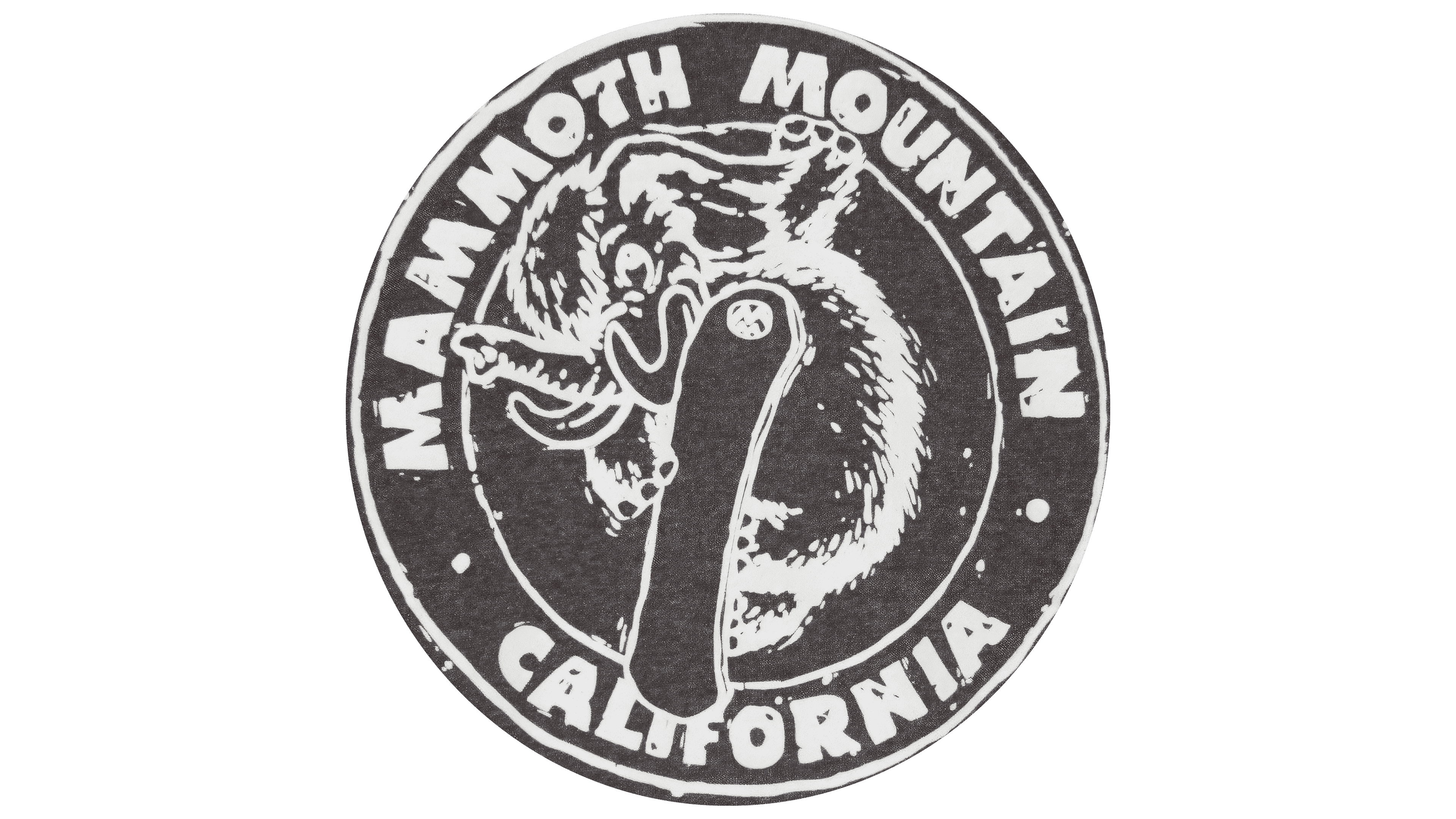
The late 20th-century logo looks like it was created from volcanic ash, highlighting the resort’s historical roots and connection to nature. A dynamic composition is depicted in white strokes against a fully black-and-gray background. The centerpiece is a daring baby mammoth flying on a snowboard, captured mid-jump. Its snowboard is in the foreground, extending beyond the image’s boundaries, adding depth and motion.
This image emphasizes the spirit of boldness, speed, and modern entertainment that attracts young people to the resort. The logo showcases the resort’s energy and innovation, offering next-generation activities. The text along the border was enlarged to shift the focus from the ancient animal to the resort. This design makes the logo bold and highlights the resort’s modern offerings while maintaining its historical connection to nature and antiquity.
2000s – 2010s
The new emblem features a fresh, vibrant, modern design that brings dynamism and originality to the resort’s visual identity. The main element is an uneven blue rectangle, which simultaneously symbolizes:
- The sky, toward which the mountain peaks rise.
- An ice block evokes the Ice Age and the ski resort’s coolness.
Two sharp white shapes are visible in the lower part of this icy figure. These images serve as a double symbol: they resemble both mammoth tusks and the peaks of majestic mountains. Thanks to these tusk-like cuts, the blue elements form a stylized “M,” the logo’s key visual focus.
At the bottom of the logo, the word “Mammoth” is written in a unique gray font. The font looks like it was drawn with a stick in fresh snow, with the glyphs varying in size and angle, adding naturalness and authenticity to the overall composition. This design highlights the resort’s unique character, connection to nature, and the freshness and freedom inherent in the mountains.
2010s – today
The Mammoth logo is designed in black and white and, at first glance, may seem casual, yet this simplicity holds deep meaning. The upper part of the visual symbol consists of two merged “M” letters forming a three-pronged crown. This element of the identity carries several key symbols:
- The double “M” refers to the brand name.
- The crown symbolizes the resort’s premium status and highlights its high quality and worldwide recognition.
- The crown’s three prongs also resemble mountain peaks, directly referencing the resort’s natural, mountainous setting.
Below the crown is the word “Mammoth,” written in the same handwritten font used in previous versions of the emblem. This font creates a sense of ease and accessibility and draws attention to the brand.
The black-and-white color scheme emphasizes the logo’s minimalism and versatility. The black color, combined with the simple design style, symbolizes the brand’s strength and reliability. Despite its seemingly casual appearance, the logo looks modern and stands out due to its unique style.
This logo style and its elements reflect important aspects of the resort’s development. It has become well-known as a leisure and sports destination and a premium resort recognized for its quality and unique atmosphere.