![]() Unreal Tournament Logo PNG
Unreal Tournament Logo PNG
The Unreal Tournament logo captures the spirit of intense battles, where speed, tactics, and skill are everything. The game has created a world where competitive excitement reaches its peak, providing space for fast-paced, strategic combat.
Following the success of Unreal, Epic Games set out in 1998 to develop Unreal Tournament, a multiplayer shooter designed to rival popular games of the time. Originally intended as a modification of Unreal, it quickly became a standalone title under the creative leadership of Cliff Bleszinski and James Schmalz. The game garnered immediate praise for its fast-paced gameplay, creative weapons, and advanced AI opponents, and it offered team-based modes such as Assault and Capture the Flag. Soon after, a sequel arrived, showcasing improved graphics and physics, although fans had mixed reactions to its new direction. The next release, in 2004, is widely regarded as the series’s best, introducing vehicle battles in Onslaught mode and setting the standard for multiplayer shooters for years to come. Another installment followed in 2007, featuring advanced visuals, but its darker tone sparked debate among loyal fans. In 2014, Epic Games began working closely with the community on a free version using Unreal Engine 4. However, this effort ended in 2018, when Fortnite’s success shifted the company’s priorities. Even without recent official updates, the community continues to actively maintain the series, hosting tournaments and creating custom content. Unreal Tournament’s lasting influence is evident in the multiplayer shooter genre, and it continues to showcase the capabilities of the powerful Unreal Engine.
Meaning and History
![]()
What is Unreal Tournament?
It is a series of multiplayer first-person shooters that have changed the arena shooter genre. Players fight in futuristic arenas, utilizing a variety of weapons and mastering dynamic movement techniques, including dodges and double jumps. The game features various modes, including classic survival combat and team battles that involve capturing the flag or completing tasks. The player community has created thousands of additional maps and mods, making the project even more interesting and diverse thanks to the built-in level editor and support for custom modifications.
1999
![]()
Unreal Tournament appeared on the gaming scene in 1999 and stood out among competitors as a striking representative of the first-person shooter genre. Epic Games aimed to make the game spectacular and memorable, which was reflected in its logo.
The brand name is divided into two levels. The upper level, “Unreal,” resembles a weapon from the arsenal of game characters. The letters are gothic, sharp, and aggressive. The font features a metallic texture with rough plates and heavy bolts, giving it a hand-assembled appearance. The elongated, sharp edges of the letters resemble claws or blades, evoking an atmosphere of competition and intense confrontation, filled with adrenaline and brutal battles.
The second level, “Tournament,” provides the necessary balance. The strict capital letters in a serif font are symmetrically placed. They also feature metallic finishes and rivets, but the style is calm, heavy, and stable. The contrast conveys the essence of the game: dynamic, aggressive battles occur within clearly defined tournament rules and boundaries.
The primary shades of the logo are dark brown, bronze, and metallic. All colors complement each other, enhancing the impression of metal and durability. The letters’ volume is achieved through shadows, highlights, and outlines. The relief effect conveys a technological style, linking the logo to the game’s industrial theme, where high-tech weapons and armor play a key role.
2002
![]()
With the release of Epic Games’ updated shooter in 2002, the Unreal Tournament logo transformed, reflecting the game’s new focus. The emblem’s appearance became horizontal and more athletic, resembling logos of futuristic tournaments or competitions.
The series name “Unreal” remained in the upper part of the logo, retaining its familiar style: a gothic typeface with sharp curves and aggressive letter endings that resembled sharpened blades. Beneath it, the central word “TOURNAMENT” became dominant and massive. The uppercase, sans-serif letters are elongated vertically and positioned closely together, creating the impression of a unified, monolithic block.
The color palette became more contrasting and saturated. The primary black color of the letters is emphasized by metallic and silver elements in the oval background, forming a frame with sharp, pointed ends. The texture of the frame resembles armor or mechanical elements of an arena from the game world.
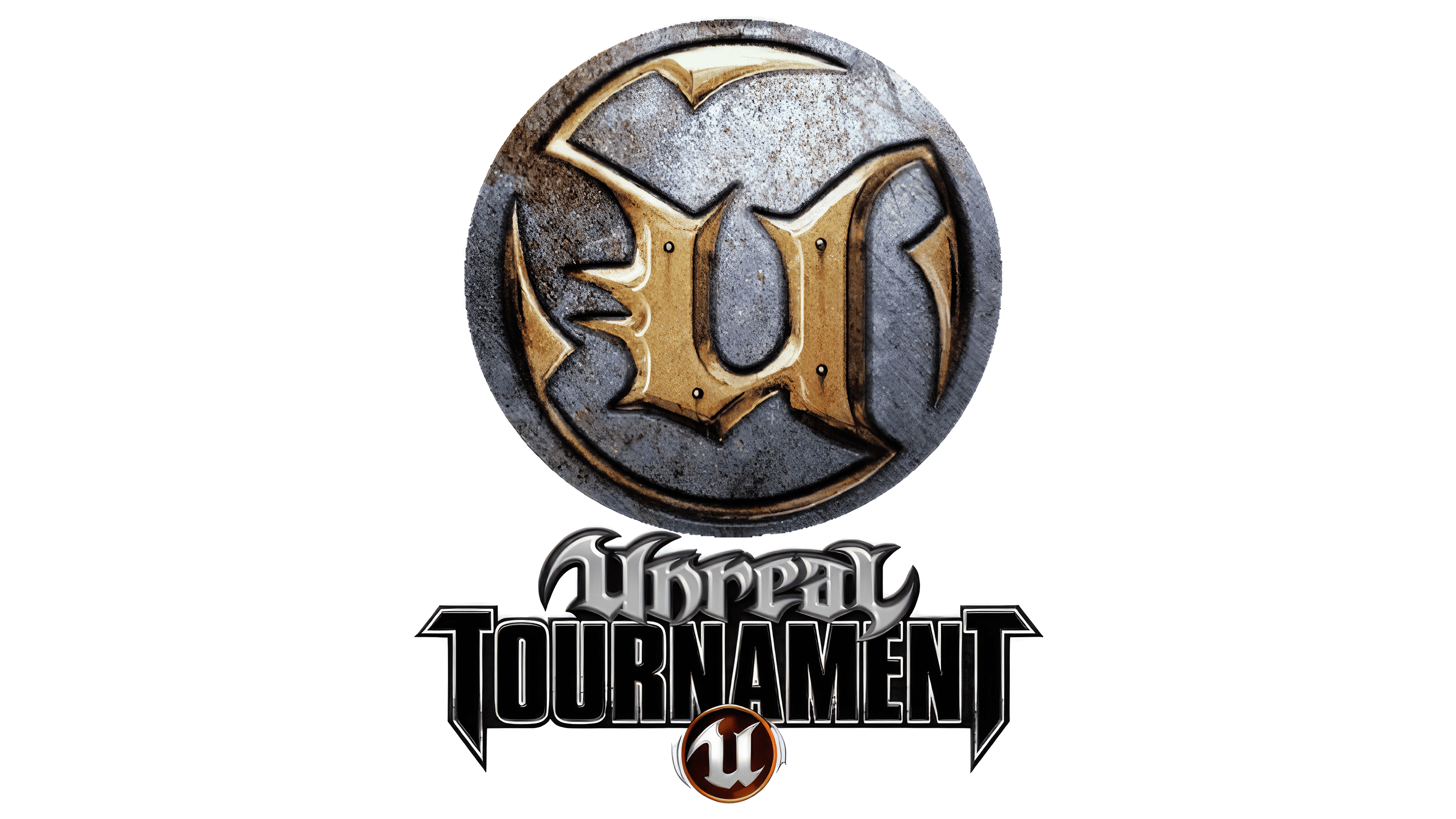
A golden medallion with the letter “U” appeared, becoming a recognizable symbol of the entire Unreal series. Its placement between “TOURNAMENT” and “2003” highlights the game’s athletic format and competitive nature, reminiscent of championship awards or battle medals earned in the virtual tournament.
The lower text, “2003,” is presented in large, strict, and concise bold lettering, indicating the specific game version. The entire logo composition became more dynamic and energetic, combining elements of technological sports and military aesthetics. Epic Games reflected the spirit of virtual combat competition in the new logo, which became the core idea and direction for developing the Unreal Tournament series.
2004
![]()
When Epic Games released another Unreal Tournament update in 2004, the series logo underwent minor changes, becoming brighter and clearer with the introduction of new color accents.
At the center of the composition is a medallion with the letter “U,” the key symbol of the entire Unreal game series. The emblem is executed in gold and deep blue colors. Because of these shades, the medallion stands out more and appears like a prize or combat award, suitable for tournaments and competitions within the game world.
The bottom inscription with the year was updated to “2004,” maintaining a strict, massive, and black style.
The overall color palette of the emblem, black, silver, gold, and newly added blue, makes the visual design richer and more energetic, conveying the competitive excitement characteristic of the game. Epic Games logically chose not to significantly alter the structure and accents, instead using color to emphasize that the 2004 version continues to develop the ideas of the Unreal Tournament series.
2007
![]()
In 2007, Epic Games decided to rethink the visual design of Unreal Tournament, and the logo underwent a drastic change, becoming more aggressive. The emphasis was on brute force and a fierce atmosphere of confrontation.
The composition is built vertically. The upper part features the familiar word “Unreal” in metallic-gray shades. The letters are heavy gothic, with smooth yet sharp curves, reminiscent of heated and cooled metal with darkened shadows. Below is the central word, “TOURNAMENT,” written in a bold and monumental sans-serif font. The first and last letters, “T,” are enlarged like columns supporting the entire structure, reinforcing a sense of solidity.
A new addition is three red stripes behind the lettering, depicted as torn, rugged marks. They resemble combat marks or claw scratches, underscoring the game’s harsh style. This is a direct reference to the third installment of the series, emphasizing its aggressive nature and the atmosphere of constant tension in matches.
In the center of the lower part is a medallion featuring the familiar letter “U,” colored with a red-orange gradient resembling molten metal, which reinforces the overall brutality of the design. The medallion acts as a combat reward, showcasing the spirit of the tournaments.
The color scheme became significantly more intense, with red symbolizing danger, cruelty, and a fighting spirit. Black adds weight and contrast to the text, while silver-gray highlights the series’ technological aesthetics. The medallion with the burning metal effect ultimately ties the composition together, visually conveying the game’s core idea of continuous, chaotic, and aggressive battles in a futuristic combat atmosphere.