The Viasat logo stands out with an informal style, leaving a pleasant impression, like the leader in satellite television. The emblem is characterized by simplicity, demonstrating the ease of joining its numerous groups of grateful customers.
Viasat: Brand overview
In the spring of 1986, Mark Dankberg, Mark Miller, and Steve Hart—three businessmen—founded the company in Carlsbad, California. The three had worked at Linkabit, a satellite communications business that influenced the company’s original focus.
The initial focus was on creating technologies for military satellite communications. For the defense industry, the founders recognized the possibilities of developing more effective and secure communication technologies.
When the company secured its first sizable contract from the US Department of Defense in 1989 to manufacture satellite communication modems, it marked a key turning point. This deal gave the fledgling company financial stability and attested to its technological know-how.
In the early 1990s, the firm started diversifying its business beyond military use and began creating technology, such as satellite internet systems, for business use.
A significant milestone was reached in 1995 when the company listed its shares on the NASDAQ stock exchange and became a public business. This IPO provided additional funding for growth and the creation of new technologies.
The company actively developed its broadband satellite internet technologies in the latter part of the 1990s. It believed that high-speed internet could be a huge asset in places where conventional land-based infrastructure was lacking or insufficient.
The year 2000 was a period of substantial growth. The corporation improved its standing in the satellite communications industry by acquiring Scientific-Atlanta’s satellite networks division.
WildBlue, the company’s first commercial satellite internet service, was introduced in 2001 and offered internet connection in rural and isolated parts of the US.
In 2007, unveiling the first high-capacity satellite communication system (HTS) represented a huge technological advancement, significantly increasing the effectiveness and speed of satellite internet.
The 2009 acquisition of WildBlue Communications allowed the firm to grow its satellite internet infrastructure and client base.
2011 was a historic year. The launch of the ViaSat-1 satellite, the most potent communications satellite in the world at the time, significantly improved satellite internet services’ availability and quality.
A new and significant economic venture was launched in 2013, offering high-speed internet services for commercial airplanes.
The deployment of the ViaSat-2 satellite in 2017 substantially enhanced the ability to offer high-speed internet.
2018, the company entered the European market after purchasing Eutelsat’s European broadband division.
2020 saw continued international expansion, with satellite internet services starting in Brazil.
Growth continued in 2021. Three ultra-high-throughput satellites were planned, and the first, ViaSat-3, was successfully launched. This satellite, covering North and South America, greatly expanded network capacity, enabling faster and more dependable internet service in rural and isolated locations. The launch of ViaSat-3 was an essential stage in the plan to offer high-speed internet service worldwide.
A big entry into the aviation communication market occurred in 2022. Long-term agreements were successfully negotiated to offer in-flight Wi-Fi with several significant airlines. These agreements reinforced the position as the top supplier of high-speed internet for commercial aircraft. Furthermore, new technologies were developed to guarantee dependable access even in the world’s most distant areas.
In 2023, a significant military communications milestone was reached. The U.S. Department of Defense awarded a large contract to design and build a new secure satellite communication system.
The global satellite network was constructed with the launch of the last ViaSat-3 satellite in 2024. This network offered nearly universal coverage, creating new avenues for high-speed internet delivery to areas that had not previously had dependable connectivity. Additionally, development began on ViaSat-4, and the next generation of satellites is expected to boost network efficiency and capacity even more.
In 2024, the Internet of Things (IoT) space’s footprint also increased. A new platform for controlling and monitoring IoT devices over satellite networks was introduced, which is particularly useful for remote industrial locations and the farming industry.
Meaning and History
What is Viasat?
It is a global communications company that provides high-speed satellite broadband services and secure network systems to residential, commercial, and government customers. Known for its advanced satellite technology, it offers internet services in areas where traditional wired internet is unavailable or limited. The company provides in-flight Internet services to commercial airlines and private jets, improving passenger connectivity. In addition to consumer internet services, the brand offers communications solutions for military and defense applications, including secure satellite communications and cybersecurity services. The company connects the world by providing reliable, high-speed internet to various sectors, including rural and remote areas.
Before 2017
To showcase its professionalism and capture the attention of potential clients, a young internet TV provider focused on visual identity because the logo is the most accessible and effective marketing tool. It allows for precise brand identification, making it popular. Of course, the company’s efforts must be present, but no work skills lead to quick recognition of a new business – an appropriate platform is needed for a successful leap forward. And often, that platform becomes the emblem.
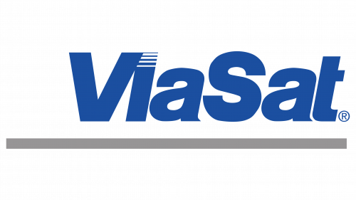
Newcomers to the digital TV industry followed this path: They tried to incorporate the most important elements into their mark—their concept, information about themselves, plans, and level of professionalism. Specifically, these are expressed in the geometric font, in stripes of varying widths, and in the logo’s color, shape, and style. Moreover, the designers skillfully combined graphics with text without infringing on their roles.
So, the foundation of the Viasat emblem is the name. It is placed in a single horizontal line and written with two capital letters: “V” (Via) and “S” (Sat). This inscription is connected to the fact that it comprises two later merged words. The extra-bold letters indicate the brand’s stable position in the satellite TV market, and the rightward tilt signifies the desire to move forward without resting on its laurels. The italic font also reflects the potential of internal energy and the intent to bring dynamism to the two-dimensional logo. Interestingly, the letter “a” has a small sharp serif, whereas the other letters do not, showcasing the company’s individuality.
The emblem contains not one stripe but several. The longest is located beneath the name and extends far beyond it. The wide line is colored in a restrained gray to demonstrate the provider’s businesslike nature and reliability. Four more stripes are integrated into the textual part of the emblem: they are stylized as the dot above the “i,” representing a segmented square. The lower the strokes, the thicker they become. Altogether, they resemble classic speed lines, conveying motion. The company points precisely to this feature through stripes, as it plays a crucial role in digital television and internet services.
The predominant color in Viasat’s visual identity is blue. It is associated with lightness, airiness, and the sky, reflecting the content delivery method. It is also the color of reliability, confidence, calmness, and stability. Combined with the massive font, it clearly expresses this idea, indicating that such a company can be a confident business partner.
2017 – today
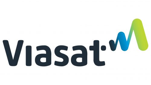
The new Viasat logo attempts to modernize the visual identity, again focusing on minimalism and a technical style. However, there is also considerable expression, manifesting in bright colors and a winding line. The dynamic nature has been preserved, reflecting the consistent data transmission speed via satellite communication.
The first thing that catches the eye is the absence of the capital “S,” which used to begin “Sat.” The designers have converted it to lowercase, disregarding grammar rules but maintaining visual balance. In this way, they balanced the right and left halves of the logo so that the victory symbol (V) is present in both parts and nothing distracts from it.
- On the left side, it is represented as an uppercase letter. It is perfectly smooth and has rounded tops.
- On the right, this role is played by a zigzag element resembling sound wave oscillations.
The text, set in a soft font with rounded glyphs, appears friendly. The curved line, resembling the rhythm of a heartbeat, adds a technological touch. It starts with a tiny dot near the crossbar of the “t” and ends with a large wave at the edge. As the height of the strokes increases, their width also grows. This graphic technique demonstrates the brand’s ability to transmit data over long distances. According to the company, this is a sign of increased connections, growth in communications, and the broadcast signal being confident and continuous.
The contrast between the solid dark text and the bright gradient wave creates a pleasant impression as they balance each other, maintaining a calm atmosphere. The zigzags begin in dark blue, transition into turquoise, and finish in pistachio—the most elegant shade of green. With its new logo, Viasat has shown the multifaceted nature of its work, a wide range of services, vast capabilities, and readiness to become a global internet provider.


