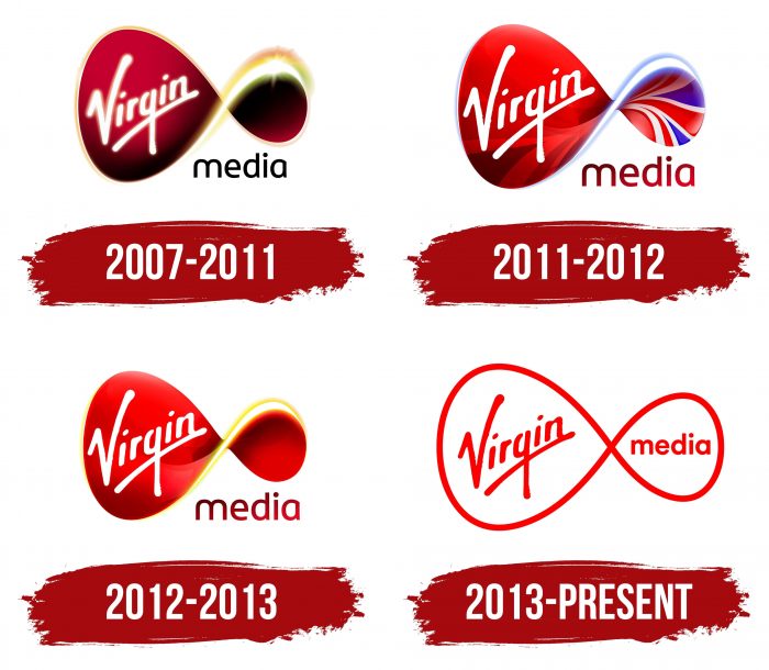
Tele and radio waves emanate from the emblem. Together with them, emotions, joy, and energy spread through the air. The Virgin Media logo demonstrates that the company has been in the business of communications, has been doing so for a long time, and plans to continue its work indefinitely.
Virgin Media: Brand overview
| Founded: | 6 March 2006 |
| Founder: | Virgin Media O2 |
| Headquarters: | Reading, England, UK |
| Website: | virginmedia.com |
Meaning and History
The telecommunications firm serves more than 50% of UK households and offers a top speed of 300 Mbps. But this is not the only thing that makes it different. To showcase its competitive edge, Virgin Media adheres to specific values that define its visual identity. The brand communicates its presence with unusual marketing techniques, attracting celebrities and adhering to a solid set of values.
Another aspect that affects Virgin Media’s visibility is the logo. He always looked the same, apart from minor differences in design, and retained the shape of the infinity sign. This is despite the fact that the company is no longer part of the Virgin Group and is part of the Anglo-Dutch-American enterprise Liberty Global. After changing the owner in 2013, she managed to keep her old name and other identity elements, which she now uses under license.
2007 – 2011
2006 saw a major milestone in Virgin Media history: Telewest and NTL merged to form one cohesive NTL: Telewest. Then they acquired Virgin Mobile, which allowed them to provide a full service. At the end of the year, the new telecommunications organization announced a name change. As a result of the rebranding, it became Virgin Media Inc. and received a bright red inverted figure-eight logo.
On the left side of the infinity sign was the white word “Virgin,” handwritten diagonally and underlined with a long white line. The right side has been darkened and decorated on top with a bright shining arc. The free space at the bottom was occupied by the black “media” lettering, consisting of sans serif lowercase letters. The red-black gradient with uneven darkening gave a special charm to the logo.
2011 – 2012
In 2011, the telecommunications company decided to show its patriotism and added the Union Jack element to the emblem, adorning the right side of the inverted eight. This redesign marked the 2012 Olympic Games in the UK and became a festive symbol for the upcoming Queen’s Diamond Jubilee.
The revamped visual identity was intended to highlight Virgin Media’s commitment to the home country. The public first saw the nationalist logo on October 15th, when a related advertisement aired. The shape of the infinity sign has not changed. But the designers played with colors: they turned the big blob into a red ruby, removed the bright highlights, and added a little neon glow. The fonts remain the same, but the word “media” has become dark pink and increased in size.
2012 – 2013
When the Olympic Games ended, and the hype died down, telecommunications company Virgin Media returned to its classic logo design. Union Jack is gone. At the same time, a faint neon sheen on the right side was preserved, and the amount of black was reduced in favor of red.
2013 – today
In 2013, the fashion for minimalism came to Virgin Media: the company simplified its main symbol, eliminating the gradient and multicolor. Specialists from the Wolff Olins agency created the visual style. They left the usual typography and removed complex elements. The Virgin lettering was repainted red and appeared on a white background. So that the right side of the “recumbent figure” is not empty, the designers have transferred the word “media” into it, which used to be at the bottom. It was the first redesign since Liberty Global bought the company.
Virgin Media: Interesting Facts
Virgin Media is a big company in the UK and Ireland that offers TV, fast internet, and phone services. Since it started, Virgin Media has been known for its new ideas and for competing with other big companies.
- How It Started: Virgin Media was created in 2006 by joining NTL, Telewest, and Virgin Mobile UK, owned by Richard Branson. This move brought together TV, internet, and phone services under the Virgin brand.
- Fast Internet: Virgin Media was the first in the UK to give its customers internet speeds over 100Mbps. They’ve always tried to offer the fastest internet possible.
- Bundling Services: They were among the first to offer bundles that included TV, internet, landline, and mobile phone services, making things simpler for customers.
- Fibre Optic Network: Virgin Media has spent a lot on its fiber optic network, making it one of the biggest in the UK. This network allows them to offer fast internet and digital TV to many people.
- Virgin Media Television: Before Liberty Global bought it, Virgin Media had its TV channels. These channels changed names or were sold, shifting the company’s focus to providing services.
- Joining Liberty Global: In 2013, Liberty Global, a big telecom company, bought Virgin Media. This made Liberty Global even bigger in Europe.
- Project Lightning: In 2015, Virgin Media started Project Lightning to extend its fiber optic network to more homes and businesses, improving its services and reach.
- TV Innovations: Virgin Media introduced the Virgin TV V6 box, which supports 4K streaming, recording several channels simultaneously, and works with Netflix.
- Merging with O2: In 2020, Virgin Media and O2 announced they would merge, creating a big competitor in broadband and mobile services, aiming to take on BT.
- Digital Inclusion: Virgin Media works on projects to help more people get internet access and learn digital skills, partnering with charities to reach those in need.
Virgin Media has played a big part in the telecom industry, focusing on new technologies, customer service, and helping people get online.
Font and Colors
Despite frequent and radical updates, the emblem has always had a stable shape and looked like a sign of infinity. The stylized symbol serves as the basis for the rest of the details. It denotes the reliability and consistency of Virgin Media, shows the stability of the connection. Its purpose is to build confidence in the services of a telecommunications organization.
A non-existent font is used for the word “Virgin.” It looks like the author of the logo has drawn the lettering by hand with one of the graphic tools (brush). The lettering in the word “media” resembles the Stolzl Medium typeface, but only with rounded corners.
Red is the classic color for all Virgin Media graphics. Previously, it was complemented with black and presented as a gradient, but now it is combined only with a blank white background. This simplification was another step towards minimalism.
Virgin Media color codes
| Red | Hex color: | #ff0000 |
|---|---|---|
| RGB: | 255 0 0 | |
| CMYK: | 0 100 100 0 | |
| Pantone: | PMS 1655 C |


