


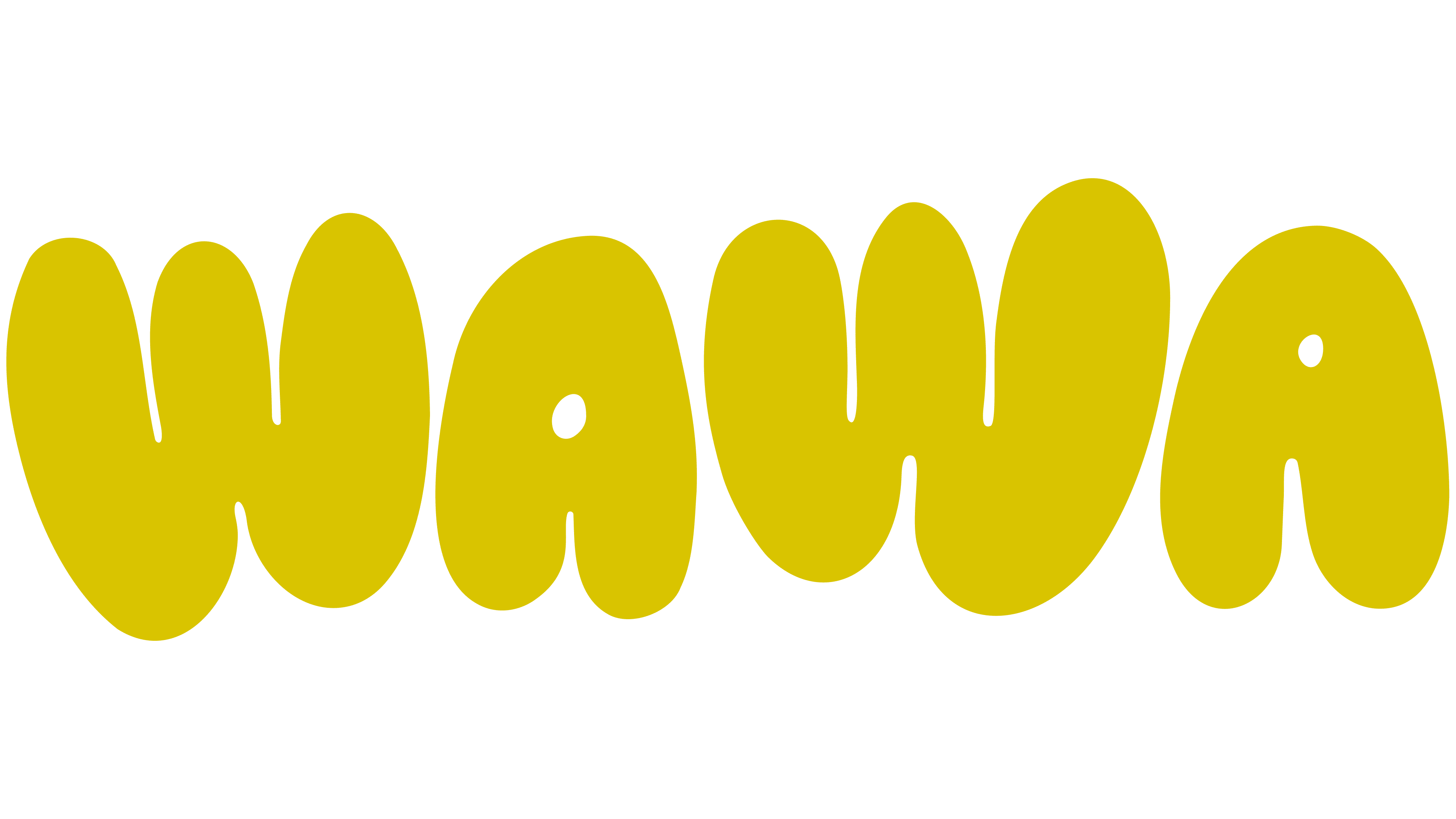
WAWA is entering the sparkling water market with a mood outside the familiar wellness segment. The brand launched in 2026 with the involvement of soccer player Sam Kerr. OneMay handled the identity. The brand focuses on taste, emotion, and the instinct to pick up a can.
The idea of Water With Aura helps WAWA move away from the usual presentation, in which water is sold as low-sugar, low-calorie, and guilt-free. The focus is on enjoyment of flavor and the overall feeling of the product.
The WAWA logo takes the leading role. The name is set in soft, rounded letters. They recall inflated forms, clay, or hand lettering. Smoothed corners and soft lines create a friendly, free, and slightly naive perception of the brand.
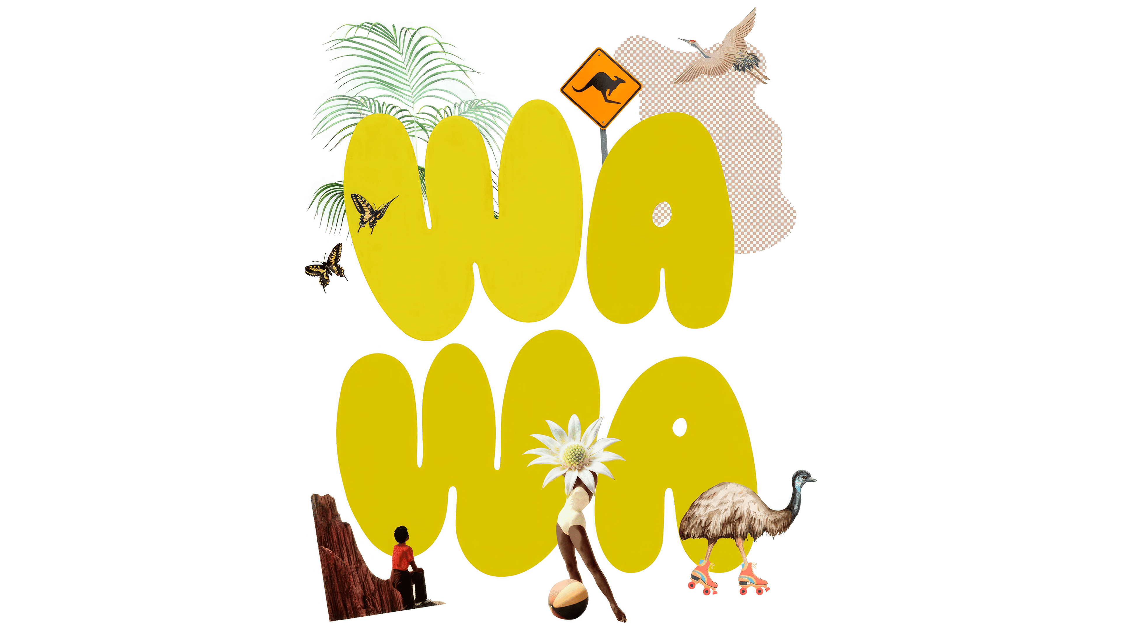
The logo’s form supports WAWA’s positioning. The brand moves sparkling water away from a dry rational tone and toward pop culture, leisure, and personal mood. In feeling, WAWA is closer to a music project, a festival brand, or an independent creative brand than to a classic wellness drink.
The yellow-olive color of the name adds a warm retro mood. Paired with a muted gray-purple background, it refers to 1970s aesthetics, psychedelia, and children’s brands. The styling still feels current. The large letters hold their shape on the can and quickly convey the brand’s mood.
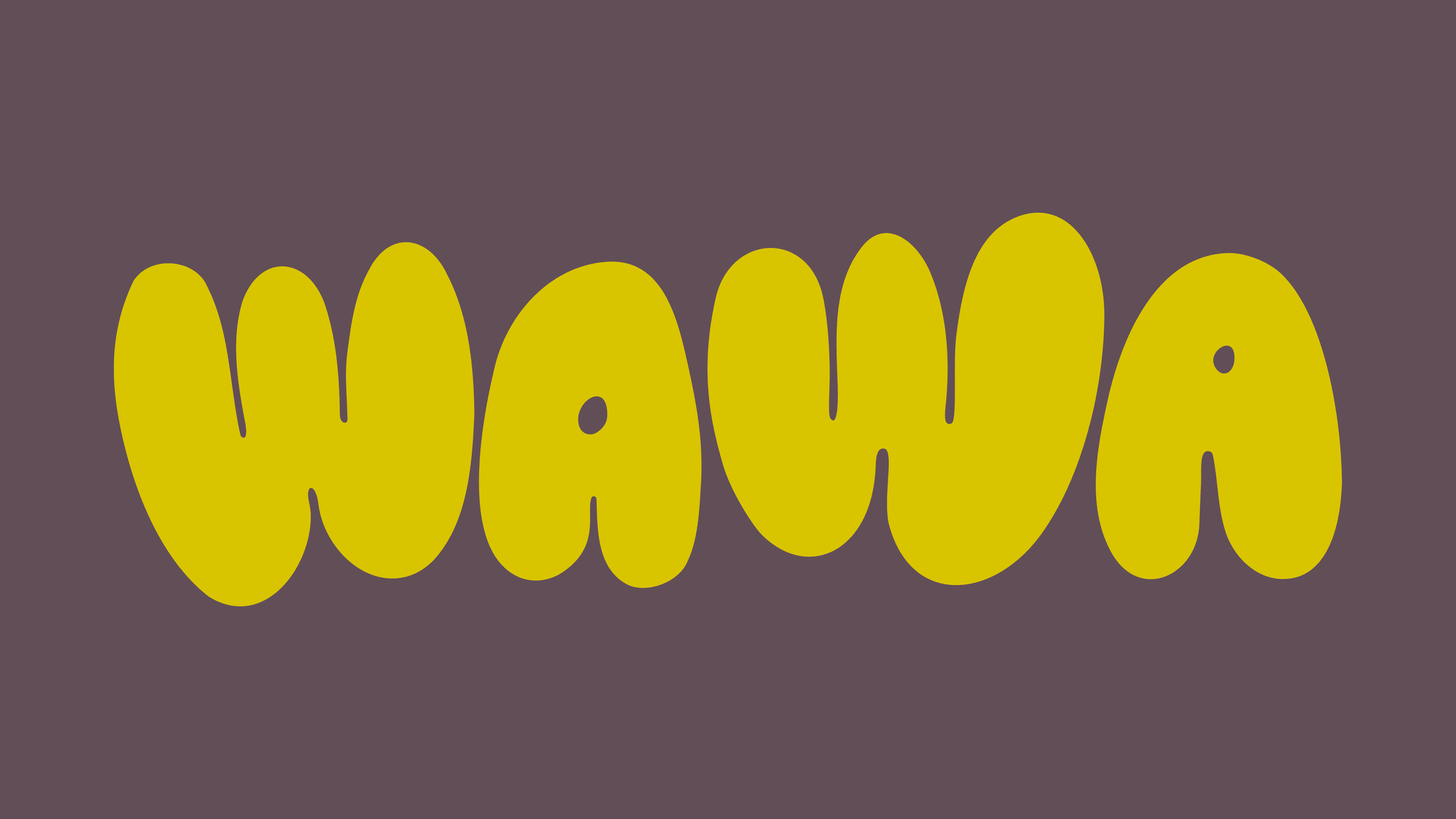
The name WAWA works like a short sound. The repeated syllables feel light, almost musical. The rounded letters support the tone and make the mark look soft. The logo creates the feeling of water with flavor, mood, and aura.
OneMay built the identity around the idea of a drink people want to buy even before the first sip. The WAWA logo became the brand’s primary sign and the can’s central image. It brings together play, nostalgia, and a modern lifestyle presentation. As a result, the brand moves away from the dry language of the sparkling water category and appears livelier on the shelf.