


 Weatherbug Logo PNG
The WeatherBug logo cleverly plays on the brand’s name, where the word “bug” simultaneously means “insect” and “secret data collection.” The emblem clarifies that the company continuously monitors weather changes and informs users about them to make people’s daily lives easier and more comfortable.
WeatherBug traces its roots to 1993, when Bob Marshall founded AWS Convergence Technologies in Germantown, Maryland. The company initially built systems for collecting and interpreting weather data. In 1996, WeatherNet placed stations in schools across the United States, creating a broad network for local observations and real-time neighborhood reports.
The WeatherBug name launched in 2000 as internet use increased demand for localized forecasts. A Palm OS application followed in 2003, giving users mobile access before smartphones became common. In 2005, the company added a professional forecasting and data-analysis product for clients and meteorologists. A Facebook application appeared in 2007.
Mobile growth accelerated in 2009 with applications for Android and iOS. AWS Convergence Technologies became Earth Networks in 2011 as its environmental-monitoring business expanded. WeatherBug remained a core service, while WeatherBug Home launched in 2012, combining weather information with household energy-use data.
Mobile advertising and location-technology company xAd acquired the service in 2016 and later renamed itself GroundTruth. The deal opened options for advertising and geolocation data. The application received a redesigned interface, personalization, and updated forecasting tools in 2019. By 2020, the network included more than 10,000 professional weather stations. From 2021 to 2023, development focused on forecast accuracy, localized data, and mobile functions.
Meaning and History
What is WeatherBug?
This multifunctional app and website provide hyper-local forecasts and alerts based on real-time weather data collected from an extensive network of weather sensors. With advanced lightning-detection technology, the platform gives users valuable time to prepare before a storm begins. In addition to basic temperature and precipitation forecasts, the app provides information on air quality, pollen count, and UV index, making it an essential resource for outdoor enthusiasts, event organizers, and health-conscious individuals. The user-friendly interface and customizable notifications help users make informed decisions about their daily activities, simplifying the interpretation of complex atmospheric data.
2000 – 2002
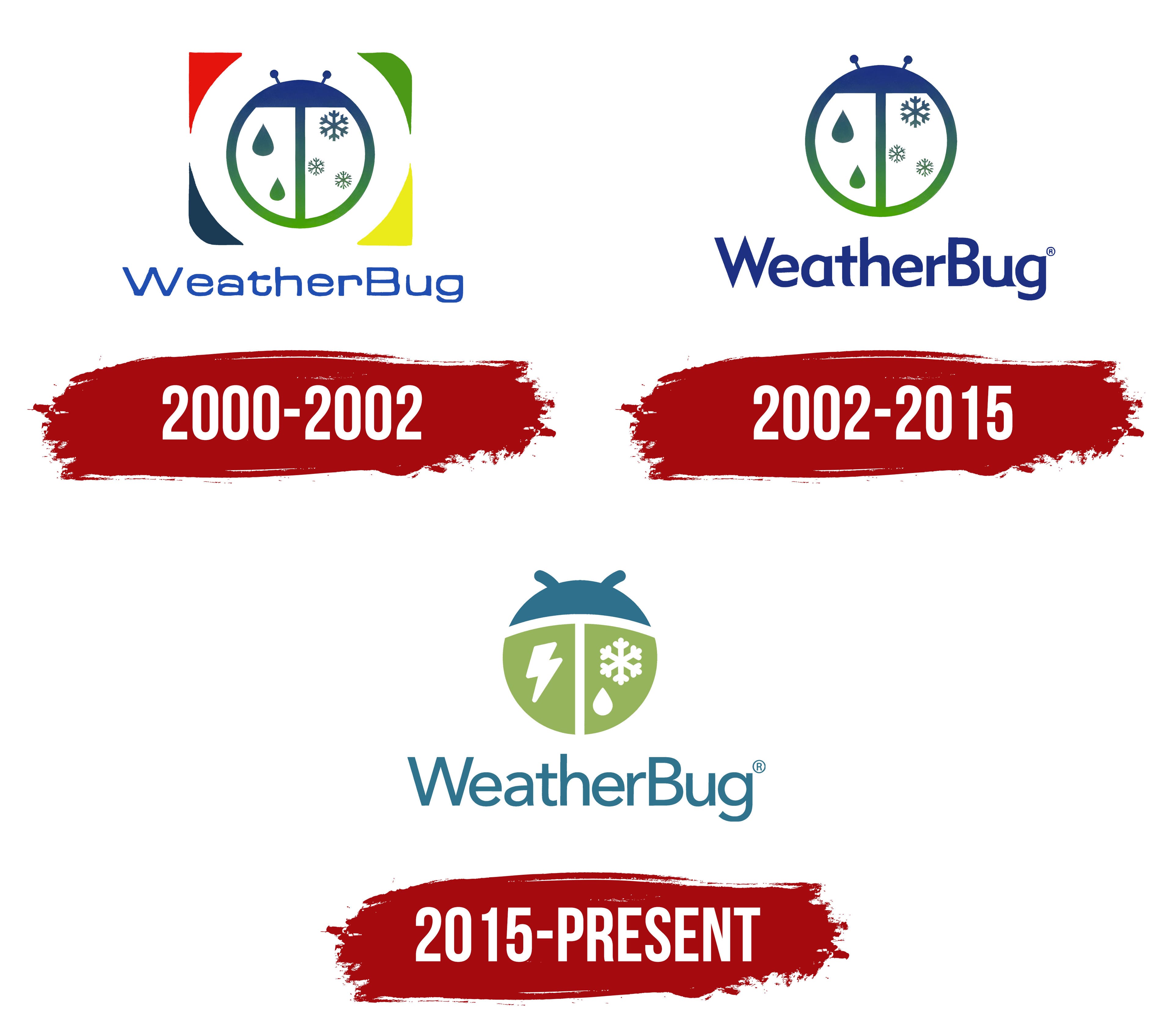
Although WeatherBug has existed since 1993, it only received an official logo in 2000, when the website and application of the same name launched. The designers creatively played with the service’s name by depicting a bug. It resembles a large white circle, split in half by a horizontal line and complemented by antenna-like feelers. Its overall shape resembles a ladybug, but instead of spots on the wings, there are drops and snowflakes, a hint that the company tracks weather conditions in real time.
Of course, it’s not exactly a ladybug, but a fictional insect that appears cute because of its two short antennae with dots at the ends. The online service needed an emblem that wouldn’t intimidate but would inspire trust and positive feelings, so the artists created this friendly image. Even the round shape was chosen deliberately: a geometric figure without corners is associated with comfort and safety.
The insect’s combined coloring catches the eye, using a blue-green gradient. The smooth color transition conveys a sense of calm and symbolizes the cyclical nature of the seasons: blue corresponds to snowy winter and rainy autumn. At the same time, green represents spring and summer when nature is in full bloom.
The bug is depicted inside a white square with no distinct borders. The geometric base has only colorful corners: red, green, blue, and yellow. These add vibrancy to the logo, visually highlighting the central image. The frame gives the impression that the ladybug is under a microscope, as if it were an important object of study. This hints at WeatherBug’s field of work, which closely observes weather changes.
The brand name is located below the image and is colored in a lighter shade of blue. The inscription uses a thin sans-serif font with closed apertures and elongated horizontal lines. The disproportionate lettering does not hinder the perception of the logo because all strokes are of equal thickness. The asymmetry symbolizes the unpredictability of weather conditions, which can change abruptly at any moment.
2002 – 2015
The designers visually simplified the logo by removing unnecessary elements to draw attention to the company’s name and its original symbol, the ladybug. To achieve this, they eliminated the colorful corners that gave the impression of a square base. The absence of frames evokes a sense of infinity, hinting that WeatherBug provides weather forecasts for various countries, not limited to specific regions.
Two raindrops are on the bug’s left wing, and three snowflakes are on the right. This pattern reflects the meteorological service’s functions, which alert users to adverse environmental conditions. The ladybug symbolizes the brand’s broad capabilities, as insects are highly sensitive to natural changes.
The bug remains just as round as in the previous logo and retains the same short antennae with bold dots at the ends. The company kept this image because it evokes positive emotions and encourages trust in the weather forecasts. Only the gradient has slightly changed: the insect’s blue shades are noticeably lighter to harmonize with the color of the text below.
An extravagant, bold sans-serif font was chosen for the name WeatherBug. It features many unusual elements, evoking associations with raindrops, snow, and sharp icicles. Each letter is uniquely distinct:
- The “W” has very sharp angles resembling thorns.
- The tops of “t” and “h” are diagonally cut.
- The vertical lines of “a,” “t,” and “u” end in small triangles at the bottom.
- The open ends of “e” and “g” are sharply pointed.
This aggressiveness in the shapes is balanced by a restrained blue color, creating a sense of calm. It suggests that bad weather poses no threat if you maintain control and are aware of an approaching storm. The green gradient that softens the logo’s blue is a reminder that any rain or snowfall will eventually end, as everything in nature is cyclical.
2015 – today
The new WeatherBug logo has undergone changes that give it a fresh and modern look. The bug remains round but has become visually simpler, no longer featuring a blue-green gradient. The image is divided into three distinct monochrome segments with no color transitions. Wide white stripes separate the blue head and the two green wings, slicing the circle into uneven parts. The geometrically precise vertical line emphasizes the orderliness typical of weather forecasts.
The outline of the ladybug remains as minimalist as before. The insect’s head is still adorned with two short antennae but lacks the familiar dots at the ends. This minor detail makes the emblem more concise, giving the brand a stricter and more professional appearance.
The designs on the bug’s back have noticeably changed and now resemble the icons used to represent natural phenomena in weather forecasts. Instead of the usual rain, a lightning bolt is depicted on the left, symbolizing storms and thunderstorms. On the right, a drop and a snowflake are grouped. The designers had to combine them to highlight the diversity of weather conditions tracked by WeatherBug. The large white symbols stand out in sharp contrast against the green background, drawing attention to the ladybug.
The company has finished experimenting with fonts and settled on a classic grotesque, roughly similar to Magnum Sans Med from FontMesa or Rutan Medium from The Northern Block. Clear lines of uniform thickness, simple geometric shapes, and a minimalist style make the brand name concise and memorable. The chosen font has no decorative elements, creating a sense of seriousness.
With its simplified graphics, the new design aligns with the informational weather service’s position of conveying reliability. For the same reason, the logo’s palette was changed: bright colors were replaced by their more muted versions. Subdued shades of blue and green evoke a sense of calm while emphasizing a connection with nature, as blue is associated with precipitation and green with vegetation. White divides the emblem into meaningful parts and highlights the most important elements, the weather symbols.