 Westfield Logo PNG
The Westfield logo is unique and elegant. Humanity’s history inspires it and presents itself to clients as an ancient symbol associated with aristocracy. The emblem demonstrates the advantages of working with an experienced, professional company.
Westfield began in 1959, when John Saunders and Frank Lowy opened Westfield Plaza in Blacktown, a suburb of Sydney. During the 1960s, the company built shopping centres across fast-growing Australian suburbs and other major cities. Its first move abroad came in 1977 with the purchase of a mall in Connecticut, starting a long expansion across the United States.
In the 1980s, Westfield entered New Zealand and developed centres that combined retail with entertainment and social spaces. During the 1990s, it bought and redeveloped US malls, while a 1994 stock-market listing provided capital for further growth. The company entered Britain in 2000 and opened Westfield London in 2004, establishing a major European project.
A 2011 reorganisation separated the Australian and New Zealand assets into Scentre Group. Westfield then focused on the US, Britain, and Europe. In 2018, Unibail-Rodamco acquired the business for $24.7 billion, creating Unibail-Rodamco-Westfield, or URW. In 2019, the group continued major developments, including Westfield Mall in the Netherlands, then the country’s largest shopping centre.
URW expanded contactless payments and virtual queues in 2020, then launched Better Places 2030 in 2021. Westfield Hamburg-Überseequartier opened in 2022 with retail, offices, leisure, and housing. In 2023, URW sold non-core properties and added more mixed-use projects. A digital platform connecting online and in-store shopping across its centres followed in 2024.
Meaning and History
What is Westfield?
It is a renowned global company that develops and manages large shopping malls. Based in Australia, it operates a network of shopping centers across the US, UK, and Europe. The shopping centers are known for a range of retail stores, restaurants, entertainment venues, and upscale amenities that create a comprehensive and engaging shopping experience for visitors. The company focuses on creating modern, aesthetically pleasing environments that attract shoppers and retailers, helping revitalize the commercial and social life of the neighborhoods in which they are located.
1960 – 1975
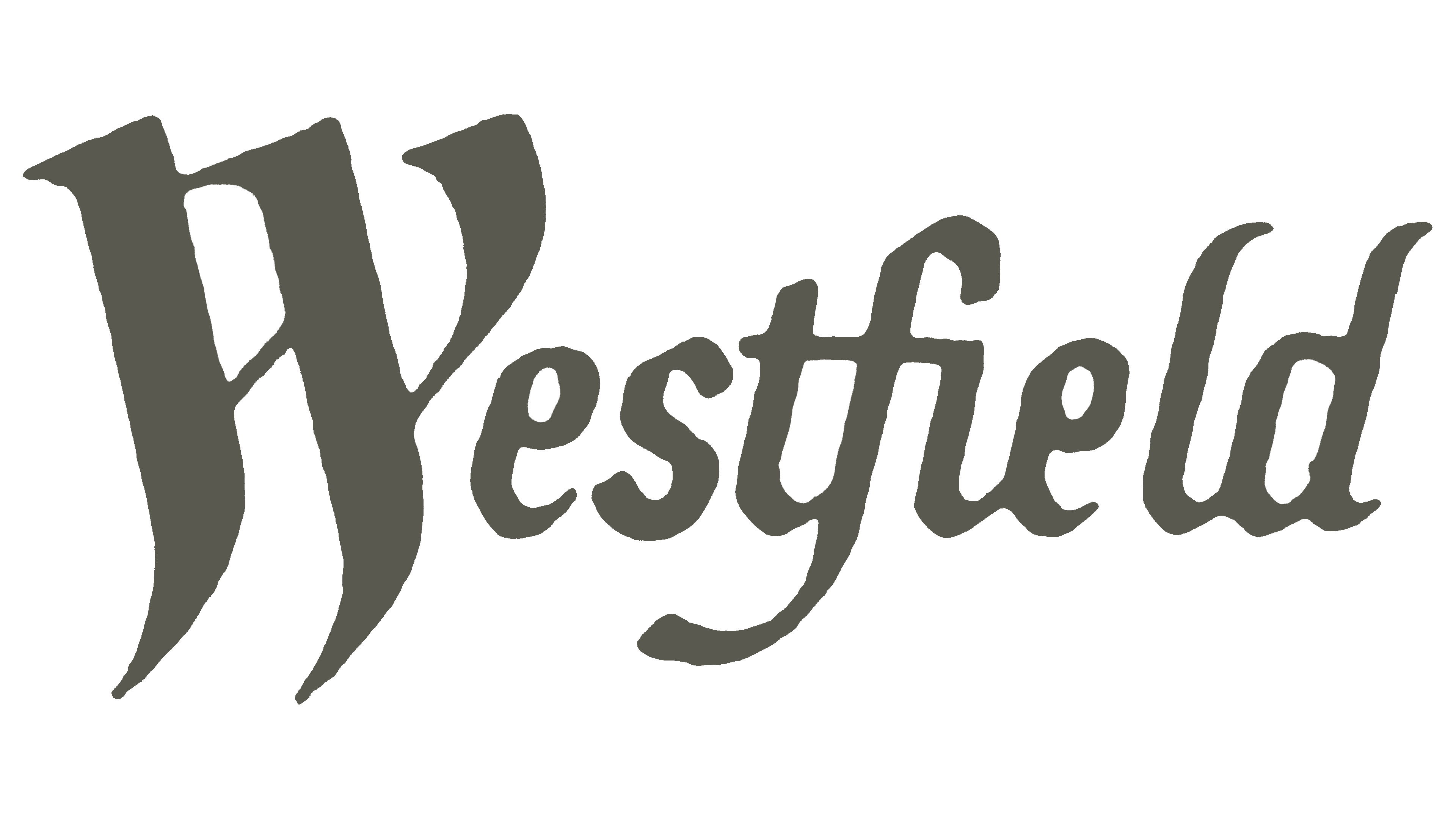
A young marketplace operator decided to present itself as an old, experienced company that is beneficial to work with. After all, reputation plays a key role in the real estate business. The company used visual identity, one of the basic marketing tools, to achieve this. The new organization chose a logo with a Gothic font to demonstrate its supposedly ancient roots. In this way, it portrayed itself as an old and respected entity specializing in aristocratic real estate.
The “ancient” style proved more than appropriate, so it became the brand’s face for a long time, embodied in a single element: the name. It is placed horizontally and occupies the entire logo space, leaving no room for clarifications or additions. The elegant inscription reigns alone in Westfield’s visual identity, serving as the central detail since it is done in an extravagant typeface.
The text is set in a unique font reminiscent of old scrolls or medieval books and is handwritten. This light historical flair, imposed on the name, helped the fledgling company attract attention and stay afloat during its early years, as clients chose it for its supposedly rich experience. This is evidenced by:
- the slanted font, as if handwritten;
- the beautifully decorated initial (the first letter);
- elegantly connected glyphs;
- gracefully curved stroke endings.
This is because the shape of some letters is inspired by the decorative Blackletter font, which conveys a medieval atmosphere. Despite the ancient, intricate, and graceful curves, the inscription is easy to read, as the “crest” with long descending ends resembles the letter “W.” Only this letter is capitalized, while the remaining characters are lowercase. Some form a unified block when connected, such as “tfie” and “ld.” This shows the company’s readiness to support anyone who turns to it for services.
Interestingly, the refined font is complemented by a simple color palette that creates a business-like atmosphere. The dark gray shade perfectly suits the old-fashioned typeface, creating an intriguing mood. It hints at the “dust of centuries,” symbolizing the company’s age and longstanding existence.
1975 – today
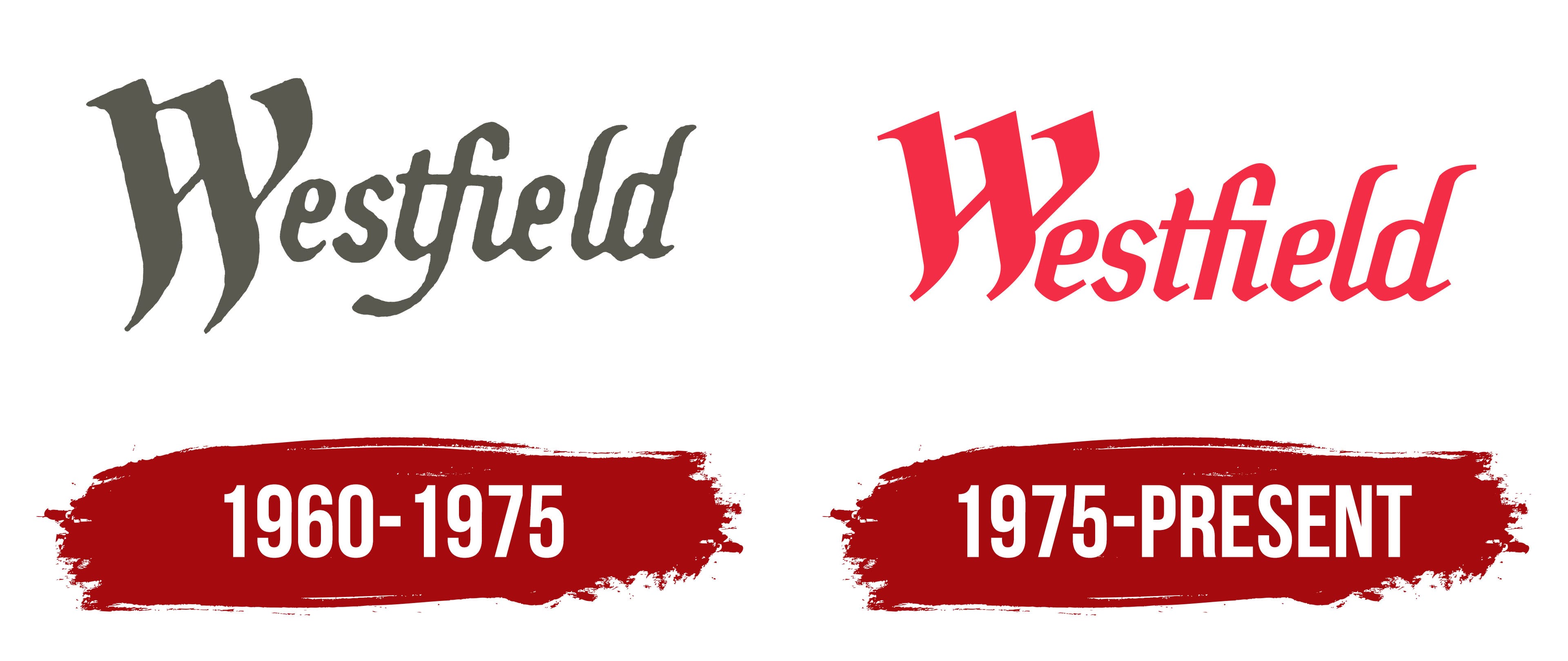
While maintaining the previous design, the Australian marketplace operator drastically updated the emblem’s color palette, abandoning dusty gray in favor of a rich red. This change benefited the marketing function, leading to greater brand recognition. The bright color immediately catches the eye and better attracts attention. Combining red with a white background is an excellent way to make the Westfield logo more enticing. The only thing that remained unchanged was the number of colors.
Another major update involved the font to prevent it from appearing too old-fashioned and Gothic, as clients were confused about the company’s services. In other words, commercial real estate management was not well associated with the mysterious “Kabbalistic” inscription. As a result, the emblem underwent slight changes, with the long downward strokes shortened. For example, adjustments were made to the “W” and “f.”
Other letters were also given a new look:
- For some, the lower line was extended (like “e”).
- For others, the connection was removed (like “t” and “i”).
- For a few, the curves were made more pronounced (like “l,” “d,” and “t”).
The result was a clear inscription with a smooth texture and improved readability. Interestingly, the dot above the letter “i” did not go unnoticed either: now, thanks to the extended curve of the “f,” it appears more pronounced, even though it is absent from its usual position.