The Westinghouse logo is a powerful visual symbol that conveys a range of hidden associations and important messages. The emblem reflects energy resilience and the continuous development of electrical systems, emphasizing the company’s progressive nature. This symbol represents the company’s leadership in the industry, showcasing its significant achievements in developing electrical devices and household appliances. The logo expresses the company’s innovative approach and impact on the market, reinforcing the image of a reliable and advanced manufacturer capable of offering modern technological solutions.
Westinghouse: Brand overview
The Westinghouse Air Brake Company was founded in 1869 by young inventor and entrepreneur George Westinghouse, marking the start of its long history. This company produced air brakes for trains, greatly improving rail safety and laying the foundation for future success in various industries.
In 1886, George Westinghouse launched an electric company that became a key player in the electrification industry. After acquiring the rights to Nikola Tesla’s alternating current (AC) system, the company challenged Thomas Edison’s direct current (DC) system. The “War of the Currents” was ultimately won by the AC system, which proved to be more effective for transmitting electricity over long distances.
A significant victory came when the company won the contract to light the 1893 Chicago World’s Fair, a major blow to Edison’s General Electric. This event enhanced the company’s reputation and showcased the advantages of AC power.
In the early 20th century, the business expanded its product line. By 1905, it had begun manufacturing home appliances such as toasters, coffee makers, and irons, marking its entry into the consumer goods market.
During World War I, the company contributed to the war effort by producing engines for ships and submarines and a range of military electrical equipment.
The 1920s were a time of great growth. The company entered the radio business, and in 1920, it launched Pittsburgh’s KDKA, one of the first commercial radio stations in the U.S. This move was the start of its long history in broadcasting.
Like many companies, the organization faced challenges during the Great Depression of the 1930s. However, it survived by diversifying its offerings and continuing to innovate. The first modern refrigerator with a hermetic compressor was developed during this time.
The company again played a major role in producing jet engines, radar systems, and other military technologies in World War II. Notably, it contributed to the Manhattan Project, which led to the development of the atomic bomb.
After the war, the business expanded into the nuclear energy industry. In 1957, it shipped the first commercial nuclear reactor to the Shippingport Atomic Power Station in Pennsylvania, marking the beginning of its strong presence in nuclear power.
The company diversified further in the 1960s and 1970s, entering the defense, aerospace, and electronics sectors. In 1974, it acquired Teleprompter Corporation and became the largest cable television provider in the U.S. Westinghouse Electric Corporation sold the rights to the appliance brand to Electrolux in the 1970s.
However, difficulties emerged in the 1980s. The financial services division struggled, prompting the company to sell off several non-core assets. During the 1990s, it restructured further, expanding its media division by acquiring CBS Inc. in 1995. By 1997, the company had shifted its focus to media and broadcasting, ultimately changing its name to CBS Corporation.
Despite the shift to media, the industrial roots were not entirely lost. In 1998, its energy and industrial businesses were sold to British Nuclear Fuels Limited (BNFL). Toshiba later acquired these operations in 2006, retaining the well-known name for its nuclear power business.
The brand continued in various forms in the 2000s and 2010s. Even under Toshiba’s ownership, the energy company remained a key player in the nuclear power industry. The name also continued to appear through licensing agreements on consumer products such as home appliances and televisions.
However, in 2017, the energy company faced major financial issues and filed for bankruptcy due to losses from new nuclear power plant projects in the U.S. In 2018, Brookfield Business Partners acquired the business, which helped it emerge from bankruptcy.
As of 2023, parts of the original empire still exist. The energy company remains a major force in nuclear power under Brookfield’s ownership, while the name continues to appear on various consumer products through licensing deals.
This company’s story involves innovation, growth, transformation, and adaptation to changing market conditions. From its pioneering work in electrification to its expansion across industries, it has left a lasting legacy in American industry and technology.
Meaning and History
What is Westinghouse?
This corporation is known for its innovative work in electrical systems, which has become a leader in power generation, especially in nuclear energy. The company influences energy systems and areas such as broadcasting, elevator systems, and household appliances. The brand covers a wide range of products and services, including consumer electronics and nuclear reactors, reflecting its transformation from a traditional industrial center into a multifaceted technology business. The brand remains associated with innovation and reliability, holding key positions in the global electrical industry and playing an important role in the global energy system.
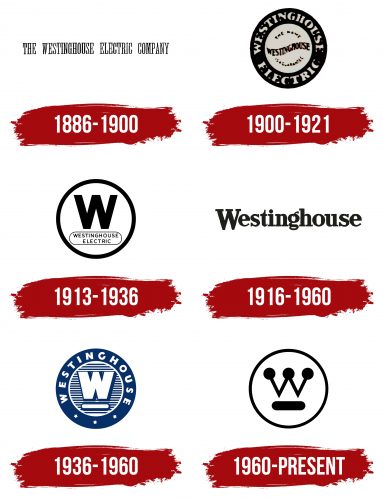
1886 – 1900
The company’s first logo was distinguished by its straightforwardness and minimalism, highlighting its clear and confident position in the market. The symbol featured the name Westinghouse Electric Company, styled in a manner reminiscent of a newspaper headline. The elongated letters symbolized the company’s pursuit of progress and reflected its commitment to implementing advanced technologies. The linear arrangement of the visual elements emphasized the process of transmitting electricity through wires, referencing the company’s core area of business.
This simple yet powerful visual image conveyed the seriousness and professionalism of the brand, named after its founder, George Westinghouse, who became a symbol of innovation and development in the electrical engineering industry.
1900 – 1921
The company’s emblem was a seal with a broad black border, inside which the name was prominently displayed in capital letters. This design conveyed a sense of formality and reliability, emphasizing the company’s status. A powerful advertising technique was used at the center of the composition — a promise of product reliability. The inscription read: “The name Westinghouse is a guarantee,” which directly indicated the brand’s confidence in the high quality of its products.
In its 14 years, the company achieved significant success, driven by the growing interest in electricity and patents acquired from Nikola Tesla. These factors allowed the company to build on the already well-known Westinghouse name and make the logo a symbol of quality and trust. The emblem emphasized that the brand had become integral to progress and guaranteed high product standards.
1913 – 1936
The new logo is significantly lighter and more graceful in design. The thin lines symbolize precision and the delicate work of electrical wiring and soldering, highlighting the company’s craftsmanship and technological superiority.
A white circle with a broad black outline emphasizes the company’s ability to manage alternating current technologies as if harnessing natural energy and directing it into engines and mechanisms. This element visualizes the brand’s highest-level power and control over the forces of nature.
The large black “W” with clear, straight lines emphasizes the importance of the Westinghouse name in the industrial sphere. It stands on an oval base with the full company name written on it, adding seriousness and formality.
The overall structure of the logo resembles an American electrical outlet, adding additional symbolism to the brand and associating it with electricity and modern technology deeply woven into everyday life.
1916 – 1960
During World War I, the company expanded its operations by starting rifle production, which changed its visual identity. The new emblem was created using a bold black serif font, adding a sense of strictness and solidity. The first letter of the name was enlarged and centered on the rest of the word, emphasizing the importance and significance of the mission being carried out.
This design gives the logo more emotion and expressiveness, like the surname of a patriot sincerely striving for victory. The mark appeared more dynamic and alive, reflecting the spirit of determination and dedication the company embodied in its contribution to supporting the country during the war.
1936 – 1960
The company returned to using a circle with a broad outline in the updated emblem. Along the circle’s edge is the brand name “Westinghouse” and three stars, symbolizing patriotism and the corporation’s success in the market. The central “W” and the oval base beneath it became three-dimensional, creating a 3D effect, and were placed against a striped background, resembling electrical currents and energy waves.
This design gives the impression that the logo elements are floating in the air, as if charged with electric particles, enhancing the connection with electrical innovations. The composition also highlights the resemblance to an outlet, adding symbolism and emphasizing the connection to energy sources. The blue and white color scheme further emphasizes the company’s technological focus and commitment to advanced solutions.
1960 – today
The modern emblem has retained the core concept but has been updated with new elements. The color scheme was simplified to black monochrome, giving the logo an elegant simplicity and formality. Large dots appeared at the ends of the glyphs in the letter “W,” making the symbol multifaceted and highlighting the company’s key areas of operation. These dots can be interpreted as:
- Circuit nodes symbolize the company’s work in electricity and technology.
- Electron movement, emphasizing the company’s contribution to developing nuclear energy and alternating current technologies.
- A crown symbolizes leadership and the brand’s significant achievements over many decades, as the company remains a key player.
- Radio stations, recalling the company’s important role in developing the broadcasting industry.
- Lightning or an electric discharge, a symbol of energy and power.
The logo’s composition skillfully reflects the diversity of fields in which Westinghouse has established itself as an innovator and leader, making it a worthy symbol of the company for the past 70 years.

