“Everything you want to know about the world can be found in the pages of an online encyclopedia,” says the Wikipedia logo. Our environment is multifaceted, and the site is interested in everything from herbs to technical innovations. The emblem promises accurate and expert information.
Wikipedia: Brand overview
| Founded: | 15 January 2001 |
| Founder: | Wikimedia Foundation |
| Headquarters: | California, U.S. |
| Website: | en.wikipedia.org |
Meaning and History
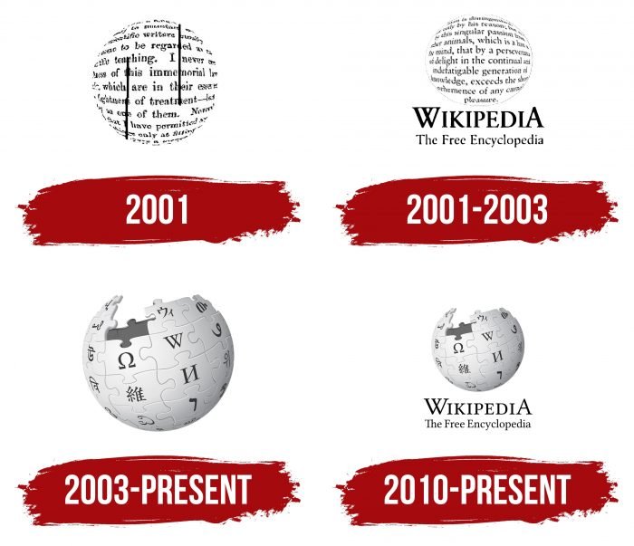
The debut logo for Wikipedia appeared in 2001. It was a round ball (an improvised globe) made up of many inscriptions. User Bjornism created it for the Nupedia logo contest. During the beta testing phase of the service, the US flag emblem was also used. Jimbo Wales suggested it.
Starting from November 2001, the virtual encyclopedia readers began to offer their versions of the logo actively. As a result, the administration has compiled a shortlist, including 24 favorite options. The last one by The Cunctator won.
During 2003, several more logo modifications appeared, which are still relevant today. After another emblem contest held in the summer, the version from Paul Stansifer (nickname Paullusmagnus) won. The user suggested a color logo formed from puzzles that were not fully assembled. In the fall of the same year, it was improved by David Friedland (user Nohat). He replaced fragments of texts with letters from the alphabet of different peoples of the world.
In 2010, another redesign took place by Philip Metschan. Its version was also tweaked to match its predecessor in style. But at the same time, the spelling of the word “Wikipedia” and the phrase “The Free Encyclopedia” were changed.
What is Wikipedia?
Wikipedia is a public, non-commercial online encyclopedia created in 2001 as an offshoot of Nupedia. It contains millions of articles written by the joint efforts of all users. Volunteers monitor the contents of the online directory. Their task is not only to replenish the site with content but also to combat the spread of misinformation.
2001
The debut emblem is a stylized globe consisting of inscriptions. The book extracts are arranged line by line and are simply taken out of context. They do not carry any information, rather they serve as design elements. In addition, the words are a reflection of the subject of Wikipedia – “piggy bank” of information about everything in the world. The logo also has two parallel thin black lines. They are placed on opposite sides at the same distance from the edges and center of the circle.
2001 – 2003
In 2001, another version of the emblem was introduced – in the form of a flattened ball. It was also full of inscriptions (more precisely, meaningless sentences). But unlike the previous version, this one has a thin edging line that runs along the entire perimeter. Also, two text clarifications appeared at the bottom: the word “Wikipedia” and the phrase “The Free Encyclopedia”. They support the monochrome style of the graphic because they are in black on a white background.
2003 – today
In 2003, the puzzle logo was approved. Small fragments depict letters from the languages of various peoples of the world. Moreover, the globe consists of them, not fully assembled. This means the infinity of the process and the inexhaustibility of information. Thanks to the letters, it became clear that the globe is slightly tilted – as it should, based on its natural axis.
2010 – today
Seven years later, a revised logo appeared. In fact, this is the previous version, supplemented at the bottom by two-line inscriptions – “Wikipedia” and “The Free Encyclopedia”. The content of the puzzles has remained almost the same. Only the shape of the signs changed: they were made elongated.
Wikipedia: Interesting Facts
Wikipedia is a free website where anyone can write and change articles. It’s like a big online book of facts and information.
- Starting Date: Wikipedia began on January 15, 2001, by Jimmy Wales and Larry Sanger. It changed the way we find and use information all over the world.
- Who Writes It: People from all over the world volunteer to write for Wikipedia. They ensure that the articles are correct and up-to-date.
- Languages: Wikipedia is available in more than 300 languages, which helps everyone learn their language, even in languages not many people speak.
- Very Popular: It’s among the top five websites people visit everywhere. Lots of people use it to find facts and learn new things.
- No Ads: Wikipedia doesn’t show ads. It runs on money users donate, keeping it free for everyone without trying to sell anything.
- Run by a Charity: Wikipedia is managed by the Wikimedia Foundation. This group doesn’t want to make money; it just wants to share knowledge.
- Special Writing Events: Sometimes, Wikipedia has events where people come together to write about certain topics, helping to ensure that all important subjects are covered.
- Fights Vandalism with AI: Wikipedia uses smart computer programs to prevent people from editing its articles, which helps keep the information safe and correct.
- QRpedia Project: Wikipedia has a cool project that uses QR codes in museums or historical sites. Scanning a code with your phone lets you read about the exhibit in your language.
- Biggest Arguments: Sometimes, people who write for Wikipedia disagree and change the same article back and forth. One article had a long argument, showing that it can be hard to agree on everything.
Wikipedia started as a new idea to share knowledge and has become an important way to learn about almost anything. It shows how working together on the internet can help spread information to everyone, everywhere.
Font and Colors
The emblem’s direct symbolism is the desire to cover the entire planet with knowledge on versatile topics. And the missing puzzle pieces represent the incompleteness of the process, which is still ahead since the world of information is immense. Fragments of the mosaic with different letters indicate the multilingualism of the site.
The actual logo looks like an unfinished globe with thin borders between elements that give it a smooth shape. In the previous version, the wrong glyphs were used, then replaced with the correct ones. Under the globe, it says “Wikipedia” with two enlarged letters (the first and the last). The phrase “The Free Encyclopedia” is in italics.
The current version of the text is a combination of lowercase and uppercase sans serif characters. The logo used to include the Hoefler Text typeface, but in 2010 it was replaced by Linux Libertine. The corporate palette is white, black, and shades of gray. There is also a 2003 color logo with blue, red, yellow, and green puzzles.
FAQ
Who created the Wikipedia logo?
The logo was created by David Friedland, known as Wikipedia user “Nohat.” His design was based on a concept proposed by Paul Stansifer in a 2003 logo contest.
The logo features a globe of puzzle pieces with some missing pieces. This symbolizes the incomplete and ever-evolving nature of knowledge. Each puzzle piece has a character from a different writing system, representing Wikipedia’s global mission to provide information in multiple languages.
Friedland’s design was chosen because it visually conveys the idea of a global, collaborative, and growing encyclopedia. The puzzle globe has become an iconic symbol, recognized worldwide as representing Wikipedia’s mission to gather and share knowledge freely.
What is the meaning of the logo Wikipedia?
The logo has a significant meaning and reflects the brand’s values and mission. It features a globe of puzzle pieces, with some pieces missing, symbolizing knowledge’s incomplete and ever-evolving nature. This design shows that information is always growing and being updated, aligning with Wikipedia’s goal to be an expanding source of knowledge.
Each puzzle piece has a character from a different writing system, representing Wikipedia’s global mission to provide information in multiple languages.
The missing pieces at the globe’s top indicate that the brand is a work in progress. This reflects the site’s collaborative nature, where users worldwide contribute to building and refining content.
What is a symbol Wikipedia?
A symbol is a mark or word that represents an idea, object, or relationship. It conveys meaning beyond its literal form, allowing people to communicate complex concepts simply.
The Wikipedia logo is a powerful symbol. It features a globe made of puzzle pieces, with some pieces missing. This design symbolizes the incomplete and ever-evolving nature of knowledge, reflecting Wikipedia’s goal to be a constantly expanding source of information.
Each puzzle piece has a character from a different writing system, representing Wikipedia’s global reach. The missing pieces at the globe’s top signify that the brand is always a work in progress.
What is an emblem Wikipedia?
The Wikipedia logo acts as an emblem. It features a globe made of puzzle pieces, with some pieces missing. This design represents the incomplete and ever-evolving nature of knowledge. The puzzle pieces contain characters from different writing systems, highlighting Wikipedia’s global reach and mission to provide information in many languages.
The missing pieces at the globe’s top signify that the emblem is always a work in progress. This reflects the platform’s collaborative nature, where users continuously contribute and refine content worldwide. This emblem encapsulates complex ideas in a simple, recognizable image.
What are the symbols on the Wikipedia logo?
The Wikipedia logo features symbols from various languages, representing its global reach and commitment to providing information in multiple languages. The globe in the logo includes characters from the Thai, Korean, Arabic, Ethiopian, Japanese, Latin, Tibetan, Chinese, Greek, Georgian, Bengali, Cambodian, and Armenian writing systems. It includes elements from the Tamil, Hebrew, and Cyrillic alphabets.
Each character on the logo is a puzzle piece, symbolizing Wikipedia’s collaborative nature. The missing pieces at the globe’s top indicate that knowledge is always evolving and that the encyclopedia is a work in progress, continuously built by contributors worldwide.
Where did the Wikipedia logo come from?
The logo’s history reflects the platform’s collaborative nature. The main inscription was developed by a user known as “The Cunctator,” who presented his design in a competition in 2001.
In 2003, another competition was held to find the best design for a graphic emblem. Paul Stansifer’s globe puzzle design won. It featured a globe made of puzzle pieces, symbolizing Wikipedia’s global and collaborative nature.
David Friedland later modified Stansifer’s design. He refined the puzzle globe, ensuring each piece represented a different writing system worldwide. This enhanced the logo’s representation of Wikipedia’s mission to provide free knowledge to everyone, regardless of language or location. The final logo, with its puzzle globe and diverse characters, captures the essence of Wikipedia.
How many Indian languages are there in the Wikipedia logo?
The official company logo features graphemes from four Indian writing systems: Kannada, Tamil, Devanagari, and Bengali. Kannada is used in Karnataka, Tamil in Tamil Nadu, Devanagari for Hindi and several other languages, and Bengali in West Bengal and Bangladesh.
This inclusion reflects Wikipedia’s dedication to representing diverse cultures and languages. It emphasizes the platform’s collaborative and global nature, where knowledge from all parts of the world is valued and shared.
