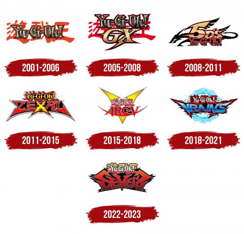
The Yu-Gi-Oh logo has a vivid dynamism, expressed in its sharp and jagged lines, creating a sense of danger and energy. This symbol represents the franchise’s core elements involving thrilling duels in specialized arenas. Each part of the emblem reflects combat, strategy, and tactics, where players use weapons for offense and defense.
The emblem carries visual references to physical weapons and the spiritual participants of the universe, including heroes, their allies, and, of course, the world of monsters where key events occur. The graphics, stylized as sharp swords or spells, enhance the perception of duels, where magical cards play a decisive role.
Yu Gi Oh: Brand overview
The history of Yu-Gi-Oh! began in 1996 when Japanese manga artist Kazuki Takahashi created a manga by the same name. The story follows a boy named Yugi Muto, who excels at solving puzzles. The manga was serialized in Shueisha’s Weekly Shonen Jump magazine.
At first, the series didn’t focus on one unified game. Each chapter featured games and puzzles that Yugi and other characters would play. However, as the manga gained popularity, readers became drawn to the unique storyline and the interesting characters.
A key moment for the franchise came in 1998 when Takahashi introduced a card game called “Magic and Wizards,” later renamed “Duel Monsters.” This game became a major part of the story and laid the foundation for the real-life trading card game that followed. That same year, Toei Animation released the first anime adaptation, which focused on the early chapters of the manga and didn’t emphasize the card game.
In 2000, NAS released a second anime adaptation, Duel Monsters, centering heavily on the card game. This version helped catapult the franchise to international fame.
In 2002, Konami released the trading card game, quickly becoming a global success among children and teens. The company continued to release new cards and sets, keeping the game fresh and engaging for players.
In 2004, the franchise saw its first full-length anime film, Pyramid of Light, which became a box-office success and further boosted its popularity.
As the years passed, the brand continued to evolve by introducing new anime series, each featuring different gameplay elements and characters. GX launched in 2004, 5D in 2008, and Zexal in 2011.
The 2010s saw further expansion with the release of Arc-V in 2014 and VRAINS in 2017, bringing fresh gameplay mechanics and broadening the universe.
Meanwhile, the trading card game continued to evolve, with Konami frequently introducing new rules and card types to maintain balance and excitement for players.
In 2016, the franchise celebrated its 20th anniversary with the release of The Dark Side of Dimensions, a movie that brought back characters from the original series.
Sevens premiered in 2019, introducing a new game format called Rush Duel to appeal to a younger audience.
As of 2023, the franchise remains one of the most popular media phenomena globally. The card game continues to attract millions of players worldwide, with regular tournaments held at various scales. The anime series also continues to draw in new fans.
What began as a simple manga has evolved over 25 years into a global phenomenon, encompassing anime, trading card games, video games, and a wide range of merchandise. The franchise has left a lasting impact on pop culture, particularly in animation and collectible card games. It continues to thrive by adapting to the changing preferences of its fanbase while staying true to its essence.
Meaning and History
What is Yu Gi Oh?
This vibrant adventure manga franchise, known for its unique blend of modern card strategy and ancient Egyptian mythology, has captivated fans worldwide. The main storyline focuses on Yugi Muto, a young boy who solves an ancient puzzle and summons the spirit of a mysterious pharaoh who shares his body. This dynamic leads to intense card duels, where victory and often the world’s fate are at stake. The strategic card game at the heart of the franchise has evolved from a fictional concept into a global sensation, with millions of players worldwide. The game is distinguished by its complex tactics, deep gameplay mechanics, and unique approach to dramatic storytelling, making every battle exciting and significant.
2001 – 2006
The game’s emblem consists of two levels: an English inscription placed over hieroglyphs, symbolizing the merging of cultures and periods. The name is divided into three syllables, sounding like exclamations, emphasizing the intense atmosphere of duels. The translation of the name means “King of Games,” and this is no coincidence, as the name reflects the essence of the game and the main character’s name—Yugi Mutou.
The bold metallic letters resemble armor, protecting the player on the battlefield. The sharp notches on the ends of the symbols enhance the impression of danger and combat. The game’s storyline revolves around card duels, and the analogy with military equipment becomes clear—every move and every card can be decisive.
The two levels of the logo represent the intertwining of the past and present. The red hieroglyphs symbolize antiquity, whose events affect the modern world, where the battle for the title of the best duelist unfolds. After assembling an ancient artifact, the main character frees the spirit of a pharaoh, and this blend of time is well conveyed through the design of the logo. The second interpretation is a symbolic representation of the alliances between people and monsters in the duel arena, highlighting the importance of strategy and synergy in the game.
2005 – 2008
The emblem of the Yu-Gi-Oh! GX movie, based on the manga events, reflects actions ten years after the original story. Large “GX” symbols are added to the familiar logo inscription. These letters represent an abbreviation for Generation X, meaning a new generation of duelists ready to enter battle.
Unlike the upper part of the emblem, the letters “GX” appear flat, but their gold and mirrored edging give the symbol additional power and expressiveness. Each detail carries meaning: the glyph “G” is styled as a blade, symbolizing sharpness and decisiveness, while the “X” resembles lightning, indicating the speed and swiftness of the game’s participants. Together, they create a sense of dynamism and strength, emphasizing that the new generation of players possesses powerful cards and the quick thinking necessary to win duels.
2008 – 2011
Yu-Gi-Oh! 5Ds is the third film, set in the distant future. The main element of the emblem is transformed into the image of a dragon, whose black body serves as the backdrop for the saga’s title, presented in bright red. The red color symbolizes battles and bravery, becoming the key focus of the entire logo. This choice of background refers to Eastern culture, reflecting major events in the story where light and dark dragon monsters are the central figures.
The golden, three-dimensional “5Ds” inscription is adorned with sharp spikes, giving it a wing-like effect that complements the dragon’s figure. The number 5 is significant, as it refers to five characters, the Signers. These heroes are connected by unique birthmarks in the shape of parts of the Crimson Dragon—an ancient creature that once saved the Earth. The logo is symbolically enclosed within the image of the dragon, emphasizing that each mark is a part of the creature, granting the heroes the power of the dragon monster for their epic battles.
2011 – 2015
The third film in the series, Yu-Gi-Oh ZEXAL, is represented by a logo with sharp, jagged shapes that emphasize the tension and dynamism of the plot. The emblem’s top part features the franchise’s name, which is traditionally placed over red hieroglyphs. The white outline creates a sticker-like effect, symbolizing a connection to the distant past events of the first part.
The letters of “ZEXAL” resemble axe blades, with their jagged and sharp edges evoking associations with metal structures and battles. The letter “X” in the center stands out, with added spherical elements pointing to one of the key characters—the spirit Astral, who seeks to recover his memories represented by numbers. The “X” also refers to the main character’s deck—Xyz One Turn Kill, symbolizing the power and strategy at the heart of the film.
2015 – 2018
The emblem is set against a large yellow “V.” At the top of the logo is the overall name of the manga, retaining its original style and font but changing to white. This symbolizes that the first story of the manga is present only as a spirit, a reminder that runs through the entire series of duels.
At the bottom of the logo is the title of the fourth series—Arc-V, representing the reactor that unites dimensions. The inscription rests on a red crescent, symbolizing a pendulum. This element is connected to the power of Pendulum Summoning, awakened by the main character, a student at the Duel Academy. The pendulum also represents one of the key dimensions—the Pendulum Dimension.
The emblem appears sharp, dynamic, and even dangerous, reflecting the balance and equilibrium achieved through the interaction of various elements within the storyline.
2018 – 2021
The series emblem is set against the backdrop of a portal, symbolizing the digital vortex of the virtual reality LINK VRAINS, where duel battles now occur. As in other series logos, the overall name of the manga is displayed at the top of the emblem in both English and Japanese, maintaining brand continuity.
The main focus is on the large trapezoidal “VRAINS” inscription, written in blue letters that symbolize the virtual world. The name is formed by merging the first letters of key terms: Virtual Reality, Artificial Intelligence, and Network System. This combination reflects the essence of the digital world where the events unfold.
The inscription is surrounded by a black-and-red outline with sharp edges, creating an effect of destruction and instability. The framing appears to be caused by digital interference, hinting at the chaos engulfing the virtual world. This element resembles a black hole gradually consuming reality. In this world of chaos, only the main character can resist the threats of hackers and protect the virtual space from destruction.
2022 – 2023
The “Yu-Gi-Oh! Sevens” logo is designed in a bright and dynamic style, setting the tone for action-packed and energetic duels. The red, angular “Sevens” inscription on a black background draws attention. Each letter seems to “explode” with spikes, resembling flashes and lightning, enhancing the sense of speed and intensity characteristic of the new Rush Duel format. This style emphasizes the aggressiveness and dynamism of the battles, which have become a hallmark of this season.
The hieroglyphs of the main title, done in a gradient from red to yellow, echo the image of the main character—Yuga Ohdo. His bold and vibrant personality is perfectly conveyed through the color scheme, symbolizing strength, energy, and a passion for victory.
The logo, released to mark the 20th anniversary of the saga, reflects a new era for the franchise and highlights the updated duel rules. It symbolizes the shift to a new generation of players and more intense, thrilling battles, emphasized through the aggressive letter design and contrasting colors.
