Zain: Brand overview
Zain’s origins trace back to Kuwait, where the Mobile Telecommunications Company (MTC) was founded in 1983. The Kuwaiti government took the lead in establishing the first mobile telecommunications company in the Middle East, aiming to provide mobile services across the country.
MTC launched Kuwait’s first mobile network using analog technology in 1985. Introducing mobile communication to Kuwait marked a breakthrough in the region’s telecommunications sector.
The 1990s saw rapid growth for the company. When the transition to GSM digital technology occurred in 1994, the quality of communication improved, and the range of services expanded. This technological shift led to a significant increase in the customer base in Kuwait.
A pivotal moment in the company’s history occurred in 1999 when MTC went public, listing its shares on the Kuwait Stock Exchange. This IPO provided the firm additional capital to support its operations and growth.
The company’s global expansion began in the early 2000s. 2003, after obtaining a license to provide mobile services in Jordan, the company launched Fastlink (later rebranded as Zain Jordan), marking its first venture outside Kuwait.
In 2005, MTC expanded aggressively by acquiring Celtel, a Dutch telecommunications firm operating in 13 African countries, for $3.4 billion. This was the largest acquisition in the company’s history and greatly expanded its reach.
In 2007, MTC underwent a rebranding. The entire company, including Celtel’s African operations, unified under the single brand name “Zain,” which means “beautiful, good, and wonderful” in Arabic. This rebranding was an important step in creating a cohesive corporate identity.
The company continued its expansion in 2008, strengthening its presence in the MENA region by acquiring licenses to operate in Morocco and Saudi Arabia.
In 2009, the company sold its African operations—except for Sudan and Morocco—to Indian telecom giant Bharti Airtel for $10.7 billion. This allowed a focus on core markets in the Middle East.
In 2010, the ownership structure shifted when a group led by the UAE’s Etisalat acquired a 46% stake from the Kuwaiti investment firm Kharafi Group. However, the deal was never finalized due to conflicts between the parties involved.
In 2011, investors from Bahrain and Saudi Arabia acquired assets in Saudi Arabia to streamline the portfolio and focus on key markets.
From 2012 to 2015, the company made substantial investments in upgrading its networks, bringing 3G and 4G technology to its major markets.
The first 4.5G services were launched in Kuwait in 2016, maintaining its lead in technological advancement in the region.
In 2017, the company focused on digital transformation, investing heavily in financial and digital services to diversify beyond traditional telecom services.
Zain became a leader in 5G technology in 2018, launching Kuwait’s first commercial 5G network. This achievement showcased the company’s commitment to technological leadership.
During 2019 and 2020, the company’s digital ventures grew further, introducing various services such as fintech platforms and digital wallets across its key markets.
In 2021, it continued expanding its 5G network throughout Kuwait and other operating countries. The company also increased its support for innovative digital projects and became more involved in developing the startup ecosystem in the region.
By 2022, it had strengthened its position in the financial and e-commerce sectors by launching new platforms and services in its main markets.
Zain remained one of the leading telecom providers in the Middle East in 2023, serving millions of customers across various countries. The focus remained on expanding digital services, advancing telecommunications technology, and continuing the development of the 5G network.
The company has evolved from a small Kuwaiti operator to a major regional telecom provider. Its ability to adapt quickly to changing market demands and technological progress, coupled with a history of key acquisitions, has been a driving force behind its success.
Meaning and History
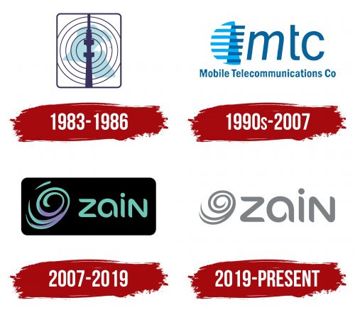
1983 – 1986
1990s – 2007
2007 – 2019
2019 – today
The Zain logo is minimalist and symbolic, effectively reflecting the company’s core idea—connecting people. The spiral on the left visually resembles a ball of yarn or a spool, symbolizing interaction and communication woven within a single network, much like threads in a ball. It appears smooth, flowing, and calm, which suggests that the company aims to provide comfort and reliability in its services rather than creating a sense of chaos or tension.
The color palette features soft gray tones, giving the emblem a sense of professionalism and stability. The gray color here acts as a symbol of reliability and technological sophistication. The absence of bright colors indicates the brand’s confidence in its quality without relying on flashy elements to attract attention.
The font used in the logo is unique, with smooth, rounded ends on the letters, enhancing the feeling of ease and simplicity. The letter “a” stands out in particular, as its shape also echoes the spiral, visually reinforcing the logo’s main symbol and creating a cohesive concept.
The logo’s visual elements highlight the company’s dedication to simplicity and accessibility. It focuses on smoothness and lightness and eliminates unnecessary complexity in communication. Zain presents itself as a company that connects people easily and comfortably, like threads intertwining to form strong, reliable connections.
