The logo Etisalat encapsulates an intriguing blend of symbolism and minimalism. It comprises two primary elements: the letter “E” and an ampersand (“&”), both of which are rendered in a dark red hue on a contrasting white backdrop. The design employs thick, clean lines, while the ends of the shapes are treated with straight cuts, thereby adding a sense of modernity and precision.
Delving into the logo’s meaning, the “E” naturally represents the initial letter of the emblem company’s name, acting as an effective shorthand for identification. On the other hand, the ampersand character carries its universal connotation of connection and continuity, possibly hinting at the brand’s aim to foster enduring relationships with its customers and stakeholders.
The logo’s minimalistic approach reflects the emblem company’s focus on simplicity and clarity, while the dark red color choice suggests power and passion. The emblem subtly communicates the company’s commitment to delivering quality and trustworthy services while maintaining a strong, modern, and connected identity.
Etisalat: Brand overview
| Founded: | 30 August 1976 |
| Headquarters: | Abu Dhabi, United Arab Emirates |
| Website: | eand.com |
Etisalat, known officially as Emirates Telecommunications Group Company PJSC, has been revolutionizing the telecommunications industry since its inception, marking a phenomenal journey from a local telecommunication provider to an influential global player.
Carrying forward the spirit of innovation from the United Arab Emirates, this multinational brand has been successful in establishing a strong foothold in 16 countries across Asia, the Middle East, and Africa. Propelling the digital age forward, the company has been at the forefront of introducing cutting-edge technology and advanced communication solutions, ensuring its customers always stay ahead of the curve.
Meaning and History
As a telecommunications services provider, the brand is deeply entrenched in the concept of connection. Its identity is symbolized by a dynamic sphere, representing a world that’s constantly evolving yet interconnected. A bold, contemporary color palette featuring green and silver helps set the brand apart in the market and speaks of its commitment to growth, technology, and sustainability.
Its mission and vision statements emphasize this commitment, mirroring its goal to ‘drive the digital future to empower societies.’ This manifests in the brand’s customer-centric approach, offering an array of services ranging from mobile and fixed-line voice services to broadband networks, thereby meeting the communication needs of individual consumers, businesses, and government agencies alike.
What is Etisalat?
Etisalat, short for Emirates Telecommunication Group Company PJSC, is a leading multinational telecommunications services provider based in the United Arab Emirates. Founded in 1976, it operates in 15 countries across Asia, the Middle East, and Africa, offering a variety of services including mobile and fixed-line voice and data services, broadband connectivity, and IPTV. Known for its advanced infrastructure and pioneering efforts in 5G technology, Etisalat is recognized as one of the largest telecom operators in the world.
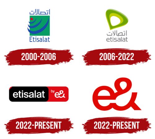
2000 – 2006
2006 – 2022
2022 – today
2022 – today
Etisalat color codes
| Racing Red | Hex color: | #e00700 |
|---|---|---|
| RGB: | 224 7 0 | |
| CMYK: | 0 97 100 12 | |
| Pantone: | PMS Bright Red C |
