


![]() 24h com vn Logo PNG
24h com vn Logo PNG
The 24h com vn logo symbolizes 24/7 control over the situation. It reflects the website’s concept: covering the latest news from Vietnam and publishing it continuously. The emblem’s unusual design reflects a creative approach to content selection.
24h.com.vn grew out of the career shifts of Phan Minh Tam, a graduate of Hanoi University of Science and Technology. After leading sales at FPT, Vietnam’s largest technology corporation, he later worked in the chemicals and non-ferrous metals sectors. The arrival of ADSL internet in Vietnam pushed him back toward technology, this time through online content.
On June 1, 2004, 24H Online Advertising Joint Stock Company was registered. Tam started the project with his university classmate Nguyen Thanh Long, a programmer willing to take the risk. The first office was a 20-square-meter room at 27 Chua Lang Lane, in poor condition and with almost no infrastructure. On June 25, 2004, 24h.com.vn officially went online.
From 2005 to 2012, the editorial office was located in the HITTC building of the Hanoi Department of Information and Communications at 185 Giang Vo Street. In 2012, the company moved to the Geleximco building at 36 Hoang Cau Street. As traffic grew, 24h faced inspections from authorities and criticism from other media over the reuse and verification of materials, while competing with portals such as VnExpress and Tuoi Tre.
The company later built a wider digital ecosystem, including Eva.vn, the women’s portal under 24H Online Advertising. In 2013, Tam acquired timviecnhanh.com and combined job-search websites into Siêu Việt. Further investments included 30Shine in 2016 and Pega in 2017, which were later consolidated under STI (Simple Tech Investment). In July 2019, the group launched 24hmoney.vn. Today, 24h.com.vn publishes about 250 articles a day and records more than 1 billion monthly views.
Meaning and History
The site’s emblem is recognizable, compact, and balanced. It is a sign not only of the portal but also of the advertising agency and has not changed since its inception.
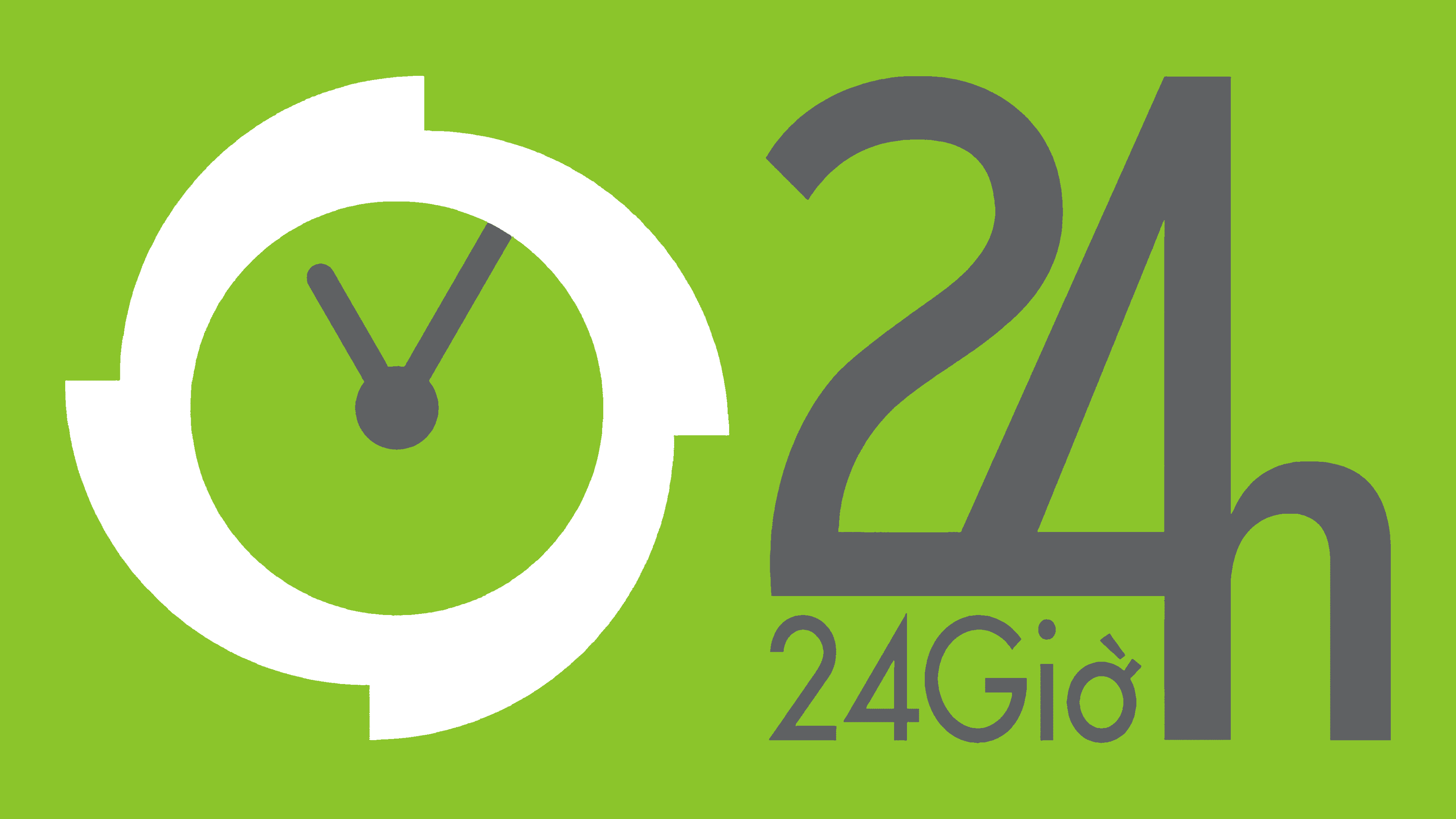
The 24h com vn logo consists of an image, supplemented by a large inscription “24h”.
What is 24h com vn?
It is Vietnam’s second most popular news portal, with 20 thematic sections. The site is owned by Advertising Corporation. 95% of the site’s visitors are Vietnamese.
24h com vn is the address of the web page. It can be translated as “24h with Vietnam”. However, the site is called “24h” or “24h news”. The shortest variant is used in the logo.
The number 24 is not only an indicator of the day. An advertising corporation organizes the site. Among its slogans is the idea that each person or company can succeed in 24 hours. With such a logo, the site owners wanted to convey that, thanks to advertising, you can achieve success on the Internet in just 24 hours.
The image shows that the site is designed for many users, not just those in Vietnam. It is also for tourists and residents of other countries. This is evident from the logo, which conveys information in both Vietnamese and English simultaneously.
After the number 24, the letter h is added, which, for English-speaking readers, indicates an abbreviation of the word “hours.” At the bottom, under the numbers, the word “gio” has been added. This is the Vietnamese version with the same meaning. Another sign of orientation toward the English-speaking contingent is the time on the logo clock: 11.05. This is the time difference with America.
Such a move has a certain success – US residents take second place in terms of portal traffic.
An interesting solution was chosen to display the letter “h”: its main leg coincides with the stick of the number 4, which was lowered for this purpose. In the resulting pocket under the digits, the Vietnamese inscription “24 gio” was placed. This combination creates harmony in the design and makes the logo compact.
There is a lot of dynamics and pressure in the logo.
- The hour circle is depicted as a flywheel with blades near the main divisions at 12, 3, 6, and 9. It symbolizes the movement, a gust of wind, which turns the wheel of life. Reflecting the most poignant, savory, and interesting events.
- The big hand left the exact value of 12 and moved on. Information that was relevant an hour ago can lose its importance in five minutes, giving way to new news. And the portal is always up to date, one step ahead.
- The uneven contour of the entire inscription, with the elongation of the number 4. Life rarely goes in a straight line. It has ups and downs.
The tail of the numeral 2 lengthens and merges with the 4. This combines the 24 into a single inscription, indicating that it corresponds to one day. Every day, the site’s main page is completely updated.
Font and Colors
The logo is in green and gray.
- Green is not Vietnam’s national color. However, it echoes the country’s landscapes, with abundant greenery and moss-covered rocks. For the Vietnamese, the color green symbolizes the femininity of life. Therefore, its appearance in the clock image suggests that this object reflects rhythm, and that the flow of life keeps pace with and encompasses all important events in the country.
- Gray is the color of constancy and stability. It demonstrates that all incidents are covered around the clock, without interruption, day after day.
The font used can only be judged by the spelling of the word “gio.” More characters are needed to accurately determine the font’s style. But it resembles Futura Pro Medium. Next to the letter “o,” there is a diacritic mark dictating the pronunciation of the letter, which is characteristic of the Vietnamese alphabet.
24h com vn Logo Color Codes:
- bright lime green: (#AEEE00)
- gray: (#8F8F8F)
FAQ
What does the 24h com vn logo stand for?
24h com vn is a digital news platform based in Vietnam, founded in 2004 and officially licensed in 2018. 24H Online Advertising Joint Stock Company operates the site.