


![]() Acme Logo PNG
Acme Logo PNG
The American supermarket chain makes a strong statement with its colorful, memorable logo. The Acme logo, like other retailers’ distinctive signs, attracts potential customers’ attention. It serves as an effective marketing tool.
Acme Markets began in 1891 in South Philadelphia, where Irish immigrants Samuel Robinson and Robert Crawford opened a small grocery store at Second and Fernon Streets. The shop offered fixed low prices, carefully selected products, and tea as one of its main goods. By 1910, Robinson and Crawford operated about 186 stores across Philadelphia.
In 1917, Robinson & Crawford merged with four local grocery chains: Acme Tea Company, S.C. Childs Company, James Bell Company, and George M. Dunlap Company. The new American Stores Company, or ASCO, had 1,223 locations. Acme Tea Company was the largest part of the merger, and its name later became the chain’s public identity. ASCO shares began trading on the New York Stock Exchange on April 25, 1929.
By the late 1920s, American Stores was competing with A&P across the region. In 1937, after Samuel Robinson stepped down, the company moved toward full-size supermarkets with wider aisles, fresh meat and dairy departments, and parking lots. The first two opened in Paterson, New Jersey, and the chain adopted the name Acme Markets. In 1961, American Stores bought Alpha Beta in Southern California. In 1963, Acme introduced its “fish eye” logo and A-Frame store format.
In 1979, American Stores was sold to Skaggs Companies, which kept the name. During the 1980s, it expanded through deals including Jewel Food Stores. At the same time, ShopRite and Wakefern Food Corporation increased pressure on Acme in its core market. Albertsons bought American Stores in 1999 for $11.7 billion. After later ownership changes involving SuperValu and Cerberus, Acme returned to Albertsons in 2013. By then, it had fallen behind ShopRite and Giant Food Stores in the Delaware Valley market.
Meaning and History
![]()
Founded in the late 19th century by two emigrants, the Acme Tea Company has established a fairly strong position in its small niche in the eastern United States. This was facilitated by an association with other emigrant businesspeople in 1917 at American Stores (ASCO). The stores adopted their current name in 1937, when it was decided to expand the range of goods and become markets. For new outlets, the name of the largest of the association’s five companies was chosen.
The market’s logo was not developed immediately, but rather some time after the opening of the first self-service stores. The visual sign changed as the network evolved and expanded. There are four updates in total.
What is Acme?
A chain of 164 supermarkets in the eastern United States, owned by Albertsons. Headquarters in suburban Philadelphia.
1954 – 1960
![]()
The first store logo was an oval, inside which the word Akme is written in capital letters with a capital A, and below, in block capital letters, “Markets.”
The oval’s shape subconsciously conveyed a sense of friendliness. She made it clear that polite service awaits the buyer in stores. The connections between the letters indicated the availability of interconnected home and household goods at the outlet. The capital A has demonstrated its leading position among stores (since its inception, the chain has held the top spot in the region, displacing most of its competitors).
The word ACME was quite popular as a brand name at the time. Translated from Greek, it meant “a period of maturity, reaching the culmination of development.” Speaking about the company, it was used to mean “the best,” “experienced,” “at the top.” For the firm of Robinson and Crawford, the choice was not exaggerated. The Tea Company is the largest partner, and the markets are industry leaders.
In English, the decoding of the ACME abbreviation is also quite optimistic: A Company that Makes Everything (a company that can do anything). The market’s signature told what industry the firm was in.
1960 – 1981
![]()
By the 60s, Acme began teaming up with pharmacies, wine stores, and fast-food systems such as the Pizza Hut franchise to provide customers with a broader range of services, turning them into supermarkets.
New logos have been developed to distinguish between regular Acme stores and supermarkets. Their elongated background resembled a fish or an eye, so the people called the symbol “fisheye.” The logo imitated lava lamps that were popular at the time. Multi-colored wax bubbles, endlessly rising and bubbling, formed a bewitching picture. There was similarly heavy traffic in Acme’s stores. New proposals, from which “eyes ran,” and the rise and fall in prices. The logo creators tried to draw an analogy to arouse buyers’ interest and associate it with something fashionable and modern. Hence, the soft rhombus shape is characteristic of lamps, and the red dot symbolizes the bubble.
- For smaller stores, a blue background with a red dot in the left corner of the eye was used. Inside the blue background was white Acme lettering in capital letters. The size of the letters indicated large stores, and the light tone represented novelty.
- For supermarkets, the main image was outlined in blue, following the contours of the “eye,” making the logo appear larger and emphasizing the store’s size. The white space inside the outline indicated the addition of new features and services beyond the familiar Acme products. This version of the visual sign resembled an eye with a tear rolling out of it.
The diamond-shaped logo echoed the special shape of the network’s elongated buildings.
1981 – 1984
![]()
The parent company changed ownership. Skaggs bought it in 1979. But it did not rename it; rather, it took the name American Stores. The purchase had a positive effect on Akma. The network expanded significantly by acquiring bankrupt stores from other companies. They were rebuilt and renamed, making them part of the network. The logo has also been updated.
He retained the eye shape and the outer stroke, as in supermarkets, but removed the teardrop dot. The shape of the visual sign was reminiscent of a rugby ball, an energetic game full of movement, shots, and competition. It suited the growing network very well. The color scheme was changed to red, which symbolized growth, expansion, and the energy of change. The effect was enhanced by a stroke at a small distance from the main background, showing the growing scale.
The white name in the center of the logo was retained. It demonstrated the convenient location of markets on the main streets, in large, crowded points. They were easy to see. White symbolizes the freshness of products and the healthcare provided by pharmacies.
1984 – 1998
![]()
American Stores continued to grow by acquiring new firms. The logo reflected this by the red extending beyond the white border. A thin white stripe remained inside the red background near the edge. The sharp corners on the sides were removed, restoring the original oval shape. The saturated red tone of the emblem signified the apogee of development and the company’s unprecedented power. The energy that destroys everything in its path. White tones represented fair play and fair prices.
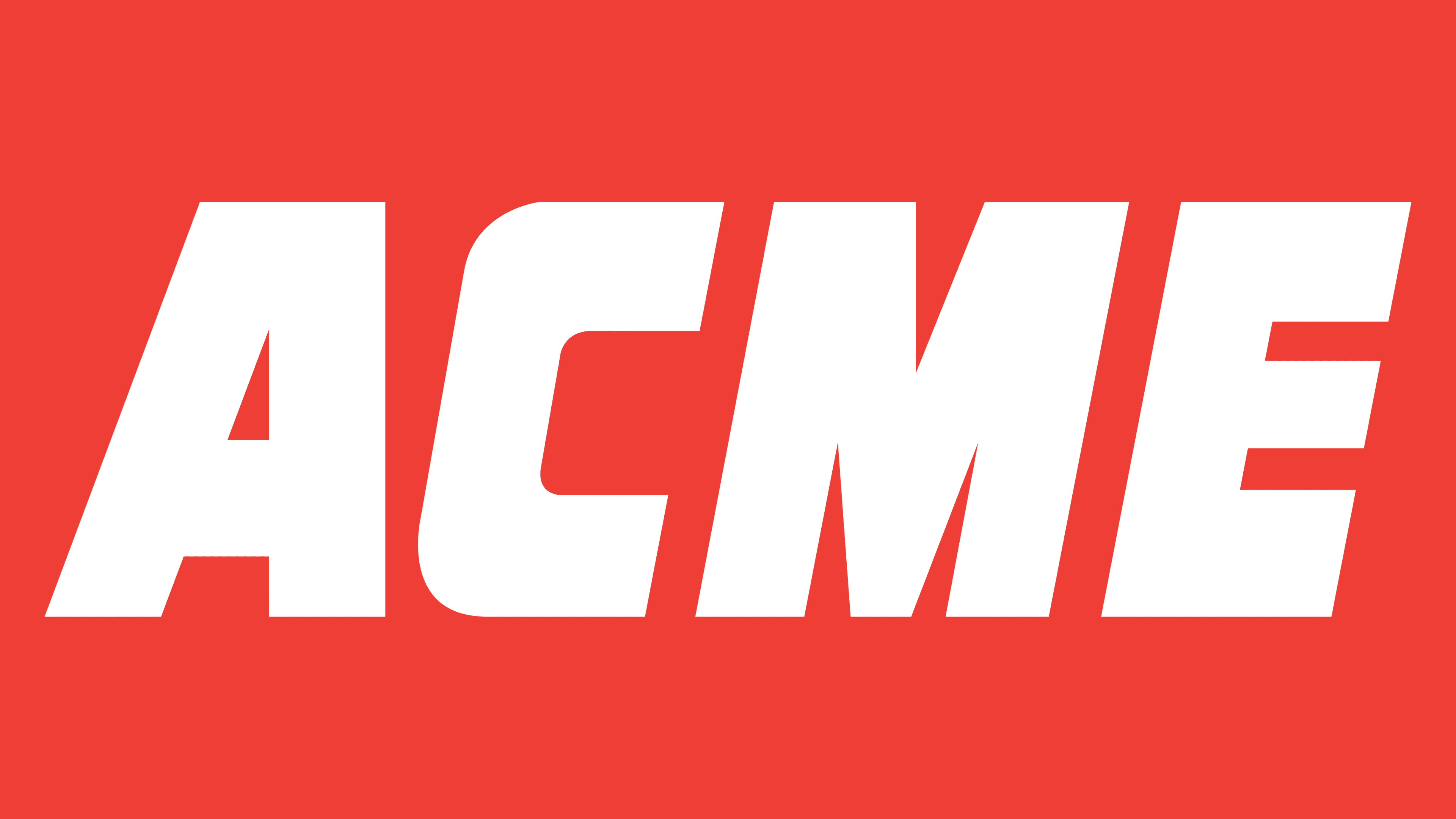
1998 – today
![]()
Acme becomes part of America’s second-largest grocery chain, Albertsons, which acquires Acme’s parent company, American Stores Company. Change of owners leads to rebranding.
The last visual sign is simple and minimalist. It consists of four capital letters of the network name. The background was removed, transferring the red color to the inscription. This suggests that the company will pay particular attention to brand development (in the future, all acquired large stores were rebranded as ACME). Italics indicate a desire to move forward, to continue working.
The visual mark mimics the logo of the Canadian division of the supermarket chain IGA from 1990. The difference is only in a paler shade of red.
Font and Colors
The main colors of the logo are red and white.
- Red – love for your work, a powerful breakthrough, and leadership.
- White – naturalness, purity, safety.
Logo font – Drop Case Italic. Massive, wide letters of equal width symbolize large stores and a uniform pace of network development without setbacks or failures.
Acme Logo Color Codes:
Primary color
- Red: Hex code: #EF4034; RGB: 239, 65, 53; CMYK: 0, 90, 86, 0; Pantone: 032 C
Secondary colors
- White: Hex code: #FFFFFF; RGB: 255, 255, 255
- Black: Hex code: #000000; RGB: 0, 0, 0