 Aeon Stores Logo PNG
Shopping for groceries, clothing, and household goods is part of the regular rhythm of life, where the store becomes a familiar destination for everyday needs. The retail chain brings together a range of different product categories and organizes the space for convenient selection. The Aeon Stores logo is associated with a company that operates stores and shopping centers in Asia, offering food, clothing, and everyday goods.
Aeon Stores (Hong Kong) was founded in December 1985. The company was established as a subsidiary of the Japanese group JUSCO to develop a retail network in Hong Kong. The first store opened in December 1987 at the Kornhill complex in Quarry Bay. It became the city’s largest department store and offered a wide selection of household goods, clothing, and food products.
In 1994, the company began trading on the Hong Kong Stock Exchange. During the same period, it began expanding into mainland China. The company opened its first stores in Guangdong Province and Shenzhen. In 1996, construction began on Jusco shopping centers in major Chinese cities, including Beijing and Shunde.
In 2000, JUSCOCITY launched its online store. It became one of the region’s first online retail projects. In the following years, the company developed new areas. AEON SUPERMARKET stores, Living PLAZA by AEON shops, and the Bento Express ready-meal chain were established.
In 2013, the brand renamed its department stores and supermarkets AEON. This change was part of a global rebranding effort. In 2021, the third AEON STYLE store opened in Mong Kok. It introduced an updated format featuring the HÓME CÓORDY and TOPVALU brands.
That same year, Aeon Stores signed an agreement with the Japanese chain DAISO. After that, dozens of small-format stores under this brand began operating in Hong Kong.
Today, the company operates 10 department stores, three supermarkets, 30 Living PLAZA stores, 29 DAISO Japan stores, and 6 KOMEDA’S Coffee cafes. In Guangdong Province, it owns 20 department stores and 22 supermarkets. Aeon Stores remains one of the largest retailers in the Greater Bay Area.
Meaning and History
What is Aeon Stores?
Japan’s largest retail network operates about 18,000 stores across various formats and over 300 subsidiaries. Annual revenue is approximately 8.3 trillion yen (about $ 75 billion). Main areas include hypermarkets and supermarkets MaxValu, Daiei, and Maruetsu; convenience stores Ministop; pharmacies Welcia; and shopping centers Aeon Mall and Aeon Town.
1987 – 1990
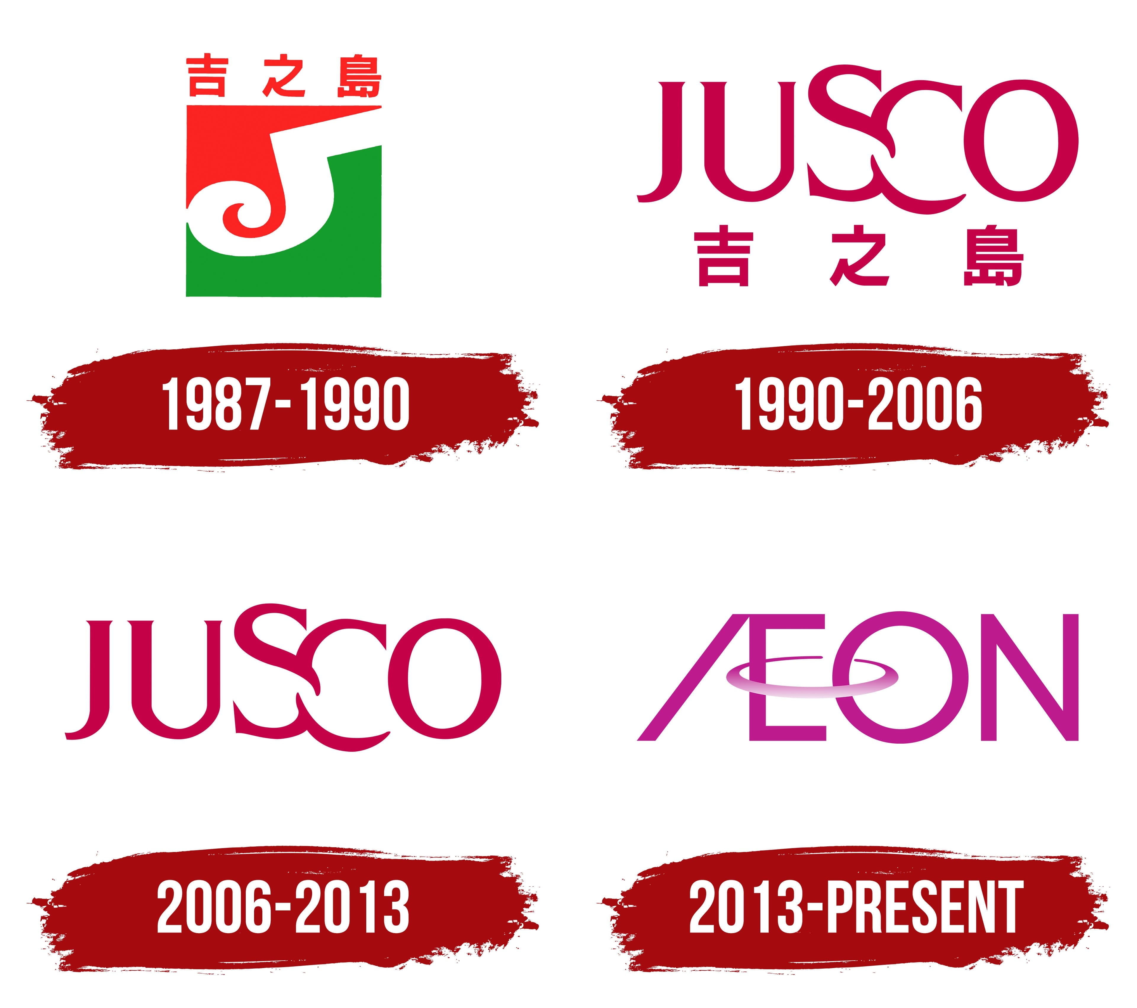
The Hong Kong division of the Japanese retail group was established in December 1985 as Aeon Stores (Hong Kong) Co., Limited. The first JUSCO department store opened in November 1987 at the Kornhill complex on Hong Kong Island. The chain used the Chinese name 吉之島 in the local market. It is pronounced “Gat Zi Dou” in Cantonese, while “Jusco” was used in English.
The JUSCO name predates the company’s entry into Hong Kong. The Japanese group was formed through the merger of Okadaya, Futagi, and Shiro. An employee competition gave it its name. It was based on the phrase “Japan United Stores Company,” referring to the consolidation of retail organizations under common management.
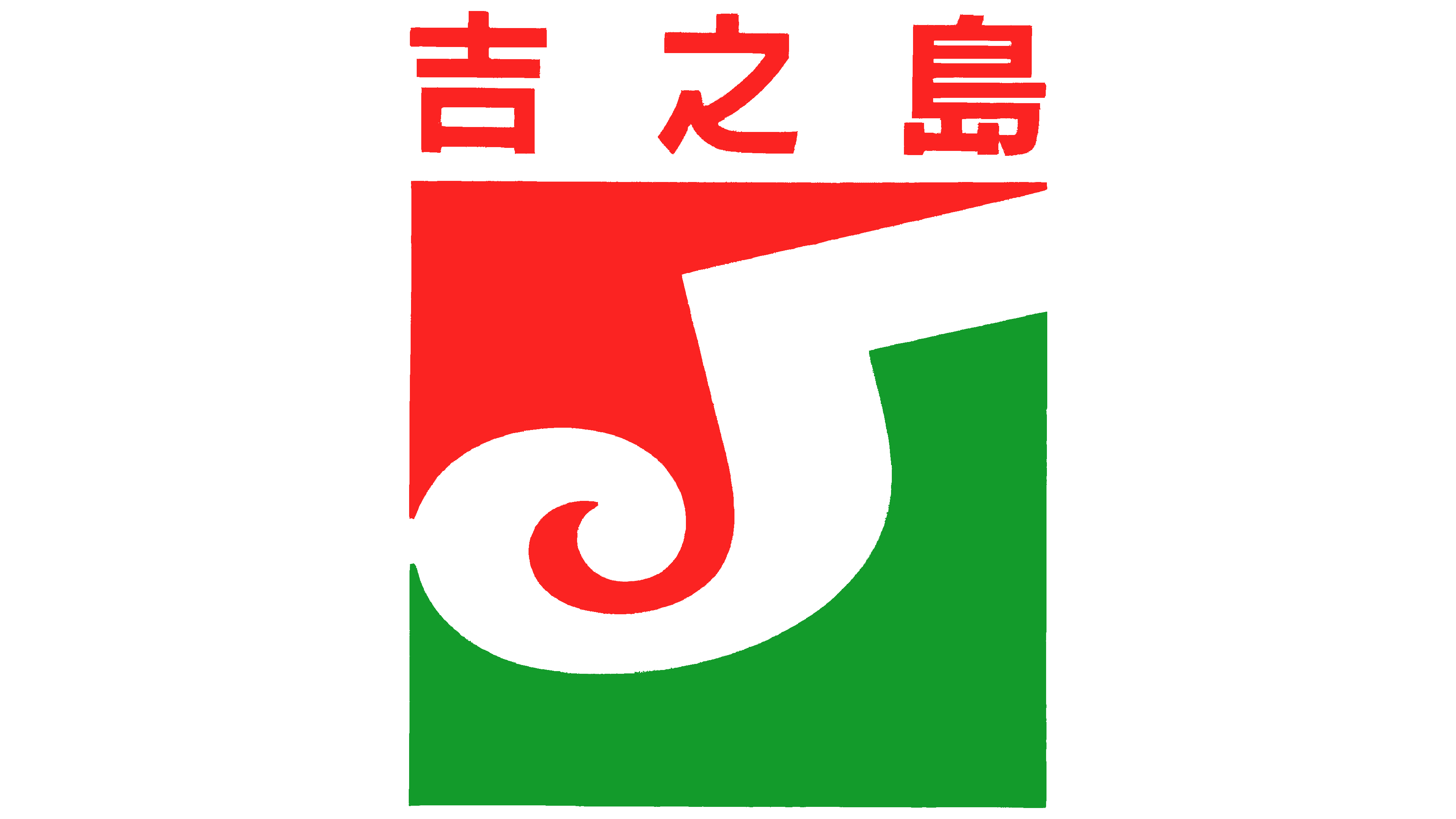
The 1987–1990 logo had 2 levels. The Chinese name 吉之島 appeared at the top, while a colored block containing a white “J” sat below. The Chinese characters addressed Hong Kong customers, while the monogram represented the international JUSCO brand.
The 3 Chinese characters were red and arranged horizontally. They used a heavy sans-serif style resembling Japanese Gothic lettering. The horizontal and vertical strokes were similar in thickness. Their angular forms created a dense line above the logo’s lower section.
A 4-sided block divided by a diagonal line appeared beneath the characters. A red field occupied the upper-left area, while green filled the lower-right section. The colored fields served as a background for the white “J” and formed its outer outline.
The white letter occupied most of the block. Its upper bar extended to the right corner. The vertical stroke descended along the boundary between the red and green fields. A heavy base curved inward, while the lower end curled into a spiral resembling a wave or calligraphic flourish.
The spiral sat within the green area, while the upper section of the “J” passed through the red field. White separated the letter from the background. The diagonal division introduced asymmetry, while the curled lower stroke balanced the large upper bar. Red appeared in both the Chinese characters and the upper field, connecting the logo’s 2 levels.
1990 – 2006
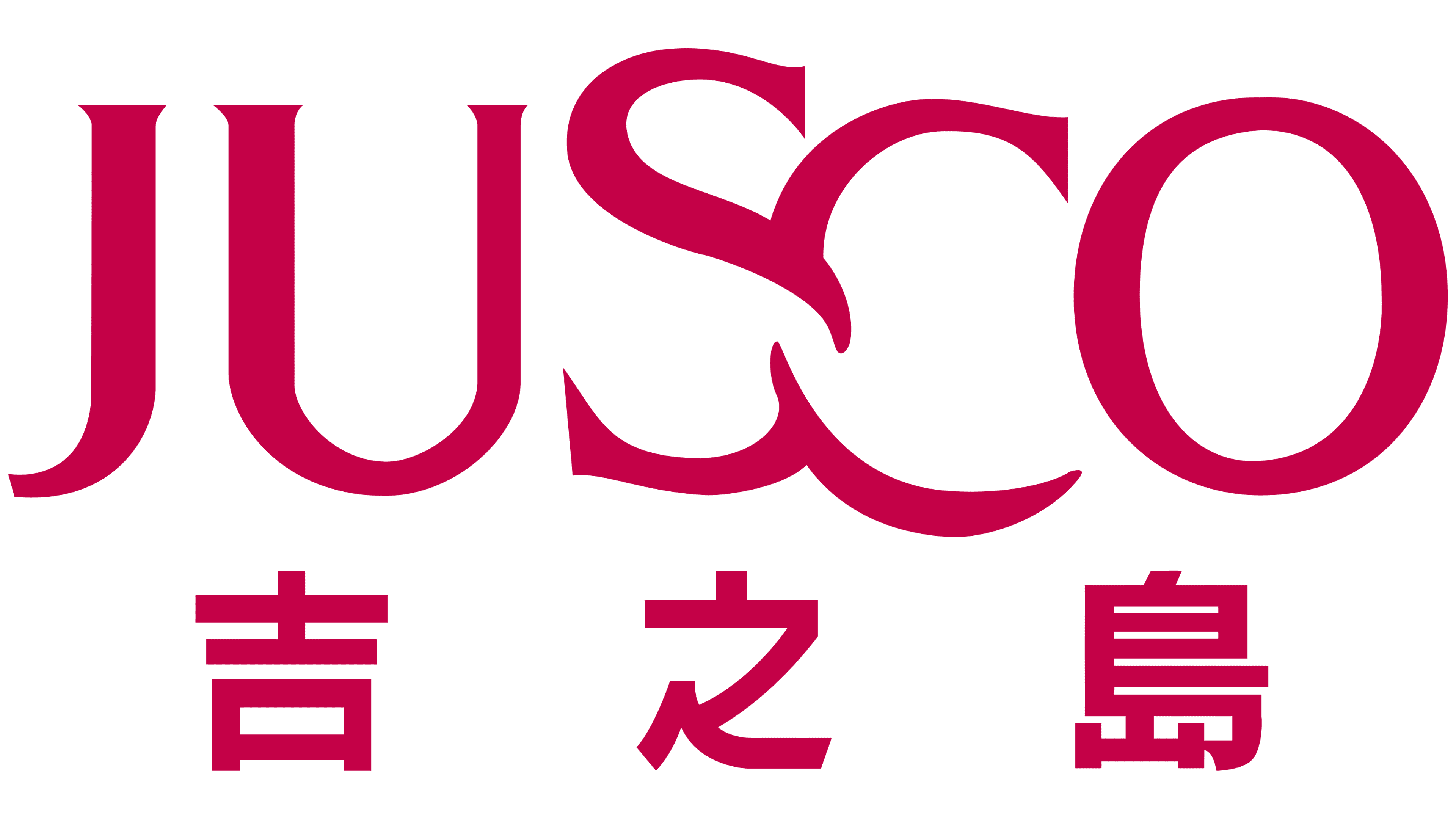
In November 1990, JUSCO shifted the primary emphasis from the square emblem to the chain’s name. Large Latin lettering became the basis of its international branding. In Hong Kong, the local name 吉之島 appeared beneath it. The 2 levels combined the international brand with the Chinese name familiar to regional customers.
JUSCO occupied the upper section of the logo. The uppercase letters used a dark burgundy color with a purple undertone. They appeared in a high-contrast serif typeface with thick main strokes and thin secondary lines.
The main typographic feature appeared between the letters “S” and “C.” The 2 characters touched and partially overlapped. Their strokes intertwined at the bottom, connecting the letters. The treatment turned standard lettering into a custom wordmark.
The 3 Chinese characters 吉之島 appeared below. They used the same burgundy color but had a heavy sans-serif form. The Chinese line was smaller than the Latin wordmark, with wide spaces between the characters. The upper level presented the JUSCO name, while the lower level identified the chain’s Hong Kong name.
2006 – 2013
In July 2003, JUSCO Stores (Hong Kong) Co., Limited adopted the legal name AEON Stores (Hong Kong) Co., Limited. The new name was used for official business, while the stores continued operating under the JUSCO brand. Signs bearing the former name remained in use until 2013.
The 2006 version removed the Chinese line 吉之島 from the logo. The composition shifted to a single level featuring the Latin name JUSCO. The shortened version suited international use and separated the brand from the identity developed specifically for Hong Kong.
The name appeared in large burgundy serif letters. Thick main strokes were paired with thin sections, recalling a traditional Roman typeface. The letters “S” and “C” intertwined in the middle of the word. Their curved lines entered one another and partially overlapped. The remaining letters stood separately in an even horizontal row.
2013 – today
The Japanese parent company adopted the name AEON on August 21, 2001. On that date, Jusco Co., Ltd. became Aeon Co., Ltd. The word “aeon” comes from a Latin root meaning “eternity.” The group associates the name with long-term service to its customers. Early English-language materials used the form ÆON with the “Æ” ligature. The company later adopted the 4-letter Latin spelling AEON.
On March 1, 2013, JUSCO stores in Hong Kong and southern China were renamed AEON. The company brought its retail locations under a single brand and linked them with Japan’s Aeon Co., Ltd. The program followed the renaming of stores in Japan in 2011 and Malaysia in 2012. The replacement of store signs accompanied “Aeon Retail’s” corporate rebranding and restructuring.
The emblem consists of the purple word AEON. Its uppercase letters use a custom sans-serif typeface built from heavy, even lines and rounded contours.
The letter “A” is divided into 2 diagonal sections. An open space occupies its center. Together, the “A” and “E” resemble the earlier “Æ” ligature. The “E” consists of a vertical stroke and 2 horizontal lines at the top and bottom.
An oval ring passes through the “E” and “O,” transitioning from purple to light pink. The line begins inside the “E,” crosses the space between the letters, curves around the front of the “O,” and partially passes behind its outline. The visible and concealed sections resemble an orbit. The ring connects the neighboring letters while preserving the individual forms of AEON.