


 Miniso Logo PNG
Purchases of small household items, cosmetics, and accessories often involve quick choices and affordable prices. Such stores offer a wide range of small items that are easy to add to everyday expenses. The Miniso logo is associated with a retail chain that sells household goods, personal care products, and gifts, emphasizing a simple product range and affordability.
Miniso was founded in 2013 in Guangzhou by entrepreneur Ye Guofu. The company positioned itself as a brand inspired by Japanese aesthetics and minimalist principles. The first store opened that same year. It offered affordable daily-use products, including cosmetics, accessories, electronics, and toys. The products featured simple designs, and prices ranged from 10 to 50 yuan.
The business model was based on fast product turnover and compact store formats. An optimized supply chain played an important role. The franchise system ensured rapid company growth. By the end of 2014, the network had more than one hundred stores in China. During the same period, it began expanding into Southeast Asia. In 2015 and 2016, the brand entered the markets of South Korea, Thailand, India, and the Middle East.
In 2017, Miniso received investments from Tencent and Hillhouse Capital. In 2018, the network opened stores in North America and Europe. The number of outlets exceeded three thousand. In 2019, the company faced complaints about product quality. Afterward, the company strengthened internal inspections and controls.
In October 2020, Miniso held an initial public offering on the New York Stock Exchange. The company’s ticker is MNSO. The offering raised more than $600 million. Since 2021, the company has developed joint projects with major global brands. Its partners include Disney, Marvel, and Hello Kitty. In 2022, the sub-brand TOP TOY was launched. It focuses on collectible toys and pop culture.
In 2023, the company implemented digital technologies to integrate online and offline sales. In 2024, Miniso continued global expansion. Stores opened in African countries, and its presence in Asia grew stronger.
The brand includes more than 6,000 stores in over 100 countries. Miniso remains one of the world’s largest retailers offering affordable everyday products.
Meaning and History
What is Miniso?
An international retail chain from China with more than 6,000 stores in 100 countries. Founded by entrepreneur Ye Guofu, it specializes in affordable everyday products, including cosmetics, accessories, electronics, toys, and food. The concept is based on minimalism, frequent product updates, and a focus on a young audience. The headquarters and production facilities are located in Guangzhou, and the brand uses a Japanese style and collaborates with Marvel, Disney, and We Bare Bears.
2013 – today
MINISO was established in Guangzhou in 2013. The retail chain offered affordable everyday products and frequently updated its assortment. Founder Ye Guofu developed the business idea during a trip abroad. He saw stores selling inexpensive products, mostly made in China, in carefully organized retail environments. Ye Guofu incorporated the principles of this retail model into a new chain and gave it a shared identity. The first test store opened in Guangzhou during the brand’s founding year.
The name MINISO was formed from “mini” and “so.” The first part was associated with small size and compactness, while the second was given the meaning of life. According to the brand’s interpretation, the name referred to small everyday pleasures and quality products at affordable prices. MINISO is generally written as one word in uppercase letters. In the logo, the name was divided into “MINI” and “SO” and arranged on two lines.
The Chinese name 名创优品 is pronounced Míngchuàng Yōupǐn. The character 创 is associated with creation, while 优品 means quality products. On early storefronts, the English name appeared alongside Chinese and Japanese lettering. The katakana メイソウ was pronounced Meisō and helped present MINISO through a Japanese aesthetic. The red-and-white identity, large rectangular blocks, and sign placement resembled Japanese retail chains.
The 2013 logo featured a red shopping bag with the white name and a winking face. The bag connected the brand with shopping through a familiar retail object. Its vertically elongated body had straight sides. An outlined handle extended above the top edge, with the upper corners cut at 45-degree angles. The white opening inside the handle separated it from the solid red field.
“MINI” appeared on the upper line of the bag, while “SO” appeared below it. The uppercase sans-serif letters stood upright and had uniform stroke widths. Matching lettering united the two parts of the name. The red body framed the entire wordmark, allowing the finished emblem to be used on storefronts, price tags, packaging, and small labels.
A face made from three white shapes appeared to the right of the “O.” A dot on the left represented an open eye, while a short horizontal line on the right represented a closed eye. A semicircular smile curved beneath them. Together, they formed a winking face. The shared white color connected it with the letters on the lower line. The smile complemented the theme of everyday joy expressed through the MINISO name.
Beginning in late 2019, the chain started removing Japanese lettering and other references to its previous positioning from stores and packaging. In August 2022, the company acknowledged that presenting MINISO as a Japanese designer brand had been a mistake. It also announced plans to complete the transformation of its international stores by March 2023.
Katakana on storefronts and shopping bags was replaced with the Chinese name or the English word “MINISO.” The changes also affected the accompanying text and how the company presented its origin. The red bag, white two-line name, and winking face were retained.
2023 – today
In 2023, MINISO expanded the winking face from its logo. It was named “Wink” and became a separate brand symbol. The changes accompanied the company’s transition from an affordable-goods retail chain to a lifestyle brand, along with the development of content and international licensed collections. The red bag continued to represent the stores, while the smile began to appear separately in customer communications.
The brand unveiled its new global positioning in Guangzhou on February 24, 2023, at the “Bringing Joy to the World” event. Chief Marketing Officer Robin Liu associated the wink with beauty, warmth, and joy. He noted that the face had been part of the logo since the brand’s early period. The team separated it from the complete emblem for use with characters and licensed collections.
The face retained its three-shape design. A round dot represents an open eye, a short horizontal bar represents a closed eye, and the arc beneath them forms a smile. The different eye shapes create the wink. Separating it from the name allowed Wink to appear in themed environments and collaborative projects while staying connected to the original logo.
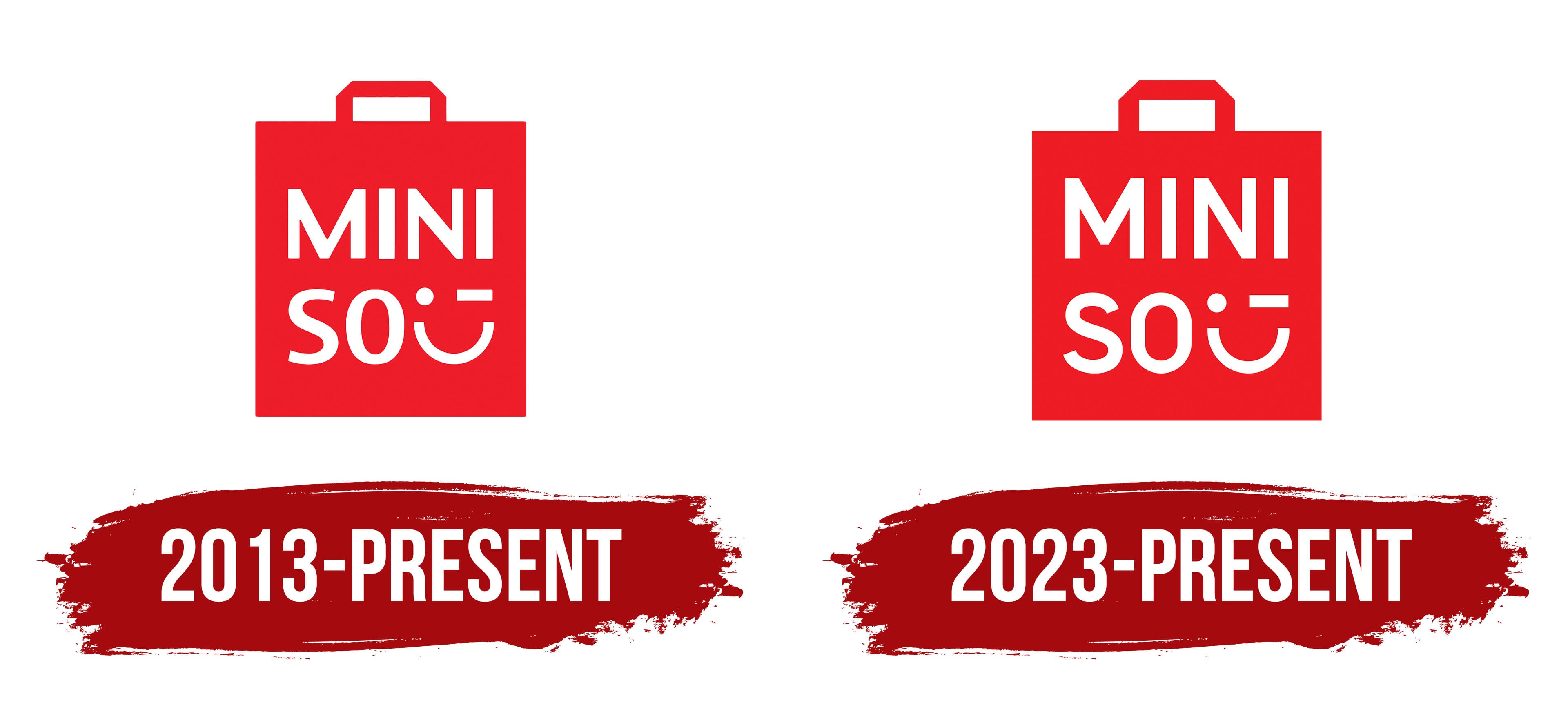
The next update marked MINISO’s 10th anniversary. On September 27, 2023, the company unveiled a logo with revised lettering and new proportions for the red bag. The body became wider and slightly shorter. The handle was reduced in relation to the main figure, and its vertical supports became shorter. The top bar retained its beveled outer corners.
The wider body provided additional room for the two-line wordmark. “MINI” remained on the top line, while “SO” and Wink appeared below. The letters and face were slightly enlarged, and their proportions were adjusted relative to the red field. The upper line became longer, and the spacing between the letters increased. Additional open space was left near the wink at the bottom. The uppercase sans-serif lettering was retained and given more space inside the bag. The red background became slightly darker, while the letters and face remained white.
The 2023 corporate program included the “Joy Philosophy” concept and the slogan “Life is for fun.” The joy theme connected Wink with new retail formats, including themed stores based on licensed properties, large flagship locations, and MINISO LAND. The full emblem appeared on storefronts, the separate face appeared in interior environments, and collaborative collections featured the short “MINISO” wordmark. Formats were selected based on each project’s size and content.
Signs were replaced as stores relocated or underwent renovation. The previous logo continued to appear at many retail locations and on social media profiles. As a result, the 2023 version was implemented gradually, with both versions remaining in use during the transition.