 Tencent Logo PNG
The Tencent logo is characterized by a simple, businesslike style that fits the visual identity of an investment company. The emblem is informative, practical, and clear, representing the corporation at all levels.
Tencent was founded in 1998 in Shenzhen, China, by Ma Huateng, Zhang Zhidong, Xu Chenye, Chen Yidan, and Zeng Liqing as Tencent Computer System Co., Ltd. The company first focused on pager software, but its direction changed after the launch of OICQ, an instant messaging service for Chinese internet users.
In 1999, the company faced a copyright dispute because OICQ was too close to ICQ, owned by AOL. In 2000, the service was renamed QQ. The same year, IDG Capital and PCCW made the first major investments in the company, helping it expand staff, develop new products, and launch QQ.com, which became one of China’s leading web portals.
Tencent began generating revenue from QQ’s large user base in 2001 through virtual items and paid services. In 2003, it entered online games with the QQ gaming portal, and in 2004, it listed on the Hong Kong Stock Exchange. Q-coin followed in 2005, while Qzone and Paipai appeared in 2006, with Paipai created to compete with Taobao from Alibaba Group.
The company’s expansion continued through investments in platforms and digital services. In 2008, it invested in Digital Sky Technologies, which later became Mail.ru Group. WeChat launched in 2011, mobile payments followed in 2013, and in 2014, the company bought a 15% stake in JD.com for $215 million. Later milestones included the Supercell deal in 2016, cloud restructuring in 2018, AI projects in 2019, a stake in Universal Music Group in 2020, VR development in 2022, startup investments in 2023, and a green technology program in 2024.
Meaning and History
What is Tencent?
It is a Chinese multinational conglomerate holding company specializing in various services and products related to the Internet, entertainment, artificial intelligence, and technology. It is one of the world’s largest technology companies, and its portfolio includes social media, online gaming, e-commerce, and cloud computing. It is known for popular social media platforms such as WeChat (Weixin) and QQ, and for dominating the online gaming industry with games such as Honor of Kings and PUBG Mobile. The company invests in startups and well-known companies worldwide across sectors, including fintech, media, and autonomous driving.
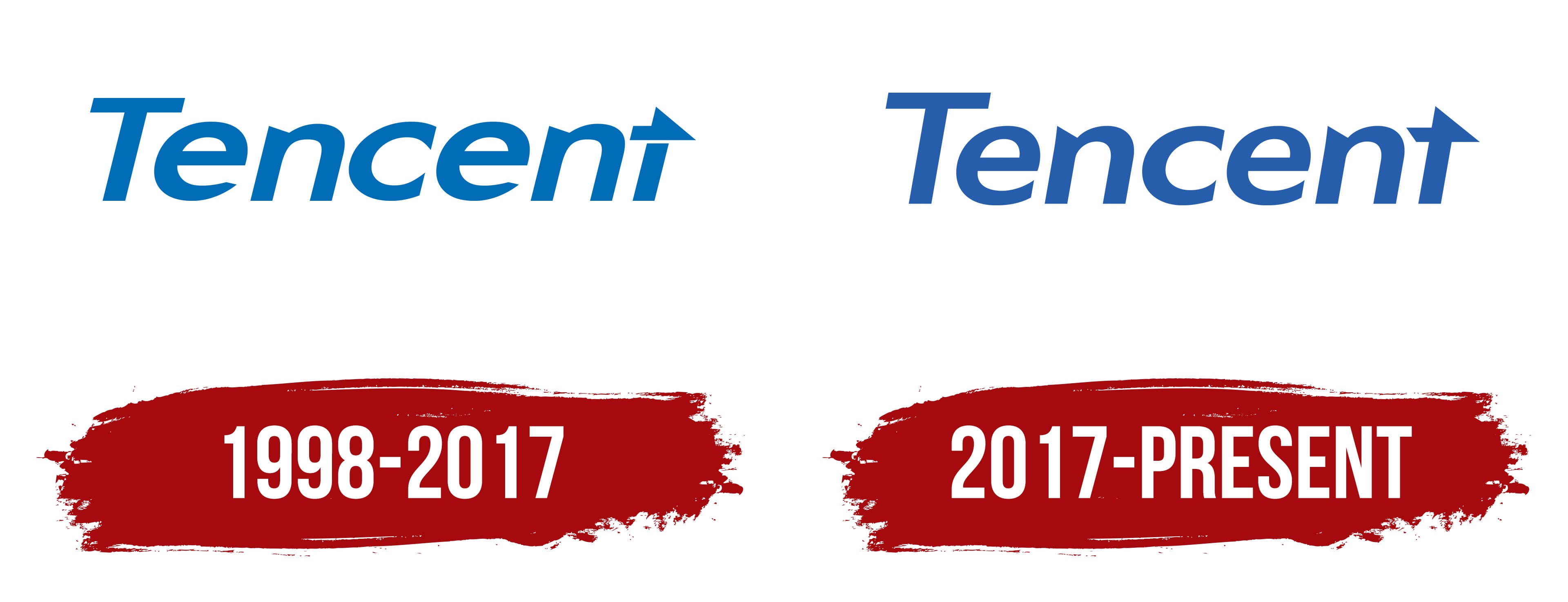
1998 – 2017

From its earliest months, Tencent used a wordmark logo, which has remained with the company for many years. This format of visual identity effectively fulfills two fundamental marketing functions:
- Introduces customers to the corporation
- Promotes its services
Even in its minimalist form, the logo successfully achieves its objectives, generating interest in the brand. The emblem serves as a visual affirmation of high professionalism, business acumen, and a responsible approach to work. At first glance, potential clients immediately understand that this is an accessible and balanced company, not devoid of creativity, as it has chosen a modified rather than a classic font to present itself effectively and express its creativity.
This approach to branding helps Tencent stand out among competitors, maintain its unique identity, showcase its skills, and emphasize its modernity. Perhaps this is why the Chinese corporation is in no hurry to change its logo drastically. The name is used as the foundation of the emblem, slightly enhanced with graphic elements. The lettering is executed in a rounded lowercase font, except the first “T,” which is uppercase and strictly geometric.
The other letters feature smooth curves and soft lines, which nicely balance the sharp cuts and pointed ends. Thanks to this combination, the Tencent emblem appears both positive and businesslike. A sense of purpose is added by the arrow-like element positioned above the lowercase “t.” This element serves several functions:
- Adds dynamism and the energy of movement
- Indicates that the company is moving forward
- Replaces the crossbar of the letter “t.”
- Makes the logo distinctive and recognizable
Additionally, the partial arrow resembles a classic paper airplane, infusing the emblem with a friendly atmosphere. The calm, light blue color further enhances this welcoming nature. This shade visually softens the glyphs’ sharpness and harshness, supporting the airplane image and reinforcing the idea of ease in working with the company.
2017 – today
The Tencent emblem is a wordmark rendered in an italic grotesque font. The rounded block letters are closely aligned in a row, clearly indicating the name of the Chinese investment corporation. The text is highly legible thanks to the optimal spacing between the characters and the smooth refinement of the glyphs. It maintains a harmonious balance between angles and curves. Notably, the letters now have a smaller tilt angle than before, giving them a straighter appearance.
Although the logo is a wordmark, it includes an important graphic element that conveys the brand’s concept. This element enhances the logo’s recognizability, even though the signature feature is now connected to the letter “t.” It embodies the drive for progress, the desire to evolve, and the commitment to progress toward a set goal. The small details resemble:
- The vertical crossbar of the “t.”
- Half of a directional arrow
- A flying paper airplane
This imagery softens the corporate emblem, creating a trustworthy atmosphere. As a result, it effectively attracts customers, which is a key factor in how a small firm transforms into a major investment corporation. The logo’s distinctiveness is further reinforced by the diagonal cuts at the ends of both “n”s and by the sharp points on the lowercase “c” and “e.”
The font used in the Tencent logo is exclusive, developed specifically for this project, and based on the Fabre Sans Pro 75 Halbfett and Soyombo Bold typefaces. Designers modified certain contours and lines and stylized the final glyph. All the letters in the wordmark are bold, sans-serif, and dark blue. Typically, the logo is placed on a white background, which signifies the company’s openness and draws attention to its name.