


![]() Aerosmith Logo PNG
Aerosmith Logo PNG
The Aerosmith logo, known to all music enthusiasts, appeared in 1989 and symbolized the absence of boundaries, the flight of thought and imagination, and freedom. Over the years, wings have been the main symbol of the musical group and have become the most iconic, recognizable element.
Aerosmith was formed in 1970 in Boston when Joey Kramer brought together Steven Tyler, Joe Perry, Tom Hamilton, and Brad Whitford. They rehearsed in a shared apartment in Back Bay and built early momentum through constant club shows. The name was chosen by Kramer, inspired by Harry Nilsson’s Aerial Ballet.
The debut album was released in 1973 on Columbia Records, with limited response. Get Your Wings, in 1974, had a similar reception. In 1975, Toys in the Attic changed the trajectory, with “Walk This Way” and “Sweet Emotion” gaining wide airplay. Rocks, released in 1976, placed the band alongside Led Zeppelin and the Rolling Stones.
By the late 1970s, internal tensions grew due to substance abuse. Joe Perry left in 1979, followed by Brad Whitford. Early 1980s releases failed, and touring declined.
The revival began in 1986 with Run-DMC’s version of Walk This Way featuring Tyler and Perry, which was widely broadcast on MTV. Perry and Whitford returned. In 1987, Aerosmith signed with Geffen Records and released Permanent Vacation, producing major singles.
Pump in 1989 strengthened the comeback, followed by Get a Grip in 1993, which sold over 20 million copies. In 1998, I Don’t Want to Miss a Thing reached No. 1 on the Billboard Hot 100.
In 2001, the band performed at Super Bowl XXXV and was inducted into the Rock and Roll Hall of Fame. Music from Another Dimension! came out in 2012. In 2023, Steven Tyler suffered a vocal injury, leading to the end of touring in 2024.
Meaning and History
![]()
The Rockers’ distinctive sign appeared in the early 1970s, when they began to take shape as a unique team. Raymond Tabano, who performed not with everyone but made a huge contribution to the group’s development, is the author of the iconic emblem. At least because he was the first to invent the famous winged logo, which is still relevant today; this version debuted in 1974 on the cover of the album Get Your Wings.
What is Aerosmith?
It’s a now-defunct American group that emerged in 1970. It performed rock music, mainly hard rock, and at the end of its career, was included in the list of the 100 greatest artists of all time.
1973 – 1974
![]()
The original logo bears little resemblance to any of the subsequent ones. It consists of the original name Aerosmith, where each letter is placed in a separate cell. Black uppercase letters stand out clearly in white holes, outlined by a dark gray irregular line. The main background is yellow; the shape is an elongated rectangle. This version appeared on the musicians’ debut album.
1974 – 1975
![]()
The collection, released in 1974, featured stylized wings with a large letter “A” in the middle. Beneath the oval surrounding it is the rock group’s name.
1975 – 1979
![]()
On the cover of Toys in the Attic, other wings appeared in strict geometric shapes. They are painted silver and widely spread. On them is the inscription “Aerosmith,” executed in arbitrary cursive.
1979 – 1982
![]()
The emblem placed on the album “Night in the Ruts” reflects its inherent atmosphere. Therefore, it is made gray-dirty, in the form of a drawing on a battered wall, in uppercase letters, without serifs, with characteristic paint spots.
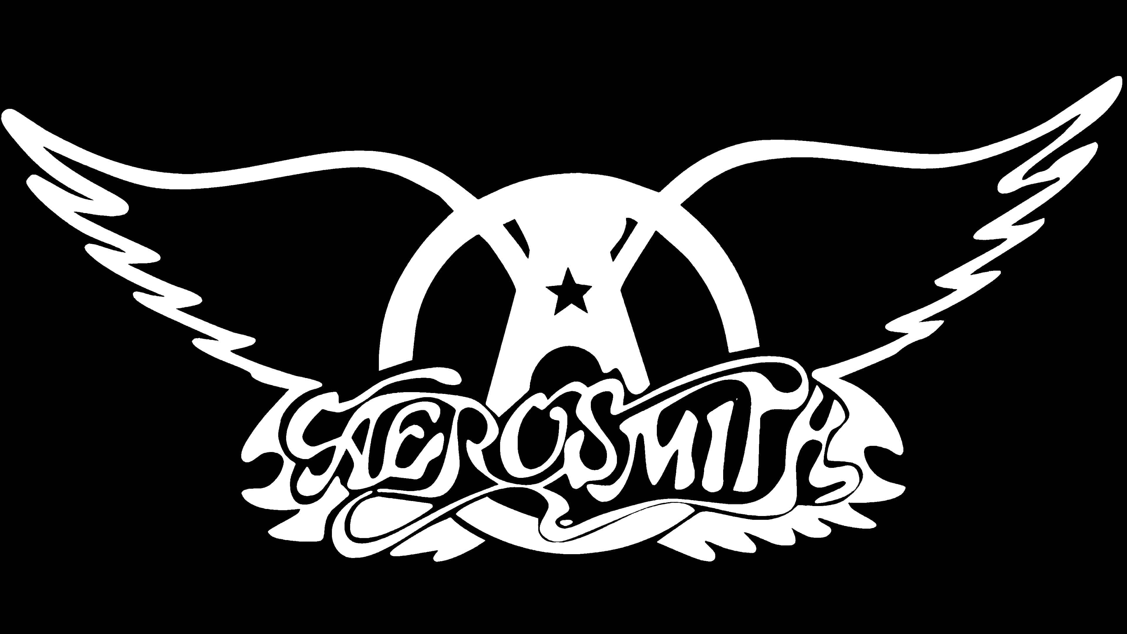
1982 – today
![]()
The current version is a little like the previous one: it again clearly shows two spread wings with a circle in the middle. The only addition is a star at the very center. Moreover, the logo used the 1975 inscription. This version first appeared on the cover of the album “Rock in a Hard Place.”
Font and Colors
The key symbol of Aerosmith is the winged letter “A” with the group’s stylized name. The ends of the widely spread wings are directed upwards.

Each logo variant has its own font. The 1975 and 1982 versions have serifs; the rest are sans-serif. The main palette is white and black. The first color is associated with confidence, wisdom, and harmony. The second symbolizes elegance, energy, and strength.
FAQ
What does the Aerosmith logo mean?
The Aerosmith logo with wings symbolizes freedom, the flight of thought, and boundless imagination. Its key element is the stylized letter A inside the ring, the first letter of the group’s name. It also pays tribute to the Flying A gas station symbol.
What does the name Aerosmith mean?
The name “Aerosmith” was concocted by the future drummer of the group by distorting the inscription on the cover of the book Arrowsmith. The fact is, he loved playing with words and adding “aero” everywhere. He was prompted by the album Aerial Ballet, recorded by Harry Nilsson.
Is Aerosmith still together?
No, the rock group Aerosmith has disbanded. The farewell tour took place in 2017.
Who owns the name Aerosmith?
Joey Kramer, the drummer of Aerosmith, came up with the name for his group even before it appeared, in 1968. Then, in high school, he wrote the word “Aerosmith” everywhere he could, mainly in textbooks.