 Airports of Thailand (AOT) Logo PNG
Airports form the first stage of a journey, where passengers check in, go through security, and move between terminals. Managing such facilities involves coordinating passenger flows, maintaining infrastructure, and handling flights. The Airports of Thailand (AOT) logo represents a company that manages the country’s largest airports and oversees their daily operations.
Thailand’s aviation history began in February 1911. During that period, Belgian pilot Charles Van den Born conducted the first demonstration flights over Bangkok. After that, the government decided to develop its own air force and sent officers to study in France. In 1914, Don Mueang airfield was opened. It became the Royal Thai Air Force base. Commercial flights began in 1924.
In 1940, the Civil Aviation Division was established. In 1955, Don Mueang was renovated for international flights. By the 1970s, it had become one of Asia’s largest airports. In 1979, the Airport Authority of Thailand was founded. Later, it was renamed AOT. By 2004, Don Mueang was serving 38 million passengers per year.
The idea for a new airport emerged in 1973. The Suvarnabhumi project was implemented only in the early 2000s. Construction began in 2002. It officially opened on September 28, 2006. The new airport became the country’s main international hub.
In 2007, Don Mueang was reopened for domestic flights. In the following years, it became the base for low-cost airlines, including Thai AirAsia. After the 2011 flood, the airport resumed operations.
By 2018, AOT ranked first among airport operators worldwide by market capitalization. In fiscal year 2024, it served more than 119 million passengers, up almost 20%.
In 2023, the government approved a 36.8-billion-baht project to expand Don Mueang. In 2024, the government announced plans to invest 4.8 billion dollars in developing Bangkok’s two main airports. By 2030, Suvarnabhumi’s capacity is expected to reach 135 million passengers per year.
AOT’s six airports served 88.5 million passengers. The company is implementing a modernization program that includes projects in Chiang Mai and Phuket, as well as building new regional airports. This strengthens Thailand’s role as a leading aviation hub in Southeast Asia.
Meaning and History
What is Airports of Thailand?
A state-owned public company that operates Thailand’s largest airports, including the main hub Suvarnabhumi in Bangkok, with an annual passenger flow of more than 40 million people. It oversees Don Mueang, Chiang Mai, Phuket, Hat Yai, and Chiang Rai airports, which connect major tourist regions. After privatizing the national airport authority, the Ministry of Finance retained most shares, while some were traded on the Bangkok Stock Exchange. The company is among the world’s most valuable airport operators.
1979 – 2002
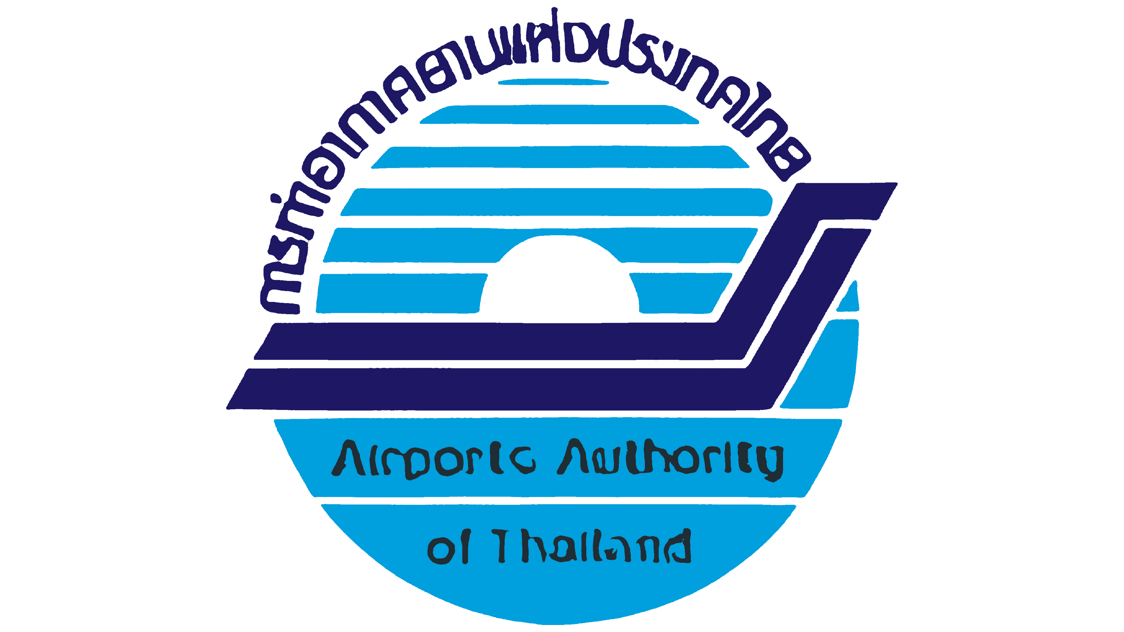
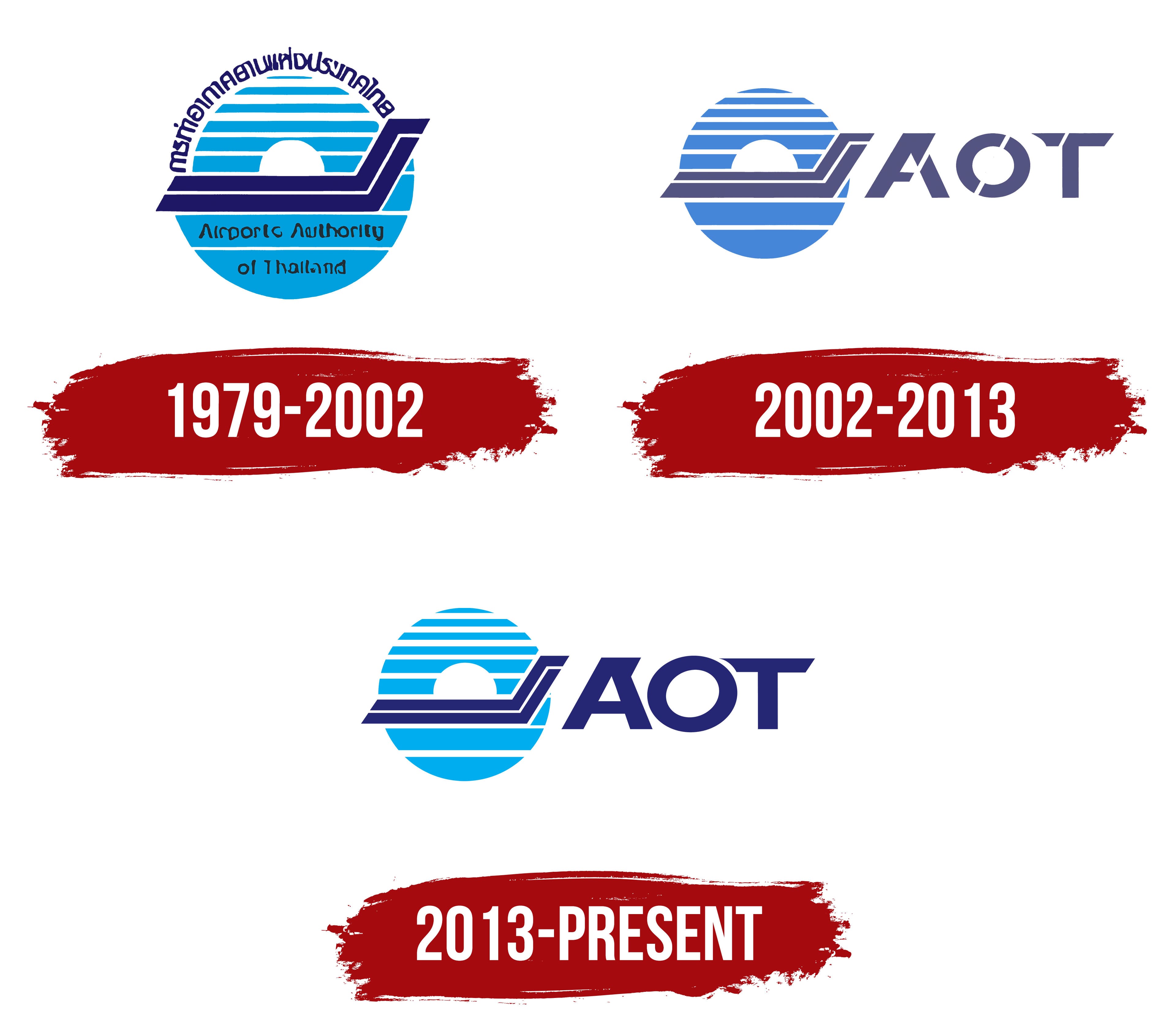
The circular Airports Authority of Thailand logo was introduced when the government organization responsible for the country’s main airports was established. It remained in use from 1979 to 2002. The emblem featured a striped light-blue disk and an angular dark-blue figure. The Thai and English names ran around the circumference.
Thailand’s early aviation history dates to 1911. From February 2 through February 8, Belgian aviator Charles Van den Born conducted demonstration flights over the Sa Pathum airfield in Bangkok. Airport management developed later. The government divided air transportation responsibilities between military and civilian agencies.
The Airports Authority of Thailand began operating on July 1, 1979, under the B.E. 2522 law. Its English name described its status as a government authority and its responsibility for managing major airports. Documents used the abbreviation “AAT,” formed from the initials of the full name.
A large circle served as the basis of the emblem. The Thai name followed the upper curve in dark blue letters. The English name Airports Authority of Thailand appeared along the bottom. It used narrow, rounded lowercase black letters. The 2 inscriptions surrounded the inner image and identified the organization in Thailand and abroad.
A light blue circle divided by white horizontal lines occupied the upper area. The blue stripes alternated with white gaps, forming a striped disk. A round white opening appeared in the center. The image resembled a sun above the horizon. The lower section used a shade of blue 1 or 2 tones darker than the upper section.
A heavy dark blue figure made from 2 connected lines crossed the center of the disk. A white gap remained between the outer edges. A long horizontal base turned upward at the right end to form an angle. The figure resembled a departing aircraft or an aircraft tail. Its geometric contours communicated an aviation theme.
The organization was restructured and renamed Airports of Thailand in 2002. The AAT abbreviation was replaced, ending the period of the circular Airports Authority of Thailand emblem.
2002 – 2013

AAT became Airports of Thailand Public Company Limited on September 30, 2002. The new public company assumed the former government authority’s assets, rights, obligations, and staff. The name reflected the change from an administrative agency to a corporation, retained the connection to Thailand, and identified its role in managing the country’s airports. An updated emblem accompanied the new name and remained in use until 2013.
The Thai and English names formerly arranged around the circle were replaced by the abbreviation “AOT” on the right side of the image. The letter block became a full component of the logo. The circular form, horizontal stripes, and dark angular line maintained continuity with the AAT emblem.
A light blue circle divided by white horizontal gaps appeared on the left. Its geometry became more regular, with consistent stripe widths and spacing. A white hemispherical cutout occupied the upper half. The stripes crossing the opening resembled a sun above the horizon.
A gray-blue figure made from connected angular lines passed over the disk. Its outline resembled a double arrow pointing to the right. The long horizontal section crossed the circle, angled upward, and extended beyond its edge. The silhouette suggested a flight route, takeoff, and an airport runway. The overlap of the 2 figures maintained a link with the authority’s previous emblem.
The 3 uppercase letters “AOT” stood on the right. They used a heavy, slanted sans-serif style. Diagonal openings divided parts of the letters and gave their edges a cut appearance. The treatment connected the abbreviation with the angular lines inside the circle.
The blue color became more muted. The AOT letters and the figure over the disk used a gray-blue shade with a purple undertone. The shared color scheme linked both parts of the logo. It suited the corporate materials of Airports of Thailand Public Company Limited.
2013 – today

The 2013 logo retained the previous arrangement of the circle and the AOT abbreviation. The main changes affected the colors and letterforms. Airports of Thailand maintained continuity with the 2002 identity while adapting the emblem for consistent reproduction across media of different sizes.
The striped disk changed from muted blue to the light blue Pantone 2985. The new color brightened the circle while preserving its proportions. The angular figure inside it changed to dark blue Reflex Blue. The AOT abbreviation used the same shade, connecting the image and company name through color.
The AOT letters became slightly narrower. The diagonal cuts from the previous version were removed, and the strokes became solid. The slant, heavy lines, and geometric structure remained. The revised lettering was easier to reproduce in both large and small formats.
The size of the circle and its proportion relative to the letter block remained unchanged. The 2013 version is identified by the light blue Pantone 2985 disk, the dark blue Reflex Blue elements, and the solid AOT lettering.