![]() Alphafutures Logo PNG
Alphafutures Logo PNG
The Alphafutures logo is associated with the world of finance, where precision, calculation, and strategy are crucial. The company develops technologies for analyzing complex market data, enabling the identification of key patterns. Its solutions are in demand among major players and are applied across various industry sectors.
Alpha Futures was established in the United States in 2018 by specialists in artificial intelligence and fintech, aiming to deliver innovative solutions for algorithmic trading in global financial markets.
Throughout its first year, the company concentrated on developing proprietary AI-based trading algorithms and establishing foundational technological infrastructure. In 2019, Alpha Futures introduced its inaugural AI-driven trading platform, attracting its first wave of clients and investors interested in algorithmic solutions.
Starting from 2020, Alpha Futures expanded its services, refined its core trading algorithms, and upgraded its infrastructure to ensure reliability and performance. The brand positioned itself as a technology-driven firm committed to the continuous development of advanced algorithmic trading systems.
Meaning and History
![]()
What is Alphafutures?
This company develops algorithmic trading systems for international financial markets. Its main focus is on creating automated solutions based on mathematical models and artificial intelligence to analyze market data and make trading decisions. Clients gain access to risk management platforms, high-frequency trading, and consulting services for optimizing their strategies. The organization is designed for professional traders and institutional investors, enabling them to automate processes and enhance market efficiency.
2018 – today
![]()
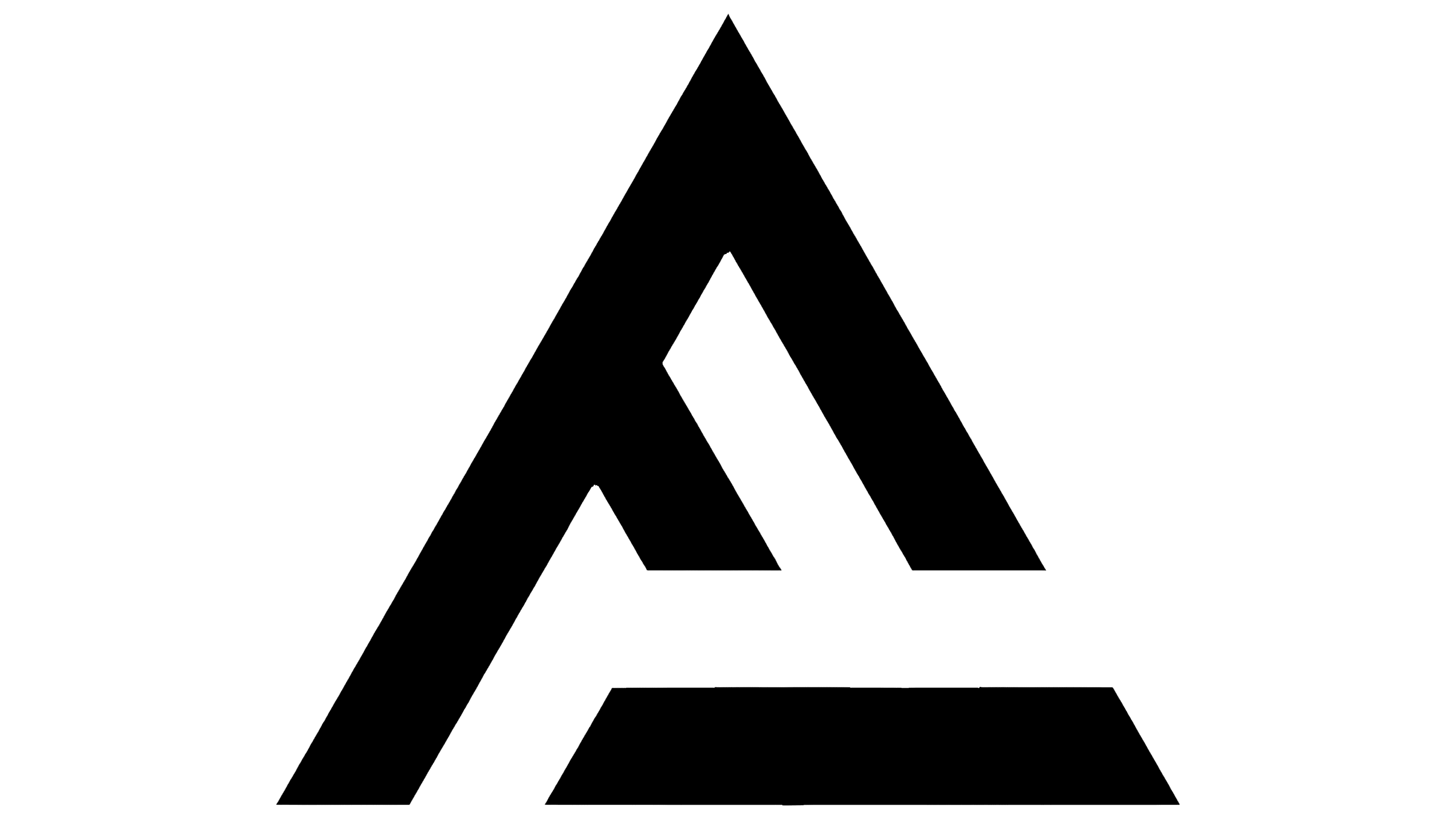
The visual structure of the Alphafutures logo is built on a strong contrast between the symbol and the text block. The left part contains a symbol based on a stylized letter “A,” constructed from intersections of diagonals and a horizontal line. Visual balance is maintained by the even distribution between the inner cutouts and the outer silhouette of the triangle, creating a solid compositional base.
To the right is the wordmark, set in uppercase letters without slant. The entire word “ALPHAFUTURES” is done in a single line, but the distribution of optical weight within the line differs. The first part of the word, namely “ALPHA,” is done in a lighter grotesque with neutral plasticity and thin strokes. The second part, “FUTURES,” is executed in a heavier weight.
The palette is limited to black, with no additional shades or textures.
The typeface is a sans-serif grotesque, presumably based on a modification of Helvetica, Eurostile, or similar geometric-logic typefaces. Letter spacing is arranged evenly, without visual gaps or compressed zones. The weight of the letters is balanced to avoid optical distortions in the perception of the line.
The design composition forms the identity of a brand operating at the intersection of technology and financial markets. The geometric structure of the symbol conveys precision and structure, and the restrained typography strengthens the association with predictability and analytics. The cutouts inside the emblem are associated with the concept of “futures,” reflecting future contracts, forward movement, and work with projected scenarios.