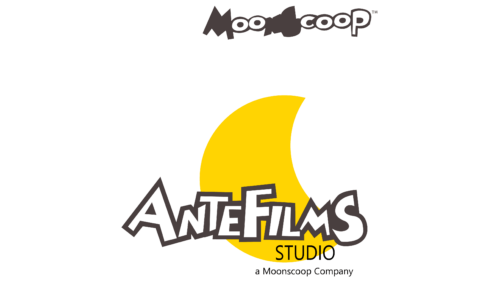
The Antefilms Studio logo from 2005 clearly represents the company’s affiliation with the larger media entity, Moonscoop. Incorporating elements of the parent company’s brand signifies unity, shared values, and collective identity.
The prominent feature of the logo is the large, yellow moon, which aligns directly with the “MoonScoop” brand name. The moon is universally recognized as a symbol of exploration, mystery, and imagination, which effectively encapsulates the essence of the animated worlds that Antefilms creates. Its yellow color can be associated with positivity, energy, and creativity.
The white uppercase lettering, overlaid on the moon and surrounded by a thick grey outline, ensures legibility and stands out against the yellow background. The word “Antefilms,” being heavier and more prominent, denotes the specific identity of the studio within the larger Moonscoop conglomerate.
The term “Studio” underlined and written in black gives a clear indication of the nature of the company’s business. The additional descriptor “a MoonScoop Company,” written in smaller letters, confirms the affiliation to the parent company, which helps in leveraging the established reputation of Moonscoop.
The Antefilms Studio logo conveys its identity as a creative and imaginative animation studio while highlighting its connection to the parent company, MoonScoop. The elements of the logo work together to communicate a brand identity that is both independent and integrated, signifying the studio’s commitment to creative excellence within a larger, collaborative network.
Antefilms: Brand overview
| Founded: | 1990 – 2014 |
| Founder: | Christophe Di Sabatino and Benoît Di Sabatino |
| Headquarters: | Paris, France |
Born in the City of Light in 1990, Antefilms set out on an inspiring journey under the guidance of its founders, Christophe Di Sabatino and Benoît Di Sabatino. This Paris-based studio wasn’t merely a production house; it was a testament to the transformative power of creative storytelling in the realm of animation.
The studio’s strength lay in its ability to blend artistry and technology to create worlds and characters that captivated audiences. Using the magical canvas of animation, it breathed life into stories that transcended geographical and cultural boundaries, appealing to audiences of all ages.
In addition to creating engaging content, the studio played a pivotal role in promoting the art of animation. It cultivated a culture that encouraged creativity, innovation, and collaboration. This culture manifested itself in the form of breathtaking visuals, relatable characters, and compelling narratives that formed the cornerstone of its productions.
The journey of the studio spanned over two decades, leaving an indelible mark on the animation industry. Although its operations officially concluded in 2014, the legacy it left behind continues to inspire animators and storytellers around the globe.
Meaning and History
The brand identity of Antefilms is rooted in its commitment to creating engaging, imaginative, and visually stunning animated content. Their shows often incorporate elements of adventure, fantasy, and humor, offering audiences vibrant, dynamic worlds to explore alongside memorable characters. Antefilms Studio emphasizes storytelling that is entertaining and imparts positive values and life lessons, making it a trusted choice for parents and a favorite among children.
The simple, clean design of the logo suggests their commitment to clear, high-quality storytelling and their streamlined approach to animation.
Furthermore, Antefilms Studio’s brand identity is tied to its continual evolution and adaptability in the ever-changing landscape of children’s media. They have shown their versatility in traditional animation and pioneering work in CGI and other cutting-edge digital animation techniques.
Antefilms Studio represents a blend of imagination, quality, and innovation in the field of children’s animation. With its enduring commitment to engaging storytelling and visual excellence, it continues to delight and inspire audiences around the globe.
What is Antefilms?
Antefilms Studio, established in France, is a prominent animation studio renowned for its high-quality work in the field of children’s television programming. They gained global recognition through their creation of successful shows like “Code Lyoko” and “Fantastic Four.” Now a part of the media company Moonscoop, Antefilms continues to influence and shape children’s entertainment worldwide.
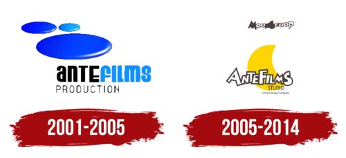
2001 – 2005
2005 – 2014
Antefilms color codes
| Yellow | Hex color: | #ffd402 |
|---|---|---|
| RGB: | 255 212 2 | |
| CMYK: | 0 17 99 0 | |
| Pantone: | PMS 109 C |
| Dark Liver | Hex color: | #493f3f |
|---|---|---|
| RGB: | 73 63 63 | |
| CMYK: | 0 14 14 71 | |
| Pantone: | PMS 439 C |


