


 Aramark Logo PNG
The Aramark logo conveys that this company is focused on people and strives to ensure their comfort. The emblem is quite versatile, as the food service provider combines several activities to offer comprehensive solutions in catering, facilities management, and uniform services.
Aramark began in 1936 in Los Angeles, when brothers Davr and Henry Davidson created Automatic Merchandising Company. The business started with vending machines, selling snacks in offices, factories, and other places where prepared food was limited. During World War II, the company expanded beyond Los Angeles after receiving contracts to supply military facilities and defense plants.
In 1959, Automatic Merchandising Company merged with Slater System, Inc., a Philadelphia food-service firm serving colleges and schools. The new structure became ARA Services, or Automatic Retailers of America. In 1960, the company entered the uniform rental and service business by acquiring United Uniform Company. It began international expansion in Mexico in 1968.
The 1970s and 1980s brought further diversification. WearGuard Corporation, acquired in 1976, strengthened the workwear business, while National Child Care Centers, Inc. entered the child-care services business in 1983. In 1994, ARA Services changed its name to Aramark, reflecting a wider service portfolio and international operations. In 2001, the acquisition of ServiceMaster Management Services expanded its facility management operations.
In 2006, investors led by CEO Joseph Neubauer took Aramark private. The company returned to the New York Stock Exchange in 2013 through an IPO. Later acquisitions included CampusEAI Dining Services, Avendra LLC, AmeriPride Services Inc., and HPSI. From 2018 to 2022, Aramark added health programs with the American Heart Association, EverSafe hygiene standards, plant-based food options, AI inventory tools, menu technology, and contactless payment systems.
Meaning and History
What is Aramark?
It is an American provider of catering and facilities management services to clients in various industries, including education, prisons, healthcare, business, and leisure. Founded by Davre Davidson and Henry Davidson, the company offers services including catering, maintenance, facility services, and uniform supply. The company is known for its attention to quality and satisfaction through effective, efficient service solutions.
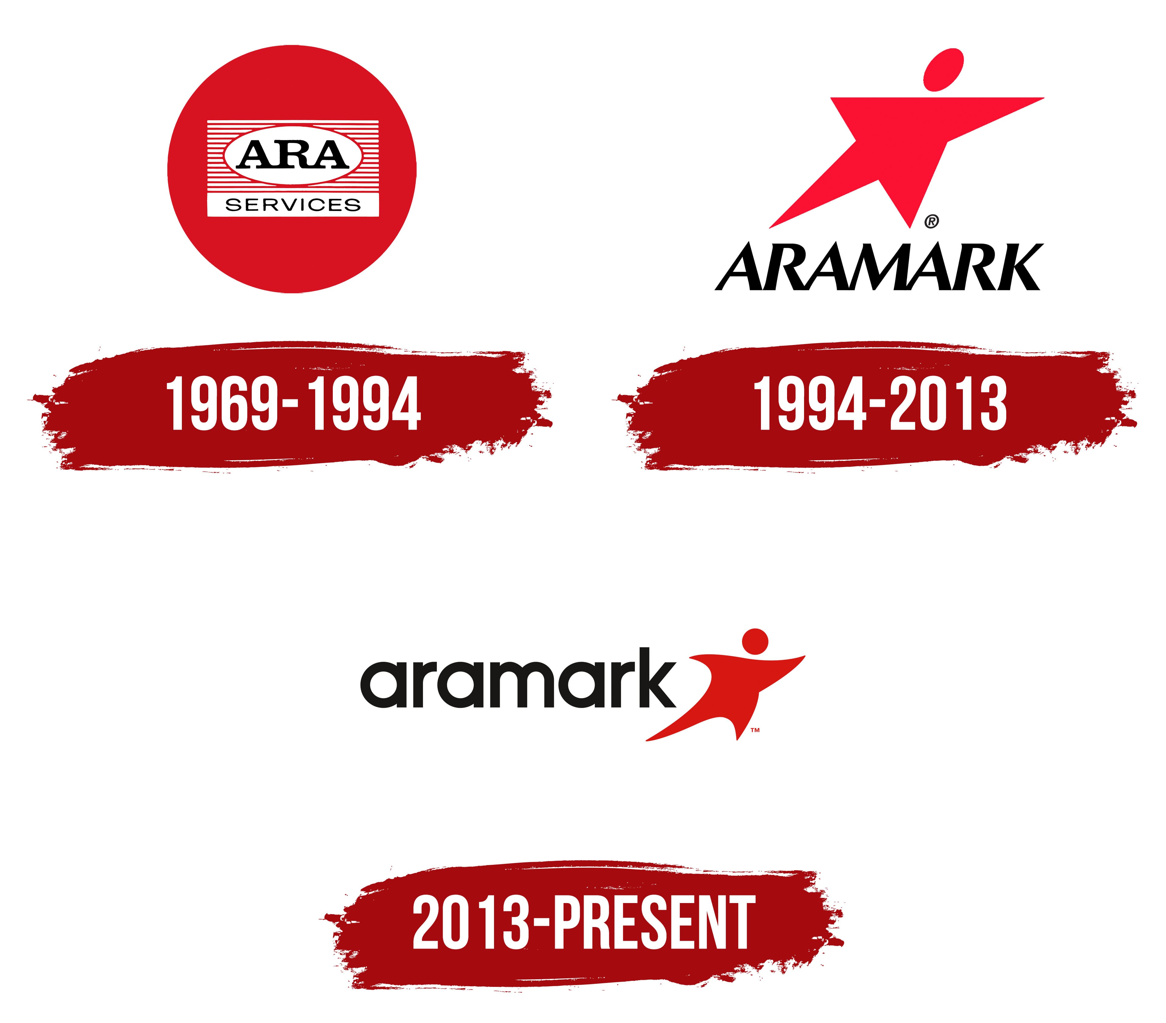
1969 – 1994
The history of this logo began in 1969 when the company ARA changed its name to ARA Services. The extensive rebranding was intended to reflect its rapid growth, as it had proven its capabilities by providing ready-made meals to tens of thousands of athletes and fans at the 1968 Olympic Games.
The brand transformation led to the creation of an emblem featuring a red circle, whose shape emphasizes the food service industry, where punctuality and timeliness are crucial. Additionally, the circle symbolizes cyclicality, as the company performs the same processes daily to feed millions of customers. In this case, the red color reflects the relentless energy of ARA Services. It also stimulates appetite, making the red logo ideal for a catering service provider.
A rectangle of thin horizontal stripes inside the circle reflects the company’s progressive spirit. Long lines frame a white ellipse with the inscription “ARA.” The abbreviation, formed from the words “Automatic Retailers of America,” is rendered in a strict antique font. Due to the large rectangular serifs, the letters connect at the bottom, symbolizing orderliness, cohesion, and mutual support. The contrasting thickness of the strokes enhances the emblem’s dynamism, highlighting the brand’s continuous development.
The inscription “SERVICES” is in a solid white rectangle at the bottom. It consists of thin glyphs with balanced letter spacing. The classic grotesque font has no decorative elements, evoking a sense of seriousness and a business-like approach. The striking contrast of black text, white geometric shapes, and a red base makes the logo recognizable in all the countries where ARA Services operates.
1994 – 2013
As the company evolved, it transitioned from a simple food service provider to a uniform rental company. To mark this new stage of its evolution, it renamed itself Aramark. In honor of this grand new name, a logo was created with a corresponding inscription.
Designers completely reworked everything from the shape of the graphic elements to the font, which acquired barely noticeable triangular serifs. Despite this, the letters connect at the bottom, forming an unbroken chain. This style fosters a sense of friendliness as the company continues to expand its business in Europe and Asia.
The bold italic font looks dynamic, highlighting the brand’s active engagement. The sharp peaks of the “A” enhance visual movement, while the ” R ” open counters indicate Aramark’s accessibility to all who need food services.
The wordmark is complemented by a bright image of a five-pointed star, with a circle replacing the top point. The stylized person is a universal figure, representing both a satisfied customer and a welcoming company employee. The pose expresses joy and exultation, as the widely spread arms indicate. Additionally, the star signifies high-quality services and is traditionally considered a symbol of excellence.
The logo continues to be dominated by red, which symbolizes energy, passion, and vitality. It is balanced by black, which emphasizes Aramark’s reliability and modernity.
2013 – today
In 2013, the company changed its logo because the previous version lacked visual balance. Designers adjusted the shape of the inscription to make the brand name clear and legible. To achieve this, they separated the letters and switched them to lowercase. Using lowercase glyphs makes the emblem less formal, giving Aramark a friendly and approachable appearance.
The new lowercase sans-serif font looks concise, with rounded corners and consistent thickness. This makes the text blend well with the adjacent symbol, a running person. This figure no longer resembles a cropped five-pointed star, as its arms and legs have become flexible: all four limbs are of different lengths and bent in various directions. This creates the illusion of movement as if the character is not standing still but hurrying somewhere.

The running person symbolizes a company striving for progress and innovation. It also represents an Aramark employee rushing to provide quality services to customers. Additionally, this abstract figure embodies those seeking quick and comfortable living and working conditions.
The red color radiates energy and passion, perfectly matching the person’s dynamic pose. It conveys the idea of moving forward and effectively attracts attention, making the logo a powerful marketing tool. The dark text creates a strong contrast with the bright emblem. Combined with the modern font, the black color emphasizes Aramark’s contemporary approach to service delivery.