


For the Archery World Cup’s 20th anniversary, the competition’s trophy became the basis for the series’ logo. Brisbane-based designer Graham Anderson, working as Arecibo, developed the identity for the 2026 anniversary season. A hand gripping a bow now unites the World Cup stages, the final, and television broadcasts.
World Archery launched the series in 2006 following the success of the 2003 World Championships in New York and the 2004 Olympic Games. Competitions in urban settings and online broadcasts of the final matches helped introduce audiences to archery. Each season consists of 4 stages in different countries and a final. Since 2010, the top 8 archers in each category have competed for the overall title, up from 4 finalists previously.
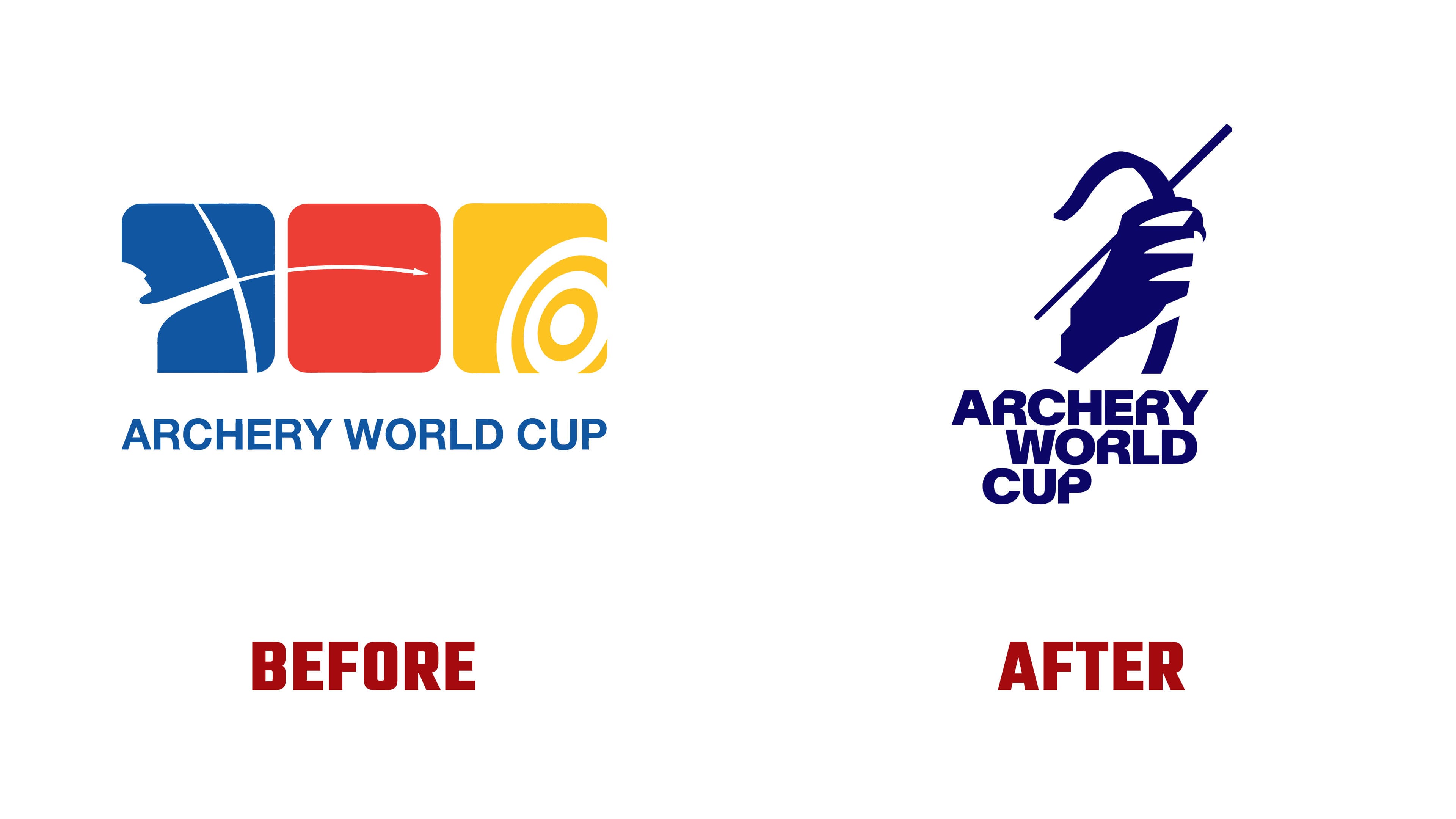
Over the years, the identities used at individual stages had drifted apart. According to Arecibo, the previous system had become dated, and host cities were applying the logo on their own terms. The project aimed to bring the competitions together as a single series and convey the tension before a shot. The concept was named “Can’t Miss.” For athletes, the phrase speaks to the need to hit the target. For spectators, it invites them to witness the decisive moment. The double meaning links the risk of missing on the shooting line with the anticipation in the stands.
The previous logo consisted of 3 rounded squares. The blue square contained a white profile of an archer and part of a bow; an arrow crossed the red square, and a target occupied the yellow square. Beneath them, ARCHERY WORLD CUP appeared in blue sans-serif capitals. The colors echoed a target’s rings. The new version replaces that image sequence with a single-color emblem based on the trophy.
A hand grips a bow, with a diagonal arrow running beside it. Gaps separate the fingers, the bow curves above the hand and extends below it, and the wrist ends in a stepped edge. The hand’s contours convey the effort of holding the bow and the tension before releasing the arrow. The 45° diagonal and stepped cut carry through the rest of the identity.
In the vertical version, ARCHERY, WORLD, and CUP sit on 3 lines beneath the emblem. The bold uppercase lettering is tightly stacked, with the lines offset from one another. Lausanne-based Swiss studio Newglyph created the AWC Baikal wordmark by modifying its Baikal typeface. The upper-left corners of the “R” and “P” are cut at the same diagonal angle, while the “A” has a small triangular counter.
AWC Baikal ranges from narrow, thin styles to wide, bold ones. Shared letterforms connect the series name to the host city names. The cuts in the “R” recur in BERLIN, PARIS, and MADRID. The emblem and wordmark can be used separately, while anniversary versions add an outlined “20.” During development, the designer explored other angles and combinations with the Hyundai logo. The final emblem was designed to stand alone. The primary colors retain the blue from the previous identity.
A square grid, frames, and designated spaces for sponsor logos were developed for modular event setups. Within the shared guidelines, cities can add local patterns and color combinations. Broadcasts feature a 3D trophy, with titles entering along a 45° diagonal. After Effects templates let teams update content while keeping a consistent design throughout the season.