


 Armani Exchange Logo PNG
The Armani Exchange logo vividly embodies the brand’s creativity and originality across its entire product line. The identity elements declare that the brand’s clothing, footwear, and accessories completely oppose classic style. Just as the rebellious spirit dominates the product design, the logo reflects this boldness. Its details and accents emphasize the existence of two opposite worlds of fashion. Despite being youth-oriented, this brand is part of the prestigious Armani fashion house, which adds extra significance. This fact played a key role in its popularity and in earning customer trust, making the products stylish and reliable in buyers’ eyes.
Armani Exchange was founded by Giorgio Armani in 1991 as a younger and lower-priced line within his fashion group. The idea followed a trip to the United States, where Armani saw strong interest in designer clothing among younger buyers who could not afford luxury labels. The first A|X store opened that year in SoHo, New York, selling T-shirts, jeans, jackets and sweaters influenced by club culture and streetwear.
During the 1990s, the brand expanded across the United States and used provocative advertising to build recognition among younger consumers. Its first European store opened in London in 1997. By the early 2000s, the range included watches, sunglasses, fragrances and other accessories. An online store followed in 2005, extending sales beyond physical locations.
In 2008, A|X opened a three-floor, 1,000-square-metre European flagship on Regent Street in London. Expansion continued during the 2010s with stores in Paris, Milan, Tokyo and Dubai. Giorgio Armani bought the remaining 50% stake from his partners in 2014, bringing the label under full control of the Armani group. A complete watch line was introduced in 2017.
The 2019 campaign “New Energy, Same Spirit” updated the brand’s marketing. During 2021 and 2022, A|X connected online and physical retail more closely and revised collections around changing youth trends. By 2023, its range still centered on casual clothing, watches, eyewear, fragrances and accessories within the wider Armani business.
Meaning and History
What is Armani Exchange?
This is a younger and more affordable division of Armani’s renowned fashion house, combining modern street fashion with classic Italian style. The brand targets stylish urban consumers and offers a wide range of clothing, footwear, and accessories at more accessible prices than the main brand. The collections are known for their bold graphic elements, elegant silhouettes, and a mix of semi-formal and casual pieces for day and evening wear. The brand’s stores are distinguished by vibrant displays and a club-like atmosphere, making shopping an exciting and contemporary experience.
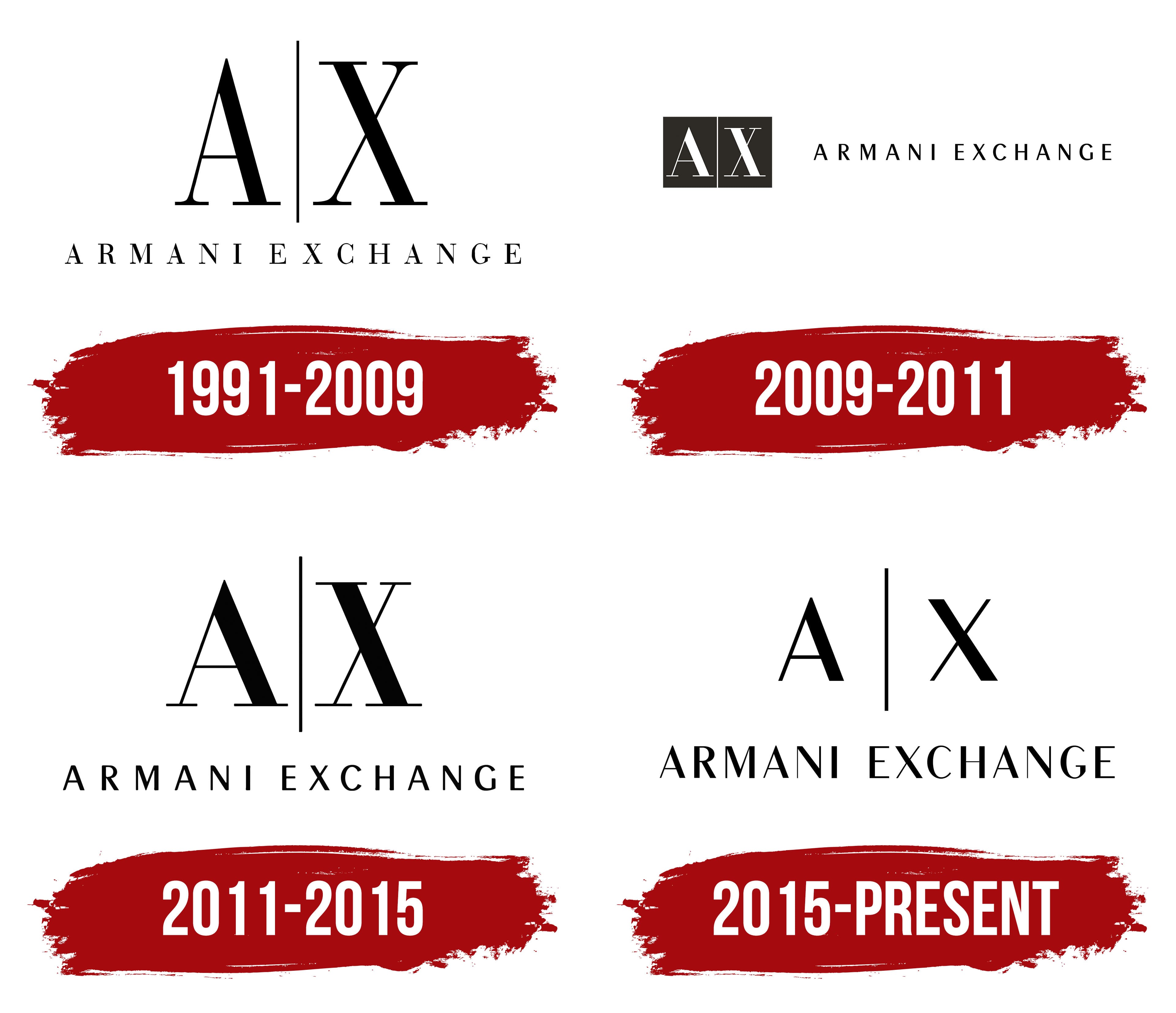
1991 – 2009
The first Armani Exchange logo fully reflected the brand’s philosophy, rooted in street fashion, music, and constant progress. It conveyed a multi-layered paradigm of meanings and attracted attention with various elements.
The color palette remained simple but effective. The white background, commonly used by many textile brands, symbolized purity and reliability, creating a perfect foundation for the dark text symbols and logo elements.
The identity’s modernity lies in its simplicity and clarity. The brand name was positioned at the bottom, while the center was dominated by two capital letters separated by a straight vertical line. This design choice highlighted the elegance and extravagance of the brand’s products, offering a visual parallel to street fashion.
The capital “A” and “X” represented the first letters of the company’s name, and the vertical line, a unique element to separate opposing concepts, added a distinct touch to the emblem. Instead of the usual diagonal line, a vertical line, perfectly equal to the height of the letters, was used in the visual symbol. This decision gave the logo a fresh look, aligning with the brand’s spirit.
2009 – 2011

Two key motifs, originally presented in the new version of the identity, can be traced in the updated logo released in 2009. First, it is worth noting an interesting technique: the brand name appears twice,t in different formats, emphasizing the equal importance of all emblem elements.
Now, the text fragments of the visual symbol are aligned on a single line rather than split into two lines, as in the previous version. The color scheme remained unchanged, with a white background and black letters, which maintains the purity and strictness of the visual image. However, the appearance of two black squares influenced the overall perception of the logo, giving it a sense of dynamism and depth.
The black shapes on the right are a second background for the capital letters, enhancing their visual impact. This technique highlights the letters and geometric forms, making them memorable and creating harmony. The brand name is readable on the right side, crafted with even, strict, and perfectly smooth lines. The noticeable spacing between the letters gives the text expressiveness and style.
This logo skillfully combines unity, contrast, strict symmetry, and originality in a harmonious whole. It conveys the brand’s philosophy and emphasizes its modernity and relevance.
2011 – 2015
In 2011, fans of stylish, original products noticed that the brand took a step back in time, but with a refreshed perspective. The products again acquired features of the first models, and the logo changed, becoming a reinterpretation of the 1991 identity.
Black letters were gracefully positioned on a snow-white background, maintaining restraint and elegance. In the center, a thin black dividing line reappeared, symbolizing harmony and clarity. The capital letters “A” and “X” became more expressive, with increased height and broad lines, symbolizing the fashion house’s stability and confidence. The thin serifs at the base of the letters appeared unshakable, like a foundation. The contrast between thin and broad lines gave the visual identity uniqueness, and the visual expressiveness bordered on elegance.
The lower row was reserved for the full brand name, set in a classic font to emphasize precision and refinement. The spaciousness between the letters added lightness, enhancing readability and highlighting the sophisticated simplicity.
2015 – today
Despite all the fashion trends and influences, the modern and stylish Armani Exchange logo has remained true to tradition. The new A|X logo, as it is commonly called, reflects the essence of the brand: understated elegance and contemporary minimalism. It is executed in a black-and-white color scheme, emphasizing timeless classic style and the refined aesthetic characteristic of its parent brand, Armani. The two main symbols, the letters “A” and “X,” separated by a vertical line, create a strict, balanced composition free of unnecessary elements, remaining stylish and functional.
The black color symbolizes strength, confidence, and solidity, fully reflecting the brand’s spirit aimed at a young audience that values fashion trends and seeks luxury and quality. The contrast with the white background adds a sense of purity and order, allowing the emblem to “breathe” without overwhelming the visual space.
The font is designed in a strict, geometrically precise style. The letters are slightly elongated, giving the visual symbol a sense of lightness and spaciousness. The letters’ proportions and placement are carefully calculated, with every detail designed to create a harmonious image.
Giorgio Armani aimed to create a line accessible to a broader audience while maintaining his main brand’s elegance and unique style. The emblem perfectly aligns with this concept: it is simple yet refined, highlighting the brand’s key symbols “A” and “X” and keeping the full name below, striking a balance between recognition and modesty.