 Banco Macro Logo PNG
Financial transactions in Argentina include payments, transfers, loans, and account management, supporting day-to-day activities across regions nationwide. The banking network covers cities and provinces, ensuring access to services. The Banco Macro logo represents a bank that provides financial products to individual and business customers nationwide.
The company began operations in 1976 as a brokerage firm called Financiera Macro. Mario Brodersohn, José Dagnino Pastore, and Alieto Guadagni founded it. In 1977, they established Macro Compañía Financiera. In 1985, Argentine entrepreneur Jorge Horacio Brito acquired the firm. He merged it with his company, Anglia. Under his leadership, the organization became a financial agent for several northern provinces of Argentina.
In May 1988, the company received a license from the Central Bank of Argentina to conduct banking operations and was registered as Banco Macro. In June of the same year, Jorge Brito became chairman of the board. Until 1995, the bank mainly served corporate clients. During this period, it became one of the first banks to issue debt securities and shares on the domestic market.
In 1996, Banco Macro acquired three regional banks, including Banco Misiones and Banco del Noroeste. By 1997, the network had more than 100 branches. In 1998, it acquired Banco Jujuy. From 2001 to 2004, the bank participated in the privatization of regional banks and strengthened its presence outside Buenos Aires.
In March 2006, Banco Macro held an IPO on the New York Stock Exchange under the ticker BMA. In 2010, the bank acquired Banco Privado de Inversiones and expanded its investment banking division.
From 2003 to 2016, Jorge Brito served as chairman of the Argentine Banking Association. In 2016, he received the Fortuna Lifetime Achievements Award. In the 2010s, Banco Macro became one of the country’s largest banks, with an extensive branch network.
In August 2023, the bank announced the acquisition of Banco Itaú Argentina. The deal closed on November 3, 2023, after Central Bank approval. In 2024, lending increased by 17 percent and deposits by 13 percent.
In November 2024, Banco Macro received approval to merge with Banco BMA.
Meaning and History
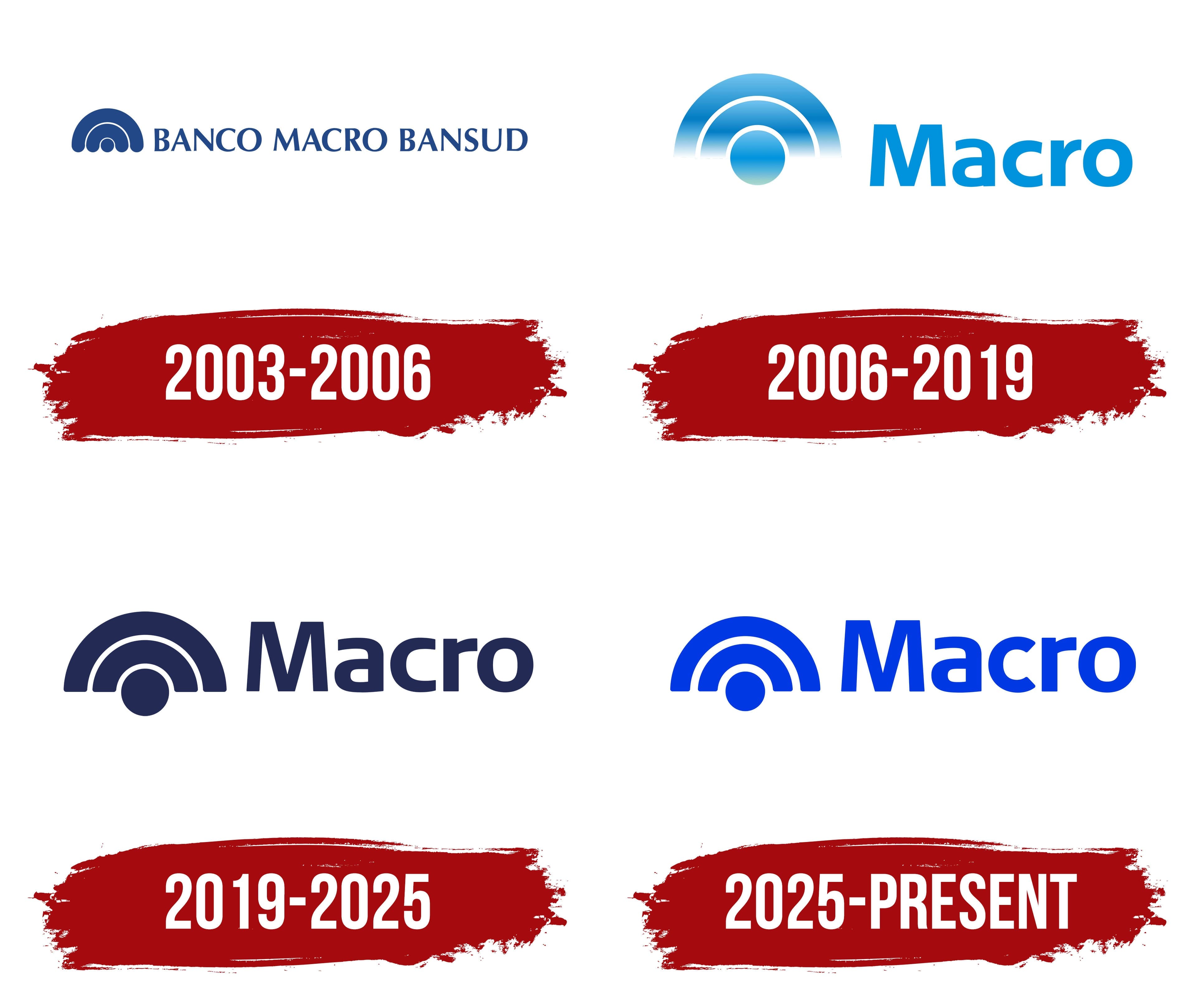
What is Banco Macro?
It is one of Argentina’s largest private banks, headquartered in Buenos Aires. The institution ranks sixth in the country by total assets and is considered one of the market’s most profitable players. Its main focus is operations in provinces and small towns, where it offers traditional banking services, including loans, deposits, checking and savings accounts, mortgages, and property insurance.
2003 – 2006
The Banco Macro Bansud name emerged after Macro acquired a controlling stake and legally merged the 2 banks. Macro gained control of Banco Bansud in 2001, and the companies completed their legal merger in 2003. The combined organization adopted the name Banco Macro Bansud S.A. The logo brought the 2 brands together in a shared wordmark for the first time.
Macro’s history began on September 4, 1978, with the incorporation of Macro Compañía Financiera S.A. The company provided financial services. In 1985, a group led by Jorge Horacio Brito and Delfín Ezequiel Carballo acquired it. The new owners continued developing the organization and prepared it to obtain banking status.
In 1988, the Central Bank of Argentina authorized the company to operate as a commercial bank. The legal name Banco Macro S.A. was adopted after the authorization. Macro carried over from the former financial company and remained in use through later acquisitions, mergers, and name changes. After the integration of Bansud, it became the first part of the expanded name.
The Banco Macro Bansud logo consisted of a compact emblem on the left and the full name on the right. All components appeared in the same dark blue. The horizontal composition placed the emblem and 3 words on one line, giving Macro and Bansud equal visual weight.
The emblem was built from 2 semicircular arcs. The upper figure was large, with a broad open area at the bottom. A smaller arc of similar thickness appeared inside and followed the outer contour. Thin white gaps separated the blue bands.
A small solid circle sat beneath the arcs, centered within their width. Its diameter was slightly narrower than the band thickness. The outer semicircle, inner arc, and lower dot formed a symmetrical emblem. Banco Macro continued using a similar form in later years.
The words BANCO MACRO BANSUD appeared on the right. They used uppercase letters with small serifs. Tight spacing and a shared dark blue color combined the name into a single typographic block. Macro and Bansud had the same size, color, and position on the line, representing 2 brands within one bank.
The logo remained in use from 2001 to 2006 while the organization operated under the legal name Banco Macro Bansud S.A. In 2006, the bank shortened its name to Banco Macro and retained the dark blue emblem for the next version of its identity.
2006 – 2019

Shareholders approved the return to the legal name Banco Macro S.A. on April 28, 2006, and completed its registration on July 11. The bank resumed operations under the shortened name in August. Documents used the full name Banco Macro S.A., while the logo displayed the single word Macro. A new wordmark replaced the 3-word Banco Macro Bansud line.
The redesign changed the relationship between the emblem and text. The emblem was enlarged and placed on the left, with the shortened Macro name on the right. Reducing the name to one word made the composition more compact. The typographic section centered on the name inherited from Macro Compañía Financiera.
The emblem retained its structure of 2 arcs and a small circle. The outer semicircular band formed a dome, while the smaller inner arc followed its curve. Both arcs rose upward, leaving the lower interior open. The circle sat beneath them, completing the vertical arrangement.
White gaps separated the outer arc, inner band, and circle. The 3 blue components retained separate outlines within the overall form. The arcs had equal thickness, and the circle sat on the center axis. The construction continued the Banco Macro Bansud emblem design, but with a shortened name.
A light blue gradient replaced the solid dark blue. It combined rich blue, light blue, azure, and a subtle turquoise tone near the base. The color transition passed through both arcs. The circle used a similar distribution of tones, while white gaps separated the colored components.
Macro appeared in an upright sans-serif typeface. The initial “M” remained uppercase, while the other letters were lowercase. The strokes had consistent thickness, and the contours became even and rounded. Light blue connected the name with the emblem. It distinguished the new typography from the dark blue Banco Macro Bansud line.
2019 – 2025

In the late 2010s, a solid dark blue version of the Macro logo replaced the gradient. The timeline dates it from 2019 to 2025. The update affected the color and reproduction method, while the emblem’s form and the wordmark’s placement remained unchanged.
All components received a blue-purple shade close to indigo. The arcs and circle became solid, replacing the transitions between light blue, azure, and turquoise with a uniform color. Macro used the same shade, combining the emblem and name into a single horizontal block.
A construction of 2 concentric semicircular arcs and a separate circle appeared on the left. The outer arc enclosed the entire figure, while the smaller arc ran inside and repeated its curve. The circle occupied the lower area along the center axis. White gaps separated the 3 components and defined their boundaries.
The emblem resembled a dome or radio wave. Brand materials associated it with reach, infrastructure, and a network connecting customers, regions, and financial flows. The 2 nested arcs represented connections between different levels, while the lower circle completed the figure.
Macro appeared on the right. The initial “M” remained uppercase, followed by lowercase letters. The upright sans-serif typeface used strokes of consistent thickness. A shared color connected the wordmark with the emblem’s geometry.
In 2021, the bank expanded its identity system around the slogan “Pensá en grande,” meaning “Think big.” During the presentation, management confirmed that the existing logo would remain in use. Additional colors appeared in communications materials, while the dark blue emblem retained its established appearance.
The slogan connected Macro with a Spanish expression about thinking on a large scale. It belonged to the bank’s 2021 advertising platform. The name’s origin remained tied to the Macro financial company established in the 1970s. Its name later passed to the bank.
2025 – today

Bright blue became the primary color of the Macro version introduced in 2025. The bank retained the existing emblem structure and focused the update on the color and letterforms. The new version continued the earlier identity using the same basic components.
The emblem consisted of 2 arcs and a circle. Their shape, placement, and proportions remained intact. All 3 components received the same rich blue color. Macro used a matching shade, bringing the emblem and wordmark together in a horizontal composition.
Changes to the name affected the letter proportions. The uppercase “M” became narrower, while the remaining characters retained their combination of straight and rounded forms. Larger counters created more open space inside the letters. The terminals of the rounded characters were aligned, preserving the sans-serif style and established spelling.
The name continued to use an uppercase “M” followed by lowercase letters. The revision refined the construction for a digital identity while preserving Macro’s overall form. Bright blue replaced the restrained blue-purple shade of the previous version and extended across the entire composition.
The bank described the redesign as a transition to a modern digital identity system. Retaining the logo’s foundation was linked to customer closeness and a human communication style. The updated color and revised letter proportions defined the 2025 version.