 Bank Hapoalim Logo PNG
Banking operations in Israel include card payments, account management, lending, and business services. These tasks are part of everyday life and form the familiar financial system. The Bank Hapoalim logo represents a banking institution that serves private clients and companies and offers payment services and credit products.
Bank Hapoalim was founded on November 20, 1921. It was established as the financial arm of the Histadrut, the Israeli labor federation. The main purpose was to provide loans to cooperatives and enterprises of the workers’ movement in Palestine. As early as the 1920s, the bank struggled to raise capital abroad. An attempt to sell shares in the United States brought in only 3$35,000instead of the planned 2$250,000
In the 1930s, the bank remained stable amid economic turmoil and maintained its clients’ trust. In 1937, bank representative Avraham Dickenstein secured investments totaling 140,000 pounds with the support of U.S. Supreme Court Justice Louis Brandeis. In 1941, the AMPAL organization was established to finance the industry in Palestine.
After the establishment of the State of Israel in 1948, the bank strengthened its position. By 1951, it had become one of the country’s three largest banks. In 1969, it began transforming into an international institution. In 1971, it opened its first overseas branch in London.
In 1983, a banking crisis occurred, after which the government nationalized Bank Hapoalim. In 1996, the bank was sold to a group of investors led by Ted Arison. His daughter Shari Arison retained a stake until 2022. After that, the controlling interest ended.
In 2020, the bank paid an $874 million fine for its involvement in a case involving the concealment of client assets. In 2021, profit amounted to 915 million shekels. In 2023, it rose to 7.36 billion shekels. During the same period, the Bank of Israel criticized the organization for poor service quality.
In August 2024, Yadin Antebi became CEO. In 2025, Noam Hanegbi was appointed Chairman of the Board of Directors.
Meaning and History
What is Bank Hapoalim?
The largest financial institution in Israel, with assets exceeding $ 168 billion, operates in retail, commercial, and investment banking, asset management, and international operations. About one-third of its loan portfolio consists of mortgages. The Poalim Capital Markets division handles equity offerings and M&A transactions, while Bank Hapoalim Switzerland serves wealthy clients. The bank holds government bonds of Israel and the United States.
1950s – 1989

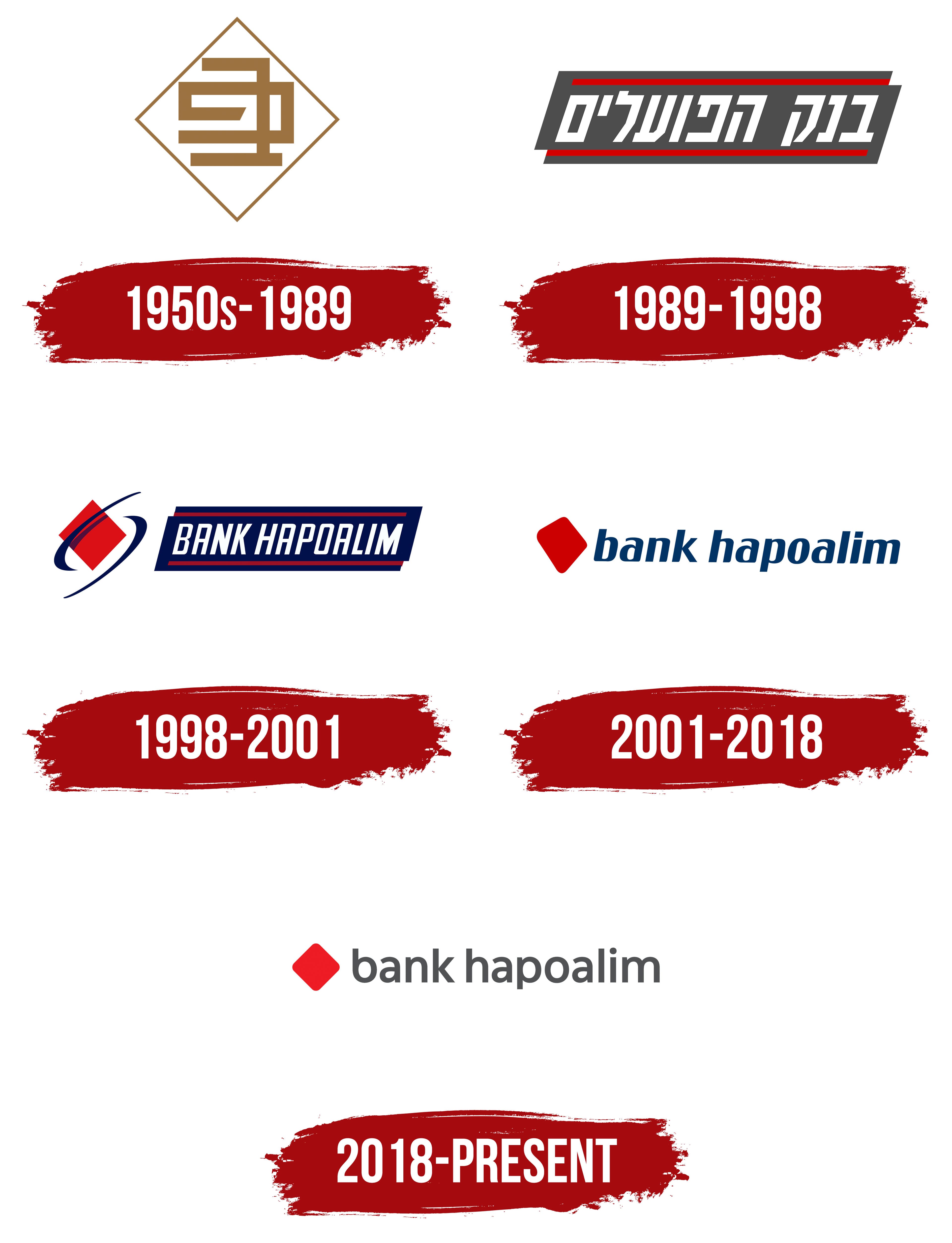
Bank Hapoalim’s diamond symbol predates the period listed in the timeline. The displayed emblem dates to the 1950s, while a retrospective by the OPEN agency shows a similar symbol as early as 1921. It consisted of a thin diamond-shaped outline and an angular monogram associated with Hebrew script.
Organizations representing the Jewish Yishuv, the World Zionist Organization, and the General Federation of Jewish Workers in Eretz Israel (the Histadrut) founded Bank Hapoalim in 1921. The bank’s official history identifies 1921 as its founding year. The date November 20 requires separate confirmation.
The Hebrew name בנק הפועלים means “Workers’ Bank.” It reflected the institution’s origins and its connection with labor organizations, cooperatives, and economic associations within the Yishuv. The English form Bank Hapoalim transliterated the Hebrew name into Latin letters and differed from the literal translation “Workers’ Bank.”
The early emblem had a thin diamond-shaped frame. Inside was an angular monogram constructed from horizontal and vertical bands of equal thickness. The lines joined at 90-degree angles and resembled simplified forms from square Hebrew script.
The monogram was associated with letters from the bank’s name. The early version included the diamond and interior figure, while the written name was added later. On subsequent documents and signs, the emblem appeared beside the Hebrew name.
In the supplied image, the frame and interior bands are brown. Both components use the same tone. Historical documents and signs show other single-color variations, making brown one of several colors used during the early period.
During the 1950s and 1960s, the logo accompanied Bank Hapoalim’s expansion following mergers with workers’ credit and savings cooperatives. The geometric monogram retained a connection with the institution’s origins, while the diamond remained part of the bank’s identity. The version continued in use until 1989.
1989 – 1998

In 1989, Bank Hapoalim replaced the standalone monogram with a compact panel containing its full Hebrew name. The diamond gave way to an elongated dark shape with white lettering and red lines. The version remained in use until 1998.
The background was a horizontal 4-sided figure with slanted side edges. The entire block leaned to the right. Dark gray with a blue undertone provided the foundation for the white lettering. It separated the bank’s name from the surrounding space.
The inscription בּנק הפּועלים appeared inside. Read from right to left, the text presented the Bank Hapoalim name. The large letters used a heavy sans-serif style and followed the panel’s slant. Tight spacing let the line fill most of the dark field.
Two thin red lines ran along the upper and lower edges. They extended across the full length of the panel, remained parallel, and followed its slant. The red lines framed the white lettering above and below, while the side edges remained open.
The composition resembled an elongated information sign. The shift to the full name moved the bank’s identity toward typography. The combination of a dark gray-blue field, white letters, and red lines continued in Bank Hapoalim’s identity during the following decades.
1998 – 2001

The diamond returned to Bank Hapoalim’s identity in 1998 as the red component of a multicolored emblem. The designers added two dark blue arcs to the earlier geometric form. The slanted panel containing the bank’s name remained in use beside it.
The emblem appeared to the left of the text. Its central figure was a red square rotated onto one corner. The diamond had straight edges and occupied the inner area between the blue lines. The contrast between red and dark blue separated the figure from the typographic block.
Two curved bands passed around the diamond from opposite sides. One extended from top to bottom along its edge. The second formed a broad oval contour around the red diamond. Together, the lines created an open frame with gaps between its sections.
An elongated dark blue panel slanted to the right appeared beside the emblem. The Hebrew version contained the bank’s Hebrew name, while the English version used BANK HAPOALIM. The background followed the lettering’s direction and continued the structure introduced in 1989.
The English name appeared in narrow white uppercase sans-serif letters. The letters were tall and slightly rightward-slanted. The line occupied most of the horizontal area within the dark blue field.
Two thin red lines ran along the panel’s upper and lower edges. They remained parallel and followed the typographic block’s slant. Red connected the lines with the diamond on the left, while dark blue unified the wordmark background with the surrounding arcs.
2001 – 2018

By the start of the new century, Bank Hapoalim used a multipart emblem with a red diamond, blue arcs, and its name inside a slanted panel. In September 2001, a composition built from 2 primary components replaced the previous frame. The update retained the red-and-blue combination introduced in 1998 and the diamond associated with the bank’s early history.
The red diamond appeared to the left of the name, separate from the orbital lines and frame. Its form moved away from the geometry of an ordinary square rotated on its axis. The sides gained a slight curve, the corners softened, and the silhouette became asymmetrical. The large red shape occupied a relatively small area of the logo while still playing a leading role in the composition.
The lowercase English words “bank hapoalim” appeared on the right in rich blue. The sans-serif lettering had dense strokes and leaned to the right. A space separated the 2 words, while consistent lowercase lettering combined them into one wordmark. The blue typography and red diamond continued the color system established in the late 1980s.
Bank Hapoalim is a transliteration of the bank’s Hebrew name. For local audiences, the Hebrew wordmark used the same combination of blue text and a red diamond. The brand also used English and Arabic versions. The shared geometric figure unified all 3 forms and maintained continuity across different writing systems.
The Hebrew, English, and Arabic wordmarks used different typefaces, leaving the typography visually inconsistent. By the end of the period, the differences called for a revision. Coordinating the 3 versions became one of the objectives of the 2018 project that replaced the logo used since 2001.
2018 – today

The Bank Hapoalim update began with research into customer perceptions and changes in banking since 2001. The Tel Aviv agency OPEN proposed the image of a financial advisor supporting customers through personal and business decisions. Introduced on November 15, 2018, the brand platform used the statement “With you in every decision.” The bank shifted from a formal corporate tone toward continuous advisory support.
The familiar red diamond maintained continuity with the previous identity. OPEN retained the figure while completely revising its contour. The asymmetrical rotated shape became symmetrical and upright. Its sides were aligned around a common axis, and its corners were gently rounded. The agency linked the new design to an equal dialogue between the bank and its customers.
The diamond became the foundation of an expanded system. The team developed changing configurations of the figure for different services and situations. The primary red outline preserved the connection with Bank Hapoalim, while the adaptable construction supported different communication themes. In shortened applications, the diamond appeared without the wordmark, representing the bank as a standalone emblem.
The “bank hapoalim” wordmark received rounded letters and an upright position. Dark blue was replaced by dark gray, letter spacing increased, and the text followed a horizontal baseline. According to OPEN, gray communicated a professional tone, while the softened typography made the bank’s message more approachable for customers.
Poalim Sans was created for the new system. Yanek Iontef and Daniel Grumer of Fontef Type Foundry developed the typeface. The geometric sans-serif family included 3 weights and supported Hebrew, Arabic, and Latin scripts. The team developed all character sets through a shared process with coordinated proportions, stroke thicknesses, and line relationships. The unified family replaced the separate typefaces used in earlier versions.
Poalim Sans appeared in the logo, banking documents, and digital interfaces. The family included several numeral sets, fractions, currency symbols, superscripts, and subscripts. The primary emblem received Hebrew, Arabic, and English versions with matching proportions, gray lettering, and the red diamond.